Broadway
Behr's deepest near-black neutral, reviewed honestly: the rooms where it turns dramatic, the light that makes it disappear, and what to pick instead.

Jessica has spec'd whites and neutrals for more than 300 rooms and keeps a sample wall of painted drawdowns in her studio. Every color review is checked against real reader rooms in the comments and re-tested when a formula changes. About the testing process →

- 1Cordovan Brown0
- 2Broadway6
The Fast Verdict
Broadway is Behr's real near-black — LRV 6, essentially no hue to defend, not a navy or an olive wearing a black costume. Behr itself markets it as a "deep slate" evoking an October night sky and grade-school black construction paper, which tells you the whole approach: this color is built to disappear into drama, not to announce a specific undertone. Give it real light and white trim and it reads sharp and expensive; leave it in a dim room with no lamps and it just reads dark.
Front doors, shutters and exterior trim · dining rooms and dens used mostly at night · kitchen islands and cabinets against white · a single accent wall behind a bed or shelving · anyone who wants genuine drama, not a colored-black substitute
Your only real living space is small and already dim · you're hoping for a specific undertone like navy or olive · your room runs on cool LEDs with no lamps · you want a color a first-time painter can cover in one easy coat
- A genuine flat near-black at LRV 6 — no competing hue to negotiate
- Reads sharp and modern against white trim, brass and warm wood
- One of the more consistently dramatic colors in low light and in bright light alike
- Doors and cabinets: near-black hides scuffs and fingerprints better than a light color
- Behr backs it with a masonry/exterior formula, not just an interior tint
- LRV 6 drinks whatever light the room has left — wrong pick for an already-dim room's walls
- Reviewers genuinely disagree on the undertone; sample before trusting any single description
- Needs a proper tinted primer and usually two full finish coats regardless
- Not the color to reach for if you want a nameable hue like navy or green rather than "black"
What Color Is Broadway, Really?
Broadway is Behr's near-black entry, dark enough (LRV 6) to read as flat black in most rooms, with only a whisper of color underneath. Behr's own marketing has featured it as a Color of the Month, describing it as a "deep slate" that calls to mind an October night sky and the black construction paper from every kid's Halloween art project — evocative language, and honestly accurate: this is a color built for near-black drama first, a specific hue second.
Where it gets genuinely interesting is the undertone question. Professional colorists who have physically swatched this depth of Behr charcoal land in different places — some read a cool, blue-leaning charcoal; others clock subtle brown warmth underneath; a few see a faint green-gray. At LRV 6, that disagreement is not a data error, it's just what happens at the bottom of the deck: with almost no light bouncing back to the eye, the color borrows its apparent temperature from whatever is nearby — the color temperature of your bulbs, the warmth of your floor, the wall it sits beside. Broadway doesn't have a fixed personality so much as a very dark, very quiet canvas that takes on the personality of the room around it.
At this depth, the practical numbers matter more than the color theory. LRV 6 means the paint absorbs almost all the light that hits it: it will noticeably darken a room's overall brightness, needs a gray- or black-tinted primer over anything lighter to avoid a warm ghost showing through, and typically wants two full finish coats even after priming. Treat it less like "paint" and more like a material decision — the same category as a black granite counter or a wrought-iron stair rail.
Where It Shines
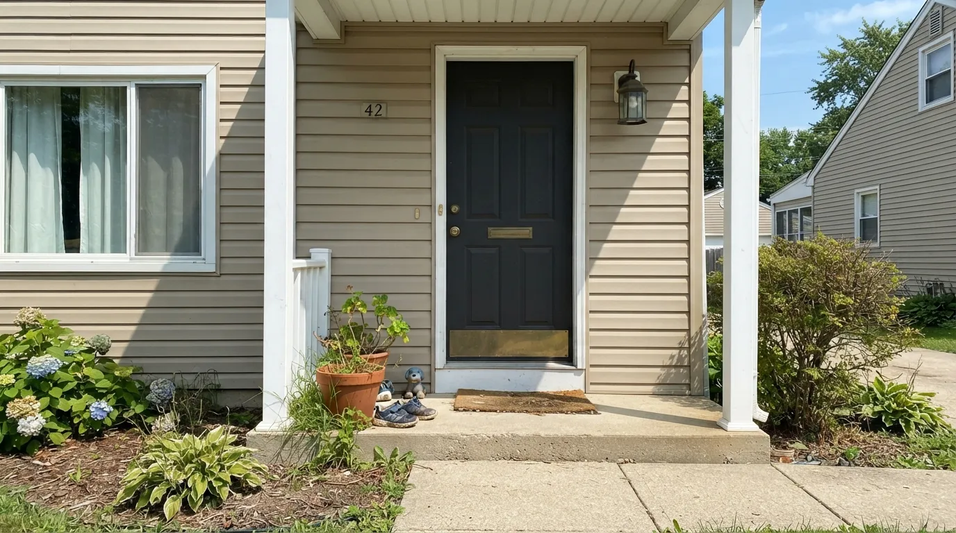
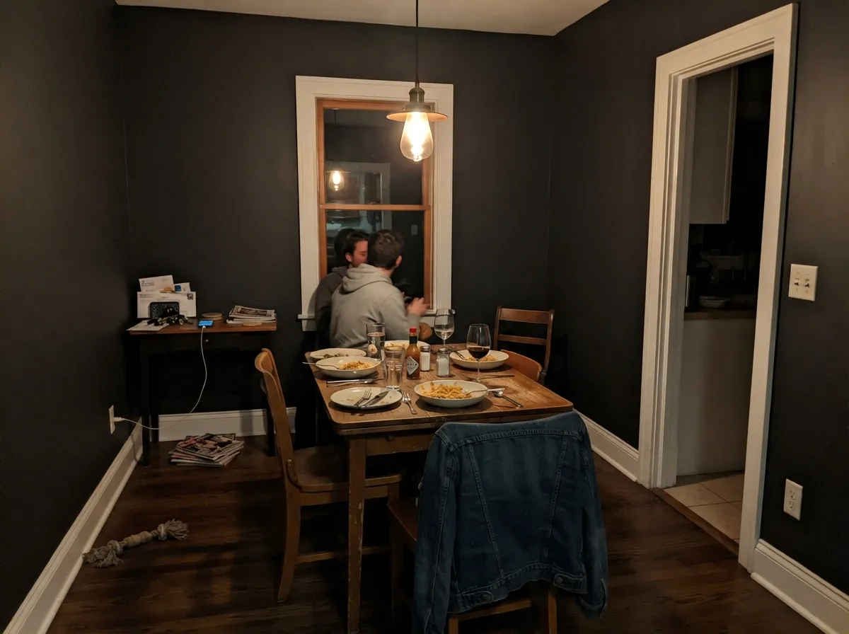
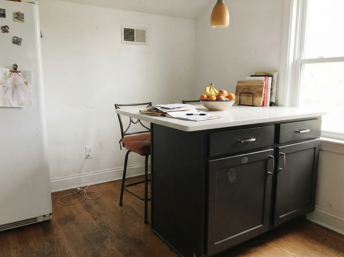
Broadway earns its keep exactly where you want commitment without a hue to justify: front doors, a dining room that mostly gets used after dark, an island or cabinet run next to a lot of white. Give it real ambient light — daylight through a window, warm lamps at night — and it reads sophisticated and deliberate rather than like a hole in the wall. Against white trim, brass hardware and warm wood, the contrast does most of the design work for you; you barely have to style around it.
Where It Fails
Almost every regret story with a near-black this deep follows one of three scripts, and all three are predictable before the first coat goes on. None of them are the paint's fault — but if your room matches one, sampling bigger will only confirm the problem, not solve it.
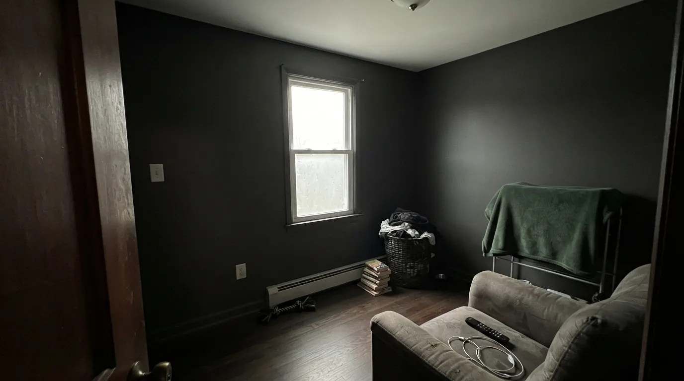
Near-black on four walls in a room with one small window and no lamps swallows what little light is left; readers describe it as feeling like a cave rather than dramatic. It's a different story as an accent wall or a door in that same room — the fix is committing less color, not skipping the color.
Because different colorists genuinely read Broadway differently — blue-leaning to some, brown-charcoal to others — buyers hoping for a moody navy or a deep olive sometimes just get flat black under their own light. If the undertone is the whole point, pick a color whose name commits to it (Naval for blue, Roycroft Bronze Green for green) instead of a near-black this close to neutral.
Skip the gray- or black-tinted primer over a warm beige or yellow wall and you'll be on a third coat, watching a warm halo show through in raking light. Near-blacks are unforgiving about this step in a way mid-tones never are.
Room by Room
A near-black door reads sharp against a white, beige or brick house and photographs well in every light condition, which is exactly why Behr also sells this depth of charcoal in an exterior masonry formula. Semi-gloss, and prime bare wood or fiberglass first.
A room that mostly gets used under a chandelier or pendant is the ideal Broadway candidate: the paint disappears into the shadows between fixtures and glows warm right where the light hits. Matte or eggshell; skip it if the room is also your daytime home office.
Broadway on lower cabinets or a single island, with white walls and counters around it, is one of the safer high-contrast kitchen moves — it hides fingerprints and scuffs better than a colored cabinet paint and never clashes with counter veining. Satin, urethane-fortified cabinet enamel.
A powder room is small enough to fully commit without the room going cave-like, and near-black in a windowless half-bath under a good sconce reads genuinely custom. Add a mirror to bounce back what light there is.
Works well behind a desk or shelving wall when there's daylight to balance it; skip it as the only color in a north-facing office with no lamp on the desk, where screen glare will fight the dark wall all day.
Behind a headboard, with warm 2700K bedside lamps, it's genuinely restful. As the only color in a smaller or dimmer bedroom, it tends to read heavy rather than cozy — that's the accent-wall vs. whole-room line to respect here.
Your Light Is the Risk
In strong window light it reads as a true, sharp charcoal-black — no murkiness — and the contrast against white trim does the styling for you.
Without real light it goes flat and heavy and the corners disappear into shadow. The room reads smaller, not moodier.
Low-angle morning and evening light pulls out a faint warmth or coolness — readers disagree on which they see, and you'll likely watch that same debate play out on your own wall.
Warm 2700K bulbs soften it toward a warm charcoal-black; cool LEDs keep it flatter and more blue-gray. Pick the bulb before you pick the paint.
Most complaints about Broadway are a light mismatch. Upload a photo of your actual room and see it on your walls — then ask for the same wall in north light or evening lamps before you buy a single sample.
Need It From Another Brand?
Any paint counter can custom-tint Behr PPU18-20 directly. If you would rather stay in one brand's own deck, these are the closest stock matches, measured as ΔE2000. Under 2 is a difference you will not see on the wall.
| Brand | Closest color | ΔE | LRV | |
|---|---|---|---|---|
| Sherwin-Williams | Iron OreSW 7069 · Sherwin-Williams | 0.7 | 6 | Color page → |
| Benjamin Moore | Notre DameCSP-570 · Benjamin Moore | 1.6 | 6 | Color page → |
| Valspar | Arrowhead8006-11F · Valspar | 2.8 | 5 | Color page → |
| PPG / Glidden | OnyxPPG1011-7 · PPG / Glidden | 2.1 | 6 | Color page → |
| Glidden | Deep Onyx00NN 07/000 · Glidden | 2.1 | 7 | Color page → |
| Dutch Boy | Charcoal Brick405-7DB · Dutch Boy | 4.4 | 6 | Color page → |
Similar Behr Colors
The nearest shades to Broadway within Behr's own range, ranked by perceptual color distance — useful when you want the same look a touch lighter, darker, or warmer.
WCAG 2.1: AA is 4.5 : 1 for normal text, 3 : 1 for large text, AAA is 7 : 1.
Broadway vs the Colors You're Also Considering
Every Broadway sample board has the same rivals on it. The numbers show the real lightness gap — then it comes down to which risk you would rather live with.
Pick this for the flatter, more consistently neutral near-black — Broadway doesn't flash a secondary hue the way Cracked Pepper does.
Behr PPU18-01 · LRV 5Cracked PepperPick this if you want Behr's most famous black and don't mind a violet flash in strong sun.
Pick this for a touch more reflectance and Behr's easier at-store tinting if you're already buying Behr.
Sherwin-Williams SW 6258 · LRV 3Tricorn BlackPick this for the deepest, truest black in any deck we've reviewed — LRV 3, essentially zero ambiguity.
Limousine Leather MQ5-05 at LRV 4 with hex #3B3C3B is the nearest Behr neighbor and reads a shade greener. Black Garnet N110-7 at #38363D is the same depth with a faint purple lean, which shows up mostly next to gray trim. Raven Black PPF-59 at LRV 5 with hex #3D3D3D is a plain neutral that sits one point lighter, a reasonable pick if Broadway feels too heavy.
Across brands, Hirshfield's Sayward Pine H0101 at LRV 4 measures a deltaE of 0.76, close enough to call a match. Benjamin Moore Black Tar 2126-10 at LRV 6 and Glidden Onyx Black 00NN 05/000 at LRV 5 both sit at 1.07, and Dunn-Edwards Black DEA002 at LRV 4 at 1.4. Farrow and Ball Smelt Black No. G18 at LRV 5 comes in at 1.66. All of those are visually identical in normal room light.
Sherwin-Williams Greenblack SW 6994 at LRV 4 measures 2.63 and pulls green, so it is very close but worth sampling. Dutch Boy Deepest Purple 445-7DB at 3.94 is close but visibly different side by side.
Broadway Coordinating Colors
The rule for coordinating with a near-black this deep is simple: give it a genuinely light partner and one warm material note, and let the near-black do the contrast work. It pairs cleanly with warm whites and creams, with brass and matte black hardware, and with a single warm accent — leather, terracotta, walnut — that keeps the whole room from reading cold. These are the partners that keep showing up in rooms that work:
Broadway on Exteriors
Broadway is one of the few colors at this depth that Behr also sells in a dedicated exterior masonry formula — an elastomeric coating built for stucco and brick — which is a real signal that the company expects this color to live outside, not just on an interior accent wall. That makes it a legitimate front-door, shutter, or trim color, not just a moody interior pick borrowed for the outdoors.
Outside, expect it to read as a true, sharp near-black in direct sun and to soften slightly in shade — the same light-dependence that shows up indoors. Pair it with a genuinely light body color (white, warm beige, soft gray) so the near-black reads as intentional trim, not as an entire dark facade; a near-black house with near-black trim loses the contrast that makes this color work.
Broadway With Wood Tones and Metals
Walnut, espresso stain and dark leather are the easy pairing — the warmth in those materials fills in whatever undertone Broadway itself won't commit to, and the whole combination reads deliberate rather than accidental. Pale white oak and lighter floors work too, giving more of a modern, high-contrast look rather than a cozy one.
Metals do a lot of the heavy lifting here: unlacquered brass and warm gold hardware keep the room from feeling cold, matte black hardware nearly disappears into the paint for a monochrome look, and polished chrome or nickel is the one finish that can read a little sterile against it. If you're not sure which way to go, brass is the safer first choice.
Three Ready Palettes Built on Broadway
A color is never alone on the wall. These are complete combinations in the 60-30-10 pattern, with the reason each one holds together. Every one opens in the visualizer.
A near-black door against a light warm-neutral house body is the classic high-contrast entry, and it photographs well in any weather. The warm beige porch trim keeps the whole facade from tipping cold.
Try this palette in your roomA leather-brown built-in against near-black walls keeps the room grounded and warm instead of cold or clinical; the creamy trim gives the eye somewhere to land.
Try this palette in your roomNear-black island against crisp white walls is the classic two-tone kitchen move; a terracotta accent on the stools keeps the whole room from reading cold or showroom-sterile.
Try this palette in your roomBroadway FAQ
Is Broadway actually black, or a dark gray?
At LRV 6 it reads as black in almost every real-world light — that's dark enough that most people won't call it "gray" on the wall. It's not a pure zero-chroma black like a true reference black, but the difference is subtle enough that it only shows up in bright, direct light.
What's the difference between Broadway and Cracked Pepper?
Both are Behr near-blacks at nearly the same depth. Cracked Pepper is known for a violet flash in strong sun; Broadway stays flatter and more neutral across different light. If you want zero surprise undertone, Broadway is the steadier pick.
Can I use Broadway on all four walls of a room?
Only if the room gets real daylight or you're committed to warm lamps at night — a dining room, a den with a window, a powder room. In a small room with one weak window and no lamps, it reads dark and closed-in rather than dramatic; use it as an accent wall or a door there instead.
What primer does Broadway need?
A gray- or black-tinted primer over any lighter existing color, then plan on two full finish coats even after priming. Skipping the tinted primer is the most common reason painters end up on a third coat.
Is it good for a front door?
Yes — it's one of the stronger uses for this color. Near-black doors read sharp against nearly any house body color, and Behr also sells this depth of charcoal in an exterior masonry formula, which tells you it's built to hold up outside.
Will Broadway make a room feel smaller?
In a dim room with no real light source, yes — the color absorbs what light there is and the walls close in. In a room with a window and a lamp or two, it reads as intentional drama rather than a smaller room; the light in the room decides which effect you get, not the paint itself.
Have you painted with Broadway?
Rate it — one tap helps the next reader decide.
Ask a Question