Sunset Color Palette — Tangerine Dusk
A warm five-color sunset scheme that runs from coral and tangerine through gold into dusky purple and deep evening blue — every color matched to real paint you can buy.
By Maya Patel · Reviews Editor & Product Tester
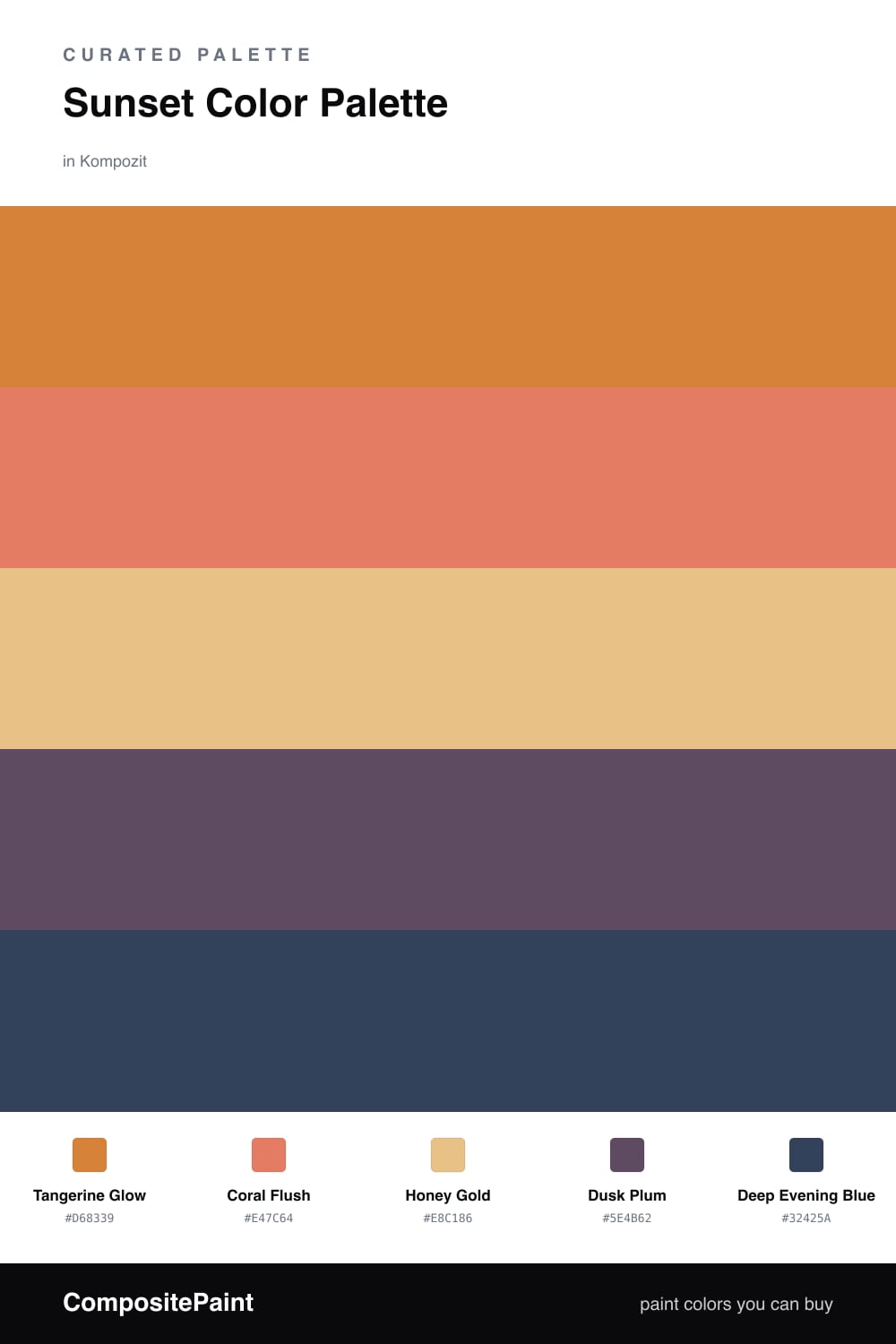
This is a sunset captured in order, warm light melting down into night. Tangerine Glow leads as the dominant, that exact moment the sky turns molten, with Coral Flush layered just beneath it for the softer pink heat at the horizon. Together they carry the warmth without tipping into anything garish.
Honey Gold is the base that holds it all up, a muted amber that reads almost as a neutral and keeps the brights from shouting. Then the palette cools on purpose. Dusk Plum is the dusky purple that creeps in as the light fades, and Deep Evening Blue is the first clear patch of night sky.
The trick in 2026 is restraint with the warms and confidence with the cools. Push the tangerine and coral into the spotlight, but let the plum and blue anchor the edges so the whole thing feels like a real gradient and not a fruit bowl. Done right, it glows.
Buy These Colors
Each color matched to the closest real paint in every brand, by ΔE2000. Kompozit first; take any SKU to the store — these mix on demand.
Questions
Let the dusky purple and evening blue do real work, not just trim accents. Give one of them a feature wall or a run of cabinetry so the warm tangerine and coral read as the glow of a sunset rather than a single hot color filling the space.
Lead with Tangerine Glow as your dominant and keep Honey Gold as the soft base behind it, roughly a 60/30 split. Save Coral Flush, Dusk Plum, and Deep Evening Blue for smaller moments so the warm-to-cool gradient stays believable.
Similar Palettes
Closest schemes by color — not by label.