Summer Color Palette — Watermelon Cooler
A juicy five-color summer scheme pairing watermelon pink with cool mint, sky blue, and a slice of citrus, all balanced by a creamy white — every color matched to real paint you can buy.
By Emily Roberts · DIY Editor & First-Timer's Guide
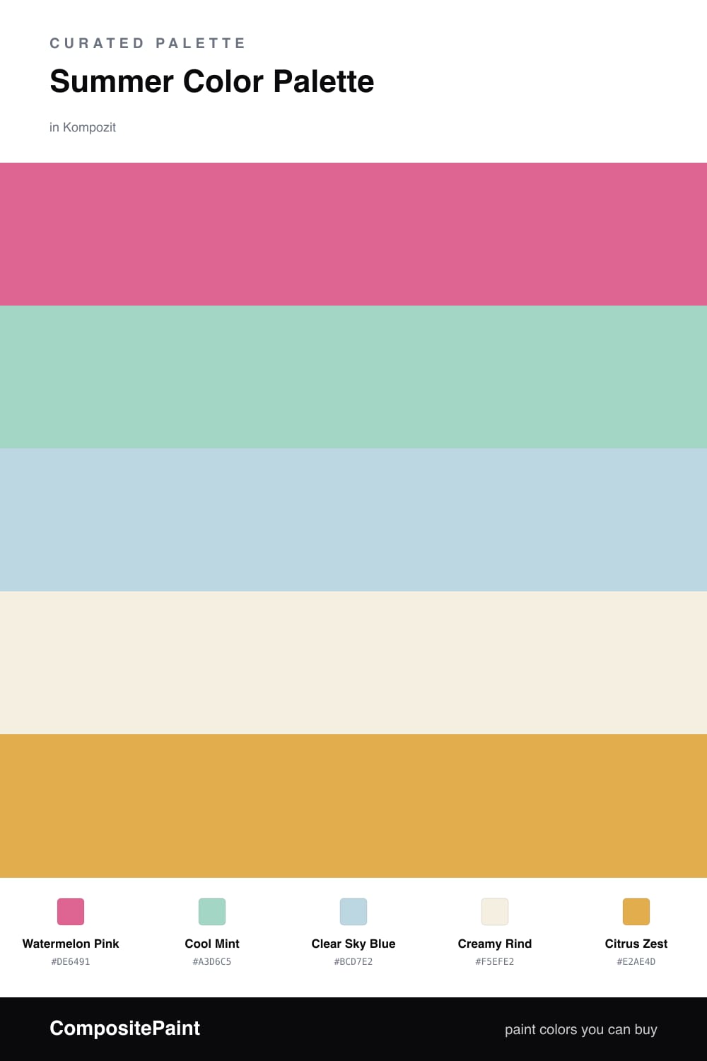
Nothing says summer quite like a cold slice of watermelon, and that is exactly the feeling this scheme is going for. Watermelon Pink leads the way as the dominant color — warm and a little playful, the kind of pink that feels fresh rather than sweet. It is the heart of the palette, so let it take up the most space.
From there, Cool Mint and Clear Sky Blue do the cooling-off. They are the water and the open sky in this lineup, and together they keep the pink from running too hot. If a color “role” like Support sounds fancy, it just means that blue is here in smaller doses to back up the mint, not to compete with it. Creamy Rind is your base — a soft off-white that gives everything room to breathe, the way a rind quietly holds the slice together.
The little spark at the end is Citrus Zest, a warm sunny orange used as the accent. A touch goes a long way, so think of it as a squeeze of lime over the whole thing rather than a main ingredient. Used in small bits, it ties the warm and cool sides together and gives this 2026-fresh palette its summer glow.
Buy These Colors
Each color matched to the closest real paint in every brand, by ΔE2000. Kompozit first; take any SKU to the store — these mix on demand.
Questions
Not if you let the neutrals carry the load. Keep Watermelon Pink to one feature wall or a strong piece of furniture, then surround it with Creamy Rind so it reads as cheerful rather than overwhelming. A pink this warm is friendlier than it looks on the chip.
Use them at different strengths. Let Cool Mint do more of the work as the secondary color and keep Clear Sky Blue to smaller touches like a chair or some cushions. When one cool tone leads and the other supports, the pair feels layered instead of like a single block of color.
Similar Palettes
Closest schemes by color — not by label.