PROFESSIONAL-GRADE PAINT
ONE COAT COVERAGE
MADE FOR REAL RESULTS
CompositePaint

Summer Kitchen Palette — Bright White & Sky Blue

A fresh 4-color summer scheme for kitchens: crisp bright white, soft sky blue, warm sand, and a cheerful coral accent for sunny mornings. Every color matched to real paint you can buy.

By Jessica Williams · Color Stylist & Interior Editor

Bright White
Cabinets & Trim
Kompozit Sugar Dust · 0011
#F8F6ED
LRV 92
Sky Blue
Walls
Kompozit Soft Blue · 0651
#A8CCDD
LRV 57
Warm Sand
Floors & Wood
Kompozit Hephaestus · 0321
#E1D4B6
LRV 66
Soft Coral
Accent
Kompozit Summer Memory · 1052
#DF856E
LRV 34
View palette in

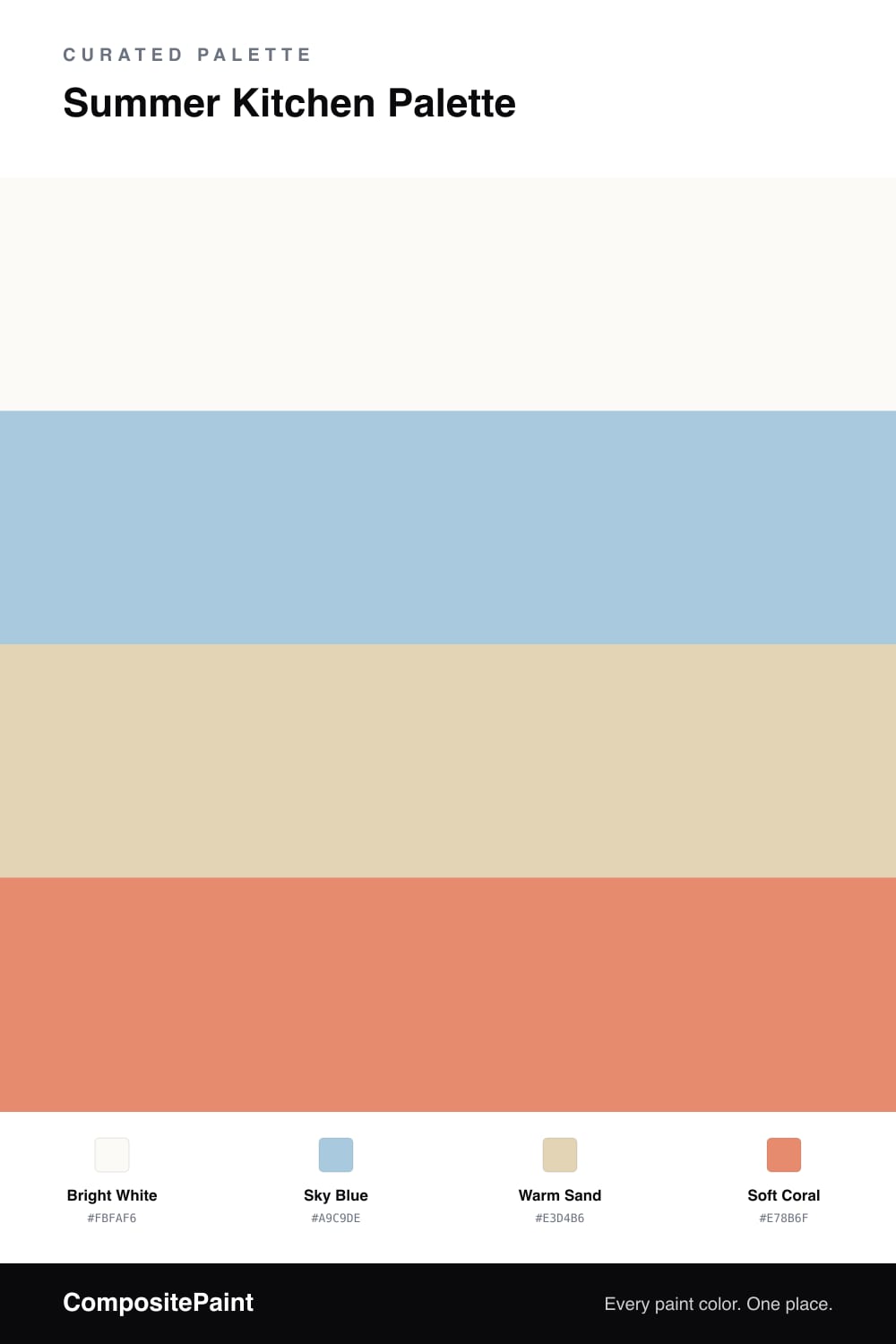
A summer kitchen should feel like the windows are open even when they are not — bright, breezy, and a little salty. This palette starts with a bright white on the cabinets and trim, clean enough to bounce morning light around the whole room.

The walls go to a soft sky blue, the color of a clear day, which keeps the white from feeling sterile and adds a coastal calm. Warm sand comes in underfoot through wood floors or a butcher-block counter, grounding all that brightness so the room still feels cozy.

Then a soft coral accent — stools, small appliances, a bowl of fruit — adds the happy pop that says summer. Lead with white and blue, let sand warm the floor, and use coral as the smile in the corner. It stays fresh from June straight through August.

Buy These Colors

Each color matched to the closest real paint in every brand, by ΔE2000. Kompozit first; take any SKU to the store — these mix on demand.

Bright White
#FBFAF6 · LRV 96 · Cabinets & Trim
Kompozit Sugar Dust · 0011 ΔE 2.44
Backdrop Tabula Rasa · BD-TR ΔE 3.59
Behr Crystal Cut · PR-W13 ΔE 0.62
Benjamin Moore Snowfall White · 2144-70 ΔE 2.86
Clare Whipped · PNT100-LT-02 ΔE 1.03
Dunn-Edwards Cool December · DEW383 ΔE 0.85
Farrow & Ball All White · No. 2005 ΔE 1.05
Magnolia Home True White · JG-21 ΔE 1.51
PPG / Glidden Delicate White · 1001-1 ΔE 1.99
Sherwin-Williams High Reflective White · SW 7757 ΔE 1.38
Valspar Ultra White · 7006-24 ΔE 0.91
Sky Blue
#A9C9DE · LRV 55 · Walls
Kompozit Soft Blue · 0651 ΔE 2.47
Backdrop Lost in the 80s · BD-LO ΔE 2.57
Behr Caspian Tide · PPU14-13 ΔE 1.85
Benjamin Moore Palatial Skies · 800 ΔE 0.93
Clare Summer Friday · PNT100-LT-37 ΔE 6.82
Dunn-Edwards Afternoon Sky · DE5877 ΔE 4.26
Farrow & Ball Blue Ground · No. 210 ΔE 8.53
Magnolia Home Vibrant Horizon · JG-88 ΔE 7.46
PPG / Glidden Sonata · 1157-3 ΔE 1.82
Sherwin-Williams Vast Sky · SW 6506 ΔE 2.94
Valspar Utterly Blue · 4006-7B ΔE 2.12
Warm Sand
#E3D4B6 · LRV 67 · Floors & Wood
Kompozit Hephaestus · 0321 ΔE 0.9
Backdrop Cookies & Cream · BD-CC ΔE 3.26
Behr Sand Pearl · PPU7-18 ΔE 2.85
Benjamin Moore Cornice Tan · CW-115 ΔE 0.72
Clare Turbinado · PNT100-LT-21 ΔE 4.09
Dunn-Edwards Bisque Tan · DE6157 ΔE 1.74
Farrow & Ball Matchstick · No. 2013 ΔE 1.81
Magnolia Home Morning Snow · JG-167 ΔE 3.36
PPG / Glidden Loofah · 1094-2 ΔE 0.48
Sherwin-Williams Irish Cream · SW 7537 ΔE 2
Valspar Fennel Splash · 6007-3B ΔE 1.27
Soft Coral
#E78B6F · LRV 37 · Accent
Kompozit Summer Memory · 1052 ΔE 2.43
Backdrop Rosita · BD-RO ΔE 10.69
Behr Candied Yams (m210-5) · M210-5 ΔE 2.88
Benjamin Moore Flamingo Orange · 075 ΔE 3.41
Clare Pink Sky · PNT100-MD-28 ΔE 9.71
Dunn-Edwards La Terra · DE5172 ΔE 3.6
Farrow & Ball Red Earth · No. 64 ΔE 7.51
Magnolia Home Rosy Pink · JG-154 ΔE 14.8
PPG / Glidden Warm Welcome · 1194-5 ΔE 1.35
Sherwin-Williams Sunset · SW 6626 ΔE 4.59
Valspar Desert Rose · 2004-3C ΔE 2.07

Questions

Will sky blue walls feel too cold in a kitchen?

Not with warm sand and a coral accent in the room. The blue stays light and airy rather than chilly, and the warm tones around it balance things out so the kitchen feels sunny instead of clinical.

Where should the coral go?

Keep coral to the small stuff — bar stools, a kettle, dish towels, or the inside of open shelves. It is a happy color but a strong one, so a little reads as cheerful while a lot can feel loud in a working kitchen.

Similar Palettes

Closest schemes by color — not by label.