Palette

Spring Color PaletteSpring Bloom

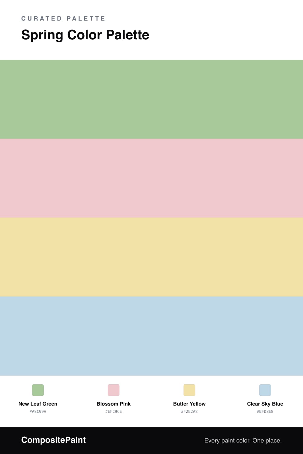
A fresh four-color spring scheme pairing soft leaf green and blossom pink with buttery yellow and clear sky blue, every color matched to real paint you can buy.

By Maya Patel · Reviews Editor & Product Tester
View palette in

Spring is the easiest season to over-sweeten, so this scheme leans on a soft, slightly grayed New Leaf Green to do the heavy lifting. It behaves almost like a warm neutral, which is exactly why it works as the dominant color in a 2026 palette that wants to feel fresh without tipping into nursery territory.

Against that green, Blossom Pink brings the bloom and Butter Yellow adds a low, sunny warmth. Neither shouts. They read as quiet color rather than statement color, which is the contemporary move right now.

The spark is Clear Sky Blue — a clean, airy accent that keeps the warm tones honest and stops everything from going too soft. Use the green broad, the pink and yellow in supporting roles, and the blue as your single bright note.

Buy these colors

Every Color, Matched to Real Paint

Each color matched to the closest paint in every brand we track, by ΔE2000. Tap a swatch for its full guide. Take any code to the store, they mix on demand.

Questions people actually ask

Questions

How do I keep four soft pastels from looking too sweet?

Let the green lead and use it on the biggest surface, then treat the pink, yellow, and blue as smaller touches. The muted leaf green reads almost like a neutral, which keeps the whole scheme grounded instead of candy-colored.

Which color should I paint the walls?

Go with New Leaf Green for walls. It is the calmest and most livable of the four, and it lets Blossom Pink, Butter Yellow, and Clear Sky Blue come in as trim, textiles, or a single feature piece.