CP

Rose Color Palette — Rose Dawn

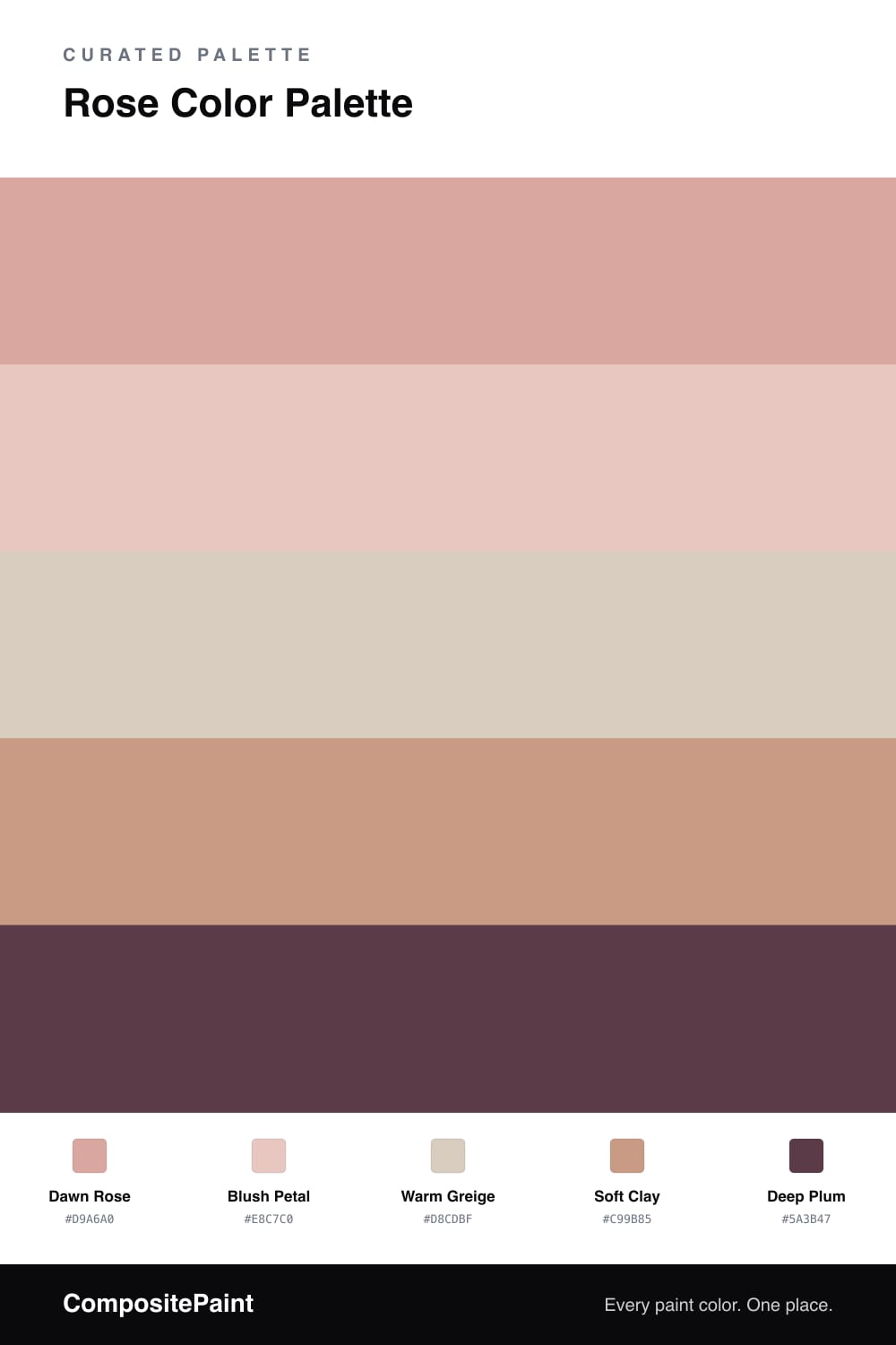
A soft five-color scheme led by a powdery dawn rose, warmed with blush and clay and steadied by greige and a deep plum accent — every color matched to real paint you can buy.

By Jessica Williams · Color Stylist & Interior Editor

This is rose the way it actually shows up at first light — quiet, dusty, a little gray. Dawn Rose leads the whole scheme with a powdery warmth that feels more like a soft morning than a valentine, and that restraint is exactly what makes it feel current in 2026.

Around it, Blush Petal adds a lighter breath of the same family while Warm Greige gives your eye somewhere to rest. Soft Clay warms the edges and keeps things grounded, so the palette never tips into precious.

Then a single note of Deep Plum does the heavy lifting. Used in small doses, it sharpens all that softness and gives the room a spine. Keep the rose tones generous and the plum rare, and the mood stays calm, modern, and easy to live with.

View palette in
Dawn Rose
Dominant
PPG / Glidden Coral Cove · PPG1057-4
#DDA69F
LRV 45
Blush Petal
Secondary
Behr Iced Cherry · S160-1
#E8C7BF
LRV 62
Warm Greige
Base
Farrow & Ball Stirabout · No. 300
#D9CFC2
LRV 63
Soft Clay
Support
Sherwin-Williams Rose Tan · SW 69
#CD9C85
LRV 38
Deep Plum
Accent
C2 Paint Speakeasy · C2-504
#5C3E48
LRV 6

Buy These Colors

Each color matched to the closest real paint in every brand, by ΔE2000. Tap a swatch for its full guide or + to save it — take any SKU to the store, they mix on demand.

Dawn Rose
#D9A6A0 · LRV 45 · Dominant
Sherwin-Williams · SW 7581 · ΔE 5.4
Behr · PMD-70 · ΔE 3.45
Benjamin Moore · 046 · ΔE 4.83
Valspar · V081-3 · ΔE 3.6
PPG / Glidden · PPG1057-4 · ΔE 1.02
Glidden · 60YR 57/216 · ΔE 1.02
Dutch Boy · 305-3DB · ΔE 2.95
HGTV Home by Sherwin-Williams · HGSW 3016 · ΔE 7.69
Dunn-Edwards · DET416 · ΔE 2.21
Magnolia Home · JG-154 · ΔE 8.95
Farrow & Ball · NO. 9806 · ΔE 3.5
Diamond Vogel · 0049 · ΔE 3.86
Hirshfield's · 0049 · ΔE 3.74
Rodda · R122 · ΔE 8.22
C2 Paint · C2-528 · ΔE 7.2
Clare · PNT100-MD-76 · ΔE 3.57
Portola Paints · HAVANA · ΔE 9.83
Annie Sloan · PALOMA · ΔE 13.2
Backdrop · BD-RO · ΔE 2.07
Rust-Oleum · 285143 · ΔE 19.18
Kompozit · 0049 · ΔE 3.74
Blush Petal
#E8C7C0 · LRV 62 · Secondary
Sherwin-Williams · SW 6596 · ΔE 3.92
Behr · S160-1 · ΔE 0.45
Benjamin Moore · 037 · ΔE 0.75
Valspar · 2001-8C · ΔE 1.71
PPG / Glidden · PPG1058-3 · ΔE 1.03
Glidden · PPG1058-3 · ΔE 1.41
Dutch Boy · 303-2DB · ΔE 2.34
HGTV Home by Sherwin-Williams · HGSW 1067 · ΔE 3.92
Dunn-Edwards · DE6101 · ΔE 4.18
Magnolia Home · JG-26 · ΔE 2.04
Farrow & Ball · NO. 230 · ΔE 5.4
Diamond Vogel · 0069 · ΔE 1.76
Hirshfield's · 0069 · ΔE 1.49
Rodda · CA055 · ΔE 9.49
C2 Paint · BD51 · ΔE 2.73
Clare · PNT100-LT-60 · ΔE 4.02
Portola Paints · GYPSY · ΔE 8.24
Annie Sloan · OLD OCHRE · ΔE 13.08
Backdrop · BD-AU · ΔE 5.21
Rust-Oleum · 285142 · ΔE 4.47
Kompozit · 0069 · ΔE 1.49
Warm Greige
#D8CDBF · LRV 62 · Base
Sherwin-Williams · SW 9516 · ΔE 2.21
Behr · PPU7-09 · ΔE 1.53
Benjamin Moore · 982 · ΔE 1.25
Valspar · 8004-9B · ΔE 2.02
PPG / Glidden · PPG1024-3 · ΔE 1.57
Glidden · PPG1074-3 · ΔE 2.46
Dutch Boy · 440-1DB · ΔE 1.61
HGTV Home by Sherwin-Williams · HGSW 2497 · ΔE 1.28
Dunn-Edwards · DE6213 · ΔE 1.06
Magnolia Home · JG-55 · ΔE 5.33
Farrow & Ball · NO. 300 · ΔE 0.68
Diamond Vogel · 0560 · ΔE 0.95
Hirshfield's · 0560 · ΔE 0.72
Rodda · CA133 · ΔE 2.21
C2 Paint · C2-945 · ΔE 2.08
Clare · PNT100-LT-17 · ΔE 1.42
Portola Paints · FIGUEROA · ΔE 2.83
Annie Sloan · OLD OCHRE · ΔE 6.6
Backdrop · BD-RR · ΔE 2.78
Rust-Oleum · 285142 · ΔE 8.95
Kompozit · 0560 · ΔE 0.72
Soft Clay
#C99B85 · LRV 38 · Support
Sherwin-Williams · SW 69 · ΔE 0.91
Behr · S210-4 · ΔE 2.08
Benjamin Moore · 1227 · ΔE 2.47
Valspar · 2004-8A · ΔE 3.65
PPG / Glidden · PPG16-02 · ΔE 4.08
Glidden · PPG16-02 · ΔE 4.22
Dutch Boy · 306-4DB · ΔE 4.56
HGTV Home by Sherwin-Williams · HGSW 2075 · ΔE 4.56
Dunn-Edwards · DET456 · ΔE 1.65
Magnolia Home · JG-110 · ΔE 11.61
Farrow & Ball · NO. 21 · ΔE 1.55
Diamond Vogel · 0037 · ΔE 1.4
Hirshfield's · 0044 · ΔE 3.73
Rodda · CA106 · ΔE 7.22
C2 Paint · C2-512 · ΔE 3.75
Clare · PNT100-MD-76 · ΔE 4.6
Portola Paints · PIXIE · ΔE 4.15
Annie Sloan · FRENCH LINEN · ΔE 15.07
Backdrop · BD-RO · ΔE 6.1
Rust-Oleum · 371674 · ΔE 20.88
Kompozit · 0044 · ΔE 3.73
Deep Plum
#5A3B47 · LRV 6 · Accent
Sherwin-Williams · SW 6027 · ΔE 4.81
Behr · T15-4 · ΔE 2.89
Benjamin Moore · CC-34 · ΔE 2.34
Valspar · 8003-2G · ΔE 2.93
PPG / Glidden · PPG1048-7 · ΔE 3.28
Glidden · PPG1048-7 · ΔE 3.15
Dutch Boy · 402-7DB · ΔE 5.69
HGTV Home by Sherwin-Williams · HGSW 3011 · ΔE 4.81
Dunn-Edwards · DEA194 · ΔE 3.47
Magnolia Home · JG-102 · ΔE 6.17
Farrow & Ball · NO. 222 · ΔE 4.25
Diamond Vogel · H065 · ΔE 4.03
Hirshfield's · 1222 · ΔE 3.29
Rodda · R119 · ΔE 3.86
C2 Paint · C2-504 · ΔE 1.24
Clare · PNT100-DP-54 · ΔE 16.01
Portola Paints · POE · ΔE 5.69
Annie Sloan · BURGUNDY · ΔE 10.4
Backdrop · BD-IT · ΔE 14.25
Rust-Oleum · 285144 · ΔE 18.76
Kompozit · 1222 · ΔE 3.29

Questions

Why does this rose palette feel calm instead of sweet?

The rose here is muted and grayed rather than candy-bright, so it reads grown-up. The greige and clay pull it toward warm and earthy, which keeps the whole scheme soft instead of sugary.

How should I balance these colors?

Let Dawn Rose lead across the biggest surfaces, use blush and clay as gentle layers, and save the deep plum for the smallest moments — a chair, a frame, a strip of trim.

KEEP EXPLORING

Similar Palettes

Closest schemes by color — not by label.