CP

Greige Kitchen Palette — Dawn Greige & Maple Walnut

A calm five-color greige kitchen scheme pairing soft dawn greige walls with warm white trim, creamy cabinets, walnut wood, and a deep olive accent — every color matched to real paint you can buy.

By Maya Patel · Reviews Editor & Product Tester

Dawn Greige
Walls
Kompozit Desert Mirage · 0231
#D2CABC
LRV 60
Linen White
Trim & Ceiling
Kompozit Nilla Vanilla · 0003
#F1EBE0
LRV 83
Soft Almond
Cabinets or Vanity
Kompozit White Elephant · 0223
#E3DBC8
LRV 71
Maple Walnut
Wood & Floors
Kompozit Queen Lioness · 0284
#77613D
LRV 13
Deep Olive
Accent
Kompozit Clover Patch · 0431
#464A3B
LRV 7
View palette in

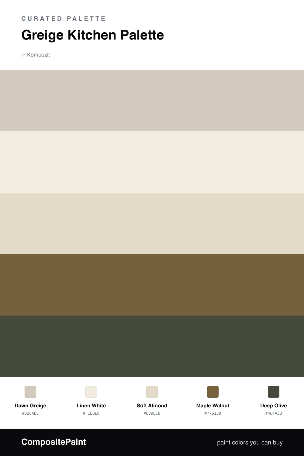
Greige is the safe-but-not-boring choice for a 2026 kitchen, and this scheme proves it. Dawn Greige leads on the walls, soft enough to flatter wood and warm enough to skip the cold gray look that everyone is moving away from.

I paired it with Linen White on the trim and ceiling for a clean, low-contrast frame, and Soft Almond on the cabinets so they feel custom rather than builder-grade. The whole base reads like one quiet, layered neutral.

The depth comes from Maple Walnut on flooring or an island, and a single hit of Deep Olive as your accent — a stool, a backsplash, or the inside of open shelves. Keep the greige dominant and let those two warm darks do the heavy lifting in small amounts.

Buy These Colors

Each color matched to the closest real paint in every brand, by ΔE2000. Kompozit first; take any SKU to the store — these mix on demand.

Dawn Greige
#D3CABA · LRV 60 · Walls
Kompozit Desert Mirage · 0231 ΔE 0.81
Backdrop Real Real · BD-RR ΔE 1.63
Behr Sandstone Cliff · 750C-3 ΔE 0
Benjamin Moore Bleached Gray · ES-78 ΔE 0.51
Clare Flatiron · PNT100-LT-17 ΔE 2.28
Dunn-Edwards Dry Creek · DE6122 ΔE 3.7
Farrow & Ball Cromarty · No. 285 ΔE 3.88
Magnolia Home Plaster · JG-156 ΔE 0.82
PPG / Glidden Moth Gray · 1024-4 ΔE 0.59
Sherwin-Williams Ancient Marble · SW 6162 ΔE 2.68
Valspar Villa Grey · 6005-1B ΔE 0.99
Linen White
#F2ECE0 · LRV 84 · Trim & Ceiling
Kompozit Nilla Vanilla · 0003 ΔE 0.49
Backdrop Jane · BD-JA ΔE 1.9
Behr Bleached Linen · PPU5-09 ΔE 1.63
Benjamin Moore Arbor White · ES-01 ΔE 1.13
Clare Wing It · PNT100-LT-24 ΔE 3.05
Dunn-Edwards Bone China · DEW339 ΔE 1.29
Farrow & Ball White Tie · No. 2002 ΔE 2.73
Magnolia Home Pearly Cotton · JG-33 ΔE 2.23
PPG / Glidden Candlelit Beige · 1207-1 ΔE 1.21
Sherwin-Williams Greek Villa · SW 7551 ΔE 1.09
Valspar Cream Delight · 7002-14 ΔE 0.57
Soft Almond
#E4DAC7 · LRV 71 · Cabinets or Vanity
Kompozit White Elephant · 0223 ΔE 0.98
Backdrop Cookies & Cream · BD-CC ΔE 2.14
Behr Chartreuse Frost · MQ3-17 ΔE 1.07
Benjamin Moore Spring in Aspen · 954 ΔE 1.67
Clare Greenish · PNT100-LT-68 ΔE 3.79
Dunn-Edwards Cream Wave · DE6198 ΔE 1.47
Farrow & Ball Shadow White · No. 282 ΔE 1.95
Magnolia Home Morning Snow · JG-167 ΔE 0.83
PPG / Glidden Botany Beige · 15-27 ΔE 0.75
Sherwin-Williams Neutral Ground · SW 7568 ΔE 1.24
Valspar Daybreak · 6008-3A ΔE 1.18
Maple Walnut
#7A5C40 · LRV 12 · Wood & Floors
Kompozit Queen Lioness · 0284 ΔE 5.26
Backdrop Buenos Aires · BD-BA ΔE 1.83
Behr Molasses · S220-7 ΔE 3.49
Benjamin Moore Marsh Brown · 2164-20 ΔE 3.24
Clare Coffee Date · PNT100-DP-53 ΔE 11.08
Dunn-Edwards Rodeo · DEA163 ΔE 2.55
Farrow & Ball Salon Drab · No. 290 ΔE 7.31
Magnolia Home Cognac · JG-164 ΔE 2.36
PPG / Glidden Maple Syrup · 1084-7 ΔE 1.56
Sherwin-Williams Burnished Brandy · SW 7523 ΔE 1.68
Valspar Muddy Mississippi · 3004-9A ΔE 1.14
Deep Olive
#4A4A33 · LRV 7 · Accent
Kompozit Clover Patch · 0431 ΔE 3.82
Backdrop North End · BD-NE ΔE 8.18
Behr Wanderer · 770D-7 ΔE 1.65
Benjamin Moore Windsor Green · CW-505 ΔE 4.14
Clare Blackish · PNT100-DP-54 ΔE 10.27
Dunn-Edwards Mink · DE6392 ΔE 11.81
Farrow & Ball Studio Green · No. 93 ΔE 9.63
Magnolia Home Wooded Acres · JG-122 ΔE 10.58
PPG / Glidden Charcoal Smoke · 1033-7 ΔE 6.2
Sherwin-Williams Laurel Woods · SW 7749 ΔE 5.23
Valspar Deep Desert Shadow · M331 ΔE 5.73

Questions

Why does greige work so well in a kitchen?

Greige sits halfway between gray and beige, so it reads warm in morning light and cool under task lighting. That flexibility keeps a busy kitchen feeling calm all day without locking you into one undertone.

How do I keep five colors from feeling busy?

Let the greige lead on the walls and the white carry the trim and ceiling. Use the walnut and olive in small doses on an island, open shelving, or a single lower run so the room stays quiet.

Similar Palettes

Closest schemes by color — not by label.