Forest Study Palette — Forest Spruce & Soft Linen
A calm five-color study scheme built on deep forest green with warm wood, soft linen, and a smoky accent — every color matched to real paint you can buy.
By Emily Roberts · DIY Editor & First-Timer's Guide
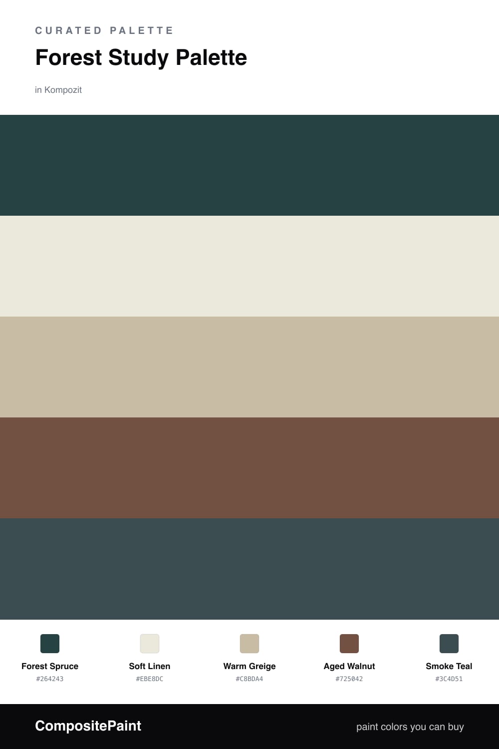
A study is the one room where you get to slow down, so I leaned into colors that feel grounded and quiet. Forest Spruce carries the walls — deep enough to wrap the room like a soft blanket, but muted so it never feels heavy. It is the kind of green that reads modern in 2026 without chasing a trend.
To keep things from going too dark, Soft Linen on the trim and ceiling lifts everything and gives your eye a place to rest. Warm Greige on cabinets or built-in shelving bridges the green and the wood, and Aged Walnut ties in your desk and floors with a rich, lived-in brown.
The little surprise here is Smoke Teal. Use it on a reading chair, a lamp, or the inside of a bookcase — just a touch. It echoes the green without copying it, and that small spark is what makes the whole study feel pulled together instead of plain.
Buy These Colors
Each color matched to the closest real paint in every brand, by ΔE2000. Kompozit first; take any SKU to the store — these mix on demand.
Questions
Not the way you might think. A muted forest green like this reads as cozy rather than cramped, especially with soft linen trim bouncing light around. Keep one wall lighter if you want extra breathing room.
Warm bulbs around 2700K make the green and walnut glow and keep the room feeling like a quiet retreat. Cool daylight bulbs can flatten the green, so save those for the desk task lamp.
Similar Palettes
Closest schemes by color — not by label.