Aqua Color Palette — Aqua Vale
A serene five-color scheme led by a soft aqua, layered with warm neutrals and one deep clay accent, with every color matched to real paint you can buy.
By Jessica Williams · Color Stylist & Interior Editor
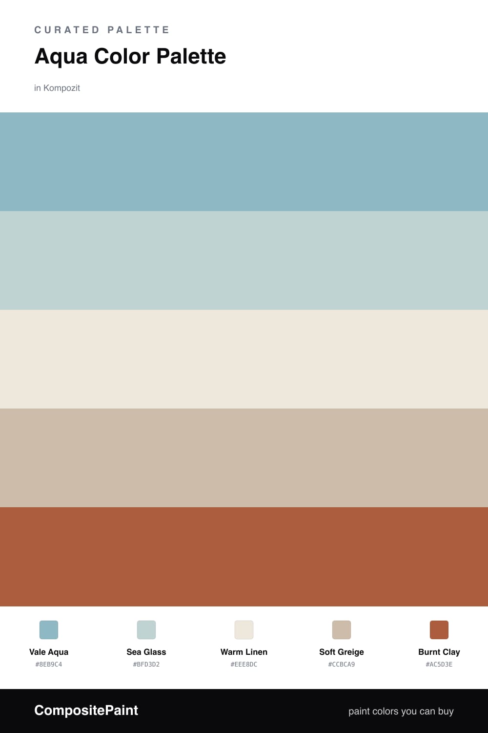
Aqua is having a quiet moment in 2026, and Vale Aqua shows why. It is soft and watery, the kind of shade that catches afternoon light and turns a wall into something you want to sit beside. I let it lead here, with Sea Glass as a paler echo for trim or a second wall.
The neutrals do the gentle work. Warm Linen keeps the scheme from drifting too cool, and Soft Greige adds a little weight so the aqua never floats away. Together they give your eye somewhere soft to rest.
Then there is Burnt Clay — just a whisper of it. One warm, earthy accent is all this palette needs to feel alive and current. Keep it small, a cushion or a ceramic, and let the aqua stay the star.
Buy These Colors
Each color matched to the closest real paint in every brand, by ΔE2000. Kompozit first; take any SKU to the store — these mix on demand.
Questions
Aqua borrows the quiet of both blue and green, so it reads cool and restful without feeling cold. Pairing it with warm linen and greige keeps that calm grounded instead of clinical.
Let the aqua lead at roughly two-thirds of the room, fill the rest with the soft neutrals, and save the burnt clay for the smallest touches like a chair or a vase.
Similar Palettes
Closest schemes by color — not by label.