CP

Aqua Powder Room Palette — Tide Pool Aqua & Warm Linen

A serene 5-color scheme for a powder room: tide-pool aqua walls, warm linen backdrop, crisp trim, grounding wood, and a deep teal accent — every color matched to real paint you can buy.

By David Chen · Formulation Lead & Resident Chemist

Tide Pool Aqua
Walls
Kompozit Peg's Promise · 0702
#8CACA2
LRV 38
Warm Linen
Backdrop & Vanity
Kompozit Moth Mist · 0356
#EDEBDE
LRV 83
Soft Chalk White
Trim & Ceiling
Kompozit Sugar Dust · 0011
#F8F6ED
LRV 92
Toasted Walnut
Wood & Vanity Top
Kompozit Cavern Sand · 0165
#947054
LRV 19
Deep Teal Slate
Cabinet Accent
Kompozit Calm Interlude · 0501
#3C4D51
LRV 7
View palette in

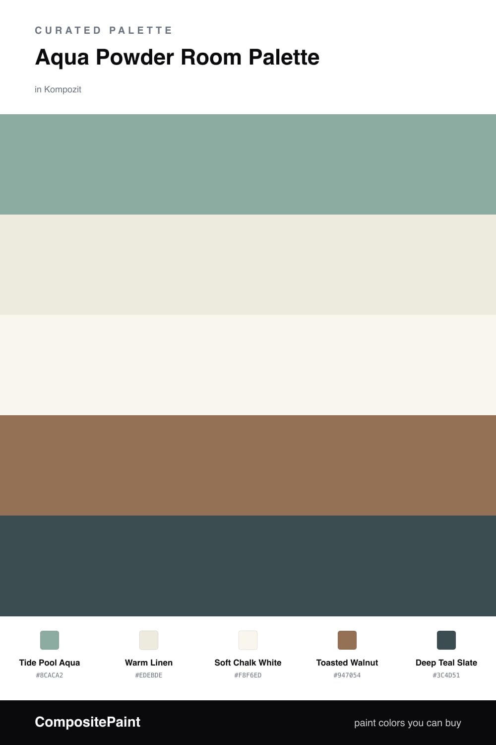
A powder room is the one place I tell people to be brave with color. You are only ever in it for a few minutes, so a wall that would feel like too much in a bedroom becomes a small, welcome jolt instead. That is why the lead here is a real tide pool aqua — saturated enough to make the room feel intentional, but softened with gray so it never tips into a swimming-pool brightness.

The work of keeping that aqua warm falls to the supporting colors. A warm linen carries the vanity and any open backdrop, while a soft chalk white on the trim and ceiling gives the eye a clean edge without going stark blue-white. Then toasted walnut on a wood vanity top grounds the whole scheme — aqua and brown are old friends, the way sea glass looks against driftwood.

Save the deep teal slate for the smallest surface you have: a single cabinet face, an interior, or the back of a niche. Used on roughly one-fifth of the room or less, it deepens the aqua instead of competing with it, and it gives the eye somewhere to rest.

Buy These Colors

Each color matched to the closest real paint in every brand, by ΔE2000. Kompozit first; take any SKU to the store — these mix on demand.

Tide Pool Aqua
#7FB4B0 · LRV 40 · Walls
Kompozit Peg's Promise · 0702 ΔE 5.42
Backdrop Underdog · BD-UD ΔE 12
Behr Aqua Gray · BNC-18 ΔE 1.34
Benjamin Moore Covington Blue · HC-138 ΔE 4.72
Clare Vacay · PNT100-LT-44 ΔE 3.94
Dunn-Edwards Barrier Reef · DE5745 ΔE 4.58
Farrow & Ball Arsenic · No. 214 ΔE 8.07
Magnolia Home Morning Calm · JG-77 ΔE 3.87
PPG / Glidden Key Largo · 1140-4 ΔE 5.53
Sherwin-Williams Reflecting Pool · SW 6486 ΔE 2.25
Valspar Carnival Glass · 8002-35D ΔE 2.7
Warm Linen
#EFEADD · LRV 82 · Backdrop & Vanity
Kompozit Moth Mist · 0356 ΔE 1.47
Backdrop Jane · BD-JA ΔE 1.75
Behr Papier Blanc · HDC-NT-08 ΔE 0.58
Benjamin Moore Stoneware · CSP-245 ΔE 0.84
Clare Like Buttah · PNT100-LT-62 ΔE 2.97
Dunn-Edwards Abstract White · DE6232 ΔE 0.59
Farrow & Ball James White · No. 2010 ΔE 1.88
Magnolia Home Pearly Cotton · JG-33 ΔE 1.47
PPG / Glidden Horseradish · 1086-1 ΔE 0.49
Sherwin-Williams Classic Light Buff · SW 50 ΔE 0.53
Valspar Shell White · 7007-12 ΔE 0.89
Soft Chalk White
#FAF8F2 · LRV 94 · Trim & Ceiling
Kompozit Sugar Dust · 0011 ΔE 1.47
Backdrop Tabula Rasa · BD-TR ΔE 2.64
Behr Polar Bear · 75 ΔE 1.47
Benjamin Moore Snowfall White · 2144-70 ΔE 2.28
Clare Whipped · PNT100-LT-02 ΔE 1.98
Dunn-Edwards Milk Glass · DEW358 ΔE 0.6
Farrow & Ball All White · No. 2005 ΔE 1.24
Magnolia Home True White · JG-21 ΔE 1.52
PPG / Glidden Delicate White · 1001-1 ΔE 2.04
Sherwin-Williams High Reflective White · SW 7757 ΔE 1.03
Valspar Ultra White · 7006-24 ΔE 0.98
Toasted Walnut
#9A6F4A · LRV 19 · Wood & Vanity Top
Kompozit Cavern Sand · 0165 ΔE 3.02
Backdrop Old Soul · BD-OS ΔE 16.37
Behr Olympic Bronze · PPU4-17 ΔE 1.59
Benjamin Moore Runyon Canyon Tan · 1140 ΔE 0.93
Clare Big Apple · PNT100-DP-30 ΔE 15.5
Dunn-Edwards Autumn Bark · DEA164 ΔE 1.22
Farrow & Ball Picture Gallery Red · No. 42 ΔE 13.31
Magnolia Home Remote Trail · JG-165 ΔE 10.22
PPG / Glidden Apple Butter · 15-02 ΔE 1.7
Sherwin-Williams Renwick Golden Oak · SW 2824 ΔE 2.5
Valspar Chestnut Beach · 3002-7A ΔE 2.52
Deep Teal Slate
#2C4A4C · LRV 6 · Cabinet Accent
Kompozit Calm Interlude · 0501 ΔE 5.14
Backdrop After Hours · BD-AH ΔE 9.42
Behr Thermal · S440-7 ΔE 0.91
Benjamin Moore Miramichi · CC-752 ΔE 1.79
Clare Blackish · PNT100-DP-54 ΔE 12.53
Dunn-Edwards Deep Pine · DEA180 ΔE 3.7
Farrow & Ball Hague Blue · No. 30 ΔE 7.4
Magnolia Home Arches · JG-97 ΔE 9.96
PPG / Glidden Midnight Hour · 1038-7 ΔE 7.62
Sherwin-Williams Gale Force · SW 7605 ΔE 7.49
Valspar Mountain Midnight · 8004-37G ΔE 3.64

Questions

Is aqua too bold for a small powder room?

It works better in a small powder room than almost anywhere else. A powder room is a space you visit briefly, so a saturated aqua reads as a pleasant surprise rather than something you live with all day. Keep the lighting warm and the aqua stays soft instead of clinical.

How do I keep aqua walls from feeling cold?

Pair the aqua with warm tones, not more cool ones. The warm linen, toasted walnut, and brass or aged-bronze fixtures here pull the aqua toward calm rather than chilly. A warm white on the ceiling, not a blue-white, finishes the trick.

Similar Palettes

Closest schemes by color — not by label.