How to Choose Paint Colors: A Step-by-Step Method
How to choose paint colors without guessing. Start from what stays, pick one anchor, check the undertone and the light, then test big before you buy a gallon.

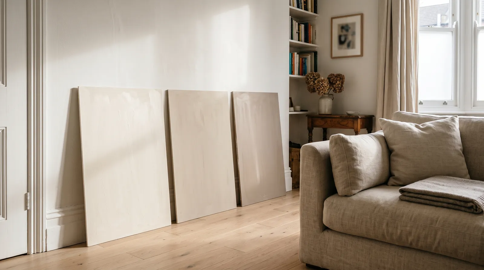
Most people choose a paint color backwards. They start at the store, in front of a wall of chips, under lighting that exists nowhere in a home, and try to fall in love. Then they carry a 2-inch square back to a room full of things that were never consulted, and wonder why the greige went purple.
There is an order that works, and it starts nowhere near the chip rack. It starts with your floor.
The Short Version
Choose paint colors in this order: start from the things you are not replacing (floor, counters, trim, the biggest furniture), pick one anchor wall color that agrees with their undertone, check its LRV against the light your windows actually give you, then build the rest of the room around it in a 60-30-10 split and test it big before you buy a gallon. Everything else is detail.
The reason this order works is that it moves from fixed to flexible. Your oak floor is not negotiable. Your quartz counter is not negotiable. Wall paint is the cheapest, most changeable surface in the room, which means it is the one that should adapt. People invert this constantly, fall for a color first, and then spend the next year quietly resenting a floor that was there the whole time.
- Start from what stays. The fixed finishes set the temperature. The paint follows.
- Pick one anchor color, not a palette. The rest of the scheme derives from it.
- Read the undertone against pure white paper before you read anything else.
- Match the brightness to the light using LRV and which way the windows face.
- Fill out the room in 60-30-10 so one color leads and the others support.
- Test at scale, against the trim, at the hours you live there. Two full days minimum.
- Preview it on your own wall before the first gallon leaves the store.
Step 1: Start From What Isn’t Changing
Walk into the room and list everything you are keeping. Flooring. Countertops or tile. Cabinets. Trim and doors. The sofa, the rug, the dining table, anything big enough to hold a chunk of the room’s visual field. That list is your brief, and paint is the last thing you get to pick, not the first.
Now read the temperature of that list. Honey oak, walnut, terracotta tile, cream cabinetry, brass hardware, red-toned brick: warm. Grey-washed plank, white marble with grey veining, chrome, stone tile, cool white cabinets: cool. Most rooms are already leaning one way and have been for years.
The trade-off nobody warns you about is that fighting the fixed finishes costs more than following them. A cool grey wall over warm honey oak reads slightly wrong no matter how good the grey is on its own, and the only fixes are new floors or new paint. One of those is $80. Pick the temperature your room already has.
There is a brightness version of this too. A pale oak floor sits around LRV 50 to 55; stained walnut reads closer to LRV 12. Rooms generally feel resolved when the wall lands within about 20 LRV points of the floor in either direction, which quietly rules out half the shortlist before you have looked at a single chip.
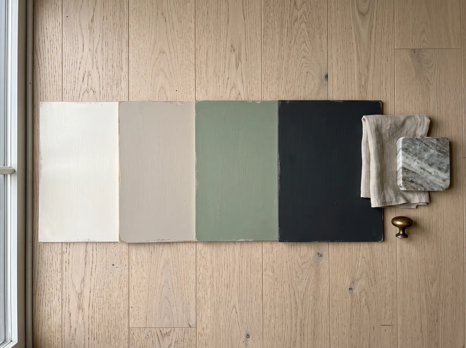 The right way round: the boards get judged against the floor, the fabric, and the metal that are already staying. The paint is the variable.
Go deeper: greige and beige are the neutrals that go wrong most often against fixed finishes, and beige and greige undertones explained covers the four leans (green, purple, pink, yellow) and where each one falls apart.
Step 2: Pick the Mood, Then One Anchor Color
Skip the palette. Pick one color.
Before you do, name the mood in one word, out loud. Calm. Warm. Crisp. Cozy. Dramatic. This sounds soft and it does real work, because it decides brightness before hue and brightness is the bigger lever. Calm and airy means a high-LRV wall in the 70s or 80s. Cozy and enveloping means mid-tones in the 40s to 60s. Dramatic means committing to the 10 to 25 band and lighting the room properly to support it.
Then pick the single color that will cover the most square footage in the room. That is your anchor. Everything else in the scheme gets chosen against it, in the room, not in a browser tab.
| Mood you want | Where the anchor LRV usually lands | What it does |
|---|---|---|
| Bright and open | 75–85 | Bounces light back, keeps a small room from closing in |
| Calm and neutral | 55–75 | The workhorse band; greiges, soft sages, warm taupes |
| Grounded and confident | 25–50 | Holds its own against trim and floor without going dark |
| Moody and enveloping | 10–25 | Dining rooms, libraries, powder rooms; needs real lamping |
One anchor, one decision. If you cannot pick, the paint color quiz will narrow you to a family in about a minute, which is enough to start sampling.
Step 3: Read the Undertone Before Anything Else
An undertone is the faint second color hiding inside the one you think you bought. A grey that reads blue at breakfast. A white that goes pink by a north window. A beige that turns green next to your oak floor. It is invisible on a chip and unmissable on 200 square feet, because color intensifies as the area grows.
The test costs nothing and takes ten seconds. Hold the chip flat against a sheet of pure printer-white paper in daylight. Paper has no undertone to compete with, so the paint gives itself up: creamy and muddy means warm (yellow, peach, red), crisp and steely means cool (blue, green, violet). Do it with three chips at once and the differences jump out that would never show one at a time.
This is the single step that decides whether the room feels settled or subtly off. When the wall, the trim, and the fixed finishes all agree on warm or cool, the eye stops noticing them and starts noticing the room. When one of the three disagrees, everybody feels it and nobody can name it. Two greys at the same LRV can fight badly if one runs blue and the other runs taupe.
Whites are the worst offenders because the undertone is essentially all you are looking at. If a white is on your shortlist, white undertones explained is worth the five minutes before you shop.
Go deeper: paint undertones explained walks through spotting warm versus cool, why your white looks pink, and how undertone agreement holds a palette together.
Step 4: Match the Color to Your Light
Two numbers decide how a color behaves once it is on the wall, and neither of them is the name on the lid.
The first is LRV, Light Reflectance Value: a number from 0 to 100 for how much visible light the dried film bounces back. Real paint runs from about 94 at the whitest white down to about 5 at the blackest black. LRV is the volume knob; hue is the song. A greige and a sage at LRV 50 return the same light, but the sage drapes the room in color and the greige sits back behind whatever you put in front of it.
The second is which way the windows face, and it moves the LRV reading by real amounts.
| Direction | Light quality | What it does to your color | Lean toward |
|---|---|---|---|
| North | Cool, soft, steady all day | Reads roughly 5–10 LRV points lower and cooler | Warm whites, warm greiges, earthy colors |
| South | Bright, warm, direct | Reads slightly higher and noticeably warmer | Anything; deep and rich hold up here |
| East | Warm morning, cool afternoon | Golden early, flat later | Colors chosen for the morning hour |
| West | Cool morning, warm late afternoon | Dim early, glowing and gold late | Warm colors that flatter evening light |
The practical rule: in a north-facing room, push your shortlist 5 to 10 LRV points brighter and one notch warmer than instinct says, because the light will take both back. In a south-facing room you can drop into the 50s and 60s without the room going dim, which is why saturated blues and forest greens work there and collapse into a cave in a north room.
Bulbs finish the job at night. Warm LEDs at 2700K lay a yellow wash over everything and flatter warm colors while muddying cool ones. Daylight LEDs at 4000K and up add blue, sharpen cool tones, and make warm whites look faintly dingy. Whatever you test in daylight, look at again under your own bulbs at 9pm.
Go deeper: what is LRV explains the bands and the trim gap, and choosing paint by room light direction covers all four orientations in detail.
Step 5: Build the Palette Around the Anchor
You have one color. Now give the rest of the room jobs, in proportion. The shorthand is 60-30-10: roughly 60% of the room in the dominant color (usually walls plus the biggest soft surfaces), 30% in a secondary (sofa, drapes, a large rug, cabinetry), 10% in an accent (pillows, art, a lamp, a painted door).
The split works because the eye wants a hierarchy. Equal amounts of three colors feel like an argument; a field, a partner, and a spark feel like a decision.
Two rules keep it honest. First, the secondary needs real contrast against the dominant or you have built a two-color room by accident. Second, keep at least two of the three on the same temperature side. A warm greige wall with cool blue-grey drapes and warm brass accents reads muddy, and the muddiness is undertone, not taste.
If three colors feels like one too many, the two-color version is 80/20: about 80% one calm color, 20% a single contrast. It reads quieter and more modern, and it is the better tool for bathrooms, studios, small rooms, and any space you want serene. Neither version is more correct. A living room you want to feel collected is 60-30-10; a north-facing bedroom you want to feel restful is 80/20.
Keep the accent portable for as long as possible. Pillows and art and lamps move; a wall does not. The only accents worth committing to in paint are the ones you can redo in an afternoon: a door, a single run of trim, an accent wall that is already an architectural feature.
Go deeper: the 60-30-10 color rule has the full breakdown, including when to drop it entirely for a tonal room.
Step 6: Test It Properly, Because This Is Where People Lose the Money
Everything up to here is shortlisting. This step is the actual decision, and it is the one that gets skipped.
Test on boards, not on the wall. A brushed patch on the wall dries against whatever color is already there, cannot be moved, and locks you in before you have really looked. A poster board or foam board with two coats can travel: to the north wall, to the south wall, against the floor, against the sofa, into the hallway.
Test against the trim, touching. The trim is the fixed line your eye follows around every door, window, and floor edge, and it judges every wall color you put beside it. Tape the board flush against the baseboard or casing with no gap between them, because a board floating a foot away tells you nothing about the relationship. And do not assume your white trim is white: hold pure paper against it first. Old alkyd trim ambers with age, and a baseboard that read crisp in 2010 now reads cream, which quietly rules out every cool grey you were considering.
Test two or three colors, not eight. Past three, your eye starts ranking the samples against each other rather than against the trim and the floor.
Test across two full days, at the hours you use the room. Morning, midday, late afternoon, and lamp-lit night. The color you choose for a 4pm kitchen has to survive breakfast.
Here is the money math, and it is not close:
| Option | Typical cost | What you learn |
|---|---|---|
| Paper chip from the rack | Free | The color exists. Nothing about how it behaves. |
| Peel-and-stick sample (about 9-by-15-inch) | About $7 each | Real dried paint, movable, no brush, no mess |
| Sample pot, 8 oz, painted on a board | About $6–$10 | Real paint at real scale; two coats covers a board |
| Skipping the test | $40–$100 a gallon, plus a weekend | Whether you were right |
Three samples cost about the price of a takeout lunch. A repaint of an average bedroom costs two gallons, a weekend, and the specific irritation of doing a job twice. Buy the samples. Our paint samples guide covers who ships peel-and-stick versions of which brands.
Go deeper: how to test wall colors against existing trim has the full protocol, including when the honest answer is that the trim has aged out and needs repainting first.
Step 7: Make It Flow Through the House
A room is not the unit of decision. The sightline is.
The question is never “do these two colors go together.” It is “can I see them at the same time.” Rooms you view through an open doorway, or all at once in an open plan, need to be close cousins: the same undertone, a step or two apart in depth. A bedroom behind a closed door can go anywhere it likes, which is exactly where a deep charcoal or a saturated green earns its place without fighting the floor plan.
For a whole house, the working shape is three to five wall colors, one trim white, and one ceiling white. The trim white is the cheapest cohesion you can buy: run one white through every baseboard, casing, and door in the house, and the walls can shift dramatically while the house still reads as one continuous space. Change the trim room to room and you break the thread for nothing.
In an open plan, tighten that further. One main wall color carried across every wall in the sightline, one trim and ceiling white, one or two accents from the same temperature side. Three to five colors total for the whole footprint. When you want to mark a zone (the kitchen, the dining end), do it with the island, the lower cabinets, a rug, and the lighting before you reach for a second wall color, and if you do change the wall color, change the depth of the same undertone rather than jumping families.
One thing to expect: a single color reads cooler near the windows and warmer in the back corners of a big open space. That is not the color failing. That is a forty-foot wall showing you what light direction does, which is why you sample at both ends.
Go deeper: how to plan a whole-house color palette covers assigning each color a job across the floor plan, and color flow in an open floor plan handles the sightline problem specifically. If you want to map it before you paint anything, planning paint colors on a floor plan is the version with a pencil.
Step 8: See It on Your Own Walls Before You Buy
The last gap in the process is scale. A 9-by-15-inch sample tells you the truth about the color. It does not tell you what the color does to the whole room, and that is the part people are actually nervous about at the paint counter.
Our room color visualizer closes it. Upload a photo of your actual room, drop a real, buyable color onto the walls, and look at your own furniture and your own floor under your own light instead of a stock photo of somebody else’s living room. It is free to try, it works on the room you are standing in, and it costs nothing to change your mind eleven times.
Use it as the second-to-last step, not the first. A preview cannot replace a dried sample taped against your trim, because a screen is emitting light and a wall is reflecting it, and no visualizer resolves an undertone the way pure paper does. What it does well is the question the sample cannot answer: how does this look everywhere at once. Shortlist with chips, decide with samples, confirm the whole room on screen, then buy the gallon.
Common Mistakes
- Choosing the color first and the room second. The floor, the counters, and the trim were there first and they are staying. Read them, then shop.
- Judging from the chip. A 2-inch square under store fluorescents tells you the color exists. It tells you nothing about how it behaves in your light, at your scale, next to your oak.
- Matching by name instead of by undertone. Two colors both labeled warm white, from two brands, can sit on opposite sides of the line. Compare the swatches directly; labels are marketing.
- Testing once, in one light. A wall that agrees with the trim at noon can clash under warm LEDs at dinner. Two days, four times a day.
- Sampling away from the trim. The colors have to touch. The relationship is what you are choosing.
- Ignoring the ceiling. A ceiling at LRV 90 over walls at LRV 30 flattens a room. Either pull the ceiling within about 20 points of the walls or commit to the contrast on purpose.
- Too many colors. Past five or six wall colors, a house stops flowing. Subtract before you add.
- Going bold in an open sightline. A color you would love in a closed study reads chaotic when three rooms can see it. Save the drama for rooms with doors.
Where to Start Today
If you want the shortest honest path from nothing to a gallon: stand in the room, name the temperature of your floor, pick three chips in that temperature within about 20 LRV points of it, hold all three against white paper, buy samples of the two that survive, paint boards, tape them against your trim, and look at them for two days. Then preview the winner on a photo of the room and go buy it.
That is a week of thinking and about $15 of paint. The alternative is a weekend and two gallons finding out the same thing.
Browse colors by family, undertone, and LRV to build the shortlist, and remember that color is mix-on-demand at any paint counter, so the brave choice and the safe choice cost exactly the same.
Related
- Paint undertones explained
- What is LRV? Light Reflectance Value, explained
- Choosing paint by room light direction
- The 60-30-10 color rule
- How to test wall colors against existing trim
- How to plan a whole-house color palette
- Color flow in an open floor plan
- Preview a color on a photo of your own room
Ask a Question