How to Plan a Whole-House Color Palette
A whole house color palette ties every room together with shared whites, trim, and a few colors that drape from space to space. Here's how to build one.

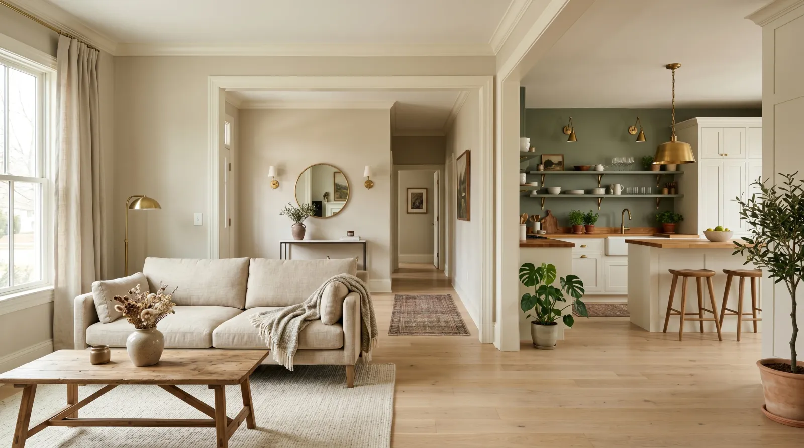
Walk through a house that was painted room by room, over a decade, by whoever had a free weekend, and you can feel it before you can name it. The living room is a cool grey, the hallway a builder beige, the dining room a green someone loved in 2014. Each color might be fine alone. Together they fight. A whole-house color palette is the fix: a small, deliberate set of colors chosen to live together across every doorway and sightline, so the house reads as one place instead of eight.
The idea is simpler than it sounds. You pick a handful of colors that share an undertone, decide which color does what job, and let them flow. The trim and ceiling usually stay constant. The walls vary, but quietly, within the same family.
TL;DR
- Build a palette of three to five wall colors plus one trim white and one ceiling white — not a different color per room.
- Pick colors that share an undertone (all warm, or all cool). Mixed undertones are what make a house feel disjointed.
- Run one trim white through the whole house for instant cohesion, even if every wall color changes.
- Anchor the palette to a whole-house neutral you can see from the most rooms, usually in the hallway and open-plan core.
- Let rooms that share a sightline stay close; closed-door rooms can go bolder.
- Test every color on a board in the actual room at the hour you use it before you commit the gallon.
Start With the Light, Not the Color
Before you pull a single chip, walk the house at the time of day you live in it most. Notice which rooms face north and stay cool and flat, which catch low warm western light in the afternoon, which never see direct sun at all. The same white will go grey-blue in a north-facing kitchen and creamy in a west-facing bedroom. A palette has to survive all of those rooms, so you choose for the hardest light, not the friendliest.
This is also why a color you adore in a friend’s house can disappoint in yours. Their living room faces south and yours faces north. The paint is innocent. The light did it.
If undertones are new to you, the undertone guide covers how a “grey” can secretly read green or violet. That hidden lean is the single thing that makes or breaks a whole-house palette.
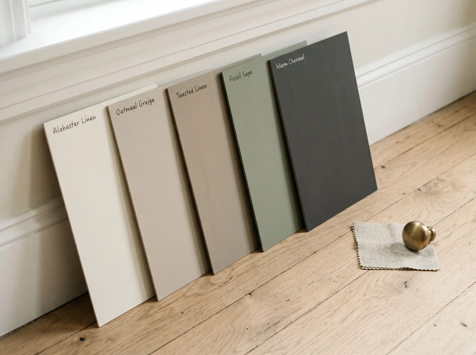
Pick One Undertone and Hold It
The rule that does the most work: every color in the house should sit in the same temperature family. Warm whites with warm greiges and warm woods. Cool whites with cool greys and cool stone. The moment you mix a cool blue-grey wall with a warm cream trim, the eye catches the clash even if no one can explain it.
Warm undertones (yellow, red, a touch of orange) make a house feel cozy and forgiving, and they flatter wood floors and brass. Cool undertones (blue, green, violet) read crisp and modern, and they sit well with chrome, marble, and grey flooring. Neither is better. Pick the one your fixed finishes already lean toward, because the floor and the counters are not getting repainted.
 A working palette: the colors change in depth but share one quiet undertone, so they read as a family against the same floor.
Give Each Color a Job
A palette isn’t a pile of colors you like. It’s a set of roles. Once you assign jobs, the house organizes itself.
| Role | What it does | Typical LRV | Where it lives |
|---|---|---|---|
| Whole-house neutral | The connector; the most-used color | 60–75 | Hallways, open-plan core, stairwells |
| Lighter neutral | A brighter version of the same hue | 75–85 | Small or dark rooms that need lift |
| Deeper color | Adds weight and intimacy | 25–50 | Dining room, study, primary bedroom |
| Accent | The one bold move | varies | A powder room, a front door, one feature wall |
| Trim white | Constant through the house | 82–90 | All baseboards, casing, doors |
| Ceiling white | Usually a flat white, often the trim white at 50% | 88–92 | All ceilings |
You don’t need every row. A small home might run one neutral, one trim white, one ceiling white, and a single deeper bedroom color. That’s a complete palette. The LRV guide explains why those brightness numbers matter as much as the hue.
How to Choose the Whole-House White
The trim white is the thread that stitches the house together, so it earns the most testing. Pick one and run it through every room: baseboards, casing, doors, crown molding. When the white never changes, walls can shift dramatically and the house still reads as one continuous space.
Lean slightly warm for a softer white that flatters most homes, or go crisp and clean for a cooler look that suits modern interiors and grey-toned floors. Whatever you pick, sample it in your darkest north-facing room and your brightest room on the same day. A white that goes dingy in the dark room or glares in the bright one will undermine the whole plan. For the deeper version of this, see white undertones explained, since the difference between a green-white and a pink-white shows up most on trim.
Let Sightlines Decide How Far Colors Wander
The question isn’t “can these two colors go in the same house.” It’s “can I see them at the same time.”
Rooms you view through an open doorway, or all at once in an open-plan layout, need to be close cousins. Stay within a tight band of the same hue, or use the neutral in the connecting space and let the colors live one step removed. A closed-door bedroom or a tucked-away study can go further, even bolder, because you experience it on its own. This is where a moody charcoal or a deep green earns its place without fighting the rest of the floor plan.
If you want two related colors in one open space, the two-tone wall approach shows how to split a room cleanly rather than letting two colors collide at a corner.
Build It in Proportion
Across the whole floor plan, aim for roughly 60% neutral, 30% a repeated secondary color or material, and 10% accent. The neutral does the connecting. The secondary, often a wood tone, a cabinet color, or a repeated upholstery, shows up in several rooms and quietly links them. The accent is allowed to change from room to room because it’s small.
This proportion is why an all-white house with one navy front door and a green study feels intentional, while a house with six equally saturated wall colors feels restless. Let most of the house be quiet so the few loud moments land.
Common Mistakes
- Choosing colors at the store, in isolation. Chips under fluorescent light tell you the color exists, not how it behaves. Bring samples home and test on boards in each room.
- Mixing undertones by accident. A warm cream trim against a cool blue-grey wall is the most common clash. Sort your shortlist by undertone first, depth second.
- Switching trim color room to room. One trim white through the whole house is the cheapest cohesion you can buy. Changing it breaks the thread.
- Forgetting the hallway. People paint every room and leave the hallway last, then grab anything. The hallway connects everything; it should be the neutral that ties the palette together.
- Going too bold in open sightlines. A dramatic color you’d love in a private den reads chaotic when you can see it from three other rooms. Save the bold moves for closed-door spaces.
How to Test the Palette Before You Commit
Pull your shortlist and paint sample boards, not patches on the wall, so you can move each color around. Lean a board against the floor, the trim, and your largest piece of furniture in every room it might go. Walk the house with the boards in the morning, the afternoon, and under your evening lamps. Carry the trim white board into every room alongside the wall color, because the relationship between wall and trim is what you’re actually choosing.
Order your boards from lightest to darkest and check that they feel like one family. If one jumps out as cooler or warmer than the rest, it’s the odd color out, and it’ll be the one that nags at you for years.
When the boards agree across rooms and hours, you have a palette. Browse the full color hub to find real, buyable matches sorted by family and undertone, then sample the top three at full size before the first gallon goes on the wall.