How to Map Paint Colors on a Floor Plan
How to map paint colors on a floor plan before you buy: a 30-minute paper-and-pencil method to plan wall colors room by room and catch clashes early.

Mapping paint colors on a floor plan means assigning a wall color to each room on a drawing of your home before you buy a single gallon, so you can see how the colors flow from space to space. You print or sketch the plan, lay a swatch over each room, and read the whole palette at once. The point is hierarchy. A typical house reads best with 3 to 5 wall colors total, not one per room, and the map shows you where a color should carry through and where it should stop. It takes about 30 minutes with a pencil and a fan deck.
I learned this the slow way, choosing colors one room at a time and then standing in a hallway watching a warm bedroom fight a cool living room through an open doorway. The floor plan fixes that before any paint goes up.
TL;DR
- A color map is your floor plan with one wall color assigned to each room, planned as a set instead of one room at a time.
- Aim for 3 to 5 colors in the whole house: one dominant neutral, one or two supporting tones, plus trim and ceiling white.
- Carry one color through the sightlines (open plans, halls, stairwells); change color only behind a door.
- Keep every color in one undertone family so the rooms agree even when they differ.
- Build the map on paper first, preview it in a room visualizer, then confirm the finalists with real samples on the wall.
When to Map Colors on a Floor Plan
Reach for this when:
- You are painting more than one connected room and want them to feel like one home.
- You have an open floor plan where the kitchen, dining, and living areas share walls and sightlines.
- You are repainting a whole house or a full floor and need to keep the count of colors honest.
- You keep picking colors you love individually that somehow don’t sit together once they’re up.
- You are selling and want a calm, cohesive palette that photographs as one continuous space.
The map earns its keep most in homes built after about 2000, where great rooms and broken-plan layouts mean you see three or four rooms from a single spot. Each color has to answer to its neighbors.
When Not to Bother With a Full Map
- A single room behind a door. A bedroom you can’t see from anywhere else doesn’t need a plan. Pick for that room’s light and move on.
- A tiny enclosed space. A powder room or a closet often reads best as one enveloping color top to bottom. There’s nothing to flow.
- A tonal, all-one-color house. If you want five connected rooms in the same soft greige, you don’t need a map to balance colors you aren’t changing.
In those cases the work is choosing one color well for one light condition, which is a different job than mapping.
How Color Mapping Compares
| Floor-plan color map | Single-room sampling | Visualizer app | |
|---|---|---|---|
| What it solves | Flow across the whole house | One room’s exact color | A quick first look |
| Sees the sightlines | Yes | No | Partly |
| Effort | ~30 min on paper | High per room | Low |
| Catches clashes early | Yes | No | Sometimes |
| Best for | Whole-house, open plans | Final color pick | Narrowing a shortlist |
The three work together. Map the house on paper, narrow each room with a visualizer, then sample the finalists on the wall. For the room-by-room logic behind an open layout, see the deeper piece on color flow in an open floor plan.
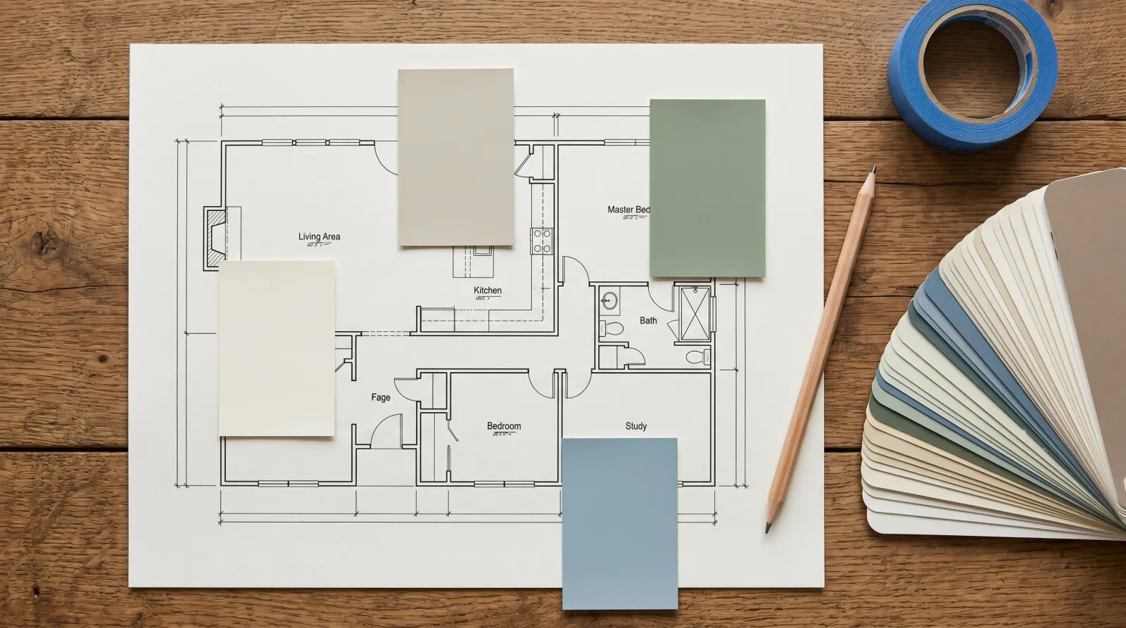
How to Build the Map
Start with the plan itself. A builder’s floor plan, a real-estate listing sketch, or a quick hand drawing all work. You only need the room outlines and the doorways, because the doorways are where color decisions live.
Pick the dominant color first. This is the neutral that carries your open and connected spaces, usually a soft white or a greige, and it should hold up in the room’s worst light. Lay it over every space your eye crosses from a central standing spot: the main hall, the open-plan walls, the stairwell. One color through all of it.
Now add the supporting tones for the rooms behind doors. A bedroom can go sage, a study can go deep blue, a dining room can take a warmer body color, as long as each one shares an undertone with the dominant so the transitions don’t jar. Warm whites want warm supporting colors. A cool gray hall wants its rooms to lean cool too.
Mark trim and ceiling on the plan as one shared white across the whole house. Letting the trim wander is the fastest way to make a home feel pieced together.
Once the swatches are placed, stand where you’ll actually stand. Read the plan from the front door, from the kitchen, from the top of the stairs. Anywhere two colors meet in an open doorway, ask whether they agree or argue. Then move the finalists into a room color visualizer to preview them on a photo of your real wall before you commit.
Common Mistakes
- One color per room. The most common map error. Eight rooms, eight colors, and a house that reads like a paint store. Carry the dominant through the shared spaces and change color only behind a door.
- Ignoring the sightlines. Two rooms can look great alone and clash through the doorway between them. Plan the colors you’ll see together, together. This is exactly the trap open floor plans set.
- Mixing undertones across the map. A warm-greige living room flowing into a cool-gray hall reads muddy at the seam. Keep the whole plan on one side of the warm-cool line.
- Forgetting the light changes room to room. The same white goes cool in a north bedroom and warm in a west kitchen. Note each room’s light direction on the plan so you choose for the light each space actually gets.
- Skipping the gallon math. A plan with no quantities means a mid-job supply run. Once the colors are set, run a coverage and gallons estimate per color so you buy each one in one trip.
What the Map Looks Like
A finished color map is your floor plan with each room shaded in its assigned swatch, the dominant neutral repeating through the connected spaces, and trim and ceiling noted as one shared white. The visual tell of a good map is repetition. You should see the same dominant color appear in three or four spots across the plan, with the private rooms as small pockets of difference. If the plan looks like a patchwork quilt, you have too many colors. If it looks like a few large fields with a couple of accents, you’ve got it.
Where to Buy and What to Look For
You don’t buy a “color map.” You buy fewer cans, more deliberately, because the plan told you which colors repeat. Pull large peel-and-stick swatch sheets or sample pots for your three to five finalists, not the whole fan deck. Every color is mix-on-demand at any paint counter, so the count on your map, not the brand, is what controls cost and cohesion.
For testing the colors digitally first, the room color visualizer drops a color onto a photo of your actual room, and the color matcher tool helps you find a paintable match if you’re pulling a color from a rug or a tile. Confirm the winners with a real sample on the wall before you scale up to gallons.
Pick the dominant first. Carry it through everything you can see at once. Let the rooms behind doors be where the house gets its variety.
Related
Frequently asked questions
How do I plan paint colors for my whole house?+
How many paint colors should a house have?+
Should every room be a different color?+
Can I use an app to test paint colors in my room?+
- Color flow in an open floor plan
- Undertones, explained
- Room color visualizer