The 60-30-10 Color Rule (and 80/20)
The 60-30-10 color rule is the simplest way to balance a room. Here is how to split your dominant, secondary, and accent colors, plus when to use 80/20 instead.

Walk into a room that feels finished and you are almost always looking at three colors doing three different jobs. One color holds the room. One supports it. One small thing sings. The 60-30-10 rule is the shorthand designers use to keep that balance honest: about 60% of the room in a dominant color, 30% in a secondary, and 10% in an accent. It is a ratio, not a measurement, and once you see it you cannot unsee it.
The split works because the eye wants a clear hierarchy. Equal amounts of three colors feel like an argument. A field, a partner, and a spark feel like a decision.
TL;DR
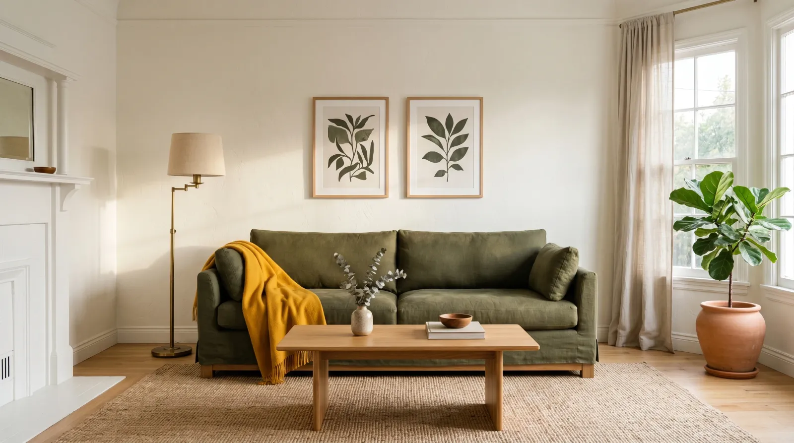
- 60% dominant — walls, large rugs, the biggest furniture. The color the room rests on. Usually your calmest tone.
- 30% secondary — sofa, drapes, an armchair, cabinetry. Supports the dominant and adds the first real contrast.
- 10% accent — pillows, art, lamps, a vase, a painted door. The bright or dark note that wakes the room up.
- 80/20 is the two-color version: one calm color across 80% of the room, one contrast in the last 20%. Use it for serene, minimal spaces.
- The numbers are a starting ratio. Count by how much surface your eye lands on, not with a tape measure.
What Each Number Is Doing
The 60% is your ground. In most rooms that is the walls plus the largest soft surfaces, and it usually reads warm or quiet so you can live with it at every hour. This is where a low-key neutral earns its keep. A soft white, a greige, a muted sage. Something that sits back and lets everything else happen in front of it.
The 30% is the supporting color, and it carries about half the visual weight of the dominant. Think upholstery, drapery, a large area rug, or kitchen cabinetry. It should contrast the dominant enough to be its own thing while sharing an undertone, so the two read as a pair rather than a collision. Walls in a warm off-white want a secondary that also leans warm. The moment the secondary fights the dominant on undertone, the room goes slightly seasick and no one can say why.
The 10% is small on purpose. Pillows, a throw, art, a lamp base, a stack of books, a painted interior door. This is the only place the rule wants you to be brave. The accent can be saturated, dark, or loud precisely because there is so little of it. A whole wall of mustard is a commitment. A mustard pillow is a wink.
When the Rule Earns Its Keep
Reach for 60-30-10 when:
- You are starting a room from scratch and need a way to choose what goes where.
- A room feels flat and you cannot figure out why. Usually the accent is missing.
- A room feels busy and you cannot calm it down. Usually you have three or four colors all fighting for the 30% slot.
- You are pulling a palette from a single object you love (a rug, a painting). Pull the dominant, secondary, and accent straight out of it.
When to Skip It
The rule is a scaffold, not a cage. Drop it when:
- You want a tonal, layered room — five shades of the same greige with no accent at all. Quiet rooms break the rule on purpose.
- The space is tiny. A powder room or a reading nook often reads better as one enveloping color top to bottom than as a careful three-way split.
- You are working with bold pattern. A patterned wallpaper or a large rug can already contain its own internal balance, and forcing a separate accent on top muddies it.
In those cases the 80/20 rule is the better tool, or no rule at all.
60-30-10 vs 80/20
The 80/20 rule is the same instinct with the accent and secondary folded together. About 80% one calm color, 20% a single contrast. It reads quieter and more modern. You lose the third layer of interest, which is the point. Fewer colors, more stillness.
| 60-30-10 | 80/20 | |
|---|---|---|
| Colors | Three | Two |
| Mood | Layered, classic, lived-in | Calm, minimal, modern |
| Best for | Living rooms, bedrooms, open plans | Studios, bathrooms, serene spaces |
| Risk | Accent gets ignored or overdone | Can read cold or unfinished |
| Accent role | A separate 10% spark | Folded into the 20% contrast |
Neither is more correct. A north-facing bedroom you want to feel restful is an 80/20 room. A living room you want to feel collected and warm is a 60-30-10 room.
How to Actually Build the Split
Start with the color you have to live with most, which is almost always the dominant. Choose it for the light in the room and the hour you use it, not for the chip. A dominant white that looks crisp in the store can go grey and cool in north-facing light, so the LRV and undertone behind it matter more than the name on the lid.
Pick the secondary against the dominant, in the actual room. Hold the fabric or cabinet sample on the wall color at 4pm. If they share a warm or cool lean, they will sit together. If one reads warm and one reads cool, you will feel the friction before you can name it, which is exactly the trap undertones set for people.
Save the accent for last and keep it portable. Pillows and art and lamps move, so you can test an accent without repainting anything. The one accent worth committing to in paint is a door, a single piece of trim, or an accent wall — small enough to repaint in an afternoon if it goes wrong.
Common Mistakes
- Counting by furniture instead of by field. The dominant 60% is whatever fills the most visual space, not the biggest single object. White walls and a huge charcoal sofa can mean the sofa is sharing the dominant role, which changes everything downstream.
- Letting the accent grow to 25%. The 10% loses its punch the moment there is too much of it. Three mustard accents is a palette. Eight is just a yellow room with extra steps.
- Matching the secondary to the dominant too closely. A secondary within a few shades of the dominant disappears, and you have built an 80/20 room by accident. Give the secondary real contrast.
- Fighting undertones across the split. A warm greige wall with cool blue-grey drapes and a warm brass accent reads muddy. Keep at least two of the three on the same temperature.
- Forcing the rule on a tonal room. Some of the calmest rooms have no accent at all. If you want serene, two tones done well beat a forced third color.
Where to Start Shopping
You do not buy “a 60-30-10 kit.” You build it from one good dominant and work outward. For the dominant, a quiet wall neutral does the most work, and the interior trim and wall paint round-ups are sorted by how each white and greige behaves in real light. For the accent, color is mix-on-demand at any paint counter, so the bravest 10% costs the same as the safest.
Pull the dominant first. Test the secondary against it on the wall, at the hour you live there. Let the 10% be the last and the loudest thing you choose.