Dark Truffle
Behr's deep brown-black, reviewed honestly: the light it needs to read brown instead of pure black, and the two Sherwin-Williams colors it is nearly identical to.

Jessica has spec'd whites and neutrals for more than 300 rooms and keeps a sample wall of painted drawdowns in her studio. Every color review is checked against real reader rooms in the comments and re-tested when a formula changes. About the testing process →
- 1Polished Mahogany3
- 2Dark Truffle8
- 3Porpoise13
- 4Cavern Clay20
The Fast Verdict
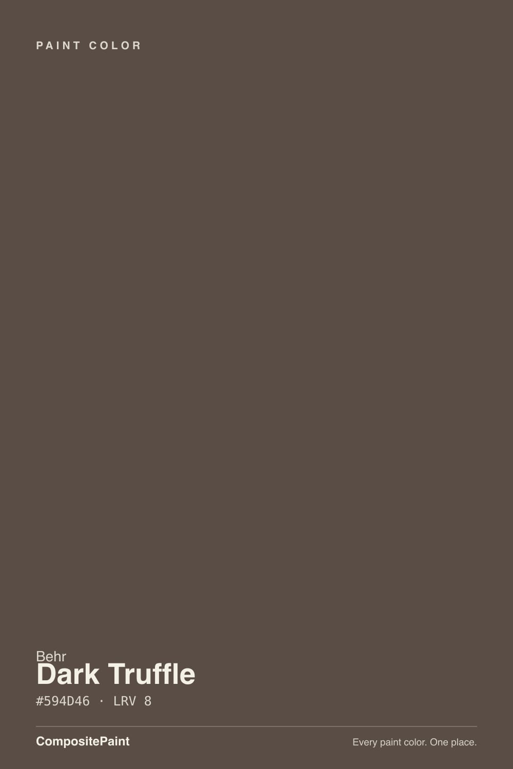
Dark Truffle is a deep, warm brown-gray sitting at LRV 8 — dark enough that in anything but real light it reads as plain black. Give it daylight or a lamp and the brown comes forward: grounded, a little dusty, closer to espresso than to charcoal. It has no design pedigree, no Color of the Year moment, and almost nothing written about it online — which makes it an honest workhorse, not a name to chase. If you have already fallen for Urbane Bronze or Sable, this is functionally the same color in Behr's deck.
Front doors and shutters · a den or library wall lit by lamps · a kitchen island or built-in against lighter cabinetry · anyone who wants a Sherwin-Williams-deep brown-black at a Home Depot counter
The room stays dim with no warm light source · you're painting all four walls with no lighter partner · your metals and stone lean cool (chrome, gray marble) · you want a color with an established Houzz or Pinterest trail to lean on
- A warm, grounded brown-black instead of a flat charcoal
- Reads as expensive and deliberate on doors and cabinetry with real light
- Sits almost exactly where Sherwin-Williams Urbane Bronze and Sable do — same depth, Behr counter
- Flatters brass, bronze, walnut, and warm leather
- Deep enough (LRV 8) to hold its color as an accent without needing a whole room
- Reads as plain black in dim rooms or under cool LED light
- Almost no independent reviews or project photos to check your expectations against
- Swallows a room fast without a lighter partner surface
- Fights cool metals and cool gray stone
What Color Is Dark Truffle, Really?
A warm, muted brown-gray built low on the value scale — LRV 8, the same depth as Sherwin-Williams Urbane Bronze and Sable and Benjamin Moore Taupe. Behr's own color copy plays up a cool, shadowy mood for this one, but the numbers don't back that up: in the hex, red sits well ahead of blue, the signature of a warm color, not a cool one. Treat it as a warm near-black brown and set that cool framing aside — it is closer to espresso grounds than to slate.
Line it up against the decks other brands already sell and the family resemblance is obvious. Dark Truffle sits almost exactly on top of Urbane Bronze in hex value, a shade browner than that and a shade grayer than Sable, and noticeably less orange than Benjamin Moore's Taupe. If a client asked a Behr-only painter for "that Sherwin-Williams brown-black everyone uses on doors," this is the can they would hand over.
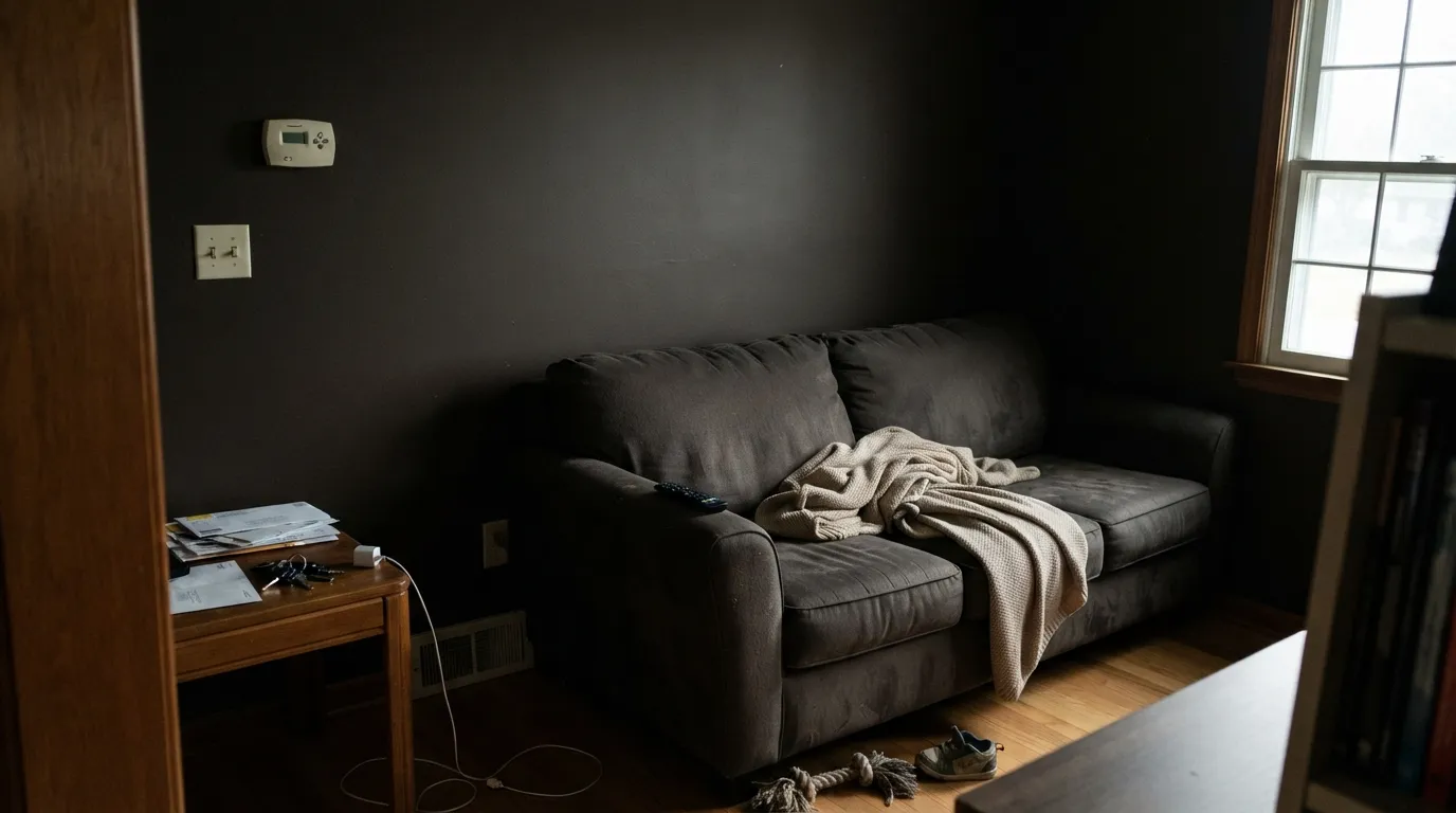
Undertone in one line: warm brown first, gray second, never blue and never true black. At LRV 8 it needs real light to prove the brown is there — in shade or under cool bulbs it will read as flat black, and that is the single thing to plan around before you buy a gallon.
Where It Shines
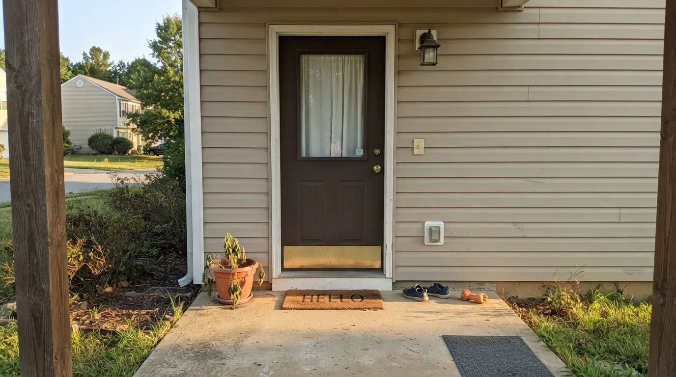
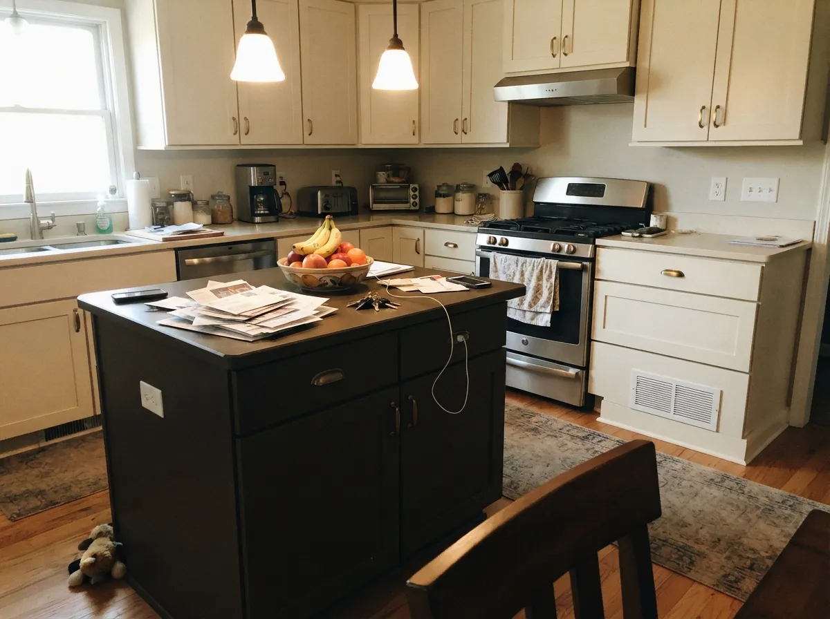
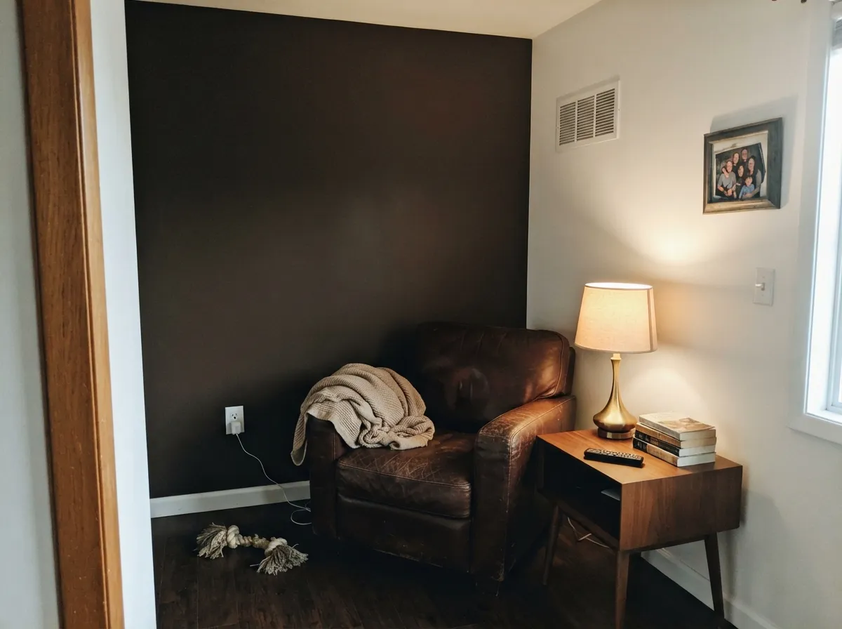
This color earns its keep in small, deliberate doses with real light hitting it. A front door under a porch light or actual sun shows the brown clearly and reads as a considered, expensive-looking choice rather than a plain black door. On a kitchen island or a run of built-ins under can lights, it anchors a room of lighter cabinetry the way a piece of dark furniture would. In a den or library with warm lamps and leather, it disappears into the mood instead of announcing itself — which is exactly the job a color like this is supposed to do.
Where It Fails
Dark Truffle doesn't have a pile of one-star reviews online — it barely has any reviews at all, which is its own kind of warning. The three ways it goes wrong are the same ones every warm near-black at this depth runs into, and none of them are unique to Behr:
At LRV 8 there isn't much reflectance to work with. In shade, on a cloudy day, or under cool white LEDs, the warm brown drops out and the wall or door just reads black. That's not a defect — it's what a color this dark does without help. Add a warm 2700K fixture or don't fight it.
A whole room in a color this dark with matching trim and ceiling reads like a cave rather than a moody library. Every successful room with Dark Truffle keeps a lighter surface nearby — trim, ceiling, an opposite wall — so the eye has somewhere to land.
Chrome, brushed nickel, and gray-veined marble sit at the opposite temperature and make the brown look muddy instead of intentional. This color wants brass, bronze, matte black hardware, and warm-toned stone or wood — pair it cool and it looks like a mistake, not a choice.
Room by Room
Semi-gloss, with porch light or real sun hitting it daily, this is where the color makes the most sense: a near-black door with a visible brown soul instead of flat black. Works especially well against a lighter warm-neutral siding.
One island or one wall of cabinetry against lighter perimeter cabinets and warm wood counters. A full kitchen of this color risks going cave-like; used as the single dark note, it works exactly like dark furniture does.
Low, warm light is this color's natural habitat. Pair with leather, walnut shelving, and brass reading lamps rather than depending on ceiling fixtures alone.
Full-room commitment is a lot at this depth for a room you wake up in. An accent wall behind the headboard, lit by warm bedside lamps, gets the mood without the cave effect.
A single vanity under warm brass fixtures and a wood-tone countertop looks custom. Skip it if the tile or countertop leans cool gray — the clash shows fast in a small room.
Possible, but only with a genuinely bright room and a lighter trim/ceiling to break it up. This is not a whole-house color, and nothing in its record suggests anyone treats it that way.
Your Light Is the Risk
Full sun on a front door, or under-cabinet lights on an island, is where the brown actually shows. This is the light to sample it in before buying.
Without direct light hitting it, the color drops the brown entirely and reads as flat black. Fine if black is what you wanted; a letdown if you paid for "brown."
Clearly brown at midday in good light, sinking toward near-black by dusk. The shift is real but slow — most people read it as the color settling in for the evening, not misbehaving.
2700K warm bulbs keep the brown visible after dark. Cool white LEDs flatten it to black — the fastest fix for a door or den that looks too dark is swapping the bulb, not the paint.
Most complaints about Dark Truffle are a light mismatch. Upload a photo of your actual room and see it on your walls — then ask for the same wall in north light or evening lamps before you buy a single sample.
Need It From Another Brand?
Any paint counter can custom-tint Behr PPU5-19 directly. If you would rather stay in one brand's own deck, these are the closest stock matches, measured as ΔE2000. Under 2 is a difference you will not see on the wall.
| Brand | Closest color | ΔE | LRV | |
|---|---|---|---|---|
| Sherwin-Williams | Chateau BrownSW 7510 · Sherwin-Williams | 2.1 | 8 | Color page → |
| Benjamin Moore | WillowCC-542 · Benjamin Moore | 2.1 | 8 | Color page → |
| Valspar | Turkish Coffee6003-2C · Valspar | 4.4 | 7.4 | Color page → |
| PPG / Glidden | SarsaparillaPPG1018-7 · PPG / Glidden | 1.6 | 8 | Color page → |
| Glidden | SarsaparillaPPG1018-7 · Glidden | 1.5 | 8 | Color page → |
| Dutch Boy | Heritage Brown411-7DB · Dutch Boy | 3.0 | 8 | Color page → |
Similar Behr Colors
The nearest shades to Dark Truffle within Behr's own range, ranked by perceptual color distance — useful when you want the same look a touch lighter, darker, or warmer.
WCAG 2.1: AA is 4.5 : 1 for normal text, 3 : 1 for large text, AAA is 7 : 1.
Dark Truffle vs the Colors You're Also Considering
Every Dark Truffle sample board has the same rivals on it. The numbers show the real lightness gap — then it comes down to which risk you would rather live with.
Pick this if you're already at Home Depot and don't need the Sherwin-Williams name on the can.
Sherwin-Williams SW 7048 · LRV 8Urbane BronzePick this if your painter already stocks Sherwin-Williams — the two sit at almost identical depth and warmth.
Pick this for the grayer, more restrained version of the same warm dark.
Sherwin-Williams SW 6083 · LRV 8SablePick this for a version pushed a step further toward orange-brown, less gray.
The Behr neighbors are separated more by lean than by depth, since almost all of them share LRV 8. Oiled Teak N180-7 at #584E48 is very slightly greener, Rare Wood MQ2-39 at #584C44 is a shade more orange, and Warm Pumpernickel HDC-FL15-05 at #5C4E44 is the warmest and most clearly brown. Charred Hickory ECC-28-3 at #5B4E4A drifts a little toward gray-plum, and Natural Bark N170-6 at LRV 7 is the darkest of the set.
Across brands, Rodda Leather Panel R042 at LRV 8 differs by only 1.03, so it is visually identical in normal room light, as is Glidden Sarsaparilla PPG1018-7 at 1.48. Benjamin Moore Willow CC-542 at 2.09 and Sherwin-Williams Chateau Brown SW 7510 at 2.10 are very close, sample first, with Chateau Brown reading a touch more orange. Farrow and Ball Mahogany No. 36 at LRV 7 and 3.86 and Valspar Turkish Coffee 6003-2C at LRV 7.4 and 4.37 are close but visibly different side by side.
Dark Truffle Coordinating Colors
The rule for coordinating with Dark Truffle: keep everything else warm. It sits happily next to warm whites, warm beiges, and other members of its own brown-black family, and it wants brass or bronze metal over anything chrome. These are the partners that keep it looking deliberate instead of muddy:
An Honest Deep Brown, Not a Famous One
Dark Truffle has no Color of the Year moment, no viral Pinterest board, and — as of this review — almost no independent write-ups or project photos to point to. That's a real difference from colors like Urbane Bronze or Iron Ore, which built their reputations one viral farmhouse door at a time. Dark Truffle is the same idea sitting quietly in Behr's standard deck, unmarketed.
That obscurity cuts both ways. You won't find a dozen Houzz threads to check your undertone worries against, but you also aren't paying a premium for a name — it's a Home Depot color-match away, and the math says it will behave almost exactly like the famous colors it resembles. If you want the workhorse-warm-black look without hunting down a specific brand, this is a reasonable, if unglamorous, way to get there.
Dark Truffle With Wood Tones and Metals
Because the color is itself a deep brown, wood pairing is more about contrast in value than in tone. Golden or honey oak floors work better than you'd expect — the door or cabinet reads as a deliberately darker accent rather than a clash, because the value gap (LRV 8 against a floor closer to 35-45) is large enough to register as contrast, not competition. Walnut and espresso wood read as close cousins and blend rather than contrast, which is fine for cabinetry but can flatten a door against a dark porch.
Metals are where this color draws a hard line: brass, warmed bronze, and matte black all sit comfortably next to it, while chrome and brushed nickel read cold and slightly wrong. If the hardware is already chrome, swap it before repainting — it will do more for the finished look than a different paint color would.
Three Ready Palettes Built on Dark Truffle
A color is never alone on the wall. These are complete combinations in the 60-30-10 pattern, with the reason each one holds together. Every one opens in the visualizer.
A warm beige body and a warm white trim leave the door as the only near-black note on the house, so it reads as a deliberate accent instead of competing with the siding. Brass hardware finishes the look.
Try this palette in your roomAlabaster keeps the perimeter light so the kitchen stays bright, the island carries the one dark note, and Kendall Charcoal on the hood is close enough in family to feel coordinated rather than clashing with two unrelated darks.
Try this palette in your roomSilky White trim and ceiling keep the room from going cave-like even at four walls of Dark Truffle. Cavern Clay on a single shelf or nook adds warmth without competing — both colors share the same brown-red family, just at very different depths.
Try this palette in your roomDark Truffle FAQ
Is Dark Truffle brown or black?
Brown — but only when it gets real light. At LRV 8 it is dark enough that shade, cloudy days, or cool LED bulbs will make it read as plain black. In daylight or under a warm bulb the brown comes forward clearly. Sample it in the actual light your door or wall gets before buying.
What is the closest color to Dark Truffle from a bigger brand?
Sherwin-Williams Urbane Bronze — the two sit at nearly identical depth and warmth. Sable is a step warmer and more orange; Benjamin Moore Taupe is a step further into straight brown. If you're comparing chips at three different stores, all four are the same family.
Does it work as an exterior door color?
Yes — this is its strongest use case. Under a porch light or direct sun it reads as a considered dark brown-black rather than flat black, and it pairs well with warm-toned siding and brass hardware. Semi-gloss for durability.
Can I use it on kitchen cabinets?
In doses, yes — an island or a single run of built-ins against lighter perimeter cabinets. A full kitchen in a color this dark is a heavy commitment with almost no project photos online to check the result against, so test a large sample first.
What trim white goes with Dark Truffle?
A warm white, not a stark cool one — Silky White or a similarly warm off-white keeps the pairing soft. A blue-white trim will make the brown look muddier by contrast instead of clean.
How many coats does dark paint like this need?
Plan on two finish coats minimum over a lighter existing wall, and a tinted gray primer first if you're covering something bright or previously papered. Dark, saturated colors at this depth are notorious for needing an extra coat compared to a mid-tone — budget the paint accordingly.
Have you painted with Dark Truffle?
Rate it — one tap helps the next reader decide.
Ask a Question