CP

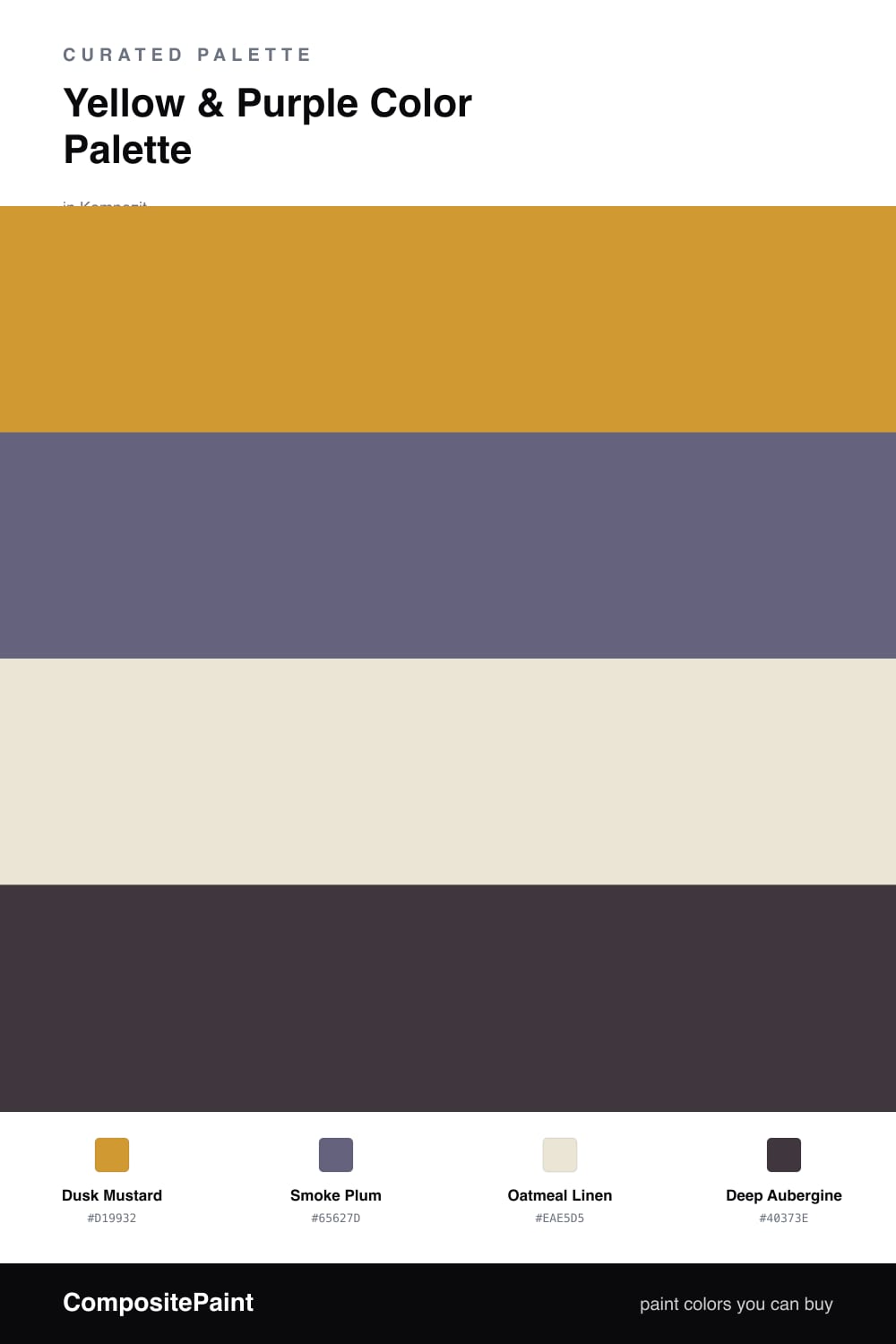
Yellow & Purple Color Palette — Dusk Mustard

A grown-up four-color scheme pairing warm mustard yellow with smoky dusk purple, softened by oatmeal and grounded in deep aubergine — every color matched to real paint you can buy.

By Maya Patel · Reviews Editor & Product Tester

Dusk Mustard
Dominant
Kompozit Yellow Shout · 0935
#D19932
LRV 37
Smoke Plum
Secondary
Kompozit Grapes of Wrath · 1284
#65627D
LRV 13
Oatmeal Linen
Base
Kompozit Bleached Meadow · 0376
#EAE5D5
LRV 78
Deep Aubergine
Accent
Kompozit Eleanor Ann · 1229
#40373E
LRV 4
View palette in

Yellow and purple sit opposite each other on the color wheel, which is exactly why this pairing has bite. The trick in 2026 is to take both colors down a notch so they feel lived-in instead of loud. Dusk Mustard leads here as a warm, slightly muddy yellow that reads more like turmeric than a school bus, and Smoke Plum answers it with a grayed purple that has just enough dusk in it to stay calm.

Oatmeal Linen is the quiet workhorse that makes the whole thing breathe, giving your eye somewhere soft to land between the two stronger tones. Without a base this warm and neutral, mustard and plum can feel like they are competing. With it, they settle into each other.

For depth, Deep Aubergine grounds the scheme in the smallest doses, used on trim, a door, or one anchoring piece. Keep the mustard dominant, the plum as a supporting layer, and the aubergine as punctuation, and you get a moody, contemporary palette that still feels warm and easy to live with.

Buy These Colors

Each color matched to the closest real paint in every brand, by ΔE2000. Kompozit first; take any SKU to the store — these mix on demand.

Dusk Mustard
#C99A3C · LRV 36 · Dominant
Kompozit Yellow Shout · 0935 ΔE 2.38
Backdrop Carry the Two · BD-CT ΔE 17.42
Behr Solid Gold · M280-6 ΔE 2.41
Benjamin Moore Fields of Gold · 203 ΔE 0.74
Clare Good as Gold · PNT100-DP-59 ΔE 7
Dunn-Edwards Roman Gold · DE5356 ΔE 2.23
Farrow & Ball India Yellow · No. 66 ΔE 4.31
Magnolia Home Bright Days · JG-45 ΔE 9.02
PPG / Glidden Golden Field · 1107-7 ΔE 2.92
Sherwin-Williams Crispy Gold · SW 6699 ΔE 1.76
Valspar Golden Avocado · 3008-5A ΔE 1.91
Smoke Plum
#6E5A78 · LRV 12 · Secondary
Kompozit Grapes of Wrath · 1284 ΔE 6.56
Backdrop Mom Jeans · BD-MJ ΔE 19.61
Behr Plum Shade · 100F-6 ΔE 2.74
Benjamin Moore Fire and Ice · 1392 ΔE 3.3
Clare Prince · PNT100-DP-33 ΔE 6.82
Dunn-Edwards Princely Violet · DE5957 ΔE 1.22
Farrow & Ball Down Pipe · No. 26 ΔE 18.48
Magnolia Home Autumn Gray · JG-143 ΔE 13.14
PPG / Glidden Pageant Pansy · 13-20 ΔE 0.79
Sherwin-Williams Plummy · SW 6558 ΔE 2.62
Valspar Purple Valley · 1001-5A ΔE 3.76
Oatmeal Linen
#EDE6D6 · LRV 79 · Base
Kompozit Bleached Meadow · 0376 ΔE 1.03
Backdrop Don't Eat the Yellow Snow · BD-DS ΔE 3.01
Behr Rye Flour · HDC-FL13-5 ΔE 1.8
Benjamin Moore White Down · 970 ΔE 0.93
Clare Like Buttah · PNT100-LT-62 ΔE 1.8
Dunn-Edwards Antique White · DEW351 ΔE 0.74
Farrow & Ball Dimity · No. 2008 ΔE 2.01
Magnolia Home Carter Crème · JG-16 ΔE 0.82
PPG / Glidden Little Lamb · 1112-1 ΔE 1.4
Sherwin-Williams Ivory Lace · SW 7013 ΔE 1.28
Valspar Double Scoop · V176 ΔE 0.98
Deep Aubergine
#3A2C3E · LRV 3 · Accent
Kompozit Eleanor Ann · 1229 ΔE 6.67
Backdrop After Hours · BD-AH ΔE 17.73
Behr Rich Bordeaux · BXC-87 ΔE 4.09
Benjamin Moore Velvet Cloak · CSP-480 ΔE 5.41
Clare Blackish · PNT100-DP-54 ΔE 15.66
Dunn-Edwards Old Mill · DEA185 ΔE 10.78
Farrow & Ball Pitch Black · No. 256 ΔE 12.9
Magnolia Home Blackboard · JG-05 ΔE 11.72
PPG / Glidden Black Magic · 1001-7 ΔE 13.33
Sherwin-Williams Raisin · SW 7630 ΔE 8.06
Valspar Rare Wine · 1011-9 ΔE 3.21

Questions

Does mustard yellow really work with purple, or is it too much?

It works because both colors are muted, not candy versions of themselves. Dusk Mustard is earthy and dialed back, and Smoke Plum is grayed-out rather than violet, so they read as a sophisticated pair instead of a bright clash. The oatmeal base keeps plenty of air between them.

Which color should I use most of?

Lead with the mustard and let it carry the room at roughly half the palette, use the plum as a supporting layer on a third of it, and keep the aubergine for the smallest accents like trim or a single piece. The oatmeal fills the rest and stops the scheme from getting heavy.

Similar Palettes

Closest schemes by color — not by label.