CP

Pink & Green Color Palette — Rosebud Garden

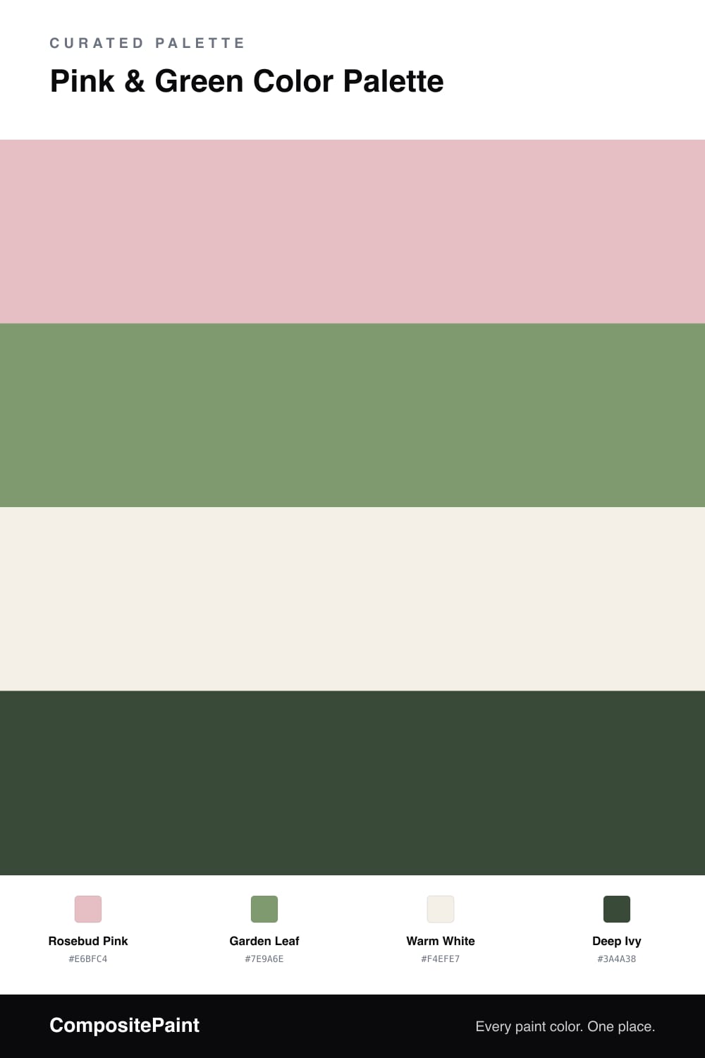
A fresh four-color scheme pairing soft rosebud pink with leafy garden green, steadied by warm white and a deep ivy accent — every color matched to real paint you can buy.

By Emily Roberts · DIY Editor & First-Timer's Guide

Pink and green is having a real moment again, and honestly it never should have left. It feels like a garden in early summer, which is exactly the mood here. The scheme leans on a soft Rosebud Pink as the anchor, with a leafy Garden Leaf green as its quieter partner.

The trick to keeping this pairing from feeling too sweet is to dial both colors back a notch. The pink is muted and a little dusty rather than bubblegum, and the green leans toward a calm leaf tone, so the two sit together like they belong in the same garden. Warm White keeps everything bright and breathable between them.

A small dose of Deep Ivy is the part people forget. That deep, almost-black green gives your eye somewhere to rest and makes the soft pink look more intentional. Use the pink as your main color, let the green carry the supporting work, and save the ivy for the smallest, sharpest moments.

View palette in
Rosebud Pink
Dominant
Diamond Vogel Quiet Pink · 0084
#E4BEC2
LRV 57
Garden Leaf
Secondary
Dunn-Edwards Money · DE5613
#7B9A6D
LRV 27
Warm White
Base
Valspar Crisp Cotton · 7007-4
#F4EFE7
LRV 87
Deep Ivy
Accent
Backdrop North End · BD-NE
#3D4D3F
LRV 7

Buy These Colors

Each color matched to the closest real paint in every brand, by ΔE2000. Tap a swatch for its full guide or + to save it — take any SKU to the store, they mix on demand.

Rosebud Pink
#E6BFC4 · LRV 58 · Dominant
Sherwin-Williams · SW 6310 · ΔE 2.11
Behr · S180-2 · ΔE 1.73
Benjamin Moore · 2093-50 · ΔE 3.29
Valspar · 2001-4B · ΔE 2.43
PPG / Glidden · PPG1183-3 · ΔE 2.01
Glidden · PPG1183-3 · ΔE 2.44
Dutch Boy · 304-2DB · ΔE 4.35
HGTV Home by Sherwin-Williams · HGSW 2046 · ΔE 2.11
Dunn-Edwards · DE5093 · ΔE 3.44
Magnolia Home · JG-26 · ΔE 6.92
Farrow & Ball · NO. 278 · ΔE 2.77
Diamond Vogel · 0084 · ΔE 0.58
Hirshfield's · 0084 · ΔE 1.09
Rodda · R109 · ΔE 12.28
C2 Paint · BD51 · ΔE 4.52
Clare · PNT100-LT-60 · ΔE 9.29
Portola Paints · HIGH CLIFF · ΔE 13.15
Annie Sloan · OLD OCHRE · ΔE 19.06
Backdrop · BD-BG · ΔE 8.09
Rust-Oleum · 285142 · ΔE 6.89
Kompozit · 0084 · ΔE 1.09
Garden Leaf
#7E9A6E · LRV 29 · Secondary
Sherwin-Williams · SW 9040 · ΔE 2.47
Behr · PPU11-03 · ΔE 2.04
Benjamin Moore · 433 · ΔE 3.93
Valspar · 5008-6B · ΔE 2.33
PPG / Glidden · PPG17-28 · ΔE 3.42
Glidden · 70GY 30/254 · ΔE 4.72
Dutch Boy · 229-5DB · ΔE 5.05
HGTV Home by Sherwin-Williams · HGSW 2264 · ΔE 2.47
Dunn-Edwards · DE5613 · ΔE 0.75
Magnolia Home · JG-08 · ΔE 5.35
Farrow & Ball · NO. 33 · ΔE 4.08
Diamond Vogel · 0745 · ΔE 3.01
Hirshfield's · 0752 · ΔE 3.59
Rodda · R058 · ΔE 4.41
C2 Paint · BD81 · ΔE 6.48
Clare · PNT100-MD-64 · ΔE 8.22
Portola Paints · BRONSON · ΔE 11.91
Annie Sloan · CHATEAU GREY · ΔE 12.28
Backdrop · BD-HF · ΔE 13.2
Rust-Oleum · 285141 · ΔE 13.2
Kompozit · 0752 · ΔE 3.59
Warm White
#F4EFE7 · LRV 87 · Base
Sherwin-Williams · SW 7102 · ΔE 0.93
Behr · PWN-35 · ΔE 0.5
Benjamin Moore · 876 · ΔE 0.96
Valspar · 7007-4 · ΔE 0
PPG / Glidden · PPG0998-1 · ΔE 2
Glidden · 61YY 85/050 · ΔE 0.47
Dutch Boy · 020W · ΔE 1.04
HGTV Home by Sherwin-Williams · HGSW 4053 · ΔE 0.93
Dunn-Edwards · DE6211 · ΔE 0.81
Magnolia Home · JG-107 · ΔE 1.43
Farrow & Ball · NO. 2003 · ΔE 2.04
Diamond Vogel · 0012 · ΔE 1.82
Hirshfield's · 0012 · ΔE 2.14
Rodda · CA013 · ΔE 1.38
C2 Paint · C2-932 · ΔE 0.5
Clare · PNT100-LT-24 · ΔE 1.74
Portola Paints · ORIGAMI · ΔE 1.49
Annie Sloan · OLD OCHRE · ΔE 12.58
Backdrop · BD-TR · ΔE 2.35
Rust-Oleum · 329598 · ΔE 5.86
Kompozit · 0012 · ΔE 2.14
Deep Ivy
#3A4A38 · LRV 6 · Accent
Sherwin-Williams · SW 41 · ΔE 3.13
Behr · 790D-7 · ΔE 4.07
Benjamin Moore · CC-692 · ΔE 5.88
Valspar · 5009-3 · ΔE 6.42
PPG / Glidden · PPG1134-7 · ΔE 2.67
Glidden · 30GG 06/113 · ΔE 6.07
Dutch Boy · 327-7DB · ΔE 3.13
HGTV Home by Sherwin-Williams · HGSW 2291 · ΔE 6.83
Dunn-Edwards · DEA181 · ΔE 8.23
Magnolia Home · JG-97 · ΔE 14.17
Farrow & Ball · NO. W55 · ΔE 3.06
Diamond Vogel · H098 · ΔE 9.48
Hirshfield's · 0431 · ΔE 5.68
Rodda · CA212 · ΔE 14.06
C2 Paint · C2-694 · ΔE 4.9
Clare · PNT100-DP-54 · ΔE 12.29
Portola Paints · NOSTALGIA · ΔE 9.54
Annie Sloan · AUBUSSON BLUE · ΔE 13.95
Backdrop · BD-NE · ΔE 2.09
Rust-Oleum · 391445 · ΔE 5.93
Kompozit · 0431 · ΔE 5.68

Questions

does pink and green really go together?

It does, and it is one of the oldest pairings in the book. Pink and green sit near opposite each other on the color wheel, so they make each other look fresher instead of clashing. Keeping the pink soft and a little muted, and the green leaning toward leaf rather than lime, is what keeps it grown-up and calm.

how much of each color should I use?

Let the pink lead. Here Rosebud Pink is the dominant color and the green plays the supporting role, roughly a 60/30 split, with the warm white filling the gaps and a touch of deep ivy for contrast. If you flip it and use mostly green, the pink reads as a sweet little accent instead.

KEEP EXPLORING

Similar Palettes

Closest schemes by color — not by label.