CP

Pink & Green Color Palette — Garden Bloom

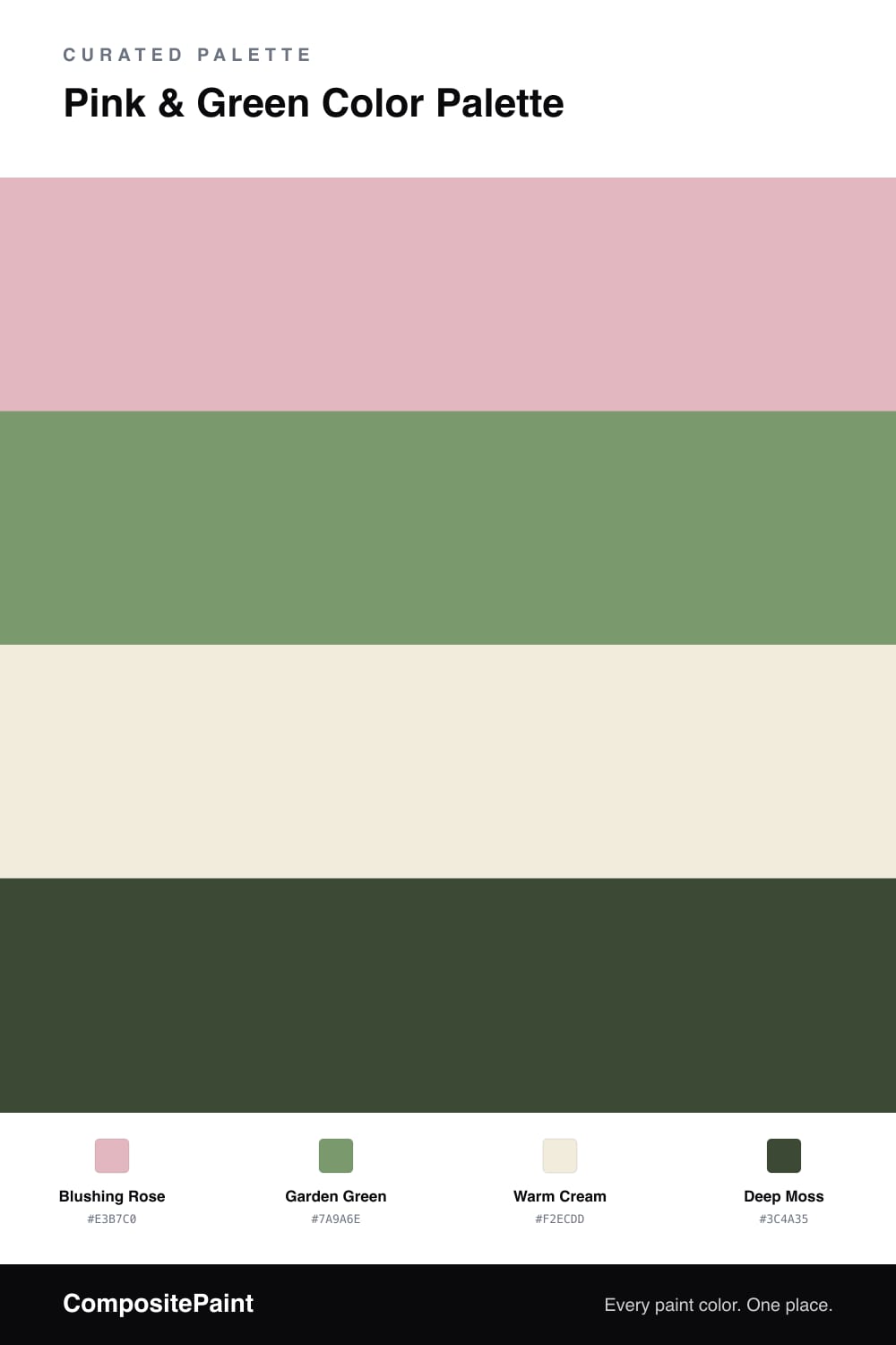
A soft four-color scheme pairing a blushing rose pink with a leafy garden green, settled by warm cream and a deep moss accent — every color matched to real paint you can buy.

By Jessica Williams · Color Stylist & Interior Editor

Pink and green is the pairing the garden has been quietly making forever — a petal against its own leaves. This scheme borrows that ease, leaning on a dusty Blushing Rose as the soft, enveloping lead and a grounded Garden Green as its natural foil.

Warm Cream sits between them like morning light, keeping the two colors from competing and letting each one breathe. A little Deep Moss does the grown-up work, anchoring the prettiness with something shaded and still.

For 2026 this combination feels less retro and more lived-in than it used to. Keep the pink chalky rather than bright, let the green stay leafy and a touch grey, and the result is calm, fresh, and quietly confident.

View palette in
Blushing Rose
Dominant
Benjamin Moore Tara · 1270
#E5B6BF
LRV 53
Garden Green
Secondary
Dunn-Edwards Money · DE5613
#7B9A6D
LRV 27
Warm Cream
Base
Dunn-Edwards Bone China · DEW339
#F3EDDE
LRV 78
Deep Moss
Accent
Benjamin Moore Colonial Verdigris · CW-530
#3E4F33
LRV 9

Buy These Colors

Each color matched to the closest real paint in every brand, by ΔE2000. Tap a swatch for its full guide or + to save it — take any SKU to the store, they mix on demand.

Blushing Rose
#E3B7C0 · LRV 54 · Dominant
Sherwin-Williams · SW 6310 · ΔE 3.77
Behr · HDC-SP16-10 · ΔE 1.81
Benjamin Moore · 1270 · ΔE 0.77
Valspar · 1008-4B · ΔE 1.58
PPG / Glidden · PPG1050-3 · ΔE 1.1
Glidden · PPG1050-3 · ΔE 1.1
Dutch Boy · 303-3DB · ΔE 4.35
HGTV Home by Sherwin-Williams · HGSW 2046 · ΔE 3.77
Dunn-Edwards · DE6024 · ΔE 2.93
Magnolia Home · JG-26 · ΔE 8.97
Farrow & Ball · NO. 278 · ΔE 2.43
Diamond Vogel · 0111 · ΔE 0.96
Hirshfield's · 0111 · ΔE 0.93
Rodda · CA062 · ΔE 16.26
C2 Paint · BD51 · ΔE 6.42
Clare · PNT100-LT-60 · ΔE 11.43
Portola Paints · ANGEL'S LANDING · ΔE 14.1
Annie Sloan · PALOMA · ΔE 12.84
Backdrop · BD-BG · ΔE 9.86
Rust-Oleum · 285142 · ΔE 9.25
Kompozit · 0111 · ΔE 0.93
Garden Green
#7A9A6E · LRV 28 · Secondary
Sherwin-Williams · SW 9040 · ΔE 2.06
Behr · N400-5 · ΔE 2.75
Benjamin Moore · 433 · ΔE 4.7
Valspar · 5008-6B · ΔE 2.02
PPG / Glidden · PPG17-28 · ΔE 3.05
Glidden · 70GY 30/254 · ΔE 4.03
Dutch Boy · 229-5DB · ΔE 4.34
HGTV Home by Sherwin-Williams · HGSW 2264 · ΔE 2.06
Dunn-Edwards · DE5613 · ΔE 0.4
Magnolia Home · JG-08 · ΔE 5.39
Farrow & Ball · NO. 33 · ΔE 4.36
Diamond Vogel · 0745 · ΔE 3.46
Hirshfield's · 0752 · ΔE 4.55
Rodda · R058 · ΔE 4.22
C2 Paint · BD81 · ΔE 7.41
Clare · PNT100-MD-64 · ΔE 9.13
Portola Paints · BOND STREET · ΔE 15.42
Annie Sloan · PROVENCE · ΔE 12.98
Backdrop · BD-HF · ΔE 13.54
Rust-Oleum · 285141 · ΔE 13.7
Kompozit · 0752 · ΔE 4.55
Warm Cream
#F2ECDD · LRV 84 · Base
Sherwin-Williams · SW 7116 · ΔE 2.16
Behr · 710C-1 · ΔE 0.74
Benjamin Moore · ES-01 · ΔE 0.56
Valspar · 7002-5 · ΔE 0.53
PPG / Glidden · PPG1092-1 · ΔE 0.98
Glidden · PPG1203-1 · ΔE 0.52
Dutch Boy · 007W · ΔE 0.98
HGTV Home by Sherwin-Williams · HGSW 4032 · ΔE 0.58
Dunn-Edwards · DEW339 · ΔE 0.21
Magnolia Home · JG-33 · ΔE 1.21
Farrow & Ball · NO. 2003 · ΔE 1.46
Diamond Vogel · 0005 · ΔE 1.2
Hirshfield's · 0005 · ΔE 1.37
Rodda · CA001 · ΔE 0.55
C2 Paint · C2-868 · ΔE 0.98
Clare · PNT100-LT-62 · ΔE 2.54
Portola Paints · CASA FORMA · ΔE 1.43
Annie Sloan · OLD OCHRE · ΔE 10.65
Backdrop · BD-JA · ΔE 2.43
Rust-Oleum · 329598 · ΔE 3.43
Kompozit · 0005 · ΔE 1.37
Deep Moss
#3C4A35 · LRV 6 · Accent
Sherwin-Williams · SW 41 · ΔE 4.4
Behr · S-H-770 · ΔE 4.16
Benjamin Moore · CW-530 · ΔE 2.98
Valspar · 5009-3 · ΔE 7.47
PPG / Glidden · PPG1134-7 · ΔE 3.22
Glidden · 30GG 06/113 · ΔE 7.49
Dutch Boy · 327-7DB · ΔE 4.4
HGTV Home by Sherwin-Williams · HGSW 2291 · ΔE 8.04
Dunn-Edwards · DEA181 · ΔE 9.28
Magnolia Home · JG-161 · ΔE 10.16
Farrow & Ball · NO. W55 · ΔE 3.88
Diamond Vogel · H098 · ΔE 9.78
Hirshfield's · 0431 · ΔE 5.34
Rodda · CA212 · ΔE 14.1
C2 Paint · C2-694 · ΔE 6.31
Clare · PNT100-DP-54 · ΔE 12.56
Portola Paints · NOSTALGIA · ΔE 8.98
Annie Sloan · AUBUSSON BLUE · ΔE 15.28
Backdrop · BD-NE · ΔE 3.25
Rust-Oleum · 391445 · ΔE 6.83
Kompozit · 0431 · ΔE 5.34

Questions

How do I keep pink and green from feeling too sweet?

Pull both colors away from candy brightness. A dusty Blushing Rose and an earthy Garden Green read grown-up, not nursery, and the Deep Moss accent on a door or a frame adds the bit of weight that keeps the whole thing from going saccharine.

Where should each color go in a real space?

Let Blushing Rose lead on the largest walls, bring Garden Green in on a single feature wall or built-in, and keep Warm Cream on ceilings and trim. Save Deep Moss for the smallest, most deliberate moments so it always feels intentional.

KEEP EXPLORING

Similar Palettes

Closest schemes by color — not by label.