CP

Spring Kitchen Palette — Fresh Pale Green & Butter Yellow

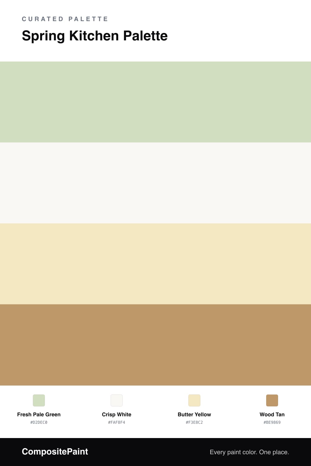
A cheerful pastel kitchen in fresh pale green, crisp white, soft butter yellow, and warm wood tan — sunny, bright, and full of life. Every color matched to real paint you can buy.

By Jessica Williams · Color Stylist & Interior Editor

A spring kitchen is all about that just-after-the-rain freshness, and this palette bottles it. The cabinets wear a fresh pale green — soft, a little grayed, like the first new leaves — so the room feels alive and sunny without going neon. It’s a color that makes cooking feel cheerful.

A crisp white on the walls and trim keeps everything bright and clean, giving the green plenty of room to shine and bouncing light around the space. That white is what keeps the whole scheme feeling open and airy.

Then a soft butter yellow adds a ray of sunshine — on a backsplash, bar stools, or open shelving — and wood tan grounds it through counters and floors so the pastels feel warm rather than candy-like. Pale green leads, white brightens, butter brings the sun, and wood keeps it cozy. It’s spring, all year long.

View palette in
Fresh Pale Green
Cabinets
Sherwin-Williams Cucumber · SW 6722
#D3DFC3
LRV 71
Crisp White
Walls & Trim
Portola Paints Table Linen · Table Linen
#FDFCF9
LRV 97
Butter Yellow
Accent
Sherwin-Williams Lily · SW 6693
#F3E8C2
LRV 81
Wood Tan
Counters & Floors
Benjamin Moore Sandy Valley · 1112
#BF9765
LRV 33

Buy These Colors

Each color matched to the closest real paint in every brand, by ΔE2000. Tap a swatch for its full guide or + to save it — take any SKU to the store, they mix on demand.

Fresh Pale Green
#D2DEC0 · LRV 70 · Cabinets
Sherwin-Williams · SW 6722 · ΔE 0.68
Behr · 400E-3 · ΔE 0.74
Benjamin Moore · 429 · ΔE 0.7
Valspar · V060-2 · ΔE 1.35
PPG / Glidden · PPG11-21 · ΔE 2.8
Glidden · 10GY 69/151 · ΔE 1.47
Dutch Boy · 326-2DB · ΔE 1.91
HGTV Home by Sherwin-Williams · HGSW 2267 · ΔE 2.7
Dunn-Edwards · DE5618 · ΔE 2.88
Magnolia Home · JG-67 · ΔE 4.46
Farrow & Ball · NO. 206 · ΔE 4.61
Diamond Vogel · 0755 · ΔE 1.33
Hirshfield's · 0748 · ΔE 1.81
Rodda · R049 · ΔE 6.2
C2 Paint · C2-655 · ΔE 4.04
Clare · PNT100-LT-68 · ΔE 7.27
Portola Paints · MARIPOSA · ΔE 9.19
Annie Sloan · OLD OCHRE · ΔE 14.42
Backdrop · BD-CC · ΔE 9.15
Rust-Oleum · 398641 · ΔE 8.98
Kompozit · 0748 · ΔE 1.81
Crisp White
#FAF8F4 · LRV 94 · Walls & Trim
Sherwin-Williams · SW 7757 · ΔE 1.61
Behr · PPU18-06 · ΔE 1.01
Benjamin Moore · 2144-70 · ΔE 3.11
Valspar · 7006-24 · ΔE 1.23
PPG / Glidden · PPG1001-1 · ΔE 2.17
Glidden · PPG1001-1 · ΔE 2.02
Dutch Boy · 001W · ΔE 1.72
HGTV Home by Sherwin-Williams · HGSW 4001 · ΔE 1.61
Dunn-Edwards · DEW358 · ΔE 1.41
Magnolia Home · JG-21 · ΔE 1.78
Farrow & Ball · NO. 2005 · ΔE 1.12
Diamond Vogel · 0011 · ΔE 2.98
Hirshfield's · 0011 · ΔE 2.43
Rodda · R007 · ΔE 1.04
C2 Paint · C2-756 · ΔE 1.3
Clare · PNT100-LT-02 · ΔE 1.23
Portola Paints · TABLE LINEN · ΔE 0.98
Annie Sloan · OLD OCHRE · ΔE 15.21
Backdrop · BD-TR · ΔE 3.54
Rust-Oleum · 285140 · ΔE 3.12
Kompozit · 0011 · ΔE 2.43
Butter Yellow
#F3E8C2 · LRV 81 · Accent
Sherwin-Williams · SW 6693 · ΔE 0
Behr · 340E-2 · ΔE 1
Benjamin Moore · 212 · ΔE 0.8
Valspar · 6008-5A · ΔE 1.66
PPG / Glidden · PPG1205-3 · ΔE 1.61
Glidden · 60YY 78/216 · ΔE 1.29
Dutch Boy · 219-1DB · ΔE 0
HGTV Home by Sherwin-Williams · HGSW 1186 · ΔE 0
Dunn-Edwards · DE5484 · ΔE 1.96
Magnolia Home · JG-38 · ΔE 1.54
Farrow & Ball · NO. 249 · ΔE 3.42
Diamond Vogel · 0797 · ΔE 2.26
Hirshfield's · 0797 · ΔE 2.23
Rodda · CA127 · ΔE 5.44
C2 Paint · C2-626 · ΔE 1.48
Clare · PNT100-LT-62 · ΔE 6.79
Portola Paints · PATISSERIE · ΔE 2.83
Annie Sloan · OLD OCHRE · ΔE 8.54
Backdrop · BD-DS · ΔE 4.27
Rust-Oleum · 329598 · ΔE 5.88
Kompozit · 0797 · ΔE 2.23
Wood Tan
#BE9869 · LRV 34 · Counters & Floors
Sherwin-Williams · SW 6130 · ΔE 1.41
Behr · 270F-5 · ΔE 1.8
Benjamin Moore · 1112 · ΔE 0.83
Valspar · V088-4 · ΔE 2.76
PPG / Glidden · PPG1094-5 · ΔE 2.24
Glidden · PPG1094-5 · ΔE 2.24
Dutch Boy · 216-4DB · ΔE 3.67
HGTV Home by Sherwin-Williams · HGSW 2173 · ΔE 1.41
Dunn-Edwards · DE6180 · ΔE 3.14
Magnolia Home · JG-166 · ΔE 10.56
Farrow & Ball · NO. 319 · ΔE 3.26
Diamond Vogel · 0247 · ΔE 2.28
Hirshfield's · H0030 · ΔE 2.08
Rodda · CA101 · ΔE 3.68
C2 Paint · BD69 · ΔE 1.68
Clare · PNT100-DP-59 · ΔE 3.16
Portola Paints · BANDELIER · ΔE 5.27
Annie Sloan · CHATEAU GREY · ΔE 10.67
Backdrop · BD-AN · ΔE 9.91
Rust-Oleum · 398640 · ΔE 10.08
Kompozit · 0255 · ΔE 1.41

Questions

do pale green and butter yellow clash in a kitchen?

Not at these soft levels. Both are pale and slightly grayed, so they sit beside each other like flowers and new leaves — fresh and harmonious rather than busy. Keep the yellow as an accent and the green leads cleanly.

how do i make a kitchen feel like spring year-round?

Lean on light, fresh color and lots of white. The pale green cabinets and crisp white walls here keep things bright, the butter yellow adds sunshine, and warm wood grounds it. Add greenery and natural light and the room feels like spring in any season.

KEEP EXPLORING

Similar Palettes

Closest schemes by color — not by label.