What Are Neutral Colors? True Neutrals, Near-Neutrals, and Undertones
Neutral colors are the low-saturation shades that carry no obvious hue — white, grey, black, beige, greige, taupe. Here is the difference between a true neutral and a near-neutral, and how to read the undertone before it lands on your wall.

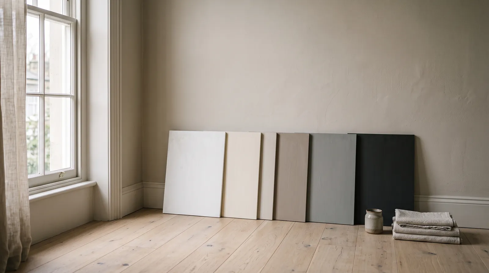
Neutral colors are the low-saturation shades that carry no obvious hue — white, black, grey, beige, greige, taupe, cream, and brown. They are the colors that stay quiet enough to sit behind everything else in a room instead of competing with it.
That is the definition. The complication is that almost nothing sold as a neutral is actually neutral. Walk a paint deck and you will find hundreds of beiges and greys that read as blank on a 2-inch chip and then, on a north-facing wall in February, turn faintly mauve. The neutral was never blank. It had a hue in it the whole time, sitting quietly under the surface, waiting for the right light to bring it out.
So the useful thing to know is not the list of neutrals. It is the difference between the two kinds.
True Neutrals vs Near-Neutrals
True neutrals are colors mixed with no hue at all: pure white, pure black, and the greys between them. On a color wheel they have no position, because there is no hue to place. Technically, a true neutral has zero saturation — equal amounts of red, green, and blue light bouncing back at you.
Near-neutrals have a small amount of real color mixed in, kept low enough that the eye still files them as background. Beige, greige, taupe, mushroom, cream, greige-white, warm grey, charcoal-brown — all near-neutrals. This is where the entire useful world of wall paint lives.
Here is the part people find surprising: paint companies almost never sell true neutrals for walls, and that is on purpose. A dead-neutral grey in a real room looks like a photograph with the color drained out. It goes flat, slightly cold, a little institutional. Adding a whisper of hue is what makes a neutral feel like a room instead of a backdrop. Benjamin Moore Classic Gray OC-23 (LRV 74) is a good example — it reads as a soft off-white to almost everyone, but there is warmth built into it that a true grey would not have.
What Counts as a Neutral
| Color | Type | Built from | Usually reads |
|---|---|---|---|
| White | True neutral (rarely) | No hue — but almost all wall whites are tinted | Warm or cool depending on tint |
| Black | True neutral | No hue | Warm if brown-based, cool if blue-based |
| Grey | True neutral | Black + white only | Flat and cool at true neutral |
| Beige | Near-neutral | Yellow, gold, or red at low saturation | Warm |
| Greige | Near-neutral | Beige with grey worked in | Either — depends on the ratio |
| Taupe | Near-neutral | Brown-grey, often with violet or pink | Warm to soft-cool |
| Cream | Near-neutral | White with yellow | Warm |
| Brown | Near-neutral | Orange and red, desaturated and darkened | Warm |
The line between them is not moral. It is just a description of how much hue is in the can, and hue is what decides whether your room feels calm or slightly off.
Every Neutral Has an Undertone
The color you see on the chip is the mass tone — the obvious surface color. Underneath it sits a second color, mixed in at low volume, that shifts how the whole thing behaves. That is the undertone, and in neutrals it does more work than the mass tone does.
Undertones are faint on a chip and loud on a wall, for one reason: color intensifies as the painted area grows. A green lean you cannot see across two square inches is unmistakable across two hundred square feet. That is the single most common way a neutral goes wrong, and it has nothing to do with the paint being bad.
The five undertones you meet in neutrals:
- Yellow / gold. The most common lean in beige and cream. Cozy under warm bulbs, can tip to butter or gold in west-facing afternoon light.
- Pink / red. Very common in taupe and in warm greys. Sits beautifully with terracotta, oak, and brass; goes rosy against cool grey flooring.
- Green. Frequent in greige and in warm greys. Reads sage or slightly muddy in flat north light.
- Violet / purple. The ambush. Hides in mid-tone greys and greiges and shows up on grey afternoons as a faint bruise.
- Blue. The cool grey standard. Crisp with marble and chrome, clinical with anything warm.
The trick to reading one is boring and works every time. Hold the sample flat against a sheet of pure printer-white paper in daylight. The paper has no undertone to compete with, so the neutral shows its hand. Creamy and gold means yellow. Slightly muddy means green. Faintly rosy means pink. Faintly violet means purple. If you want the longer version of this with beiges specifically, beige and greige undertones walks through each one.
Warm Neutrals vs Cool Neutrals
This is the split that actually decides whether your room settles.
Warm neutrals have yellow, gold, orange, or pink underneath. They advance slightly, which makes a large room feel a little more enclosed and a lot more comfortable. They sit naturally with oak and walnut floors, brass and unlacquered bronze, linen, jute, terracotta, cream trim, and leather.
Cool neutrals have blue, green, or violet underneath. They recede, which opens a small room up and keeps a modern one crisp. They belong with marble and quartz, chrome and polished nickel, white oak with a grey wash, glass, and cool-white trim.
Neither is better. What matters is that the wall agrees with the things in the room you cannot repaint. A warm greige against grey-blue tile will look slightly dirty, not warm. A cool grey against honey oak will look slightly sour, not crisp. The paint takes the blame, but the mismatch is the problem.
Light does half the work too. North-facing rooms get flat, blue-ish daylight all day, which strengthens cool undertones and can drain a warm neutral of the warmth you picked it for. South and west rooms get golden light for hours, which pushes warm undertones forward and can turn a safe beige into a gold. If your room fights you, how light direction changes paint color explains what is happening.
Neutrals Worth Knowing
These are the ones that come up over and over in real rooms, with what each one actually does. LRV is the Light Reflectance Value — how much light the color bounces back, on a scale of 0 to 100.
Sherwin-Williams Agreeable Gray SW 7029
LRV 60, and the greige that made greige a category. It sits almost exactly between warm and cool, with a very slight green-beige lean that keeps it from going cold. It behaves in most light, which is the whole reason it is everywhere. In a strongly north-facing room it can flatten a little; give it warm bulbs and it comes back.
Benjamin Moore Revere Pewter HC-172
LRV 55, and noticeably deeper than most people expect from a swatch. Green undertone, warm base, and enough depth to show trim off properly. It is the neutral that makes a room look styled rather than unfinished. Pair it with cream trim rather than stark white — pure white next to Revere Pewter makes the wall look muddy.
Benjamin Moore Pale Oak OC-20
LRV 69, a very light warm greige with a soft pink-beige lean. This is the one for rooms that need to stay bright but not white. It drapes beautifully over walls with a lot of natural light and reads almost as an off-white in a dim hallway. Watch the pink in west light.
Sherwin-Williams Accessible Beige SW 7036
LRV 58, a warm beige with a grey backbone that keeps it from going yellow. If you want beige without 1998 beige, this is it. It sits well with oak, brass, and cream, and it holds its warmth in north light better than most beiges do.
Farrow & Ball Cornforth White No. 228
LRV 60, and not a white at all — a soft mid-grey with a warm-neutral base that stays gentle instead of going cold. It is the cool option that does not turn clinical, which is a rare combination. Excellent in rooms with a lot of natural light where a true grey would feel severe.
Behr Silver Drop 790C-2
LRV around 70, a very light grey with a faint green-grey lean. It is one of the easiest light neutrals to live with because it stays quiet at scale rather than pushing blue. Behr sells through Home Depot, which makes it easy to grab a sample the same day you are deciding.
Valspar Filtered Shade 4003-1B
LRV 58, a soft warm grey that lands close to greige without committing. Sold through Lowe’s. It is a good middle option when you want a mid-tone neutral that will not fight either warm or cool fixed finishes.
For a fuller sorted list, the best greige paint colors round-up and the neutral family hub sort by LRV so you can see the light levels side by side.
Building a Room Around a Neutral
A neutral scheme is not one color. It is usually three or four, all agreeing on temperature, spread across different light levels.
The simplest structure is the 60-30-10 rule: about 60% of the room in your main neutral (walls), 30% in a secondary one (large furniture, rugs, drapery), 10% in an accent. In an all-neutral room the accent is usually texture or a much darker neutral rather than a color — a charcoal chair, a black frame, a woven basket.
Three things that make it work:
Vary the LRV, not the temperature. A wall at LRV 60, upholstery at LRV 40, trim at LRV 80. The room has depth without ever introducing a competing hue. Keep all three on the same warm or cool side.
Let the fixed finishes lead. The floor, the counters, the tile, and the cabinets are already voting. Read their temperature first, then pick a neutral that agrees.
Add texture where you removed color. A neutral room with flat surfaces reads empty. The same room with linen, boucle, oak grain, unglazed ceramic, and a nubby rug reads calm. Texture is what neutrals use instead of contrast.
Common Mistakes
- Choosing from the chip. A 2-inch sample cannot show you an undertone at wall scale. Paint a large board and lean it against the wall for a full day.
- Mixing warm walls with cool trim. The most common quiet mistake in neutral rooms. The eye catches the mismatch before the brain names it, and the room reads slightly wrong forever.
- Assuming grey is safe. Cool grey is the neutral most likely to turn violet or blue in real light. It is not the low-risk pick people think it is.
- Ignoring the bulbs. A 2700K warm LED and a 4000K cool one will show you two different walls. Choose under the light you actually live with.
- Going flat. Three neutrals at nearly the same LRV give you a room with no structure. Spread them out.
Picking Yours
| If your room has | Go | Try |
|---|---|---|
| Oak or walnut floors, brass, cream trim | Warm neutral | Accessible Beige SW 7036, Revere Pewter HC-172 |
| Marble, chrome, cool-white trim | Cool neutral | Cornforth White No. 228 |
| Mixed warm and cool finishes | Balanced greige | Agreeable Gray SW 7029, Filtered Shade 4003-1B |
| North-facing and dim | Warm, higher LRV | Pale Oak OC-20 |
| South or west, lots of sun | Slightly cooler than you think | Silver Drop 790C-2 |
| Small and needing air | LRV above 65 | Classic Gray OC-23, Pale Oak OC-20 |
The shortest way to think about neutrals is this. They are not the absence of color; they are color turned down far enough to stop asking for attention. Everything that goes wrong with them goes wrong because the volume was not quite as low as the chip suggested. Find the undertone first, match it to the room you already have, and the wall will do exactly what you hired it to do — stay quiet.
Ask a Question