
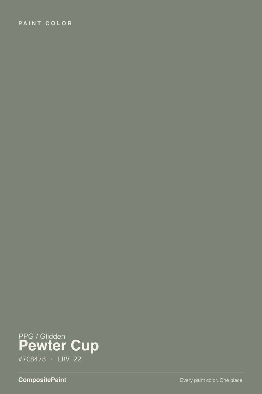
Color spec
| Brand | PPG / Glidden |
| Name | Pewter Cup |
| SKU | PPG1127-5 |
| Hex | #7C8478 |
| RGB | 124, 132, 120 |
| HSL | 100°, 5%, 49% |
| LRV | 22 |
| Undertone | neutral with no strong undertone |
| Sheens | walls eggshell · trim semi-gloss · cabinets satin · exterior siding satin |
| Family | Green |
Pewter Cup is the kind of color that never trends because nobody markets it — a muted, mid-depth sage-gray that PPG itself files as "a glass bottle green" and sells across three separate Glidden lines at Home Depot, from bargain Essentials to Diamond. It behaves like the SW/BM cabinet-sage colors people fight over on design blogs, minus the fame and minus the price. Give it real light and it is quietly excellent; starve it of light and it goes flat and murky like every color in this family does.
What Color Is Pewter Cup, Really?
A grayed-down olive-sage that PPG's own color file describes as a "saturated, neutral, glass bottle green with a viney undertone" — which is a fair description on the wall. It is not a blue-leaning sage like the ones that dominate Pinterest boards; it leans olive and slightly warm, closer to a bottle of green glass held up to the light than to eucalyptus or mint. At LRV 22 it sits in the same depth band as PPG's own Antique Silver and Benjamin Moore's Tate Olive — mid-dark, with enough body to read as a real color choice rather than a tinted white.
PPG sells this exact formula through Home Depot under at least three Glidden product lines — Essentials, Premium, and Diamond — in both interior and exterior finishes, which tells you something useful: this is a working color, not a boutique one. It is meant to be bought in a hurry by someone repainting a porch railing or a kitchen island, not agonized over in a designer's swatch deck. That also means it carries almost no public reviews or Houzz threads to check against — the honest answer here is that this review is grounded in the color's own numbers and PPG's own description, not a pile of owner testimonials, because there simply isn't one yet.
Undertone in one line: olive-green with a warm, viney cast — never blue, never true gray. If a sample reads flat khaki-brown, that is warm artificial light pulling it away from green; if it reads cool and stony, that is north daylight doing the same thing in the other direction.
Where It Shines
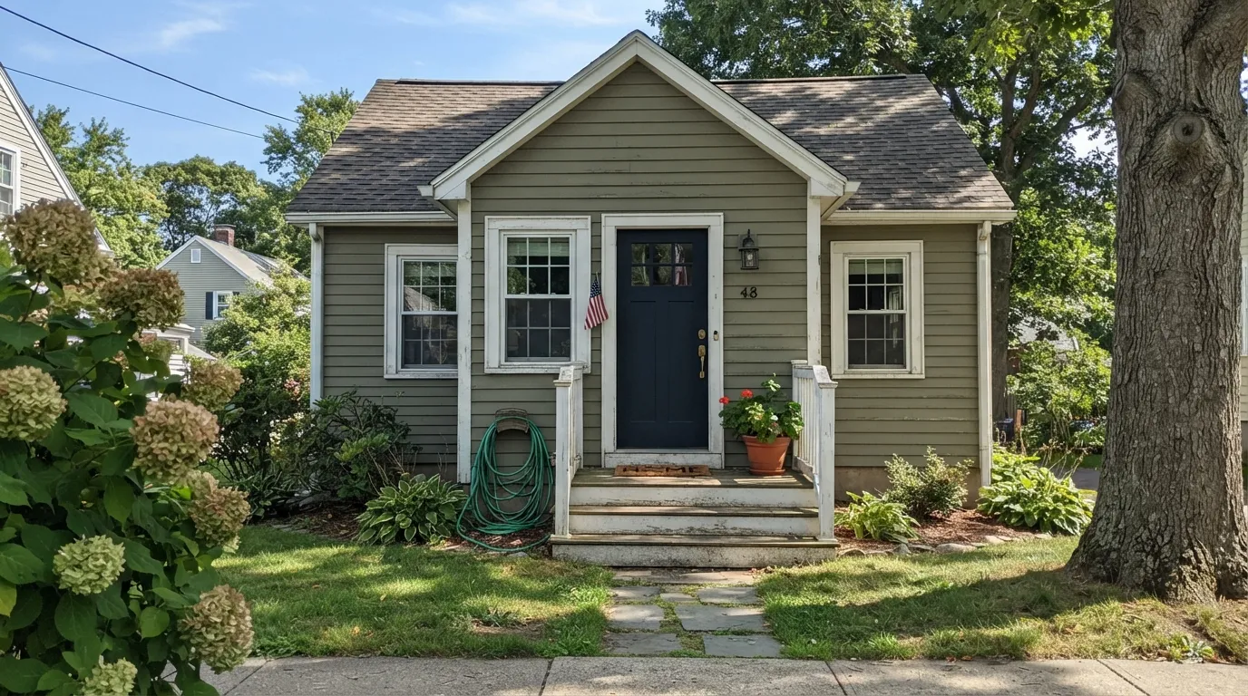
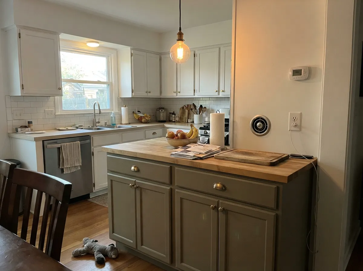
Give it real daylight or direct sun and the green comes forward and stays there — this is why PPG sells it as an exterior color as readily as an interior one. On siding, shutters, or a front door it reads as a grounded, old-money green without the near-black depth of a hunter green. Indoors, its natural home is anywhere with wood and leather: a kitchen island under warm pendant light, a den with walnut shelving, a powder-room vanity under a brass sconce. It asks for company that is warm and a little worn, not sleek and cold.
Where It Fails — the Honest Part
The regret stories with colors in this family are predictable before the first coat, and Pewter Cup will follow the same script because the physics are the same — a mid-depth, grayed green only holds its color when the room gives it light to work with.
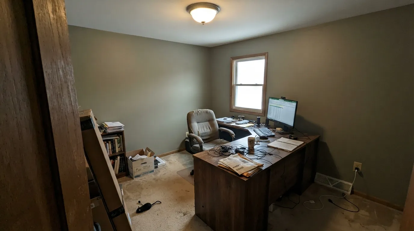
You expected gray, not green. "Pewter" in the name sets up the wrong expectation. This is a green with gray mixed in, not a gray with a hint of green — on four walls the olive is unmistakable, especially in warm light. If you want an actual gray, look at a true greige instead; this color will not read neutral.
A dim, north-facing room. Cool, flat daylight is the one condition every color in this depth-and-family combination fails at. The green muddies toward a dull khaki-brown and the room reads dark rather than colored. Test a large sample on the actual wall before committing a whole room.
No contrast, no light — just a flat coat of it everywhere. Painted floor-to-ceiling in a room with builder-grade lighting and no wood, brass, or leather to play against, it goes institutional fast — the same complaint every muted green in this LRV range gets. Give it a warm trim white and one warm-metal accent and the flatness disappears.
Room by Room
Kitchen cabinets & islands — its best job
On lower cabinets or an island under warm pendant lighting it reads custom and expensive, and it does not fight butcher block or brass hardware. Satin, urethane-fortified cabinet enamel; keep upper cabinets or walls in a light neutral so the room doesn't go dark.
Exterior siding & shutters — genuinely strong
This is the one place the color has real market proof: PPG sells it as an exterior finish, not just an interior accident. In full sun it holds a grounded, old-money green; pair with a warm white or cream trim rather than stark white, which pushes it cooler than it wants to be.
Den, office, library — yes
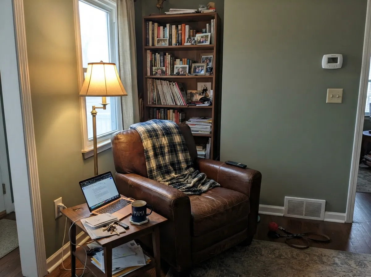
Low, warm light and wood shelving are exactly its comfort zone. Walnut, leather, and brass reading-lamp light make the olive read rich instead of murky. Eggshell for durability where a desk chair scuffs the wall.
Living room — with commitment
Works if the room gets real daylight and has warm wood furniture to anchor it. In an open-plan space it has to negotiate with every adjacent room's undertone, so sample big before committing to an open floor plan.
Powder room / vanity — the small-commitment move
A Pewter Cup vanity under a marble or butcher-block top with brass fixtures is a weekend project that reads like a bigger design decision than it was. Small rooms carry deep, mossy color well.
Bedroom — only with warm lamps
It can work as a cozy, grounded wall color at night under 2700K bulbs, but a north-facing or naturally dim bedroom will read the color as flat and dull rather than restful. Not the room to gamble on without a real sample.
The Scorecard
What it gets right
- +A real sage-olive green, not a beige pretending to be one
- +Sold in both interior and exterior formulas — proven outdoors, not just a wall-paint accident
- +Available across three Glidden price tiers, so it's cheap to test and cheap to commit to
- +Flatters walnut, leather, and brass — a natural den and cabinet color
- +Mid-depth (LRV 22) holds its color better than pale sages in bright rooms
Where it struggles
- −Almost no public reviews or owner photos to check your expectations against
- −"Pewter" in the name oversells the gray and undersells the green
- −Goes flat, muddy khaki in dim north light or plain builder lighting
- −No fame or design-blog track record if you want social proof before buying
Light by Light
Most complaints about Pewter Cup are a light mismatch. Upload a photo of your actual room and see it on your walls — then ask for the same wall in north light or evening lamps before you buy a single sample.
TEST IT IN YOUR LIGHT →Pewter Cup vs the Colors You're Also Considering
Every Pewter Cup sample board has the same rivals on it. The numbers show the real lightness gap — then it comes down to which risk you would rather live with.
Pewter Cup lives in a tight family of muted PPG greens, and the differences are small but visible. Smokey Sage (PPG11-24, LRV 23) is a touch lighter and reads slightly greener and cleaner, so choose it if you want a bit more sage and a hair more light in the room.
Lottery Winnings (PPG1129-6, LRV 22) sits at the same brightness but leans a little more clearly green, making it feel more like an intentional sage than a gray-green. If you want the color to be unmistakably green, it edges ahead of Pewter Cup.
Tortuga (PPG1032-5, LRV 22) is the warmer cousin. It carries more tan and olive, so it looks earthier and less cool than Pewter Cup at the same LRV. Pick Tortuga for a warm, organic room and Pewter Cup when you want the cooler, grayer, more neutral version of the same depth.
Need It From Another Brand?
Any paint counter can custom-tint PPG / Glidden PPG1127-5 directly — but if you would rather stay in one brand's own deck, these are the closest stock matches:
Similar PPG / Glidden colors
closest in the PPG / Glidden deckThe nearest shades to Pewter Cup within PPG / Glidden's own range, ranked by perceptual color distance — useful when you want the same look a touch lighter, darker, or warmer.
Pewter Cup Coordinating Colors
The rule with Pewter Cup is the same as with any grayed olive: warm whites over cool ones, warm metals over chrome, and one near-black note if the room needs depth. It sits comfortably next to other muted greens too, which makes tonal layering an easy option in a den or library.
The Color With No Story — And Why That's Actually Useful
Most colors in this review series arrive with a history: a Color of the Year title, a viral Houzz thread, a decades-long bestseller reputation. Pewter Cup has none of that, and it is worth being honest about why. PPG's own site lists it in the Greens family as a straightforward "glass bottle green," and Home Depot carries it mixed to order across three separate Glidden lines — Essentials, Premium, Diamond — as both an interior and exterior finish. That is a working-paint profile, not a design-trend profile.
The upside of a color with no fame is that it also carries no hype-driven disappointment: nobody bought it because an influencer painted an accent wall with it, so nobody is writing an angry review because the light in their house doesn't match a photo. What you get instead is a genuinely solid, mid-depth sage-olive at a Home Depot price point, reviewed here on its own numbers rather than on a stack of testimonials that don't exist yet.
Pewter Cup With Wood Tones and Floors
Warm woods are this color's natural company: walnut, honey oak, and butcher block all share enough of its warm-olive undertone to feel coordinated rather than accidental. Unlike a true gray or a cool blue-sage, it will not fight golden floors — the two sit in the same warm family, so the room reads intentional rather than mismatched.
Where it needs more care is contrast: paired with equally warm mid-tone wood and nothing lighter or darker to break it up, the room can read flat and monotone. A lighter trim white or one darker accent (a near-black door, dark hardware, a charcoal rug) gives the eye somewhere to land.
Three Ready Palettes Built on Pewter Cup
A color is never alone on the wall — these are complete combinations in the 60-30-10 pattern, with the reason each one holds together.
A light, genuinely neutral white keeps the kitchen from going dark while Pewter Cup does the color work on the island; a near-black hardware accent keeps the palette from feeling like two separate decisions.
TRY THIS PALETTE →A warm white trim keeps the green from reading dark and dated, and one near-black accent gives the room the depth a flat coat of sage alone can't provide. Add leather and walnut and the room does the rest.
TRY THIS PALETTE →Crisp white trim keeps the sage from reading dark on a facade, and near-black shutters supply the one deep note the scheme needs — a classic three-color exterior built for a color PPG already sells as an outdoor finish.
TRY THIS PALETTE →Accessibility (WCAG contrast)
WCAG 2.1: AA = 4.5:1 normal text · AA Large = 3:1 large text · AAA = 7:1 normal text.
The Questions Everyone Asks
Is Pewter Cup green or gray?
Green, despite the name. PPG's own color file describes it as a "glass bottle green," and on four walls the olive undertone is clear, especially in warm light. If you want an actual gray, this is not it — pick a true greige instead.
Is it good for kitchen cabinets?
Yes — this is its strongest room. It reads rich against butcher block and brass without going as dark or dramatic as a hunter green. Use a satin, urethane-fortified cabinet enamel and keep upper cabinets or walls light so the kitchen doesn't feel dim.
Can I use it outside?
Yes, and confidently — PPG sells this exact formula as an exterior paint through Glidden Essentials, not just as an interior color. Full sun keeps the green true; pair it with a warm white trim rather than stark white.
Where can I actually buy it?
Through Home Depot, mixed to order under several Glidden product lines — Essentials, Premium, and Diamond — in both interior and exterior formulas. That is also why it has almost no owner reviews online yet: it moves through paint-department orders, not a design following.
What trim white goes with Pewter Cup?
A genuinely warm, neutral white — PPG's own Delicate White or Benjamin Moore's White Dove both work. A stark cool white will push the green toward flat and gray instead of letting it read rich.
Does it work with honey oak floors?
Better than most true grays or blue-grays do, because the olive undertone shares the same warm family as honey oak. It will not clash the way a cool sage or gray-blue would, but it also won't disappear — expect the room to read as "warm and green," not neutral.
Will It Work in YOUR Room?
No page can promise how Pewter Cup behaves in your light. Upload a photo and see it on your own walls in seconds — before you spend a cent on samples.
TRY PEWTER CUP ON YOUR ROOM →
Ask a Question