The Best Bathroom Paint Colors
Fifteen bathroom paint colors that survive steam and bad overhead light — Alabaster, Sea Salt, Palladian Blue, Silver Strand, Swiss Coffee, Hague Blue and more, grouped by small baths, windowless baths, spa neutrals, and bold powder rooms.

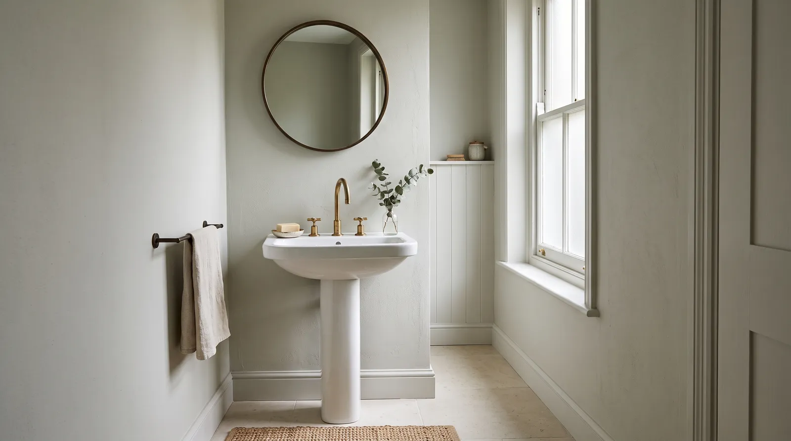
A bathroom is the hardest small room to get right. You have about fifty square feet of visible wall, one light fitting a builder chose, a mirror that shows you the result every morning, and steam actively trying to lift the paint off the ceiling.
Two things decide whether a bathroom color works, and most lists skip both. The first is artificial light, because this is the room you use at 6am in December and 11pm in June, when there is no daylight involved at all. A color picked from a chip under bright store lighting will not behave the same way under a warm vanity bulb. The second is that a bathroom has more competing surfaces per square foot than any other room — tile, stone, chrome or brass, a mirror, hard white porcelain — and the wall has to sit against all of them without arguing.
So the fifteen below are grouped by the problem you are actually solving. LRV explained covers the light-reflectance numbers I keep quoting, and the bathroom color hub has the wider shortlist if none of these land.
What Color Should I Paint a Small Bathroom?
Paint it a warm white or a very pale neutral above LRV 75, and carry the same color over the walls, the trim and the ceiling — Sherwin-Williams Alabaster (SW 7008), Behr Silver Drop (790C-2) or Farrow & Ball Pointing (No. 2003). If the room has no window at all, go warmer, to Swiss Coffee. If it is a powder room you use for two minutes at a time, ignore all of this and go dark.
The drench matters more than the specific color, and here is why. In a bathroom with white trim, a colored wall and a white ceiling, you can see every edge where one surface meets another, and each edge is a ruler telling your eye how small the room is. Take the edges away and the room stops announcing its size. That effect is bigger than a few points of LRV either way, and it costs nothing.
The second reason to go pale-but-not-white is what is already in the room. The basin, the tub, the toilet — all hard, bright, slightly cold white that no wall paint matches. A soft warm white next to that looks dirty by comparison. A pale greyed neutral makes the porcelain read as crisp instead of as the reference point everything else fails.
Best Paint Colors for Small Bathrooms
All three are above LRV 75, all worth drenching, and all chosen because they sit well against white porcelain rather than fighting it.
Sherwin-Williams Alabaster SW 7008
Alabaster is the small-bathroom white I recommend before any other, and the greige in its base is the reason. It is warm enough that a room lit only by bulbs does not go blue at night, but grey enough that it never reads creamy next to a white tub. That balance is rare — most warm whites lose against porcelain, and most cool whites go clinical under a vanity light.
Its weak spot is a north-facing bathroom with a real window, where the grey base comes forward and it can read flat; in that room take Pointing instead.
Trim and ceiling: Same color throughout, satin on the trim and a flat bathroom ceiling paint above. If you want a defined edge, Sherwin-Williams Pure White (SW 7005) on the trim gives you a crisp line without a second color.
Behr Silver Drop 790C-2
Hex: #DDE3D7 · LRV: 75 · Undertone: pale grey with a faint green cast
Silver Drop is for a small bathroom where you want a color rather than a white but cannot spare any light. At LRV 75 it still bounces almost everything, and the faint green does two useful jobs: it keeps the wall from going pink under a warm bulb, which is how most pale greiges fail in a bathroom, and it flatters skin in a mirror in a way that a flat grey does not. Against white subway tile and chrome it is faultless.
Where it struggles is a strongly beige floor tile — the green will make the floor look yellow.
Trim and ceiling: Behr Ultra Pure White in semi-gloss on the trim, Silver Drop in a flat bathroom ceiling paint. The bath-and-kitchen line is the right product; our Behr Ultra review has the coverage detail, and it is a Home Depot pickup.
Farrow & Ball Pointing No. 2003
Hex: #F3EFE3 · LRV: 86 · Undertone: warm off-white with a soft yellow-cream base
Pointing is the brightest and warmest pick in this group, and in a small bathroom with one small window it earns its price. It has the chalky depth Farrow & Ball is known for, which means the wall has a softness to it rather than looking like a flat printed surface — and in a room where you stand a foot from the wall, that is genuinely visible.
It wants warm company: brass, wood, terracotta, unbleached linen. Against cool chrome and blue-grey tile it can read yellow. Use Modern Emulsion here, not Estate, which is not built for a room with a shower in it.
Trim and ceiling: Same color on the trim in eggshell and on the ceiling. Pointing drenched over a small bathroom is one of the most reliably good-looking things you can do with paint.
Paint Colors for a Windowless Bathroom
No window is a different problem. There is no daylight to correct anything, so the color you get is whatever the bulb makes of it, every hour of every day. The rule: go warm and light, or go properly dark. Cool mid-tones are where windowless bathrooms turn into corridors.
Behr Swiss Coffee 12
Hex: #F3F2E6 · LRV: 88 · Undertone: soft warm white, gentle cream
Swiss Coffee is the windowless default for a reason. At LRV 88 it reflects nearly everything a bulb throws at it, and the cream puts back the warmth a sunless room would otherwise have to get entirely from the light fitting. Under a 2700K bulb it reads as a soft warm white; under a cold 4000K downlight it holds neutral instead of going blue, which is exactly where a pure white fails.
Trim and ceiling: Same color throughout, satin on the trim and flat on the ceiling. With no daylight there is nothing to make trim contrast look good, so skip it.
PPG Transcend PPG1079-4
Transcend is for a windowless bathroom you want to feel like a room rather than a closet. At LRV 43 it is genuinely a color, and the warmth in it means it glows slightly under a lamp instead of going grey. Against a white basin it reads intentional; against travertine or a wood vanity it reads expensive.
The honest caution: at this LRV, one weak ceiling fixture will leave the room dim. Transcend wants two sconces at mirror height. If your lighting is a single bulb in the middle of the ceiling, take Swiss Coffee and spend the difference on a better fitting.
Trim and ceiling: Benjamin Moore Simply White (OC-117) in semi-gloss on the trim, same white flat on the ceiling. The clean white keeps the taupe from sliding into beige.
Farrow & Ball Studio Green No. 93
Hex: #464D4A · LRV: 7 · Undertone: near-black green with a grey backbone
Studio Green is the lean-in option, and a windowless powder room is the right place for it. The logic is simple: if the room is never going to feel bright, stop trying. A very deep green over walls, ceiling and woodwork turns a dark box into something deliberate — a jewel box rather than a failure of daylight. It also hides splashes and fingerprints better than anything else here.
It needs light you control. Two sconces at mirror height and a warm bulb, and it is one of the best-looking things in a house at night. Under a single cold downlight it collapses into flat charcoal.
Trim and ceiling: Same color throughout, Modern Emulsion on walls and ceiling, Modern Eggshell on the woodwork. Never a white ceiling — it caps the room and undoes the whole effect.
Neutral Bathroom Paint Colors
This is the group most likely to go wrong, because bathroom light punishes neutrals. Warm bulbs pull the pink out of greiges; cold LEDs pull the blue out of greys. These three stay put in both.
Sherwin-Williams Silver Strand SW 7057
Silver Strand is the most-used bathroom neutral in the country and it deserves the position. The green in it is what stops the pink shift — a greige without it will look faintly rosy under every warm bulb you own, and once you see it you cannot unsee it. At LRV 59 it is bright enough for a windowless room and deep enough to hide water spots on the wall behind the basin.
Trim and ceiling: Sherwin-Williams Pure White (SW 7005) in semi-gloss on the trim, same white flat on the ceiling. A creamy white makes the green look murky.
Benjamin Moore Gray Owl OC-52
Gray Owl is the cooler, brighter neutral — the pick when the bathroom already has warm materials and does not need more. Against oak, brass or a terracotta floor it provides the counterweight; against white marble with grey veining it disappears into the scheme in the best way. At LRV 65 it holds up with only a small window.
In strong daylight the blue comes forward and it reads genuinely cool. If the bathroom is north-facing and you already find it cold, take Silver Strand or Alabaster instead.
Trim and ceiling: Benjamin Moore Chantilly Lace (OC-65) in semi-gloss on the trim, same white flat on the ceiling. The crisp bright white keeps Gray Owl from looking dingy.
Valspar Gravity 4005-1B
Hex: #C3C6C7 · LRV: 56 · Undertone: soft grey with the faintest blue
Gravity is the cleanest true grey here, for a bathroom where you want grey and mean grey. There is almost no color bias in it, which is unusual — most greys at this LRV pull toward green, blue or purple. That neutrality makes it very easy to pair, because it is not committing to a temperature and will not fight a warm floor or a cool tile.
It can read cool in a dim room, so it wants a real window or warm bulbs. Valspar sells through Lowe’s; the Signature line in satin is the one to use.
Trim and ceiling: Valspar Ultra White in semi-gloss on the trim, same white flat on the ceiling. Gravity is neutral enough that any clean white works.
Spa Bathroom Colors
Spa colors go wrong when they get saturated. A real spa is stone, water and steam, all of which are low-chroma. These three have color in them, but never enough to become the loudest thing in a room full of white porcelain.
Sherwin-Williams Sea Salt SW 6204
Sea Salt is the most-requested bathroom color there is, and it earns it. It changes character with the light without ever looking wrong — green in a bright room, grey in a dim one, faintly blue in north light. In a bathroom, where you go from cold daylight to warm bulb over the course of one morning, that flexibility is exactly the point. At LRV 63 it works with or without a window.
Check your floor before you commit. Against a strongly beige or yellow tile the green will make the floor look dated. Against grey, white or stone it is faultless.
Trim and ceiling: Benjamin Moore White Dove (OC-17) in semi-gloss on the trim, same white flat on the ceiling. A hard bright white makes Sea Salt look chalky.
Benjamin Moore Palladian Blue HC-144
Palladian Blue is the calmest color on this list. It carries slightly more blue than Sea Salt, which in a bathroom reads as cooler and cleaner — the water association rather than the stone one. Against white sanitaryware and chrome it looks crisp; against warm brass it softens and goes almost sage.
It wants daylight. In a windowless bathroom it goes grey and loses the thing that made it good. In an east-facing bathroom with morning sun it is lovely, and morning is when you are in there.
Trim and ceiling: Benjamin Moore Simply White (OC-117) in semi-gloss on the trim, same white flat on the ceiling. The clean white keeps the blue fresh instead of dusty.
PPG Whirlpool PPG1230-3
Whirlpool is for people who want the spa color to actually be a color. It is more chromatic than Sea Salt or Palladian Blue — a genuine soft aqua rather than a green-grey — and in a bathroom with plenty of white it reads clean rather than dated. It suits a family bathroom, where the extra energy fits a room everyone uses.
Be deliberate: at this chroma it never reads as a neutral, and it needs restrained fittings.
Trim and ceiling: PPG Delicate White in semi-gloss on the trim, same white flat on the ceiling. Keep everything else white and let the wall do the work.
Bold Powder Room Colors
A powder room is the one place in a house where you can do whatever you want. Nobody spends twenty minutes in there, it usually has no daylight to ruin, and the small size that works against you everywhere else works in your favor with a deep color. It is also the best place to use an expensive paint, because you only need a gallon.
Farrow & Ball Hague Blue No. 30
Hex: #3F4D57 · LRV: 7 · Undertone: deep blue-green that reads almost black at night
Hague Blue in a powder room is close to a guaranteed result. There is enough green in it to keep it from feeling like a corporate navy, and enough depth that under lamplight it goes nearly black and the room becomes a small dark box in the best possible way. Against brass fixtures, a dark timber vanity top and a good mirror it looks like it cost far more than it did.
Full drench is the version that works — walls, ceiling and woodwork. Hague Blue under a white ceiling looks unfinished. Use Modern Emulsion for the moisture tolerance and give the room a warm bulb.
Trim and ceiling: Same color throughout, Modern Eggshell on the woodwork.
Sherwin-Williams Riverway SW 6222
Riverway is the softer route to a dark powder room. It is a teal with a lot of grey in it, so it never gets loud — it behaves more like a dark neutral than a color, which makes it much easier to live with and much easier to pair. It works with chrome, nickel and brass equally, which almost nothing at this depth does.
At LRV 16 it is dark but not near-black, so it holds its shape under a single ceiling light better than Hague Blue or Studio Green. If you want a dark powder room and your lighting is average, this is the safe one.
Trim and ceiling: Same color on walls and ceiling, with Sherwin-Williams Pure White (SW 7005) in semi-gloss on the trim if you want the woodwork to show.
Benjamin Moore Caliente AF-290
Caliente is the one people talk themselves out of and then regret. A deep red does something no blue or green can: it makes a small room feel warm and enclosed rather than cool and enclosed, and under lamplight it turns almost velvet. Next to a brass faucet, a dark stone counter and a gold-framed mirror it is striking.
It is a powder-room color, not a bathroom color. In a room with a shower a deep red goes heavy fast, and dark plus steam shows every drip. Keep it to the half bath by the front door.
Trim and ceiling: Same color throughout in satin, or Benjamin Moore White Dove (OC-17) on the trim in semi-gloss if you want the moldings picked out. Never a cool bright white with Caliente — it makes the red look pink.
Sheen and Product: What Survives the Steam
Color is half of a bathroom decision. The finish is the other half, and it is where most bathroom paint jobs fail.
Walls: satin, or a bathroom-specific matte. Satin is the traditional answer and still a good one — wipeable, moisture-tolerant, and not so shiny that it turns every skim-coat imperfection into a highlight the way semi-gloss does in a small room. With a working exhaust fan, the modern bath-and-kitchen lines in matte or eggshell are fine too, and they look considerably better on an imperfect wall. The sheen guide has the full trade-off.
Ceiling: flat, mildew-resistant, purpose-made. The ceiling above a shower fails first, and it fails as black spotting rather than peeling. A dedicated bathroom ceiling paint has the mildewcide in it; a standard flat ceiling white does not. That one substitution prevents most of what causes bathroom ceiling mold.
Trim: semi-gloss. Baseboard and door casing get splashed, mopped and wiped. Semi-gloss is the only finish that shrugs off all three, and it is the one place in the room where the shine is worth it.
Prime bare or previously glossy surfaces. Paint coming off a bathroom wall is almost always adhesion — soap film, old gloss, or a wall painted while damp — not paint quality. If it has already happened, peeling paint in a bathroom covers the real fix.
Colors to Avoid in a Bathroom
Pink-based greiges. Perfect on a chip, rosy under every warm vanity bulb ever made. If you want a greige, pick one with a green or yellow base — Silver Strand and Gray Owl both qualify.
Cool mid-grey in a windowless room. No daylight, no warmth, LRV in the forties. That is the recipe for a room that feels like an office corridor, and it is the most common bathroom mistake I see.
Saturated turquoise above about LRV 65. Next to white porcelain, bright aqua reads as a public pool. If you want the spa feeling, take the chroma down.
High gloss on the walls. Genuinely durable, and it will show every flaw in the drywall under the raking light of a wall sconce. Satin gives you most of the durability and none of the misery.
How to Choose Between Them
Start with two facts: whether the room has a window, and how long you spend in it.
No window and daily use? Swiss Coffee or Transcend. No window and it is a powder room? Studio Green, Hague Blue or Caliente — go dark and stop fighting it. Small with a window? Alabaster, Silver Drop or Pointing, drenched over everything. Want a neutral you will not tire of? Silver Strand, Gray Owl or Gravity. Want it calm? Sea Salt, Palladian Blue or Whirlpool.
Then test in the right conditions, which for a bathroom is not the same as the rest of the house. Roll two coats onto letter-sized card rather than the wall, and prop the cards where the wall meets the basin. Look three times: in daylight with the door open, under the vanity light with the door closed, and last thing at night. The artificial-light version matters more here than the daylight version, because that is when you actually use the room. A color that is beautiful at noon and grey at 10pm is the wrong color for a bathroom.
If you want to see a shade on your own tile and your own basin before committing, upload a photo of the room to the visualizer and try the shortlist on it. It catches the obvious misses — the green that fights your floor, the grey that goes flat — before the sample pots arrive.
Ask a Question