Winter Way
Behr's cool blue-black near-black, reviewed honestly: the front doors and islands where it goes moody and modern, the dim rooms that swallow it whole, and what to pick instead.

Jessica has spec'd whites and neutrals for more than 300 rooms and keeps a sample wall of painted drawdowns in her studio. Every color review is checked against real reader rooms in the comments and re-tested when a formula changes. About the testing process →

- 1Cordovan Brown0
- 2Winter Way6
The Fast Verdict
Winter Way is Behr's proof that a near-black doesn't have to read as plain soot. At LRV 6 it sits at true near-black depth — Behr files it in the Gray family, but the base leans distinctly blue-slate, not warm charcoal. On a front door or a kitchen island, paired with a light partner, it reads calm and current, closer to deep denim than to a hardware-store black. Commit it to four walls with no real light source and it stops behaving like a color and starts behaving like a hole in the room.
Front doors and shutters · kitchen islands with a light perimeter · dens and home offices built for focus · bedroom or living-room accent walls under warm lamps
You want a true, neutral black with zero blue lean · your room runs on cool white LEDs with no daylight backup · your floors and trim are honey oak · you're painting all four walls of a dim room with no lamps planned
- A near-black with real personality — cool blue-slate, not flat soot
- Front doors and islands read modern and deliberate, not default-black
- Deep enough (LRV 6) to anchor a room without competing for attention
- Plays well with brass, marble, and white oak or walnut
- Reads calmer and less heavy than a true neutral black in daylight
- Needs real light — dim rooms with no lamps flatten it into a dark blur
- Fights honey oak floors and warm-gold trim
- Not a true black — buyers expecting zero undertone will see the blue
- Four full walls with no light source reads like a closet, not a color
What Color Is Winter Way, Really?
A dark, cool-cast blue-gray sitting right at the edge of black. Behr's own site files Winter Way in its Gray color family, and at RGB(62, 71, 76) the numbers back that up — but next to a true neutral black like Sherwin-Williams Iron Ore, the blue is unmistakable. Descriptions of it vary by source: some paint-matching sites call it a soft grey-blue, others describe a blended green-black evoking deep forest. On the wall the honest read lands closer to slate or dark denim than to green — a cool, low-chroma near-black rather than a warm, brown-black or a botanical dark.
At LRV 6 it reflects almost none of the light that hits it, which puts it in the same depth bracket as Benjamin Moore Wrought Iron and Sherwin-Williams Iron Ore. That depth is what makes it dramatic in small doses — a door, an island, one accent wall — and risky at scale. Colors this dark need a real light source to read as color at all; without one, the eye simply registers "dark," and the specific blue-slate character that makes Winter Way interesting disappears.
Undertone in one line: cool blue-gray with a faint green whisper — never warm, never brown. If your sample reads flat charcoal-black with no color at all, that's dim light doing the flattening; if it reads almost navy in bright sun, that's the paint being honest about its undertone.
Where It Shines
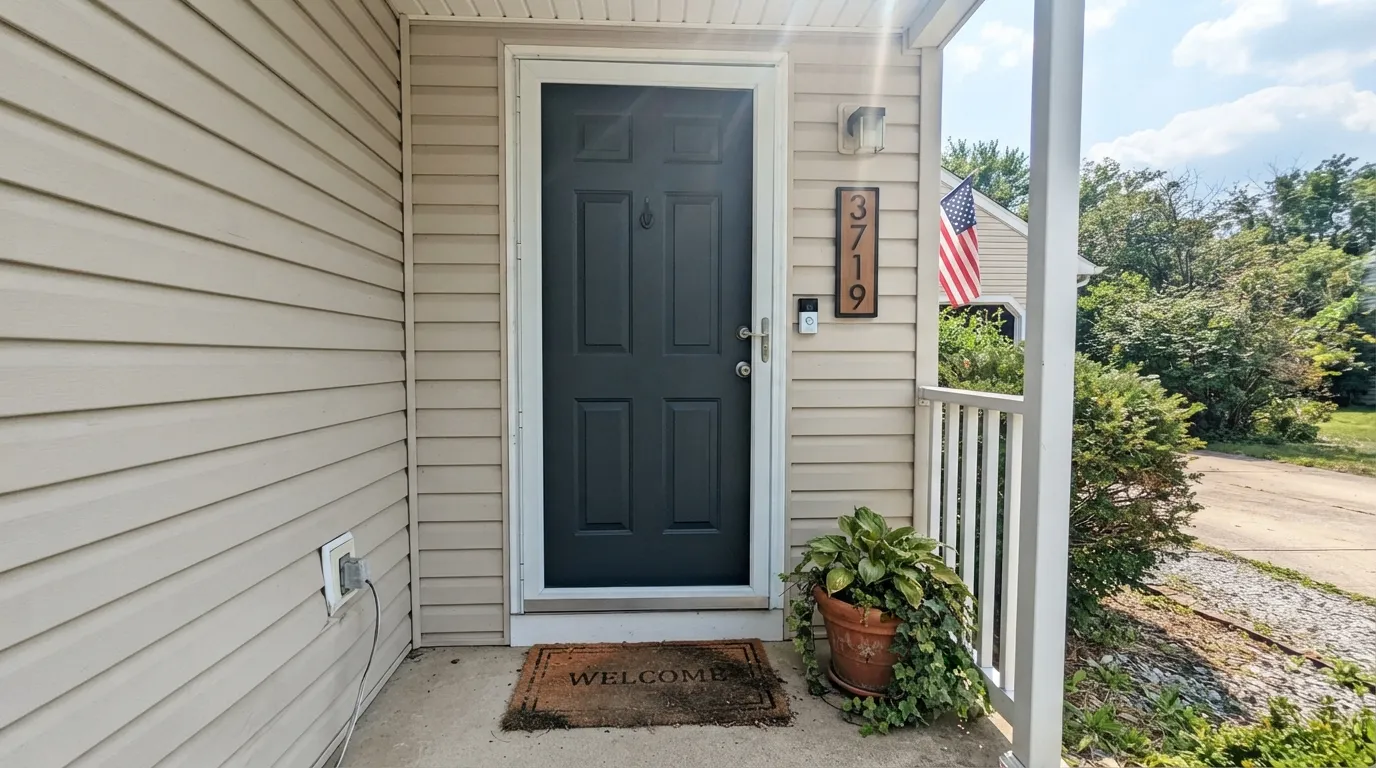
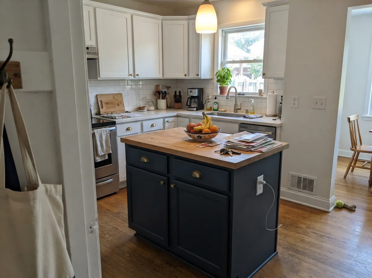
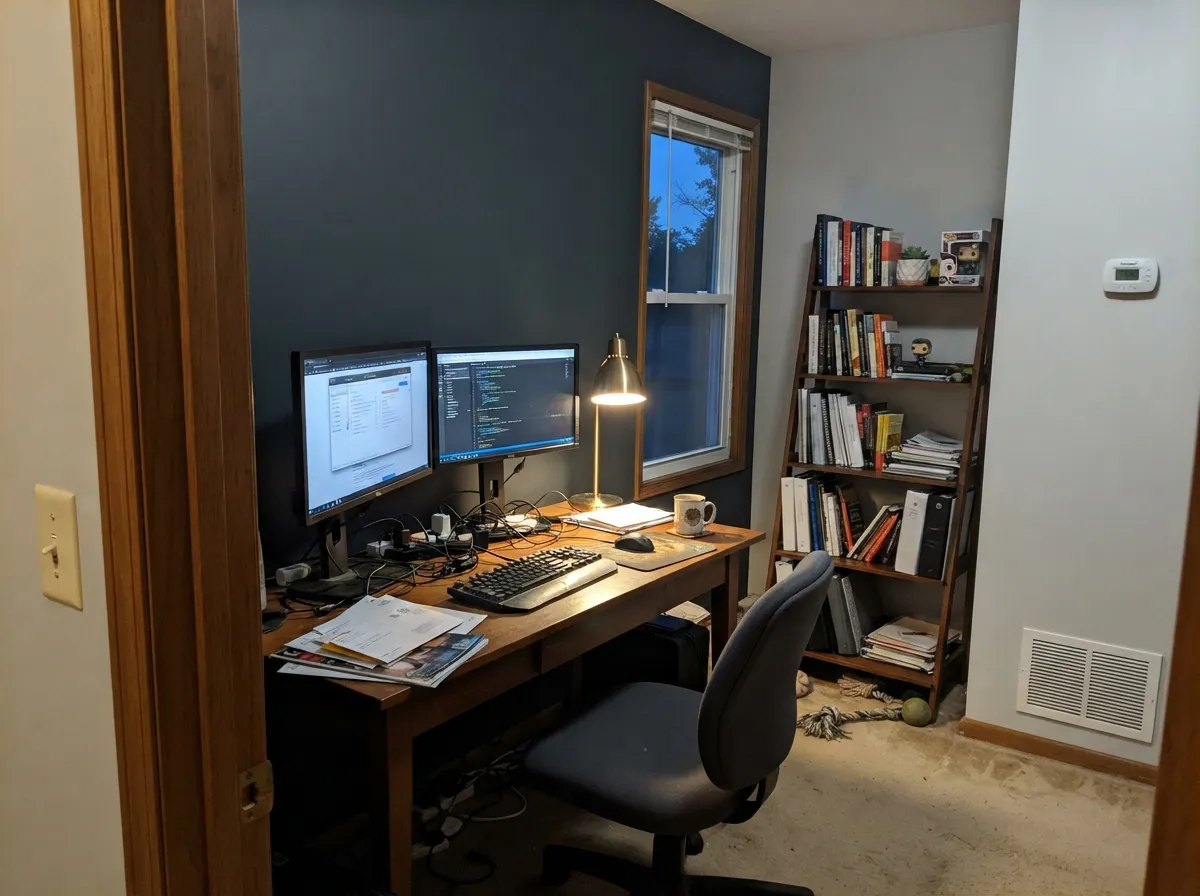
Give it a light-colored partner and a real light source and it earns its keep fast. A front door in full daylight against a white or light-gray house reads crisp and current — the cooler cousin of a plain black door, with enough undertone to feel deliberate instead of default. Its second home is the kitchen island: against white perimeter cabinets and warm brass hardware, the blue-slate depth grounds the room without the flatness a true black can bring. In a den or home office with a lamp on, it turns genuinely cozy — dark enough to feel enclosed and focused, cool enough to stay calm rather than heavy.
Where It Fails
Almost every regret story with a near-black this dark comes from one of three situations, and none of them are the paint's fault. If your room matches one, this is not your color, and a bigger sample will only confirm it faster.
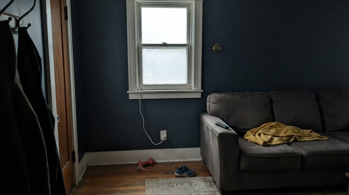
At LRV 6 there is almost nothing left to reflect. Without daylight or a warm lamp doing real work, Winter Way stops reading as a considered blue-black and just reads as a dark blur — readers describe rooms painted this dark with no supplemental light as feeling like a closet, not a color choice. Add lamps or skip the fourth wall.
The cool blue-slate base sits at the opposite temperature from golden oak and yellow-toned trim. Instead of grounding the wood, the near-black just looks like it's arguing with it — both sides read muddier next to each other. Pair Winter Way with white oak, walnut, or espresso instead.
Buyers who want a plain hardware-store black are sometimes surprised the wall or door reads distinctly blue in bright light — that's not a batch problem, it's the undertone doing exactly what it's built to do. If you want zero color lean, look at a true black like Tricorn Black or Iron Ore instead.
Room by Room
Semi-gloss Winter Way against a light-colored house is the easiest, lowest-risk use of this color. Full daylight reads it cooler and crisper than it looks indoors; pair with brass or matte-black hardware.
One dark island under white or warm-white perimeter cabinets is the classic move, and Winter Way's cool lean works especially well with brass and marble. A full kitchen of this dark, with no light counter or wall to bounce light back, gets heavy fast.
Low ambient light flatters it here rather than fighting it. Walnut shelving, leather, and one warm lamp turn the room genuinely cozy instead of cave-like. Eggshell wipes clean where a desk chair scuffs the wall.
One wall in Winter Way behind a bed or sofa reads dramatic without swallowing the room, especially with 2700K bulbs doing the work daylight can't. Keep the other three walls a soft warm white so the room doesn't go cave-dark.
With warm brass fixtures and a marble or quartz top it reads custom and current. Against cool grey tile with no warm metal in the room, it can feel like an afterthought rather than a decision.
Without a strong window and a real lighting plan, four walls of an LRV-6 blue-black reads as a dark box rather than a color. Reserve it for accents, trim, doors, and islands unless the room genuinely gets strong daylight.
Your Light Is the Risk
Outdoors in real sun, the blue-slate character reads clean and crisp — the light that makes this color worth picking over plain black.
At LRV 6 there is almost no light left to reflect. With no daylight or lamp doing real work, it goes flat and murky fast.
South light keeps it reading as a considered blue-black all day; north light drains what little color it has, pushing it toward plain dark gray.
2700K lamps keep the blue-slate undertone visible and cozy at night. Cool white LEDs flatten it toward a lifeless charcoal — swap the bulbs before you second-guess the paint.
Most complaints about Winter Way are a light mismatch. Upload a photo of your actual room and see it on your walls — then ask for the same wall in north light or evening lamps before you buy a single sample.
Need It From Another Brand?
Any paint counter can custom-tint Behr PPU25-23 directly. If you would rather stay in one brand's own deck, these are the closest stock matches, measured as ΔE2000. Under 2 is a difference you will not see on the wall.
| Brand | Closest color | ΔE | LRV | |
|---|---|---|---|---|
| Sherwin-Williams | Mount EtnaSW 7625 · Sherwin-Williams | 1.3 | 6 | Color page → |
| Benjamin Moore | Black Horizon2132-30 · Benjamin Moore | 2.7 | 8 | Color page → |
| Valspar | Naval NightM310 · Valspar | 2.6 | 6.6 | Color page → |
| PPG / Glidden | Midnight HourPPG1038-7 · PPG / Glidden | 2.0 | 6 | Color page → |
| Glidden | Midnight HourPPG1038-7 · Glidden | 1.7 | 6 | Color page → |
| Dutch Boy | Anchored Blue434-7DB · Dutch Boy | 2.7 | 6 | Color page → |
Similar Behr Colors
The nearest shades to Winter Way within Behr's own range, ranked by perceptual color distance — useful when you want the same look a touch lighter, darker, or warmer.
WCAG 2.1: AA is 4.5 : 1 for normal text, 3 : 1 for large text, AAA is 7 : 1.
Winter Way vs the Colors You're Also Considering
Every Winter Way sample board has the same rivals on it. The numbers show the real lightness gap — then it comes down to which risk you would rather live with.
Pick this when you want that near-black depth to read as a considered cool blue-slate, not plain black.
Sherwin-Williams SW 7069 · LRV 6Iron OrePick this if you want a true neutral black with no blue lean at the same near-black depth.
Pick this for the cooler, more distinctly blue version of the same near-black depth.
Benjamin Moore 2124-10 · LRV 6Wrought IronPick this for a softer, warmer-leaning near-black that's gentler on honey-toned wood.
Winter Way Coordinating Colors
The rule for coordinating with Winter Way: stay cool or neutral, and give it a light partner to bounce light back into the room. It pairs cleanly with crisp whites, other blue-grays, and brass or matte-black metal — and it argues with anything warm-gold. These are the partners that keep it looking intentional rather than heavy:
Winter Way on Exteriors
Behr sells Winter Way across its full exterior line — Ultra flat and satin, Marquee semi-gloss and satin — which tells you where it earns most of its use: doors, shutters, and occasionally full siding on a modern build. Outdoors, full daylight reads it cooler and crisper than it does indoors, and the blue-slate lean reads as intentional rather than accidental against a light-colored house.
The safest bet is a light body color — white, pale gray, or a soft warm neutral — with Winter Way reserved for the door, shutters, or a garage door. A full house in this depth needs real sun exposure and strong architectural lines to avoid looking like a shadow; on a shaded, north-facing elevation it can read closer to flat black than the intended blue-gray.
Winter Way With Wood Tones and Metals
White oak, walnut, and espresso all sit comfortably against Winter Way — the cool undertone doesn't fight their depth the way it fights golden wood. Honey oak and yellow-toned pine are the one real mismatch: the warm-gold cast and the cool blue-slate cast pull against each other, and both sides end up reading muddier than they would apart.
Metals are the easy part. Unlacquered brass and warm gold hardware give it the contrast that makes a front door or an island look considered rather than stark; matte black reads modern and low-key; polished chrome is the only metal that can make the whole pairing feel cold.
Three Ready Palettes Built on Winter Way
A color is never alone on the wall. These are complete combinations in the 60-30-10 pattern, with the reason each one holds together. Every one opens in the visualizer.
A cool white siding never fights Winter Way's blue lean, and Extra White's crisp trim gives the door a sharp frame to sit inside. The whole facade stays calm and modern rather than stark.
Try this palette in your roomAlabaster's soft warmth keeps the room from turning cold next to a blue-black island, and White Dove on the perimeter cabinets ties the whole kitchen back to the warm side so the island reads as an intentional anchor, not a cold spot.
Try this palette in your roomTwo warm whites carry most of the room's light so the one Winter Way wall can go as dark and cool as it wants without the room feeling closed in. Consistent trim keeps the transition from wall to wall from looking like an accident.
Try this palette in your roomWinter Way FAQ
Is Winter Way black or blue?
Both, in a way — Behr's own site files it in the Gray family, and at LRV 6 it sits at true near-black depth. But the base is cool blue-slate, not neutral black, and that lean shows clearly in daylight, especially next to a true black like Tricorn Black or Iron Ore. Expect near-black with a visible blue undertone, not a plain black.
Is it better for a whole room or just an accent?
Accent, in most homes. On a front door, an island, or one wall with real light behind it, the color reads deliberate and current. Committed to all four walls of a dim room with no lamps, it stops reading as a color choice and starts reading as a dark box.
What white trim goes best with Winter Way?
A cool, crisp white — Extra White or Alabaster if you want the trim to stay quietly neutral, White Dove if the rest of the room leans warm. Avoid warm cream whites on the same surface as Winter Way; the temperature mismatch reads muddy rather than layered.
Does it work on kitchen cabinets or an island?
Yes, especially as an island against a lighter perimeter. It pairs well with brass hardware and marble or quartz countertops. A full kitchen of cabinets this dark needs a light wall or a large window to keep the room from feeling closed in.
How does Winter Way compare to a true black like Tricorn Black or Iron Ore?
Side by side, the difference is obvious: Iron Ore and Tricorn Black read as neutral black with essentially no color lean, while Winter Way carries a visible cool blue-slate cast. Pick Winter Way when you want the near-black depth to carry some color; pick a true black when you want zero undertone to argue about.
Does it need a lot of coats to cover?
Two coats over a light existing wall color. Going over a very dark or saturated color, or trying to lighten a wall that was already this dark, needs a tinted primer first — skipping it is the expensive way to find out.
Have you painted with Winter Way?
Rate it — one tap helps the next reader decide.
Ask a Question