CP

Sunset Color Palette — Coral Sky

A five-color sunset scheme moving from coral and tangerine through warm gold into a dusky purple and deep sky blue — every color matched to real paint you can buy.

By Jessica Williams · Color Stylist & Interior Editor

Coral Glow
Dominant
Kompozit Summer Memory · 1052
#DF856E
LRV 34
Tangerine Haze
Secondary
Kompozit Mexican Spirit · 0984
#D68339
LRV 31
Warm Gold
Base
Kompozit Egyptian Gold · 0905
#E8C186
LRV 57
Dusk Plum
Support
Kompozit Vivid Vision · 1227
#5E4B62
LRV 8
Deep Sky Blue
Accent
Kompozit Happy Tune · 0648
#345875
LRV 9
View palette in

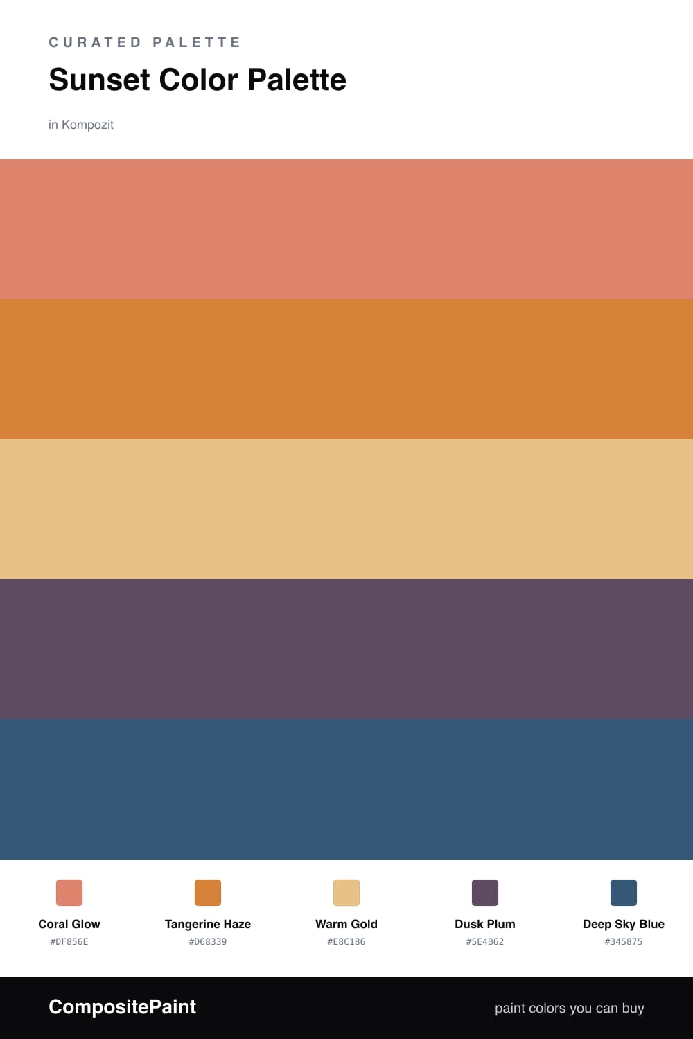
This is the sky in those last ten minutes before the sun drops, caught as paint. Coral Glow leads, soft and a little pink, the way warm light looks when it spills across a wall. Tangerine Haze sits just beside it, a touch deeper and more saturated, the glowing band right at the horizon.

Warm Gold is the calm in the middle. It reads almost neutral, so it gives your eyes somewhere to rest and lets the coral and tangerine feel intentional rather than loud. Use it generously on the largest surfaces and the brighter shades will hold their charge.

Then come the cool notes that make a sunset feel real. Dusk Plum is that smoky violet creeping in from the edges, and Deep Sky Blue is the clear evening overhead. Save both for smaller moments — a painted door, a ceiling, a run of shelving — and the whole scheme stays warm, modern, and quietly atmospheric.

Buy These Colors

Each color matched to the closest real paint in every brand, by ΔE2000. Kompozit first; take any SKU to the store — these mix on demand.

Coral Glow
#E08560 · LRV 33 · Dominant
Kompozit Summer Memory · 1052 ΔE 4.4
Backdrop Rosita · BD-RO ΔE 12.84
Behr Balcony Sunset · MQ4-38 ΔE 3.38
Benjamin Moore Golden Cherry · 069 ΔE 1.54
Clare Pink Sky · PNT100-MD-28 ΔE 11.6
Dunn-Edwards Bronzed Orange · DE5179 ΔE 2.89
Farrow & Ball Red Earth · No. 64 ΔE 7.2
Magnolia Home Vintage Crown · JG-152 ΔE 15.48
PPG / Glidden Summer Sunset · 1192-6 ΔE 3.6
Sherwin-Williams Copper Harbor · SW 6634 ΔE 3.59
Valspar Longhorn · 2007-5B ΔE 4.48
Tangerine Haze
#D9893E · LRV 33 · Secondary
Kompozit Mexican Spirit · 0984 ΔE 1.8
Backdrop Anita · BD-AN ΔE 18.11
Behr Pumpkin Toast · 270D-6 ΔE 3.66
Benjamin Moore Jack O'Lantern · 2156-30 ΔE 2.08
Clare Good as Gold · PNT100-DP-59 ΔE 11.68
Dunn-Edwards Suede Vest · DE5279 ΔE 2.81
Farrow & Ball India Yellow · No. 66 ΔE 9.68
Magnolia Home Vintage Crown · JG-152 ΔE 12.45
PPG / Glidden Carrot Cake · 1198-5 ΔE 5.58
Sherwin-Williams Serape · SW 6656 ΔE 2.52
Valspar Hazelnut Coffee · 3001-3A ΔE 0.85
Warm Gold
#E8C589 · LRV 59 · Base
Kompozit Egyptian Gold · 0905 ΔE 1.54
Backdrop Eames · BD-EA ΔE 2.4
Behr Ripe Wheat · 310E-3 ΔE 2.43
Benjamin Moore Goldfinch · 187 ΔE 0.8
Clare Golden Hour · PNT100-MD-23 ΔE 4.11
Dunn-Edwards Biscotti · DE5437 ΔE 3.3
Farrow & Ball Hay · No. 37 ΔE 3.53
Magnolia Home Heirloom Yellow · JG-43 ΔE 3.55
PPG / Glidden Gold Buff · 1208-4 ΔE 1.71
Sherwin-Williams White Raisin · SW 7685 ΔE 1.35
Valspar Delightful Moon · 3004-6A ΔE 2.56
Dusk Plum
#6B4E6E · LRV 10 · Support
Kompozit Vivid Vision · 1227 ΔE 4.54
Backdrop We Three Kings · BD-WK ΔE 20.06
Behr Prussian Plum · MQ1-39 ΔE 4.86
Benjamin Moore Passion Plum · 2073-30 ΔE 3.6
Clare Night Groove · PNT100-DP-77 ΔE 8.25
Dunn-Edwards Old-Fashioned Purple · DE6007 ΔE 3.66
Farrow & Ball Stiffkey Blue · No. 281 ΔE 19.25
Magnolia Home Coffee Nook · JG-96 ΔE 17.63
PPG / Glidden Positively Purple · 13-08 ΔE 5.12
Sherwin-Williams Impulsive Purple · SW 6832 ΔE 5.17
Valspar Purple Davenport · 1003-3A ΔE 4.51
Deep Sky Blue
#3A5878 · LRV 9 · Accent
Kompozit Happy Tune · 0648 ΔE 2.42
Backdrop We Three Kings · BD-WK ΔE 3.24
Behr Champlain Blue · HDC-CL-26 ΔE 3.26
Benjamin Moore Prussian Blue · CW-625 ΔE 2.11
Clare Deep Dive · PNT100-MD-40 ΔE 12.66
Dunn-Edwards Blue Earth · DE5853 ΔE 1.48
Farrow & Ball Stiffkey Blue · No. 281 ΔE 6.5
Magnolia Home Silos District · JG-92 ΔE 4.39
PPG / Glidden Mountain Lake · 1156-6 ΔE 4.45
Sherwin-Williams Endless Sea · SW 9150 ΔE 5.7
Valspar Sapphire Earbobs · 8003-46F ΔE 4.39

Questions

How do I keep this many warm colors from feeling overwhelming?

Let the soft gold do most of the work as your quiet base, then use the coral and tangerine in medium doses. The dusky plum and deep blue are your cool counterweights, so a little of each on trim or a single wall keeps the whole scheme from running hot.

Which color should I paint the most of?

Coral is the dominant shade here, so it leads. Think of it as roughly half the scheme, with gold filling in around it and the plum and blue saved for accents like a door, a ceiling, or built-in shelves.

Similar Palettes

Closest schemes by color — not by label.