CP

Pink, Blue & Purple Color Palette — Twilight Dreamscape

A soft four-color scheme blending dusky pink with airy sky blue and a muted lavender purple, grounded by warm greige — every color matched to real paint you can buy.

By Maya Patel · Reviews Editor & Product Tester

Lavender Mist
Dominant
Kompozit Purple Haze · 1255
#9C96C5
LRV 33
Dusk Rose
Secondary
Kompozit Moon Goddess · 0090
#D8A7AE
LRV 45
Powder Sky
Support
Kompozit Dancing in the Rain · 0644
#ABC5D6
LRV 53
Warm Greige
Base
Kompozit Feather Stone · 0229
#E3DED2
LRV 73
View palette in

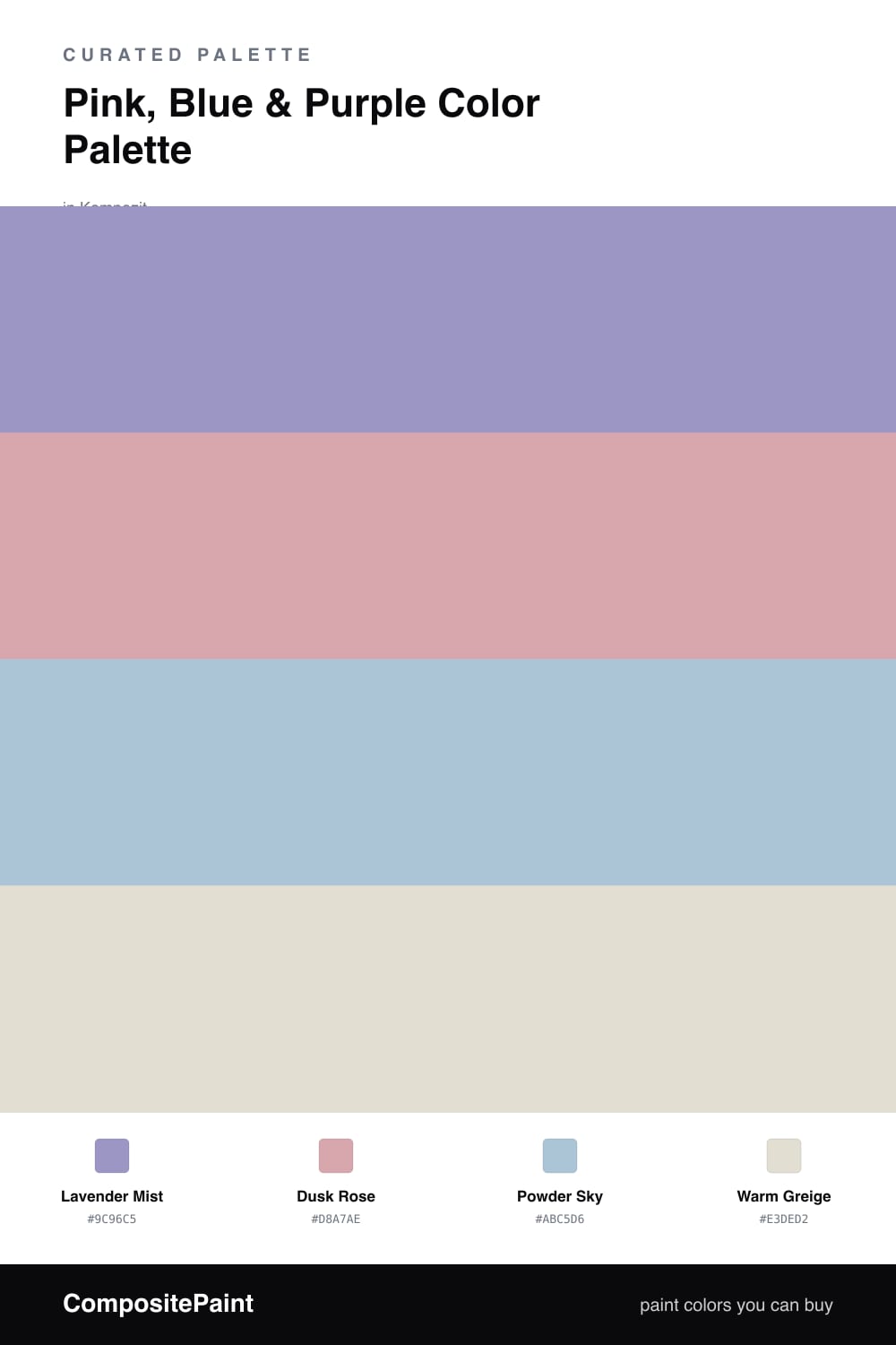
Pink, blue and purple sit side by side on the color wheel, which is exactly why this trio feels so easy together. The trick for 2026 is muting all three so they read soft and modern instead of sweet. A grayed-down Lavender Mist leads here because purple is the natural bridge between the warmer pink and the cooler blue.

Dusk Rose brings a quiet warmth without tipping into candy territory, and Powder Sky keeps the scheme feeling fresh and open. Used in smaller doses, these two play off the lavender instead of fighting it.

A Warm Greige base ties everything down and stops the palette from floating away. Lead with the lavender across your biggest surfaces, sprinkle the rose and blue as accents, and let the greige do the calm background work.

Buy These Colors

Each color matched to the closest real paint in every brand, by ΔE2000. Kompozit first; take any SKU to the store — these mix on demand.

Lavender Mist
#9D8FC4 · LRV 31 · Dominant
Kompozit Purple Haze · 1255 ΔE 2.81
Backdrop Polly Wants · BD-PW ΔE 17.68
Behr Ancestry Violet · S100-4 ΔE 3.2
Benjamin Moore Snugglepuss · 1405 ΔE 3.85
Clare Cosmic Vibes · PNT100-LT-32 ΔE 14.38
Dunn-Edwards Ode to Purple · DE5962 ΔE 4.09
Farrow & Ball Cook's Blue · No. 237 ΔE 15.97
Magnolia Home Times Past · JG-94 ΔE 19.61
PPG / Glidden Magic Carpet · 1248-6 ΔE 2.53
Sherwin-Williams Kismet · SW 6830 ΔE 3.99
Valspar Purpleheart · 8001-48D ΔE 3.33
Dusk Rose
#D8A5B0 · LRV 45 · Secondary
Kompozit Moon Goddess · 0090 ΔE 1.52
Backdrop Rosita · BD-RO ΔE 8.07
Behr Cinnamon Cocoa · 200E-3 ΔE 1.77
Benjamin Moore Hummingbird · 1271 ΔE 2.12
Clare Subrosa · PNT100-MD-76 ΔE 9.54
Dunn-Edwards Berry Riche · DE5094 ΔE 3.69
Farrow & Ball Cinder Rose · No. 246 ΔE 5.54
Magnolia Home Rosy Pink · JG-154 ΔE 13.88
PPG / Glidden Garden Party · 1182-4 ΔE 3.6
Sherwin-Williams Haute Pink · SW 6570 ΔE 5
Valspar Sugarplum Dance · 1006-6A ΔE 2.69
Powder Sky
#A9C4DC · LRV 53 · Support
Kompozit Dancing in the Rain · 0644 ΔE 2.76
Backdrop Lost in the 80s · BD-LO ΔE 3.95
Behr Caspian Tide · PPU14-13 ΔE 1.33
Benjamin Moore Palatial Skies · 800 ΔE 3.23
Clare Cloud Watching · PNT100-MD-73 ΔE 4.39
Dunn-Edwards Afternoon Sky · DE5877 ΔE 2.06
Farrow & Ball Parma Gray · No. 27 ΔE 7.26
Magnolia Home It Is Well · JG-76 ΔE 9.58
PPG / Glidden Blue Bows · 1158-3 ΔE 2.54
Sherwin-Williams Vast Sky · SW 6506 ΔE 5.16
Valspar Novella Blue · 4004-5B ΔE 1.25
Warm Greige
#E4DDD2 · LRV 73 · Base
Kompozit Feather Stone · 0229 ΔE 1.24
Backdrop Cookies & Cream · BD-CC ΔE 5.01
Behr Guesthouse · UL190-11 ΔE 1.54
Benjamin Moore Olympic Mountains · 971 ΔE 1.57
Clare No Filter · PNT100-LT-19 ΔE 2.32
Dunn-Edwards Linen White · DEC749 ΔE 2.89
Farrow & Ball School House White · No. 291 ΔE 1.39
Magnolia Home Soft Linen · JG-108 ΔE 0.5
PPG / Glidden Ash · 1076-2 ΔE 0.91
Sherwin-Williams Aesthetic White · SW 7035 ΔE 0.54
Valspar Asiago · 6005-1A ΔE 0.52

Questions

How do I keep pink, blue and purple from looking childish?

Pull every color toward grey. A dusty rose instead of bubblegum, a soft powder blue instead of bright, and a muted lavender instead of a saturated purple all read as grown-up and contemporary. The warm greige base keeps the whole thing calm and anchored.

Which color should lead in this scheme?

Let the lavender purple lead since it bridges the pink and blue naturally. Use it across the largest surfaces, bring in the dusk rose and powder sky in smaller doses, and let the warm greige carry the quiet background so nothing competes.

Similar Palettes

Closest schemes by color — not by label.