CP

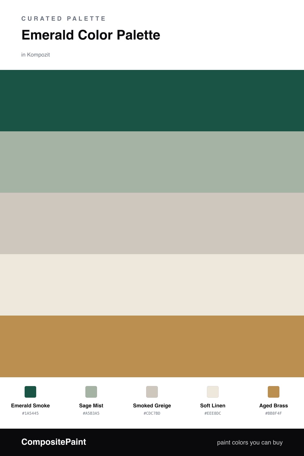
Emerald Color Palette — Emerald Smoke

A jewel-toned five-color scheme led by deep emerald, softened with smoky greige and warm cream, finished with a brass-bronze accent — every color matched to real paint you can buy.

By Maya Patel · Reviews Editor & Product Tester

Emerald Smoke
Dominant
Kompozit Cute Pixie · 0711
#1A5445
LRV 7
Sage Mist
Secondary
Kompozit Fair Maiden · 0456
#A5B3A5
LRV 43
Smoked Greige
Base
Kompozit Hidden Cove · 0210
#CDC7BD
LRV 58
Soft Linen
Support
Kompozit Hint of Vanilla · 0001
#EEE8DC
LRV 81
Aged Brass
Accent
Kompozit Bugle Boy · 0899
#BB8F4F
LRV 31
View palette in

Emerald is the deep green that earns its keep. Here Emerald Smoke leads — saturated enough to feel like a jewel, muted enough to sit quietly on a full wall. It is the anchor everything else leans on.

Around it I kept things soft. Sage Mist is a hazy green that bridges the bold and the calm, while Smoked Greige and Soft Linen open the scheme up and keep it from going heavy. These three do the breathing room work.

The trade-off with a green this rich is that it can feel flat on its own, so I added Aged Brass as the spark. A little warm metal in the lighting, hardware, or a frame catches the light and stops the emerald from reading cold. Lead with the green, keep the neutrals generous, and let the brass do the rest in small doses.

Buy These Colors

Each color matched to the closest real paint in every brand, by ΔE2000. Kompozit first; take any SKU to the store — these mix on demand.

Emerald Smoke
#1F5C4A · LRV 8 · Dominant
Kompozit Cute Pixie · 0711 ΔE 2.75
Backdrop North End · BD-NE ΔE 10.75
Behr Jungle Green · 490F-7 ΔE 3.21
Benjamin Moore Buffett Green · CW-535 ΔE 3.87
Clare Deep Dive · PNT100-MD-40 ΔE 14.75
Dunn-Edwards Billiard Table · DEA178 ΔE 2.01
Farrow & Ball Studio Green · No. 93 ΔE 16.44
Magnolia Home Weekend · JG-04 ΔE 13.27
PPG / Glidden Billiard Green · 1139-7 ΔE 3.09
Sherwin-Williams Espalier · SW 6734 ΔE 7.16
Valspar Northern Hemisphere · 5009-5 ΔE 3.97
Sage Mist
#9FB2A4 · LRV 42 · Secondary
Kompozit Fair Maiden · 0456 ΔE 1.9
Backdrop Le Freak · BD-LF ΔE 5.53
Behr Strong Winds · N380-4 ΔE 1.78
Benjamin Moore Garden Path · 466 ΔE 2.75
Clare Make Waves · PNT100-MD-43 ΔE 4.03
Dunn-Edwards Pistachio Ice Cream · DE5717 ΔE 2.45
Farrow & Ball Dix Blue · No. 82 ΔE 4.1
Magnolia Home Local Greenhouse · JG-68 ΔE 2.76
PPG / Glidden Dusty Aqua · 10-29 ΔE 1.92
Sherwin-Williams Vintage Vessel · SW 9050 ΔE 3.58
Valspar Sigh of Relief · V098-3 ΔE 2.47
Smoked Greige
#CBC7BC · LRV 57 · Base
Kompozit Hidden Cove · 0210 ΔE 1.27
Backdrop Real Real · BD-RR ΔE 3.2
Behr Wheat Bread · 720C-3 ΔE 2.07
Benjamin Moore London Fog · 1541 ΔE 0.8
Clare Windy City · PNT100-LT-08 ΔE 2.81
Dunn-Edwards Ice Gray · DEC790 ΔE 3.83
Farrow & Ball Pavilion Gray · No. 242 ΔE 2.31
Magnolia Home Earl Gray · JG-117 ΔE 1.54
PPG / Glidden Early Evening · 1006-3 ΔE 1.33
Sherwin-Williams Worldly Gray · SW 7043 ΔE 2.05
Valspar Notre Dame · 5006-1B ΔE 1.76
Soft Linen
#EFE9DC · LRV 82 · Support
Kompozit Hint of Vanilla · 0001 ΔE 0.48
Backdrop Jane · BD-JA ΔE 2.14
Behr Ivory Palace · PPU10-14 ΔE 0.54
Benjamin Moore Stoneware · CSP-245 ΔE 1.12
Clare Like Buttah · PNT100-LT-62 ΔE 2.59
Dunn-Edwards Abstract White · DE6232 ΔE 0.94
Farrow & Ball James White · No. 2010 ΔE 2.17
Magnolia Home Antique Rose · JG-23 ΔE 0.22
PPG / Glidden Cream Puff · 1078-1 ΔE 0.5
Sherwin-Williams Creamy · SW 7012 ΔE 0.52
Valspar Shell White · 7007-12 ΔE 0.85
Aged Brass
#B68A4E · LRV 29 · Accent
Kompozit Bugle Boy · 0899 ΔE 1.82
Backdrop Anita · BD-AN ΔE 13.1
Behr Rice Curry · MQ4-9 ΔE 1.19
Benjamin Moore Golden Retriever · 2165-30 ΔE 1.48
Clare Good as Gold · PNT100-DP-59 ΔE 6.59
Dunn-Edwards Bread Crust · DE5370 ΔE 2.52
Farrow & Ball Red Earth · No. 64 ΔE 16.79
Magnolia Home Vintage Crown · JG-152 ΔE 5.24
PPG / Glidden Allegro · 1090-6 ΔE 2.77
Sherwin-Williams Rookwood Amber · SW 2817 ΔE 4.87
Valspar Sand Mountain · 8003-21E ΔE 1.36

Questions

Why does emerald feel so right for 2026?

Deep greens read as calm and grown-up without going cold. Emerald has the richness of a jewel tone but still acts like a neutral, so it grounds a room the way a deep navy used to.

How much emerald is too much?

Let it lead but not swallow the space — think roughly two-thirds emerald, one-third the soft neutrals, with the brass accent in small touches like hardware or a frame.

Similar Palettes

Closest schemes by color — not by label.