CP

Emerald Color Palette — Emerald Canyon

A rich five-color scheme led by deep emerald, warmed with stone and clay and lifted by a brass accent — every color matched to real paint you can buy.

By David Chen · Formulation Lead & Resident Chemist

Emerald Canyon
Dominant
Kompozit Cute Pixie · 0711
#1A5445
LRV 7
Sage Mist
Secondary
Kompozit Hidden Glade · 0744
#98AD8E
LRV 39
Quarry Stone
Base
Kompozit Elusive White · 0002
#E8E3D6
LRV 77
Warm Clay
Support
Kompozit Cowhide · 0155
#CDA688
LRV 42
Antique Brass
Accent
Kompozit Millionaire · 0907
#B6843C
LRV 27
View palette in

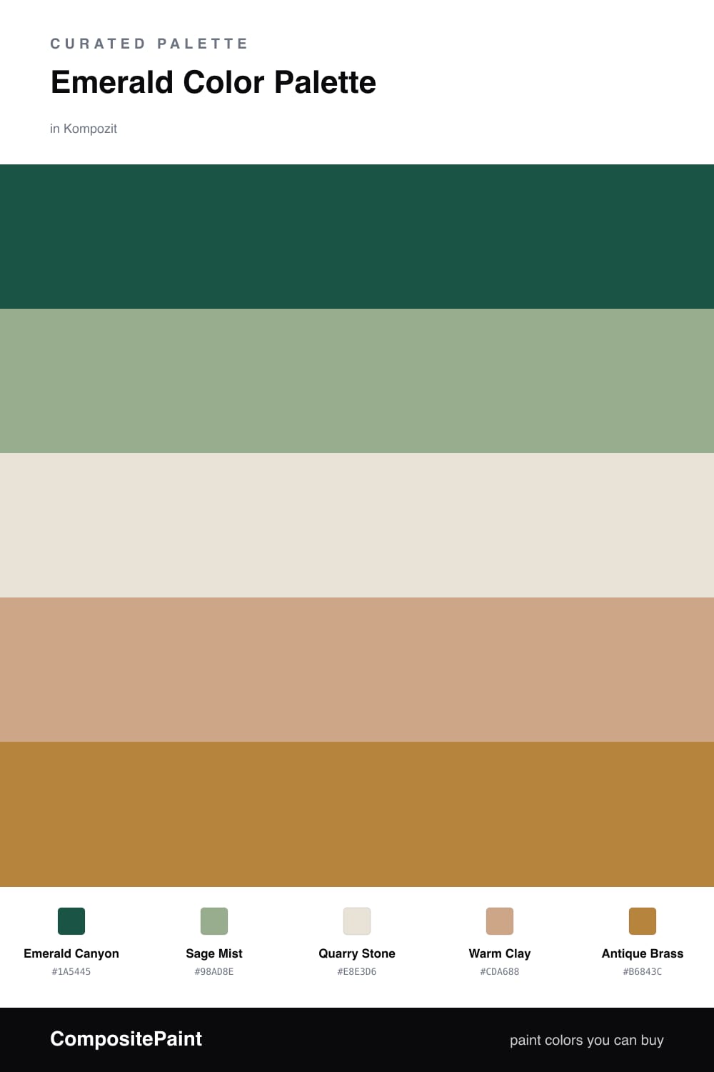
Think of Emerald Canyon as a deep forest pool catching late light. The dominant Emerald Canyon green has a faint blue undertone, which is what keeps it from feeling flat or minty. That cool depth is the anchor everything else leans on.

Around it I placed Sage Mist as a softer green echo and Quarry Stone as a quiet, warm-white base that lets your eyes rest. Warm Clay brings a touch of earth to balance all that cool green, the way a sandy bank warms up the edge of water.

The spark is Antique Brass. Use it sparingly, on hardware, a frame, or a single fixture, and it picks up the warmth in the clay while giving the whole scheme a contemporary, slightly luxe finish that feels right for 2026.

Buy These Colors

Each color matched to the closest real paint in every brand, by ΔE2000. Kompozit first; take any SKU to the store — these mix on demand.

Emerald Canyon
#1F5C4A · LRV 8 · Dominant
Kompozit Cute Pixie · 0711 ΔE 2.75
Backdrop North End · BD-NE ΔE 10.75
Behr Jungle Green · 490F-7 ΔE 3.21
Benjamin Moore Buffett Green · CW-535 ΔE 3.87
Clare Deep Dive · PNT100-MD-40 ΔE 14.75
Dunn-Edwards Billiard Table · DEA178 ΔE 2.01
Farrow & Ball Studio Green · No. 93 ΔE 16.44
Magnolia Home Weekend · JG-04 ΔE 13.27
PPG / Glidden Billiard Green · 1139-7 ΔE 3.09
Sherwin-Williams Espalier · SW 6734 ΔE 7.16
Valspar Northern Hemisphere · 5009-5 ΔE 3.97
Sage Mist
#9DAE9B · LRV 40 · Secondary
Kompozit Hidden Glade · 0744 ΔE 4.29
Backdrop Le Freak · BD-LF ΔE 3.92
Behr Green Balsam · PPU11-15 ΔE 2.83
Benjamin Moore Norway Spruce · 452 ΔE 1.22
Clare Mellow Mood · PNT100-DP-78 ΔE 5.5
Dunn-Edwards Casting Shadow · DE6291 ΔE 5.97
Farrow & Ball Dix Blue · No. 82 ΔE 6.14
Magnolia Home Weathered Windmill · JG-15 ΔE 8.7
PPG / Glidden Wandering Willow · 1031-3 ΔE 6.18
Sherwin-Williams Restful · SW 6458 ΔE 4.14
Valspar Sigh of Relief · V098-3 ΔE 2.83
Quarry Stone
#EAE3D6 · LRV 77 · Base
Kompozit Elusive White · 0002 ΔE 1
Backdrop Don't Eat the Yellow Snow · BD-DS ΔE 4.38
Behr Pavillion · QE-09 ΔE 1.05
Benjamin Moore Seapearl · 961 ΔE 1.89
Clare On Point · PNT100-LT-11 ΔE 3.08
Dunn-Edwards Crisp Muslin · DE6212 ΔE 0.91
Farrow & Ball Dimity · No. 2008 ΔE 1.87
Magnolia Home Shiplap · JG-22 ΔE 2.97
PPG / Glidden French Cream · 14-15 ΔE 0
Sherwin-Williams Panda White · SW 6147 ΔE 0.56
Valspar Quail Egg · 7002-12 ΔE 0.52
Warm Clay
#C9A98A · LRV 43 · Support
Kompozit Cowhide · 0155 ΔE 2.66
Backdrop Rosita · BD-RO ΔE 11.96
Behr Riviera Clay · UL130-8 ΔE 2.13
Benjamin Moore Hidden Oaks · 1129 ΔE 1.39
Clare Subrosa · PNT100-MD-76 ΔE 10.92
Dunn-Edwards Cliff Brown · DEC711 ΔE 1.95
Farrow & Ball Jitney · No. 293 ΔE 6.38
Magnolia Home Embossed Letter · JG-106 ΔE 6.5
PPG / Glidden Yosemite Trailhead · 15-04 ΔE 1
Sherwin-Williams Beige Intenso · SW 9096 ΔE 1.42
Valspar Gentility · T516 ΔE 1.05
Antique Brass
#B08D3C · LRV 29 · Accent
Kompozit Millionaire · 0907 ΔE 5.75
Backdrop Anita · BD-AN ΔE 15.65
Behr Lion Mane · 320D-6 ΔE 3.38
Benjamin Moore Golden Chalice · 2151-20 ΔE 1.87
Clare Good as Gold · PNT100-DP-59 ΔE 7.87
Dunn-Edwards Pirate's Gold · DEA168 ΔE 0.97
Farrow & Ball India Yellow · No. 66 ΔE 7.39
Magnolia Home Vintage Crown · JG-152 ΔE 9.03
PPG / Glidden Butterscotch Ripple · 1106-7 ΔE 3.29
Sherwin-Williams Different Gold · SW 6396 ΔE 3.94
Valspar Corduroy · 3007-5A ΔE 3.01

Questions

Why does emerald work as the lead color?

Emerald is a deep green with a blue undertone, so it reads as calm and grounded rather than bright. Surrounded by soft stone and clay neutrals, it feels like the steady center of the room instead of a loud statement.

How much of each color should I use?

Let emerald carry most of the space, roughly two-thirds, then spread the sage and the stone neutrals across the rest. Save the warm clay and the brass for small touches so the accent stays special.

Similar Palettes

Closest schemes by color — not by label.