CP

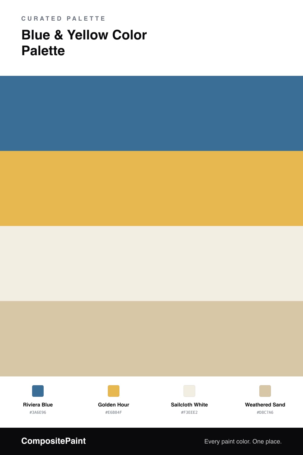
Blue & Yellow Color Palette — Riviera Afternoon

A breezy four-color scheme pairing a clear Mediterranean blue with a soft golden yellow, balanced by warm white and weathered sand — every color matched to real paint you can buy.

By Emily Roberts · DIY Editor & First-Timer's Guide

Blue and yellow is one of those pairings that just feels like good weather. This scheme leans on a clear Riviera Blue as the anchor and a soft Golden Hour yellow as the warm spark, so the whole thing reads sunny without ever getting loud.

The two brights need a little quiet space around them, and that is the job of Sailcloth White and Weathered Sand — a creamy white and a gentle, slightly grayed tan that keep everything grounded and a touch contemporary for 2026. Without those calm neutrals, blue and yellow side by side can tip into beachy-cliche territory, so let them do the soft work in the background.

If you are wondering where to start, let the blue lead, use the yellow in smaller doses, and let the two neutrals carry the rest. That is really all there is to it.

View palette in
Riviera Blue
Dominant
Dunn-Edwards Rainy Lake · DE5852
#3F6C8F
LRV 13
Golden Hour
Secondary
Glidden Golden Rae · 30YY 49/562
#E4BA50
LRV 49
Sailcloth White
Base
Valspar Wings of an Angel · V153
#F3EEE2
LRV 86
Weathered Sand
Support
Diamond Vogel Spanish Cream · 0295
#D7C6A4
LRV 57

Buy These Colors

Each color matched to the closest real paint in every brand, by ΔE2000. Tap a swatch for its full guide or + to save it — take any SKU to the store, they mix on demand.

Riviera Blue
#3A6E96 · LRV 14 · Dominant
Sherwin-Williams · SW 6516 · ΔE 4.48
Behr · 570D-6 · ΔE 1.57
Benjamin Moore · 804 · ΔE 1.79
Valspar · V069-5 · ΔE 5.63
PPG / Glidden · PPG1158-6 · ΔE 3.15
Glidden · PPG1158-6 · ΔE 2.84
Dutch Boy · 140-6DB · ΔE 1.87
HGTV Home by Sherwin-Williams · HGSW 2372 · ΔE 4.48
Dunn-Edwards · DE5852 · ΔE 1.4
Magnolia Home · JG-85 · ΔE 9.15
Farrow & Ball · NO. W29 · ΔE 5.69
Diamond Vogel · H056 · ΔE 3.98
Hirshfield's · 0619 · ΔE 2.62
Rodda · R088 · ΔE 8.13
C2 Paint · BD26 · ΔE 8.18
Clare · PNT100-MD-41 · ΔE 3.23
Portola Paints · NEWBURY PORT · ΔE 11.03
Annie Sloan · GIVERNY · ΔE 13.33
Backdrop · BD-MJ · ΔE 8.11
Rust-Oleum · 329207 · ΔE 4.8
Kompozit · 0619 · ΔE 2.62
Golden Hour
#E6B84F · LRV 52 · Secondary
Sherwin-Williams · SW 6683 · ΔE 2.88
Behr · M290-5 · ΔE 1.74
Benjamin Moore · 300 · ΔE 1.77
Valspar · 3006-3A · ΔE 1.3
PPG / Glidden · PPG1209-5 · ΔE 2.5
Glidden · 30YY 49/562 · ΔE 1.22
Dutch Boy · 115-5DB · ΔE 2.88
HGTV Home by Sherwin-Williams · HGSW 1222 · ΔE 4.3
Dunn-Edwards · DE5354 · ΔE 1.75
Magnolia Home · JG-45 · ΔE 6.27
Farrow & Ball · NO. 9915 · ΔE 4.5
Diamond Vogel · 0864 · ΔE 1.77
Hirshfield's · 0815 · ΔE 2.59
Rodda · CA132 · ΔE 8.61
C2 Paint · C2-636 · ΔE 3.13
Clare · PNT100-MD-23 · ΔE 5.85
Portola Paints · ANTIGUA · ΔE 14.9
Annie Sloan · TILTON · ΔE 1.74
Backdrop · BD-EA · ΔE 6.76
Rust-Oleum · 398641 · ΔE 15.73
Kompozit · 0815 · ΔE 2.59
Sailcloth White
#F3EEE2 · LRV 86 · Base
Sherwin-Williams · SW 7566 · ΔE 0.44
Behr · ECC-61-2 · ΔE 1.17
Benjamin Moore · ES-01 · ΔE 0.89
Valspar · V153 · ΔE 0
PPG / Glidden · PPG1100-1 · ΔE 1.19
Glidden · PPG1208-1 · ΔE 0.99
Dutch Boy · 020W · ΔE 1.76
HGTV Home by Sherwin-Williams · HGSW 4003 · ΔE 0.44
Dunn-Edwards · DEW339 · ΔE 1.22
Magnolia Home · JG-107 · ΔE 2.3
Farrow & Ball · NO. 2003 · ΔE 0.52
Diamond Vogel · 0007 · ΔE 0.83
Hirshfield's · 0012 · ΔE 0.58
Rodda · CA007 · ΔE 0.52
C2 Paint · C2-708 · ΔE 1.11
Clare · PNT100-LT-24 · ΔE 3.26
Portola Paints · ORIGAMI · ΔE 3.09
Annie Sloan · OLD OCHRE · ΔE 11.62
Backdrop · BD-JA · ΔE 1.51
Rust-Oleum · 329598 · ΔE 4.19
Kompozit · 0012 · ΔE 0.58
Weathered Sand
#D8C7A6 · LRV 58 · Support
Sherwin-Williams · SW 6120 · ΔE 1.7
Behr · ECC-54-1 · ΔE 1.59
Benjamin Moore · HC-177 · ΔE 1.05
Valspar · M118 · ΔE 2.35
PPG / Glidden · PPG1026-2 · ΔE 2.3
Glidden · 30YY 58/178 · ΔE 0.99
Dutch Boy · 415-2DB · ΔE 1.7
HGTV Home by Sherwin-Williams · HGSW 2187 · ΔE 1.7
Dunn-Edwards · DE6199 · ΔE 1.75
Magnolia Home · JG-105 · ΔE 3.91
Farrow & Ball · NO. 9907 · ΔE 2.41
Diamond Vogel · 0295 · ΔE 0.42
Hirshfield's · 0329 · ΔE 1.23
Rodda · CA112 · ΔE 3.53
C2 Paint · C2-638 · ΔE 3.28
Clare · PNT100-MD-63 · ΔE 7.58
Portola Paints · EL MATADOR · ΔE 2.63
Annie Sloan · OLD OCHRE · ΔE 2.4
Backdrop · BD-AU · ΔE 9.79
Rust-Oleum · 398641 · ΔE 4.92
Kompozit · 0329 · ΔE 1.23

Questions

Will this blue and yellow look too nautical or themed?

It can if you go all-in on bright primary blue and bright primary yellow. The trick here is that Riviera Blue is a touch grayed and Golden Hour is soft and warm, not lemon. Add the cream and sand neutrals and it reads relaxed and modern instead of beach-house costume.

How much of each color should I actually use?

Let the blue lead, roughly half to two-thirds of what you see, with the yellow as an accent in about one-fifth of the space. Sailcloth White and Weathered Sand fill in the rest so the blue and yellow always have calm space around them.

KEEP EXPLORING

Similar Palettes

Closest schemes by color — not by label.