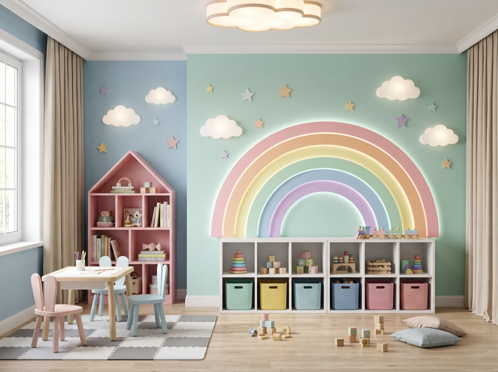
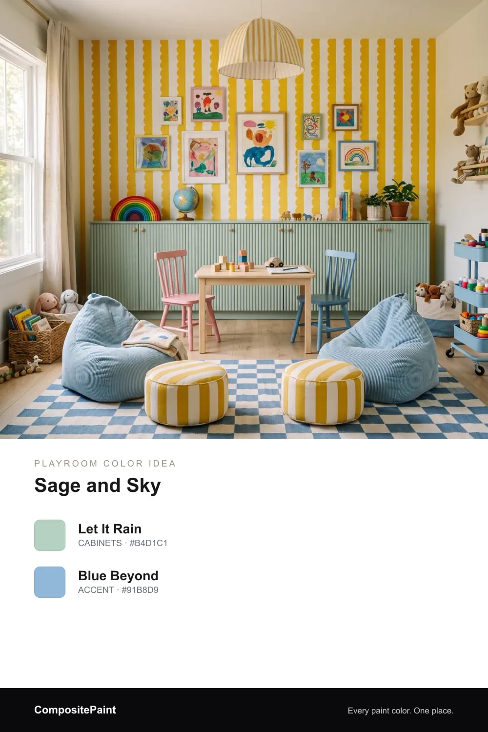
CP

12 Playroom Color Ideas

A playroom should feel happy the second you walk in, but still calm enough for real play. The right colors can do both at once, giving kids a space that's fun now and easy to grow into later. Here are twelve playroom looks to help you find the one that fits your family.

By Jessica Williams · Color Stylist

1. Sage and Sky

Playroom painted in Basket of Gold — Sage and Sky

Soft sage cabinets in Let It Rain meet a gentle sky-blue accent in Blue Beyond for a happy, easygoing room kids can play in for hours.

Walls
Basket of Gold
#F4CC3C
Kompozit
Cabinet
Dreamcatcher
#9CC1B2
Benjamin Moore
Sofa
San Francisco Bay
#79A7C5
Benjamin Moore
Cushions
Yellow Gold
#E2BA30
Behr
Rug
Zenith
#497A9F
Kompozit

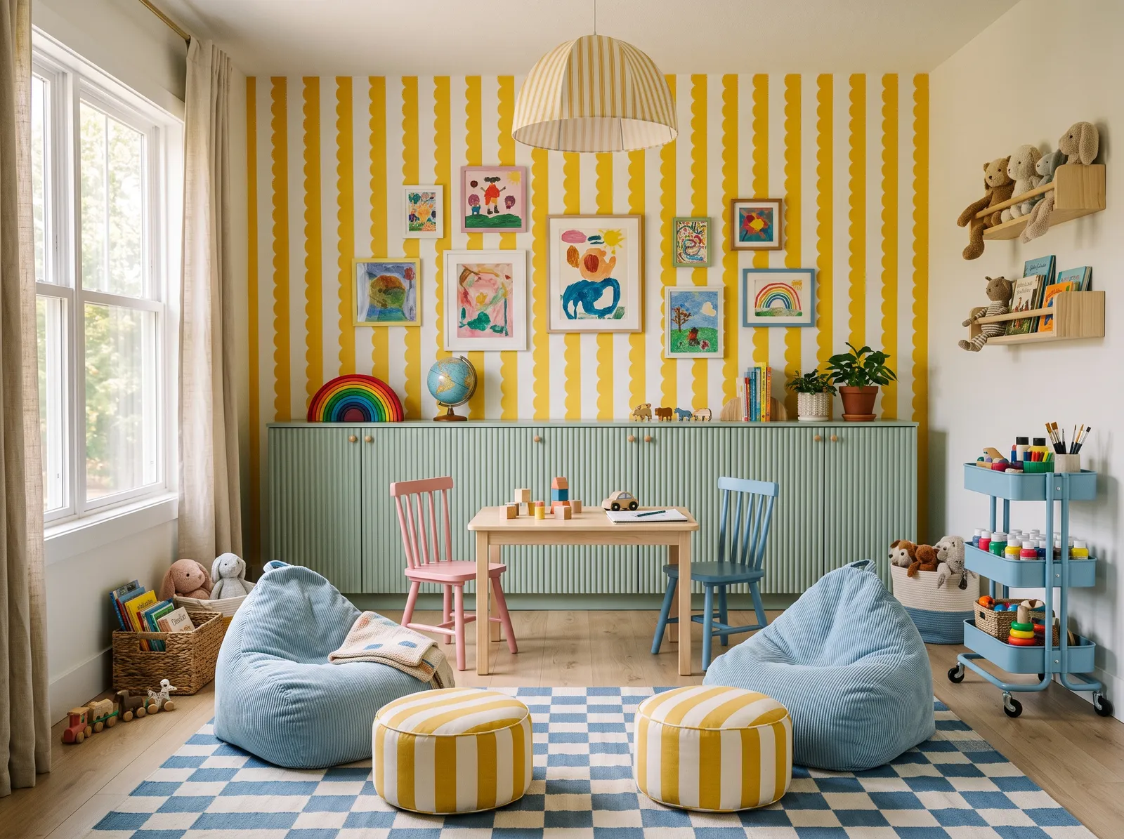
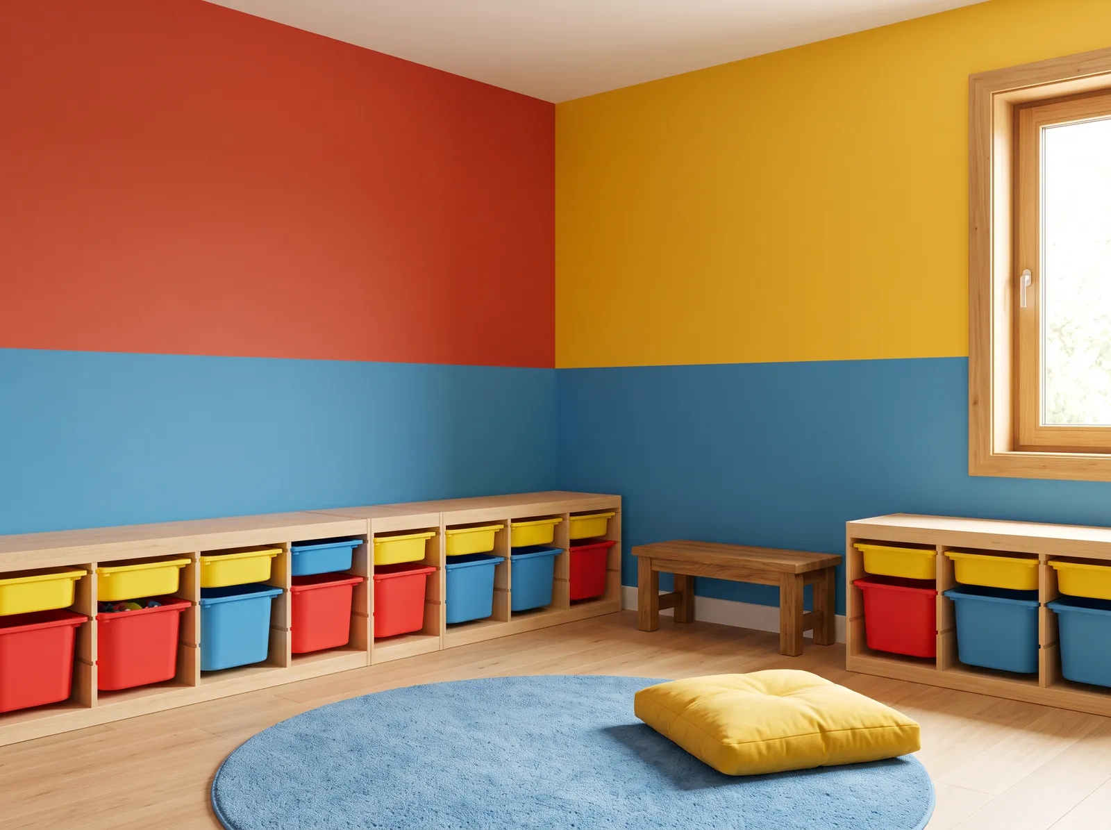
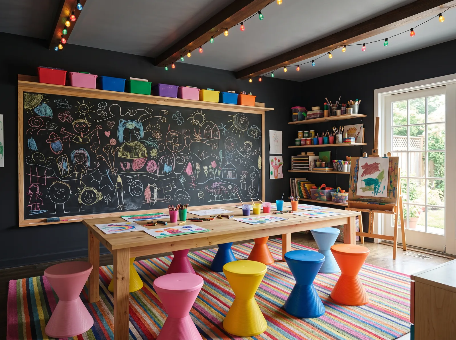
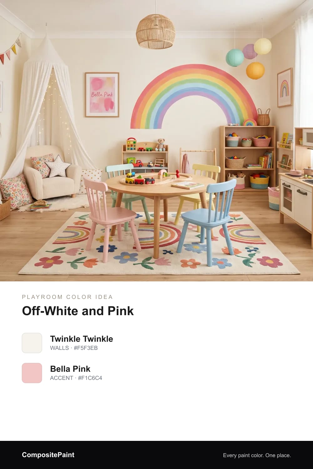
Sunny yellow is a joyful, high-energy color that instantly sparks creativity. Here, bold yellow and white striped walls pair with a soft mint green cabinet. A light wood table sits between colorful chairs, flanked by cozy sky-blue bean bags and a checkered blue rug. Striped yellow poufs tie the look together. The room feels incredibly cheerful, bright, and full of life. Cool blues and greens beautifully balance the warm yellow, keeping the high-energy pattern from feeling overwhelming. It is perfect for families wanting a stimulating, happy space for kids to play.

See it in your room

2. Soft White Canvas

Playroom painted in Fossil — Soft White Canvas

Creamy White Snow walls and crisp Warm White trim make a bright, simple base that lets colorful toys, rugs, and art do the talking.

Walls
Fossil
#F4F1EB
Dunn-Edwards
Table
Honey Glow
#E0BF99
Kompozit
Chairs
Lemon Zest
#E7C630
Dunn-Edwards
Cushions
Fiery Orange
#DA6D2B
Glidden
Rug
Snowed In
#EAE8E1
Valspar

Cream is the ultimate friendly backdrop for a space meant for imagination. In this cheerful playroom, that soft cream covers the walls, letting the white storage cubbies, light wood table, and colorful wooden chairs shine. A playful polka-dot rug anchors the center of the room, while plush pink and orange beanbags offer cozy spots to lounge. The entire space feels incredibly bright, energetic, and welcoming. Keeping the walls neutral ensures the rainbow of toys and furniture pops without feeling chaotic. It is perfect for active kids and design-conscious parents alike.

See it in your room

3. Warm Cream Sunshine

Playroom painted in Pale Almond — Warm Cream Sunshine

Warm Bunny Cake walls and soft Milk Glass trim wrap the room in gentle sunshine, cozy and bright even on the grayest days.

Walls
Pale Almond
#E7DBC3
Benjamin Moore
Cabinet
Sesame
#D0A678
Behr
Cushions
Zenith
#567FA3
Diamond Vogel
Chairs
Green Silk
#A2C2B0
PPG / Glidden

Cream is a soft, buttery off-white that instantly makes a space feel like a sunny afternoon. In this cheerful playroom, that warm cream coats the walls, creating a bright backdrop for the natural wood cabinets and small wooden table. A mint green chair, a mustard yellow pouf, and a slate blue floor cushion add playful pops of color, while the floral rug ties everything together. The room feels incredibly bright, happy, and calm. This combination works because the earthy wood tones ground the colorful accents beautifully. It is perfect for active families.

See it in your room

4. Mint, Blue and Pink

Playroom painted in Dreamcatcher — Mint, Blue and Pink

Minty Shimmering Glade walls with sky-blue Liam Blue and soft pink Jovial accents feel like a quiet rainbow that won't tire little eyes.

Walls
Dreamcatcher
#9CC1B2
Benjamin Moore
Walls
Calm Tint
#8DB1CE
Kompozit
Cabinet
Garden Party
#E2A5B8
PPG / Glidden
Curtains
Brick House Tan
#C8BCA7
Benjamin Moore
Chairs
Alluring Blue
#9EC4CD
Behr

Mint green is a fresh, cheerful pastel that instantly brightens up a child's space. Here, it covers the main wall, paired with soft sky blue on the side, a pink house-shaped cabinet, light blue and pink chairs, and a grey-and-white checkered rug. The room feels incredibly playful, bright, and full of wonder. This combination works because the soft pastel tones share the same light intensity, keeping the colorful rainbow theme cohesive rather than chaotic. It is perfect for parents who want to design a magical, creative playroom.

See it in your room

5. Cream and Terracotta

Playroom painted in Shallot Bulb — Cream and Terracotta

Soft Bone White walls and warm Russet Red cabinets give the room a cozy, storybook feel with a grown-up touch kids won't outgrow.

Walls
Shallot Bulb
#7A8D73
Behr
Cabinet
Vintage Redware
#9A4B3D
Benjamin Moore
Sofa
Elmira White
#DBD3C3
Benjamin Moore
Rug
China White
#EAE5D8
PPG / Glidden
Cushions
Pony Brown
#8D6345
Benjamin Moore

Sage green is a dusty, nature-inspired shade that brings the outdoors inside. In this playful nursery, sage green stripes cover the upper walls, while a warm cream coats the lower paneling. A rustic terracotta-red cabinet anchors the corner, paired with a soft beige bench, a braided cream rug, and a cozy brown cushion. The space feels incredibly whimsical, calm, and snug. This combination works beautifully because the earthy red cabinet provides a bold, grounding contrast to the soft, airy greens and creams. It is perfect for parents who want a gender-neutral space with vintage charm.

See it in your room

6. Primary Color Blocks

Playroom painted in Tomato Tango — Primary Color Blocks

Blocks of Bonfire Flame red, Sun Drops yellow, and Sailor's Sea Blue make a bold, joyful room that begs kids to jump into play.

Walls
Tomato Tango
#BF3F2D
Benjamin Moore
Walls
Sun Drops
#E9B328
Diamond Vogel
Walls
Pat-a-Pep
#3780B9
Valspar
Rug
Lazy Sunday
#5E8FB6
Benjamin Moore
Cushions
Sun Valley
#E4BC3B
Benjamin Moore
Cabinet
Sandstone Cliff
#D7BB98
Valspar

Primary red is a bold, energetic crimson that instantly grabs your attention. In this playful space, the walls are split into blocks of vibrant red, sunny yellow, and deep sky blue, while light wood cabinets hold matching colorful storage bins. A soft blue circular rug anchors the center of the room, topped with a plump yellow floor cushion. The entire room feels incredibly cheerful, bright, and full of youthful energy. This classic primary color combination works because the high-contrast blocks stimulate creativity and keep the mood upbeat. It is perfect for a lively kids' playroom.

See it in your room

7. Soft Blue Stripes

Playroom painted in Calm Tint — Soft Blue Stripes

Soft blue Pompeii Ruins walls and clean New House White trim feel calm and cheerful, an easy backdrop for quiet, focused play.

Walls
Calm Tint
#93B3CE
Diamond Vogel
Cabinet
Covered Wagon
#CDA885
Glidden
Rug
Paradise Found
#769BC1
Valspar
Trim
Lighthouse
#F3F4F4
Dunn-Edwards
Table
Morning Mist
#E5EDF1
Dunn-Edwards

Sky blue is a breezy, lighthearted pastel that instantly brings a sense of calm. In this playful space, sky blue and crisp white stripes adorn the walls, while natural wood cabinets line the back. A soft blue dotted rug anchors the room, matching the white and blue kids' table set. The entire setup feels incredibly cheerful, bright, and organized. Pairing cool blues with warm, natural wood keeps the space from feeling too chilly while maintaining a clean look. It is perfect for parents who want a serene play area that sparks creativity.

See it in your room

8. Off-White and Pink

Playroom painted in Westhighland White — Off-White and Pink

Warm off-white Twinkle Twinkle walls with a soft Bella Pink accent keep things light, sweet, and gentle without ever going overboard.

Walls
Westhighland White
#F3EEE3
Sherwin-Williams
Table
Farm Fresh
#C49F78
Benjamin Moore
Chairs
Blue Magpie
#8BB5D9
Valspar
Sofa
Bright Moon
#F6F1E5
Behr
Rug
Adobe White
#F1EBD8
PPG / Glidden

Cream is the ultimate friendly base color for a space meant for play. Here, it wraps the walls, while a matching cream armchair sits under a cozy canopy. The wooden table and cabinets ground the room, surrounded by pastel chairs in soft pink, blue, and yellow, all resting on a playful rainbow-patterned rug. The space feels incredibly cheerful, bright, and inviting. This combination works beautifully because the neutral backdrop lets the soft pastel accents pop without feeling overwhelming. It is perfect for parents who want a stylish yet fun playroom.

See it in your room

9. Bold Chalkboard Den

Playroom painted in Tuxedo — Bold Chalkboard Den

Deep Hocus Pocus walls and an Anchor Gray ceiling turn the room into a cozy art den where chalk drawings and bright toys really pop.

Walls
Tuxedo
#22262B
Valspar
Table
Butterscotch Drop
#CE9F6A
Dutch Boy
Chairs
Springtime Bloom
#E47DA7
Benjamin Moore
Rug
Feverish Pink
#CB3E50
Sherwin-Williams
Ceiling
Metropolis Mood
#9FA4A8
Diamond Vogel

Charcoal is a deep, dramatic gray that acts like a blank canvas. In this creative art room, the dark charcoal walls frame a massive chalkboard and contrast beautifully with the light wood craft table. Surrounding the table are playful, hourglass-shaped plastic stools in rainbow shades, all resting on a vibrant, multi-colored striped rug. The space feels incredibly cheerful, energetic, and ready for imagination. The dark background makes all those bright primary and secondary colors pop like neon lights. It is perfect for families who want to inspire endless creativity in their kids.

See it in your room

10. Sunny Yellow Scallops

Playroom painted in Fortune Cookie — Sunny Yellow Scallops

Golden Lemon Dream paired with soft Whisper White brings instant sunshine, a warm and happy mood even when it's cloudy outside.

Walls
Fortune Cookie
#DAA436
Dunn-Edwards
Accent
Blank Canvas
#F1EDE1
Behr
Table
Autumn Red
#EB8A99
Benjamin Moore
Chairs
Blueberry
#1A5E89
Benjamin Moore
Cabinet
Practical Tan
#D3BFA0
Behr

Sunny yellow is a cheerful, energetic shade that instantly brings happiness into a space. In this playful room, a scalloped yellow accent wraps around cream walls, paired with light wood toy cabinets. A bright pink table sits in the center, flanked by a deep blue chair and a forest green chair, all resting on a teal leopard-print rug. The space feels incredibly joyful, bright, and full of creative energy. The combo works because the neutral cream and natural wood ground the explosion of primary and pastel accents. It is perfect for a lively kids' playroom.

See it in your room

11. Purple, Green and Gold

Playroom painted in Linwood Beach White — Purple, Green and Gold

Soft purple Pleasant Dream with bright Blarney Stone green and Gusto Gold accents make a lively, magical room full of color and play.

Walls
Linwood Beach White
#F6F2E2
Glidden
Accent
Jade Green
#00874A
Benjamin Moore
Accent
Grape Popsicle
#966AA3
PPG / Glidden
Sofa
Petunia Petal
#E39CB5
Dutch Boy
Cabinet
Rose Mallow
#F4AAC7
Kompozit
Rug
Beautiful Blue
#186DB6
Dunn-Edwards

Cream is a soft, warm off-white that keeps spaces feeling bright and open. Here, it pairs with bold green and purple striped walls, a sweet pink bookshelf, a matching pink and purple modular sofa, and a multi-colored flower rug. The room feels incredibly cheerful, energetic, and full of youthful wonder. This combination works because the neutral upper wall balances the high-contrast stripes below, preventing the vibrant colors from overwhelming the space. It is perfect for parents who want to create a magical, imaginative playroom for their little ones.

See it in your room

12. Off-White and Red

Playroom painted in Drabware — Off-White and Red

Calm Dogwood Blossom off-white walls let cheerful Red Geranium cabinets stand out, a bright, energetic mix that still feels grounded.

Walls
Drabware
#E5DDD4
C2 Paint
Ceiling
Flurries
#F3EDE6
Behr
Cabinet
Hot Jazz
#BC3033
Dunn-Edwards
Rug
Clearest Ocean Blue
#3195CA
Benjamin Moore
Accent
Roasted Cashew
#CBA77C
Valspar

Cream is a gentle, warm off-white that keeps spaces feeling bright and open. In this active playroom, the cream walls and soft white ceiling frame a natural wood climbing gym, while deep red storage cabinets line the back wall and a multi-colored foam rug covers the floor. The room feels incredibly cheerful, energetic, and ready for adventure. This combination works because the quiet, neutral walls let the vibrant primary colors of the mats pop without overwhelming the senses. It is perfect for families wanting a high-energy play zone that still feels organized.

See it in your room

See it in your own playroom

Upload a photo of your playroom and the visualizer paints your walls in any of these colors — in seconds.

UPLOAD YOUR PHOTO →

About Playroom Color Ideas

Playroom Color Trends for 2026

Playrooms are getting softer and smarter this year. Instead of loud primary everything, parents are leaning into gentle greens, warm creams, dusty blues, and muted pinks that feel calm but still cheerful. The big idea is balance: a soft, restful base on the walls, then pops of brighter color in the accents, toys, and rugs. Earthy tones like terracotta and sage are showing up too, because they feel cozy and grown-up enough to last past the toddler years. The look that's winning is happy, but never overwhelming.

Cheerful Colors That Aren't Overstimulating

A playroom can be fun without buzzing with energy all day. The trick is to pick happy colors in their softer forms. Think a muted mint instead of bright lime, a dusty sky blue instead of electric blue, a warm butter yellow instead of neon. These colors still feel cheerful and young, but they don't keep little eyes and brains running at full speed. They make it easier for kids to settle into quiet play, reading, and rest, while the room still feels bright and inviting.

Soft Neutrals as a Calm Backdrop

Warm whites and creams are a smart starting point for any playroom. A color like a soft off-white or warm cream on the walls gives you a calm, flexible backdrop that lets all the fun stuff stand out. Toys, books, rugs, and art bring the color, and you can swap them out as your child grows without ever repainting. Neutrals also bounce light around, so even a small or shady room feels bright. If you want a space that stays peaceful and easy to update, start neutral and add color in the details.

Adding Fun With an Accent Wall or Color Pop

You don't need to drench the whole room in color to make it feel playful. One accent wall, a painted arch, or a band of color along the bottom can do all the work. A soft pink, a happy blue, or a sunny yellow on just one wall gives the room personality while keeping the rest calm. This is also the easiest part to change later, so you can let your child help pick the accent and update it as their taste shifts. A little color goes a long way.

Colors Kids Grow With (Not Too Babyish)

It's tempting to go full nursery pastel, but kids grow fast and tastes change. The colors that last are the ones that aren't tied to a tiny age. Soft sage, warm cream, dusty blue, gentle terracotta, and muted gray-blue all feel just as right for a ten-year-old as a two-year-old. If you love a sweet pink or a bright yellow, keep it in the accents and the decor rather than the walls. That way the room can grow up with your child instead of needing a full redo every few years.

Boosting a Bright, Happy Mood

If you want a room that feels sunny no matter the weather, warm yellows and golden tones are your friend. A soft golden yellow on the walls or one cheerful wall brings instant warmth and a lift in mood. Pair it with plenty of white to keep it from feeling heavy. Reds and oranges add energy too, which is great for active, busy play zones. Just balance the warm, loud colors with calm neutrals so the room feels happy and welcoming, not tiring.

The Best Paint Finish for a Playroom (Scrubbable)

Playrooms take a beating, so finish matters as much as color. Skip flat paint here, because it marks up fast and won't wipe clean. Go with an eggshell or satin finish on the walls instead. Both have a soft, low shine and stand up to little hands, crayon marks, and the odd juice splash, and they wipe down easily with a damp cloth. For trim, doors, and any cabinets, a semi-gloss is even tougher and cleans up in seconds. A scrubbable finish means you keep your colors looking fresh through years of play.

Playroom Color Ideas — Frequently Asked Questions

What is the best color for a playroom?+

There's no single best color, but soft, cheerful tones work best for most families. Gentle greens, dusty blues, warm creams, and muted yellows feel happy and fun while still being calm enough for real play. A good rule is to keep the walls soft and easy, then add brighter color in an accent wall, rugs, and toys. That way the room feels playful but never overwhelming, and it's easy to update as your child grows.

What colors are calming versus overstimulating for kids?+

Soft blues, greens, and warm neutrals tend to feel calming and help kids settle down for quiet play and rest. Very bright, saturated colors like neon yellow, hot pink, or fire-engine red can be overstimulating in large amounts, especially across every wall. You don't have to avoid bright colors, just use them in smaller doses as accents. Keep the main walls soft and restful, and let the loud colors show up in details you can easily change.

Is a bright or bold playroom a good idea?+

It can be, as long as you balance it. A bold room full of bright reds, yellows, and blues feels exciting and energetic, which is great for an active play space. The key is to give the eye somewhere to rest, with plenty of white or a calm neutral mixed in. Color blocking on the lower half of the walls or one bold accent wall lets you have the fun without the whole room feeling chaotic. If your child is very sensitive to busy spaces, lean softer.

What are good gender-neutral playroom colors?+

Plenty of colors work beautifully for any child. Soft sage green, warm cream, dusty sky blue, sunny yellow, and gentle terracotta all feel cheerful without leaning one way or the other. These tones also mix well together, so you can layer a few for a fun, balanced look. If you want a little extra color, a happy yellow or a soft mint makes a great main shade that suits everyone and is easy to decorate around as kids grow.

What playroom colors won't kids outgrow?+

The colors that last are the ones not tied to a baby phase. Warm cream, soft sage, dusty blue, muted gray-blue, and earthy terracotta all feel just as right for a big kid as a toddler. Keep these calmer tones on the walls, and put any super sweet or trendy colors in the accents and decor instead. That way you can refresh the look with new pillows, art, and rugs over the years without repainting the whole room.

What is the best washable paint finish for a playroom?+

Eggshell or satin is the sweet spot for playroom walls. Both have a soft, gentle shine and wipe clean easily, so crayon marks, sticky fingers, and splashes come right off. Avoid flat or matte here, since it stains and is hard to clean. For trim, doors, and cabinets, a semi-gloss is even more durable and scrubbable. A washable finish keeps your colors looking fresh and bright through years of busy play.

Explore more