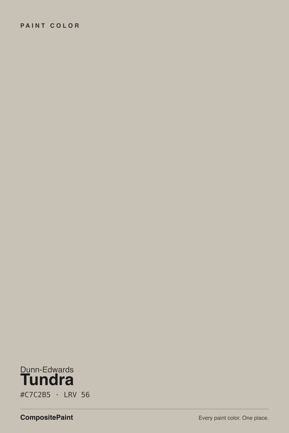
Color spec
| Brand | Dunn-Edwards |
| Name | Tundra |
| SKU | DET619 |
| Hex | #C7C2B5 |
| RGB | 199, 194, 181 |
| HSL | 43°, 14%, 75% |
| LRV | 56 |
| Undertone | warm red-orange tone |
| Family | Neutral |
About Dunn-Edwards Tundra
Tundra (DET619) from Dunn-Edwards is a light greige, which is just a soft blend of gray and beige. Its hex is #C7C2B5 and its saturation sits at only about 14 percent, so it barely commits to a color at all. What you read on the wall is a warm, quiet neutral that stays calm instead of turning cold or clinical.
With an LRV of 56 it lands squarely in the mid-light range, bouncing plenty of daylight without washing out to plain white. That balance is why it sells well: Dunn-Edwards positions it as their answer to Benjamin Moore's Revere Pewter, a go-anywhere greige that flatters wood, brass, and both warm and cool accents.
Tundra suits people who want a warm neutral that reads current, not builder-beige. It works in traditional homes, transitional remodels, and open-plan spaces where one wall color has to carry the whole floor.
Closest matches by brand
19 brands within ΔE 5The closest matches per brand by ΔE2000, computed against each brand's full deck. Only colors within ΔE 5 (close enough to substitute on a wall) are shown — brands with no real match are left off. Tap any swatch for its full single-color spec; tap the brand title to browse all neutral from that brand.
Sherwin-Williams
Behr
Benjamin Moore
Valspar
PPG / Glidden
Glidden
Dutch Boy
HGTV Home by Sherwin-Williams
Magnolia Home
Farrow & Ball
Diamond Vogel
Hirshfield's
Rodda
C2 Paint
Clare
Portola Paints
Annie Sloan
Backdrop
Kompozit
Similar Dunn-Edwards colors
closest in the Dunn-Edwards deckThe nearest shades to Tundra within Dunn-Edwards's own range, ranked by perceptual color distance — useful when you want the same look a touch lighter, darker, or warmer.
Coordinated palette
Generated by hue-rotating #C7C2B5 in HSL space. Pair Tundra with one accent and one neutral — the swatches below are starting points, not final picks.
Accessibility (WCAG contrast)
WCAG 2.1: AA = 4.5:1 normal text · AA Large = 3:1 large text · AAA = 7:1 normal text.
Dunn-Edwards Tundra Equivalents at Other Brands
Matching Tundra from a different paint counter? Below is the single closest color in each major US deck and how close it really is. Remember that any paint store can also custom-tint Dunn-Edwards DET619 directly — these equivalents are for when you'd rather stay inside one brand's own deck.
Sherwin-Williams Equivalent of Tundra
Sherwin-Williams's nearest match is High Sierra (SW 9588), visually identical in normal room light (ΔE 1.58). It runs slightly darker (LRV 53 vs 56) and carries a warm red-orange undertone, so it substitutes for Tundra without repainting risk. See the full High Sierra swatch →
Behr Equivalent of Tundra
Behr's nearest match is Armadillo (N230-3), visually identical in normal room light (ΔE 1.6). It runs slightly darker (LRV 54 vs 56) and carries a warm red-orange undertone, so it substitutes for Tundra without repainting risk. See the full Armadillo swatch →
Benjamin Moore Equivalent of Tundra
Benjamin Moore's nearest match is Cumulus Cloud (1550), visually identical in normal room light (ΔE 1.74). It runs slightly darker (LRV 52 vs 56) and carries a warm red-orange undertone, so it substitutes for Tundra without repainting risk. See the full Cumulus Cloud swatch →
Valspar Equivalent of Tundra
The closest Valspar equivalent of Tundra is Feathers of a Dove (M111). At ΔE 0.43 the two are indistinguishable on a wall — it carries the same warm red-orange undertone and runs slightly darker (LRV 53.9 vs 56). If Valspar is your counter, order Feathers of a Dove and you'll get the same color. See the full Feathers of a Dove swatch →
PPG / Glidden Equivalent of Tundra
PPG / Glidden's nearest match is Rabbit's Ear (PPG0999-2), visually identical in normal room light (ΔE 1.73). It runs slightly darker (LRV 54 vs 56) and carries a warm red-orange undertone, so it substitutes for Tundra without repainting risk. See the full Rabbit's Ear swatch →
Glidden Equivalent of Tundra
At Glidden, the closest color to Tundra is Great Gray (PPG15-28) — very close at ΔE 2.55, though not an exact twin. It runs slightly darker (LRV 54 vs 56) and carries a warm red-orange undertone; sample both side by side if the room gets strong natural light. See the full Great Gray swatch →
Dutch Boy Equivalent of Tundra
At Dutch Boy, the closest color to Tundra is Colonial Gray (422-2DB) — very close at ΔE 2.39, though not an exact twin. It runs slightly darker (LRV 54 vs 56) and carries a warm yellow undertone; sample both side by side if the room gets strong natural light. See the full Colonial Gray swatch →
HGTV Home by Sherwin-Williams Equivalent of Tundra
HGTV Home by Sherwin-Williams's nearest match is Collonade Gray (HGSW 7641), visually identical in normal room light (ΔE 1.67). It runs slightly darker (LRV 53 vs 56) and carries a warm red-orange undertone, so it substitutes for Tundra without repainting risk. See the full Collonade Gray swatch →
Magnolia Home Equivalent of Tundra
At Magnolia Home, the closest color to Tundra is Anatolian (JG-127) — very close at ΔE 2.82, though not an exact twin. It runs slightly darker (LRV 54 vs 56) and carries a warm red-orange undertone; sample both side by side if the room gets strong natural light. See the full Anatolian swatch →
Farrow & Ball Equivalent of Tundra
At Farrow & Ball, the closest color to Tundra is Elephant's Breath (NO. 229) — very close at ΔE 2.65, though not an exact twin. It runs slightly darker (LRV 52 vs 56) and carries a warm red-orange undertone; sample both side by side if the room gets strong natural light. See the full Elephant's Breath swatch →
Diamond Vogel Equivalent of Tundra
Diamond Vogel's nearest match is Hearthstone (0567), visually identical in normal room light (ΔE 1.79). It runs slightly darker (LRV 53 vs 56) and carries a warm red-orange undertone, so it substitutes for Tundra without repainting risk. See the full Hearthstone swatch →
Hirshfield's Equivalent of Tundra
At Hirshfield's, the closest color to Tundra is Hearthstone (0567) — very close at ΔE 2.39, though not an exact twin. It runs slightly darker (LRV 52 vs 56) and carries a warm red-orange undertone; sample both side by side if the room gets strong natural light. See the full Hearthstone swatch →
Rodda Equivalent of Tundra
Rodda's nearest match is Seashell (CA033), visually identical in normal room light (ΔE 1.96). It runs slightly darker (LRV 53 vs 56) and carries a warm red-orange undertone, so it substitutes for Tundra without repainting risk. See the full Seashell swatch →
C2 Paint Equivalent of Tundra
At C2 Paint, the closest color to Tundra is Dewdrop (C2-961) — very close at ΔE 3.42, though not an exact twin. It runs slightly darker (LRV 53 vs 56) and carries a warm yellow undertone; sample both side by side if the room gets strong natural light. See the full Dewdrop swatch →
Annie Sloan Equivalent of Tundra
Annie Sloan has no exact twin of Tundra. The nearest is Paris Grey (PARIS GREY) at ΔE 3.59 — close, but the difference shows next to trim and in side light. It runs slightly darker (LRV 52 vs 56). Compare large swatches before substituting. See the full Paris Grey swatch →
Backdrop Equivalent of Tundra
Backdrop has no exact twin of Tundra. The nearest is Real Real (BD-RR) at ΔE 3.62 — close, but the difference shows next to trim and in side light. It runs noticeably lighter (LRV 65 vs 56). Compare large swatches before substituting. See the full Real Real swatch →
Kompozit Equivalent of Tundra
At Kompozit, the closest color to Tundra is Hearthstone (0567) — very close at ΔE 2.39, though not an exact twin. It runs slightly darker (LRV 52 vs 56) and carries a warm red-orange undertone; sample both side by side if the room gets strong natural light. See the full Hearthstone swatch →
Tundra Color Guide
Tundra Undertones
Tundra leans warm, but gently. With saturation near 14 percent it is essentially a near-neutral with a slight lean toward warmth, so it never turns yellow or pink the way a more saturated beige can. Most of the time it simply reads as a soft, warm gray-beige.
The warm cast shows up most in strong daylight and against cooler surfaces. Put Tundra next to a bright white trim or a cool gray tile and its warmth becomes obvious. Set it beside a warm cream and it can look grayer by comparison. That flexibility is the point, but it means context decides how warm it looks.
Test it against a true white and a true gray card at the same time. If it looks warm next to the white and soft next to the gray, that is Tundra behaving normally. Always sample on the actual wall before deciding.
How Lighting Changes Tundra
At LRV 56 Tundra holds a lot of light without going flat, which makes it forgiving across exposures. In north-facing rooms, where light is cool and steady, its warmth is an asset and keeps the room from feeling gray or damp. In bright south-facing rooms it can look a touch lighter and cleaner, closer to a warm off-white.
East-facing rooms give it a soft, warm glow in the morning that cools by afternoon. West-facing rooms do the reverse, reading neutral early and warming up at sunset.
Bulb choice matters. Warm white bulbs around 2700K push the beige side forward and make it cozy. Cooler 3500K to 4000K bulbs mute the warmth and let the gray read more, which can feel more modern. Look at your sample at night under your real bulbs, not just in daylight.
Best Rooms and Uses for Tundra
An LRV of 56 makes Tundra a versatile whole-room wall color rather than a statement shade. It is bright enough for living rooms, bedrooms, hallways, and open-plan main floors, and warm enough to stay comfortable in north light. Because it is neutral, it lets furniture, art, and wood floors lead.
It also works on cabinets and built-ins when you want a soft, warm alternative to white without going dark. On kitchen or bath cabinets it pairs cleanly with wood counters and both brass and nickel hardware.
Outside, Tundra reads as a light warm-neutral body color and holds up well against stone, brick, and wood. On trim it can work in a lighter scheme, but most rooms will want a brighter white above it for contrast. For a front door you would typically want a deeper accent rather than Tundra itself.
Colors That Go With Tundra
For trim and ceilings, reach for a clean warm white so the wall reads as color rather than dirt. Whisper (DEW340), LRV 84, gives crisp contrast, while Swiss Coffee (DEW342), also LRV 84, is a slightly softer, creamier option that keeps the scheme warm.
For a grounded second wall color or lower-cabinet tone, Stonish Beige (DET625), LRV 33, is a deeper cousin in the same warm-neutral family and keeps an open floor plan cohesive.
For contrast and accent, Iron Mountain (DET637), LRV 11, is a strong charcoal for doors, islands, or an accent wall. If you want color on a front door, Maiden Voyage (DEA178), LRV 8, is a deep navy-blue that reads classic against Tundra's warmth. Warm woods like oak and walnut, plus brass or aged-bronze metals, all sit comfortably with it.
Tundra vs Similar Colors
Silver Mining (DESS45) shares Tundra's exact LRV of 56 but reads a hair cooler and slightly greener in some light, so it feels a touch crisper on the wall. Choose Tundra when you want more warmth, Silver Mining when you want the same brightness with a cleaner edge.
Serene Thought (DE6234), LRV 49, is noticeably deeper. It carries more visual weight and holds up better in very bright rooms where Tundra can look light, but it will make a dim north room feel smaller.
Moonbeam (DEGR03), LRV 52, sits between the two in depth and leans a little more toward taupe. If Tundra feels slightly too light or too gray for your space, Moonbeam is the natural step toward a warmer, cozier neutral. Sample all three side by side, since the differences are small until they are on your wall.
Dunn-Edwards Tundra — frequently asked questions
Is Tundra warm or cool?+
Tundra is a warm neutral, but only gently. Its saturation is about 14 percent, so it is close to a true greige with a slight warm lean rather than a strongly beige or yellow color. Against cool grays and bright whites its warmth shows clearly; against warm creams it can read softer and grayer.
Is Tundra more gray or more brown?+
It splits the difference, which is why it is called a greige. Tundra (DET619) reads as a soft warm gray-beige with an LRV of 56, not a distinctly brown color. In cool north light it looks more gray, and in warm bulbs or afternoon sun it looks a little more beige. Neither side dominates in most rooms.
What trim white goes with Tundra?+
Whisper (DEW340), at LRV 84, is a clean warm white that gives Tundra crisp contrast on trim, doors, and ceilings. If you prefer a softer, creamier look, Swiss Coffee (DEW342), also LRV 84, keeps the whole scheme warm. Both are much lighter than Tundra, so the wall reads as an intentional color.
Does Tundra work on cabinets and exteriors?+
Yes. On cabinets and built-ins Tundra is a warm alternative to white that pairs well with wood counters and both brass and nickel hardware. Outside it works as a light warm-neutral body color and holds up against stone, brick, and wood. For contrast, pair it with a deeper tone like Iron Mountain (DET637) on doors or shutters.
What does Tundra's LRV of 56 mean in practice?+
LRV measures how much light a color reflects, from 0 (black) to 100 (white). At 56, Tundra is mid-light: it bounces plenty of daylight and keeps rooms feeling open without washing out to plain white. That makes it forgiving across exposures and a safe whole-room wall color rather than a dark statement shade.
How is Tundra different from Silver Mining?+
Silver Mining (DESS45) has the same LRV of 56 as Tundra, so they are equally bright, but Silver Mining reads a bit cooler and cleaner while Tundra reads warmer. Pick Tundra when you want a cozier warm neutral, and Silver Mining when you want the same lightness with a slightly crisper, cooler edge. Sample both together to see it.