CP

Retro Kitchen Palette — Burnt Orange & Avocado Green

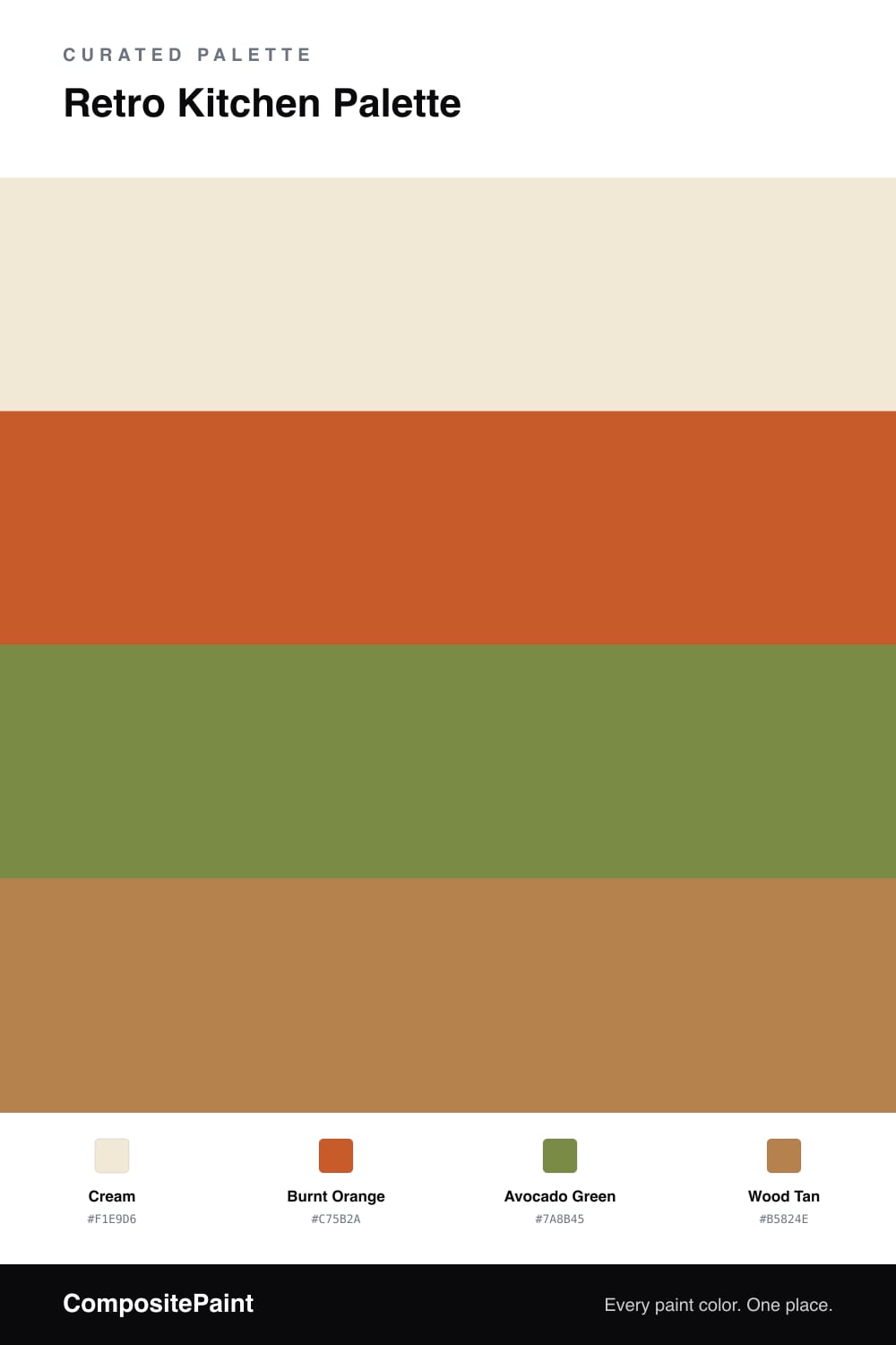
A playful 4-color retro scheme for kitchens: cream cabinets, a burnt orange accent, classic avocado green, and warm wood tan straight from the seventies. Every color matched to real paint you can buy.

By Jessica Williams · Color Stylist & Interior Editor

A retro kitchen should make you smile the moment you walk in — warm, a little playful, unmistakably nostalgic. This palette starts with cream cabinets, the soft buttery base that kept seventies kitchens from feeling chaotic, and it does the same job here.

A burnt orange accent brings the fun — stools, small appliances, or a backsplash — glowing warm against all that cream. Then comes the avocado green on the walls, the color that practically defined the era, softened just enough to feel charming instead of costume.

Wood tan rounds it out through floors, shelves, or a butcher-block counter, adding honest warmth. The trick is balance: let cream lead, treat orange and avocado as accents, and lean on wood to keep it grounded. The result is a kitchen with real retro character that still feels like a place you want to cook.

View palette in
Cream
Cabinets
PPG / Glidden Creamy White · PPG1105-1
#F0E8D5
LRV 81
Burnt Orange
Accent
Behr Jack O Lantern · M220-7
#C25A31
LRV 19
Avocado Green
Walls
Behr Green Scene · S350-5
#7D8D4C
LRV 24
Wood Tan
Wood & Floors
Behr Caramel Sauce · PMD-106
#B3804D
LRV 26

Buy These Colors

Each color matched to the closest real paint in every brand, by ΔE2000. Tap a swatch for its full guide or + to save it — take any SKU to the store, they mix on demand.

Cream
#F1E9D6 · LRV 82 · Cabinets
Sherwin-Williams · SW 7558 · ΔE 1.18
Behr · ECC-28-2 · ΔE 0.77
Benjamin Moore · 946 · ΔE 1.34
Valspar · 8003-25A · ΔE 1.09
PPG / Glidden · PPG1105-1 · ΔE 0.22
Glidden · PPG1105-1 · ΔE 0.48
Dutch Boy · 116-1DB · ΔE 1.03
HGTV Home by Sherwin-Williams · HGSW 1187 · ΔE 0.54
Dunn-Edwards · DE6170 · ΔE 1.22
Magnolia Home · JG-16 · ΔE 0.68
Farrow & Ball · NO. 2002 · ΔE 1.02
Diamond Vogel · 0009 · ΔE 0.8
Hirshfield's · 0285 · ΔE 0.9
Rodda · CA006 · ΔE 0.97
C2 Paint · C2-564 · ΔE 1.02
Clare · PNT100-LT-62 · ΔE 1.72
Portola Paints · CASA FORMA · ΔE 1.12
Annie Sloan · OLD OCHRE · ΔE 9.28
Backdrop · BD-DS · ΔE 1.86
Rust-Oleum · 329598 · ΔE 3.26
Kompozit · 0285 · ΔE 0.9
Burnt Orange
#C75B2A · LRV 20 · Accent
Sherwin-Williams · SW 6883 · ΔE 3.39
Behr · M220-7 · ΔE 2.01
Benjamin Moore · 2169-10 · ΔE 2.58
Valspar · V010-3 · ΔE 3.78
PPG / Glidden · PPG1192-7 · ΔE 4.59
Glidden · PPG1192-7 · ΔE 4.59
Dutch Boy · 207-5DB · ΔE 3.15
HGTV Home by Sherwin-Williams · HGSW 1111 · ΔE 3.39
Dunn-Edwards · DE5139 · ΔE 4.37
Magnolia Home · JG-35 · ΔE 7.25
Farrow & Ball · NO. 268 · ΔE 4.95
Diamond Vogel · 1068 · ΔE 8.63
Hirshfield's · 1026 · ΔE 3.95
Rodda · CA224 · ΔE 10.43
C2 Paint · C2-585 · ΔE 9.37
Clare · PNT100-DP-29 · ΔE 12.07
Portola Paints · MESA · ΔE 9.43
Annie Sloan · SCANDINAVIAN PINK · ΔE 12.57
Backdrop · BD-BH · ΔE 17.47
Rust-Oleum · 398640 · ΔE 12.04
Kompozit · 1026 · ΔE 3.95
Avocado Green
#7A8B45 · LRV 23 · Walls
Sherwin-Williams · SW 6719 · ΔE 3.2
Behr · S350-5 · ΔE 1.32
Benjamin Moore · 2146-10 · ΔE 5.55
Valspar · 6003-6C · ΔE 2.66
PPG / Glidden · PPG11-15 · ΔE 3.08
Glidden · PPG11-15 · ΔE 3.35
Dutch Boy · 225-5DB · ΔE 3.2
HGTV Home by Sherwin-Williams · HGSW 1241 · ΔE 7.82
Dunn-Edwards · DEA170 · ΔE 2.55
Magnolia Home · JG-08 · ΔE 10.31
Farrow & Ball · NO. CB6 · ΔE 8.63
Diamond Vogel · 0788 · ΔE 3.22
Hirshfield's · 0795 · ΔE 5.76
Rodda · R058 · ΔE 10.78
C2 Paint · C2-646 · ΔE 12.55
Clare · PNT100-DP-61 · ΔE 12.36
Portola Paints · BOND STREET · ΔE 15.49
Annie Sloan · ANTIBES GREEN · ΔE 10.95
Backdrop · BD-OS · ΔE 10.71
Rust-Oleum · 285141 · ΔE 17.58
Kompozit · 0795 · ΔE 5.76
Wood Tan
#B5824E · LRV 26 · Wood & Floors
Sherwin-Williams · SW 6131 · ΔE 2.93
Behr · PMD-106 · ΔE 0.72
Benjamin Moore · 1148 · ΔE 1.5
Valspar · V091-4 · ΔE 1.93
PPG / Glidden · PPG1082-6 · ΔE 2.38
Glidden · PPG1082-6 · ΔE 2.66
Dutch Boy · 214-6DB · ΔE 2.53
HGTV Home by Sherwin-Williams · HGSW 2172 · ΔE 2.93
Dunn-Edwards · DE5300 · ΔE 2.47
Magnolia Home · JG-152 · ΔE 5.25
Farrow & Ball · NO. 46 · ΔE 3.69
Diamond Vogel · 0998 · ΔE 2.01
Hirshfield's · 0921 · ΔE 3.36
Rodda · CA102 · ΔE 6.02
C2 Paint · BD33 · ΔE 6
Clare · PNT100-DP-74 · ΔE 13.07
Portola Paints · BANDELIER · ΔE 4.51
Annie Sloan · SCANDINAVIAN PINK · ΔE 14.95
Backdrop · BD-AN · ΔE 13.59
Rust-Oleum · 398640 · ΔE 6.33
Kompozit · 0921 · ΔE 3.36

Questions

How do I do retro orange and avocado without it looking dated?

Anchor the room with cream cabinets and keep orange and avocado as accents rather than covering every surface. A modern layout with retro color cues reads as charming and intentional, not stuck in another decade.

Where does the burnt orange work best?

Put it on the smaller statement pieces — bar stools, a single open shelf, small appliances, or a tiled backsplash. Used as a pop against cream it brings the fun retro energy without overwhelming a room you cook in daily.

KEEP EXPLORING

Similar Palettes

Closest schemes by color — not by label.