PROFESSIONAL-GRADE PAINT
ONE COAT COVERAGE
MADE FOR REAL RESULTS
CompositePaint

Pastel Blush Living Room Palette — Soft Blush & Warm White

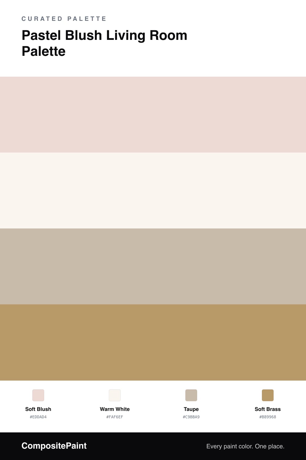
A warm, inviting pastel blush living room scheme: blush walls, warm white trim, a grounding taupe, and a soft brass accent for glow. Every color matched to real paint you can buy.

By Jessica Williams · Color Stylist & Interior Editor

Soft Blush
Walls
Kompozit Cliffswallow · 0131
#ECDDD4
LRV 74
Warm White
Trim & Ceiling
Kompozit Sugar Dust · 0011
#F8F6ED
LRV 92
Taupe
Furniture
Kompozit Moth Wing · 0183
#CCBCA9
LRV 52
Soft Brass
Accent
Kompozit Gold Season · 0297
#B19971
LRV 33
View palette in

Blush on living room walls is warmer and more flattering than people expect. This soft blush is grayed and gentle, so it behaves almost like a warm neutral, wrapping the room in a quiet glow rather than looking sweet or loud. It is especially lovely in evening light.

A warm white on the trim and ceiling keeps the scheme crisp and bright, while a taupe on the sofa or larger furniture grounds the blush and keeps it sophisticated. That neutral middle tone is what lets the pink read as elegant rather than girlish.

To add a touch of luxury, a soft brass accent in lighting, frames, or hardware brings a warm metallic glow. It picks up the warmth in the blush and gives the whole room a polished, inviting finish.

Buy These Colors

Each color matched to the closest real paint in every brand, by ΔE2000. Kompozit first; take any SKU to the store — these mix on demand.

Soft Blush
#EDDAD4 · LRV 73 · Walls
Kompozit Cliffswallow · 0131 ΔE 2.62
Backdrop Cookies & Cream · BD-CC ΔE 10.84
Behr Stolen Kiss · MQ3-34 ΔE 1.09
Benjamin Moore Sugarcane · 1185 ΔE 1.42
Clare Baby Soft · PNT100-LT-25 ΔE 1.15
Dunn-Edwards Touch of Tan · DE6079 ΔE 1.03
Farrow & Ball Great White · No. 2006 ΔE 3.99
Magnolia Home Dutch Tulip · JG-34 ΔE 5.72
PPG / Glidden Pine Hutch · 1067-1 ΔE 1.92
Sherwin-Williams Gorgeous White · SW 6049 ΔE 3.43
Valspar Honeysuckle Delight · 1007-10C ΔE 1.51
Warm White
#FAF6EF · LRV 92 · Trim & Ceiling
Kompozit Sugar Dust · 0011 ΔE 1.56
Backdrop Tabula Rasa · BD-TR ΔE 2.52
Behr China Cup · W-D-100 ΔE 0.93
Benjamin Moore Snowfall White · 2144-70 ΔE 2.84
Clare Timeless · PNT100-LT-04 ΔE 1.73
Dunn-Edwards Milk Glass · DEW358 ΔE 0.52
Farrow & Ball All White · No. 2005 ΔE 1.46
Magnolia Home True White · JG-21 ΔE 2.41
PPG / Glidden Delicate White · 1001-1 ΔE 2.7
Sherwin-Williams High Reflective White · SW 7757 ΔE 1.91
Valspar New Ream · V148 ΔE 1.95
Taupe
#C9BBA9 · LRV 51 · Furniture
Kompozit Moth Wing · 0183 ΔE 0.91
Backdrop Boy Meets Girl · BD-BG ΔE 10.91
Behr Rustic Rose · BXC-13 ΔE 2.1
Benjamin Moore Brick House Tan · CW-145 ΔE 1.89
Clare Greige · PNT100-LT-13 ΔE 5.3
Dunn-Edwards Birchwood · DEC752 ΔE 0.78
Farrow & Ball Drop Cloth · No. 283 ΔE 1.8
Magnolia Home Solid Wood · JG-109 ΔE 1.84
PPG / Glidden Stonington · 15-25 ΔE 0.9
Sherwin-Williams Dhurrie Beige · SW 7524 ΔE 0.97
Valspar Dust Bunny · 2005-10B ΔE 3.93
Soft Brass
#B89968 · LRV 34 · Accent
Kompozit Gold Season · 0297 ΔE 2.84
Backdrop Carry the Two · BD-CT ΔE 10.07
Behr Wilmington Tan · 270F-5 ΔE 0.95
Benjamin Moore Baked Cumin · 1062 ΔE 1.72
Clare Good as Gold · PNT100-DP-59 ΔE 2.53
Dunn-Edwards New Cork · DE6180 ΔE 0.82
Farrow & Ball India Yellow · No. 66 ΔE 5.44
Magnolia Home Juniper Tree · JG-166 ΔE 8.95
PPG / Glidden Golden Granola · 1094-5 ΔE 0.8
Sherwin-Williams Rustic City · SW 7699 ΔE 0.6
Valspar Corky · V088-4 ΔE 3.85

Questions

can blush walls work in a main living room, not just a bedroom?

Absolutely. A soft, grayed blush reads almost as a warm neutral on living room walls, giving the space a flattering, cozy glow without feeling overly feminine. Pairing it with taupe furniture and brass accents keeps it sophisticated and grown-up.

what furniture color suits blush walls?

Warm neutrals are the easiest companions. A taupe, oatmeal, or greige sofa lets the blush stay soft in the background, while natural wood and a touch of brass add warmth. Avoid stark cool grays, which can make the pink look out of place.

Similar Palettes

Closest schemes by color — not by label.