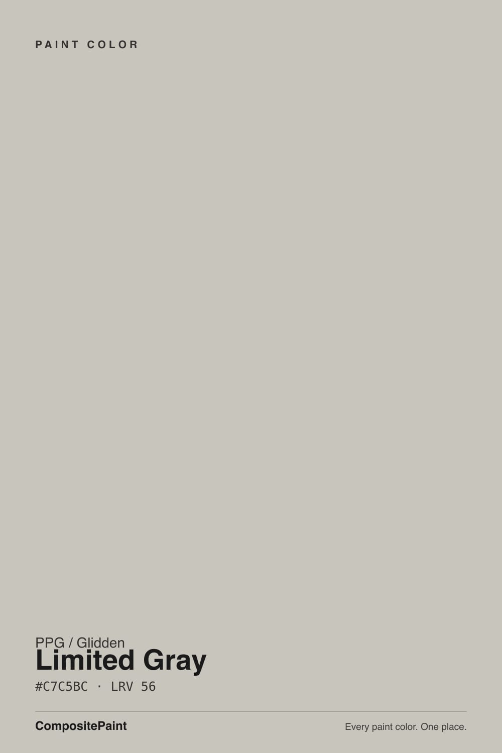
Color spec
| Brand | PPG / Glidden |
| Name | Limited Gray |
| SKU | PPG1010-3 |
| Hex | #C7C5BC |
| RGB | 199, 197, 188 |
| HSL | 49°, 9%, 76% |
| LRV | 56 |
| Undertone | warm yellow tone |
| Family | Neutral |
About PPG / Glidden Limited Gray
Limited Gray (PPG1010-3) is a soft, mid-light neutral that reads as a warm gray, or greige, on most walls. Its numbers tell the honest story: a very low 9 percent saturation means there is barely any color in it, but the small amount it carries sits in the yellow range, so it stays warm and easygoing instead of cold or steely. With a light value of 76 and an LRV of 56, it bounces a good amount of daylight without turning stark white.
PPG positions it as the brand's answer to the popular light greiges people ask for by name, which is why it shows up so often on whole-house paint lists.
It suits homes that want a calm, flexible backdrop that flatters wood floors, white trim, and mixed decor. If you like gray but find true grays too cold, Limited Gray is the softer, more forgiving version.
Closest matches by brand
19 brands within ΔE 5The closest matches per brand by ΔE2000, computed against each brand's full deck. Only colors within ΔE 5 (close enough to substitute on a wall) are shown — brands with no real match are left off. Tap any swatch for its full single-color spec; tap the brand title to browse all neutral from that brand.
Sherwin-Williams
Behr
Benjamin Moore
Valspar
Glidden
Dutch Boy
HGTV Home by Sherwin-Williams
Dunn-Edwards
Magnolia Home
Farrow & Ball
Diamond Vogel
Hirshfield's
Rodda
C2 Paint
Clare
Portola Paints
Annie Sloan
Backdrop
Kompozit
Similar PPG / Glidden colors
closest in the PPG / Glidden deckThe nearest shades to Limited Gray within PPG / Glidden's own range, ranked by perceptual color distance — useful when you want the same look a touch lighter, darker, or warmer.
Coordinated palette
Generated by hue-rotating #C7C5BC in HSL space. Pair Limited Gray with one accent and one neutral — the swatches below are starting points, not final picks.
Accessibility (WCAG contrast)
WCAG 2.1: AA = 4.5:1 normal text · AA Large = 3:1 large text · AAA = 7:1 normal text.
PPG / Glidden Limited Gray Equivalents at Other Brands
Matching Limited Gray from a different paint counter? Below is the single closest color in each major US deck and how close it really is. Remember that any paint store can also custom-tint PPG / Glidden PPG1010-3 directly — these equivalents are for when you'd rather stay inside one brand's own deck.
Sherwin-Williams Equivalent of Limited Gray
At Sherwin-Williams, the closest color to Limited Gray is Fortitude (SW 9562) — very close at ΔE 2.37, though not an exact twin. It sits at the same lightness (LRV 56 vs 56) and carries a true neutral undertone; sample both side by side if the room gets strong natural light. See the full Fortitude swatch →
Behr Equivalent of Limited Gray
Behr's nearest match is Titanium (PPU24-16), visually identical in normal room light (ΔE 1.42). It sits at the same lightness (LRV 56 vs 56) and carries a warm yellow undertone, so it substitutes for Limited Gray without repainting risk. See the full Titanium swatch →
Benjamin Moore Equivalent of Limited Gray
Benjamin Moore's nearest match is Brushed Aluminum (1485), visually identical in normal room light (ΔE 1.79). It sits at the same lightness (LRV 56 vs 56) and carries a warm yellow undertone, so it substitutes for Limited Gray without repainting risk. See the full Brushed Aluminum swatch →
Valspar Equivalent of Limited Gray
The closest Valspar equivalent of Limited Gray is Zen Pebble (V145-2). At ΔE 0.25 the two are indistinguishable on a wall — it carries the same warm yellow undertone and sits at the same lightness (LRV 55.1 vs 56). If Valspar is your counter, order Zen Pebble and you'll get the same color. See the full Zen Pebble swatch →
Glidden Equivalent of Limited Gray
The closest Glidden equivalent of Limited Gray is Eastern Lighthouse (70YY 54/049). At ΔE 0.81 the two are indistinguishable on a wall — it carries the same warm red-orange undertone and runs slightly darker (LRV 54 vs 56). If Glidden is your counter, order Eastern Lighthouse and you'll get the same color. See the full Eastern Lighthouse swatch →
Dutch Boy Equivalent of Limited Gray
At Dutch Boy, the closest color to Limited Gray is Centuryed Gray (442-2DB) — very close at ΔE 2.8, though not an exact twin. It sits at the same lightness (LRV 57 vs 56) and carries a warm red-orange undertone; sample both side by side if the room gets strong natural light. See the full Centuryed Gray swatch →
HGTV Home by Sherwin-Williams Equivalent of Limited Gray
At HGTV Home by Sherwin-Williams, the closest color to Limited Gray is Alpaca (HGSW 2467) — very close at ΔE 2.8, though not an exact twin. It sits at the same lightness (LRV 57 vs 56) and carries a warm red-orange undertone; sample both side by side if the room gets strong natural light. See the full Alpaca swatch →
Dunn-Edwards Equivalent of Limited Gray
At Dunn-Edwards, the closest color to Limited Gray is Dolphin Tales (DET600) — very close at ΔE 2, though not an exact twin. It sits at the same lightness (LRV 57 vs 56) and carries a true neutral undertone; sample both side by side if the room gets strong natural light. See the full Dolphin Tales swatch →
Magnolia Home Equivalent of Limited Gray
At Magnolia Home, the closest color to Limited Gray is Anatolian (JG-127) — very close at ΔE 2.15, though not an exact twin. It runs slightly darker (LRV 54 vs 56) and carries a warm red-orange undertone; sample both side by side if the room gets strong natural light. See the full Anatolian swatch →
Farrow & Ball Equivalent of Limited Gray
Farrow & Ball's nearest match is Pavilion Gray (NO. 242), visually identical in normal room light (ΔE 1.73). It runs slightly darker (LRV 53 vs 56) and carries a warm yellow undertone, so it substitutes for Limited Gray without repainting risk. See the full Pavilion Gray swatch →
Diamond Vogel Equivalent of Limited Gray
Diamond Vogel's nearest match is Rippled Rock (0580), visually identical in normal room light (ΔE 1.51). It sits at the same lightness (LRV 56 vs 56) and carries a warm yellow undertone, so it substitutes for Limited Gray without repainting risk. See the full Rippled Rock swatch →
Hirshfield's Equivalent of Limited Gray
Hirshfield's's nearest match is Rippled Rock (0580), visually identical in normal room light (ΔE 1.51). It sits at the same lightness (LRV 55 vs 56) and carries a warm yellow undertone, so it substitutes for Limited Gray without repainting risk. See the full Rippled Rock swatch →
Rodda Equivalent of Limited Gray
At Rodda, the closest color to Limited Gray is Sage (CA182) — very close at ΔE 2.99, though not an exact twin. It runs slightly darker (LRV 54 vs 56) and carries a cool green undertone; sample both side by side if the room gets strong natural light. See the full Sage swatch →
C2 Paint Equivalent of Limited Gray
C2 Paint's nearest match is Shaker (C2-817), visually identical in normal room light (ΔE 1.73). It sits at the same lightness (LRV 56 vs 56) and carries a warm red-orange undertone, so it substitutes for Limited Gray without repainting risk. See the full Shaker swatch →
Clare Equivalent of Limited Gray
At Clare, the closest color to Limited Gray is Motor City (PNT100-LT-09) — very close at ΔE 3.21, though not an exact twin. It runs slightly darker (LRV 54 vs 56) and carries a true neutral undertone; sample both side by side if the room gets strong natural light. See the full Motor City swatch →
Portola Paints Equivalent of Limited Gray
Portola Paints's nearest match is Lumiere (LUMIERE), visually identical in normal room light (ΔE 1.54). It runs slightly lighter (LRV 58 vs 56) and carries a warm red-orange undertone, so it substitutes for Limited Gray without repainting risk. See the full Lumiere swatch →
Annie Sloan Equivalent of Limited Gray
At Annie Sloan, the closest color to Limited Gray is Paris Grey (PARIS GREY) — very close at ΔE 3.33, though not an exact twin. It runs slightly darker (LRV 52 vs 56) and carries a warm yellow undertone; sample both side by side if the room gets strong natural light. See the full Paris Grey swatch →
Backdrop Equivalent of Limited Gray
Backdrop has no exact twin of Limited Gray. The nearest is Real Real (BD-RR) at ΔE 4.41 — close, but the difference shows next to trim and in side light. It runs noticeably lighter (LRV 65 vs 56). Compare large swatches before substituting. See the full Real Real swatch →
Kompozit Equivalent of Limited Gray
Kompozit's nearest match is Rippled Rock (0580), visually identical in normal room light (ΔE 1.51). It sits at the same lightness (LRV 55 vs 56) and carries a warm yellow undertone, so it substitutes for Limited Gray without repainting risk. See the full Rippled Rock swatch →
Limited Gray Color Guide
Limited Gray Undertones
On paper Limited Gray sits in the yellow hue range, but with saturation at just 9 percent it is near-neutral. That means it behaves like a plain warm gray in most rooms, with only a slight lean rather than an obvious color cast. You will not see yellow the way you would in a true tan or beige. What you get is a quiet warmth that keeps the gray from feeling clinical.
The lean shows up most where it has something cleaner to sit against. Put it next to a bright white trim like Pure White (PPG1001-1) and the soft greige warmth reads clearly. Set it beside a warm cream and it can look cooler and grayer by comparison.
To judge it honestly, tape a large sample next to your trim, your flooring, and a pure white card. The card is the key test. If Limited Gray looks faintly tan against crisp white, that is the yellow undertone doing its job.
How Lighting Changes Limited Gray
With an LRV of 56, Limited Gray is squarely mid-range, so it moves noticeably with the light instead of staying fixed. It reflects enough daylight to feel airy in bright rooms and can deepen toward a true mid gray in dim ones.
In north-facing rooms, which get cool, indirect light, the warmth is welcome and keeps the color from going flat or bluish. South-facing rooms flood it with warm light for much of the day, which pushes it lighter and brings out the greige side. East light reads fresh and slightly cooler in the morning, while west rooms warm up and glow in late afternoon.
Bulb choice matters just as much. Warm white bulbs around 2700K amplify the yellow lean and make it cozier. Cooler bulbs at 3500K or higher pull it back toward a plain gray. Always look at your sample at different times of day before committing.
Best Rooms and Uses for Limited Gray
At an LRV of 56, Limited Gray is a versatile mid-tone that works best as a whole-room wall color rather than a statement or a bright white. It has enough light to keep rooms open in living rooms, bedrooms, hallways, and open-plan spaces, while its warmth stops it from feeling cold in north light.
It is a strong cabinet color when you want soft contrast against white counters or backsplash without going stark. On trim it is usually too dark to separate cleanly from mid-tone walls, so pair it with a lighter white for crisp trim lines instead.
Outside, this kind of light warm gray works well on siding for a calm, current look, with white trim and a saturated front door. Because it holds a fair amount of light, keep in mind it can look brighter and washed on a sunny exterior wall than it does indoors.
Colors That Go With Limited Gray
For trim and ceilings, reach for a clean high-LRV white. Pure White (PPG1001-1) at LRV 88 gives crisp separation, while Antique White (PPG1015-2) at LRV 78 is a softer, warmer trim option that echoes the greige warmth if you want less contrast.
For a second wall color or a grounding tone, Chinchilla (PPG1001-4) at LRV 38 is a natural mid-gray step down, and Antique Silver (PPG1010-4) at LRV 36 comes from the same color line as Limited Gray, so they relate cleanly. Stone Beige (PPG1024-3) at LRV 49 leans the palette warmer if you prefer more of a tan direction.
For accents and a front door, Mariner Blue (PPG1162-7) at LRV 8 gives a deep, classic contrast, and Ivy League (PPG1130-7) at LRV 5 brings a near-black green. Both hold their own against the light walls. Natural oak and walnut, plus brass or matte black hardware, all sit comfortably with this greige.
Limited Gray vs Similar Colors
Limited Gray (PPG1010-3, LRV 56) has close neighbors in PPG's own deck, and the differences are subtle but visible on a wall. Early Evening (PPG1006-3, LRV 57) is nearly the same value but reads a touch warmer and softer, making it the pick if you want the greige side to show a bit more. Limited Gray is slightly more neutral by comparison.
Silent Storm (PPG1033-3, LRV 55) goes the other way. At almost the same lightness it leans cooler and a hint greener, so it feels more like a true gray and less like a greige. Choose it if Limited Gray looks too warm against your finishes.
Silver Band (PPG0995-3, LRV 56) matches the light level closely but sits as a cleaner, more balanced gray with less obvious warmth. If you want the flexibility of a mid gray without any tan lean, Silver Band is the safer neutral, while Limited Gray keeps a friendlier, warmer feel.
PPG / Glidden Limited Gray — frequently asked questions
Is Limited Gray warm or cool?+
Limited Gray is a warm gray. Its measured undertone sits in the yellow range, though at only 9 percent saturation the warmth is gentle rather than obvious. In practice it reads as a soft greige that stays inviting in cool north light, without the cold, steely feel of a true gray. Warm bulbs make it cozier, cooler bulbs push it more neutral.
Is Limited Gray more gray or more beige?+
It sits right between the two, which is why people call it greige. There is only a small amount of color in it, so it behaves mostly like a gray, but the warm yellow lean gives it a soft beige character next to bright white. Against a warm cream it will look grayer, and against a clean white it will look warmer.
What trim white goes with Limited Gray?+
Pure White (PPG1001-1) at LRV 88 is the go-to. It is bright and clean enough to give crisp separation from the mid-tone walls and let the greige warmth show. If you want softer, less stark contrast, Antique White (PPG1015-2) at LRV 78 is a warmer trim white that keeps the palette gentle.
Does Limited Gray work on kitchen cabinets?+
Yes. Its mid LRV of 56 gives soft contrast against white counters and backsplash without going stark, which reads as calm and current on cabinets. Pair it with a brighter white trim or ceiling and warm metal or matte black hardware. Test a door front in your actual kitchen light first, since cabinet fronts catch light differently than walls.
What does an LRV of 56 mean for Limited Gray?+
LRV, or light reflectance value, runs from 0 for black to 100 for pure white. At 56, Limited Gray reflects a bit more than half the light that hits it, putting it in the mid-light range. It keeps rooms feeling open and airy without washing out, and it moves noticeably with the light, deepening in dim rooms and brightening in sunny ones.
How is Limited Gray different from Repose Gray?+
PPG designed Limited Gray as its answer to that popular light greige, so the two are close in spirit: both are soft, mid-light warm grays meant to work whole-house. Limited Gray reads with a slightly warmer yellow lean rather than the greige purple-gray some people notice in the other. Always sample the actual PPG color, since screen and cross-brand matches are never exact.