Polar Pond
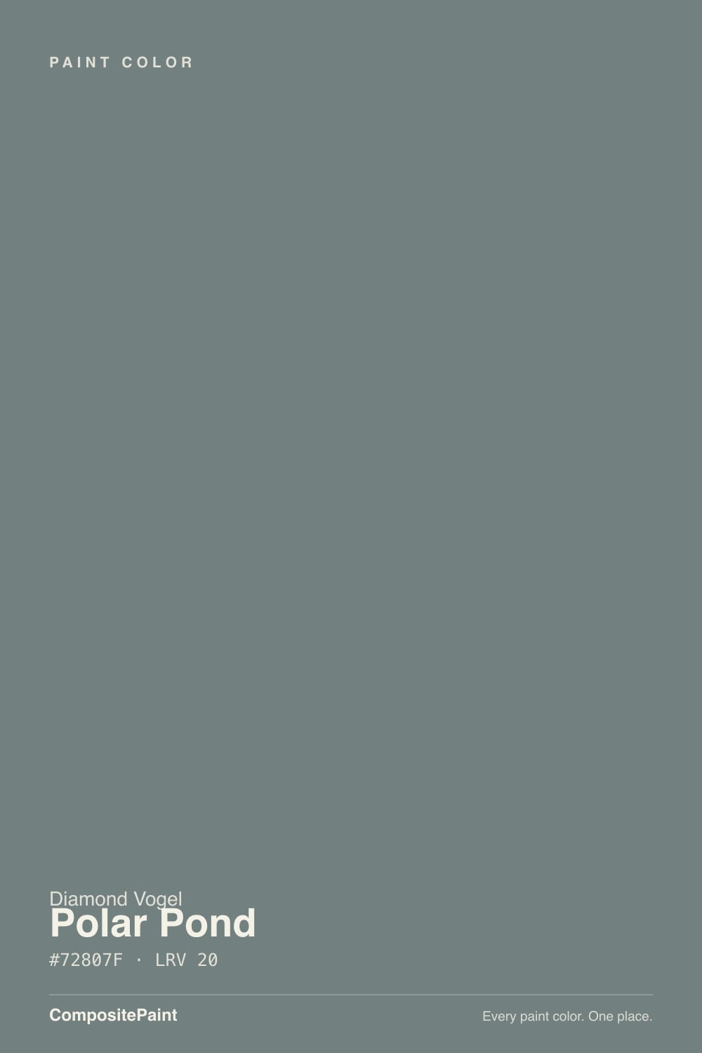
0492 · #72807F · LRV 20 — cool blue-green tone, dark — high drama, needs strong daylight or warm bulbs.
- 1Salamander6
- 2Hidden Gem14
- 3Polar Pond20
- 4Van Courtland Blue31
- 5Wythe Blue48
What Color Is Polar Pond, Really?
Polar Pond reads as a cool blue-green tone — dark — high drama, needs strong daylight or warm bulbs. The notes below cover how Diamond Vogel 0492 behaves in different light and the closest matches at competing US brands.
Best Rooms and Uses for Polar Pond
Polar Pond works best as a feature — a single wall, built-ins, a study or dining room — rather than wrapping a whole bright space. Teals add character without shouting — good for a vanity, an island or a feature wall.
How Lighting Changes Polar Pond
With an LRV of 20, Polar Pond is a deep, dramatic shade. It soaks up light in north-facing rooms and looks richest where strong daylight hits it. Because it carries almost no measurable hue, it stays a true neutral and pairs cleanly with nearly any trim or floor. Warm artificial light softens it; cool LED can make it look flat, so match your bulbs to the mood you want.
Most complaints about Polar Pond are a light mismatch. Upload a photo of your actual room and see it on your walls — then ask for the same wall in north light or evening lamps before you buy a single sample.
Need It From Another Brand?
Any paint counter can custom-tint Diamond Vogel 0492 directly. If you would rather stay in one brand's own deck, these are the closest stock matches, measured as ΔE2000. Under 2 is a difference you will not see on the wall.
| Brand | Closest color | ΔE | LRV | |
|---|---|---|---|---|
| Sherwin-Williams | Studio Blue GreenSW 47 · Sherwin-Williams | 3.7 | 20 | Color page → |
| Behr | Stormy GrayBXC-58 · Behr | 2.8 | 21 | Color page → |
| Benjamin Moore | Gray Pinstripe1588 · Benjamin Moore | 2.5 | 21 | Color page → |
| Valspar | Northern Juniper5001-4B · Valspar | 3.3 | 21.4 | Color page → |
| PPG / Glidden | Blue BloodPPG1034-6 · PPG / Glidden | 2.6 | 20 | Color page → |
| Glidden | Blue Forest90GG 21/076 · Glidden | 2.3 | 21 | Color page → |
Similar Diamond Vogel Colors
The nearest shades to Polar Pond within Diamond Vogel's own range, ranked by perceptual color distance — useful when you want the same look a touch lighter, darker, or warmer.
WCAG 2.1: AA is 4.5 : 1 for normal text, 3 : 1 for large text, AAA is 7 : 1.
Coordinated palette
Generated by hue-rotating #72807F in HSL space. Pair Polar Pond with one accent and one neutral — the swatches below are starting points, not final picks.
Have you painted with Polar Pond?
Rate it — one tap helps the next reader decide.
Ask a Question