Luxe
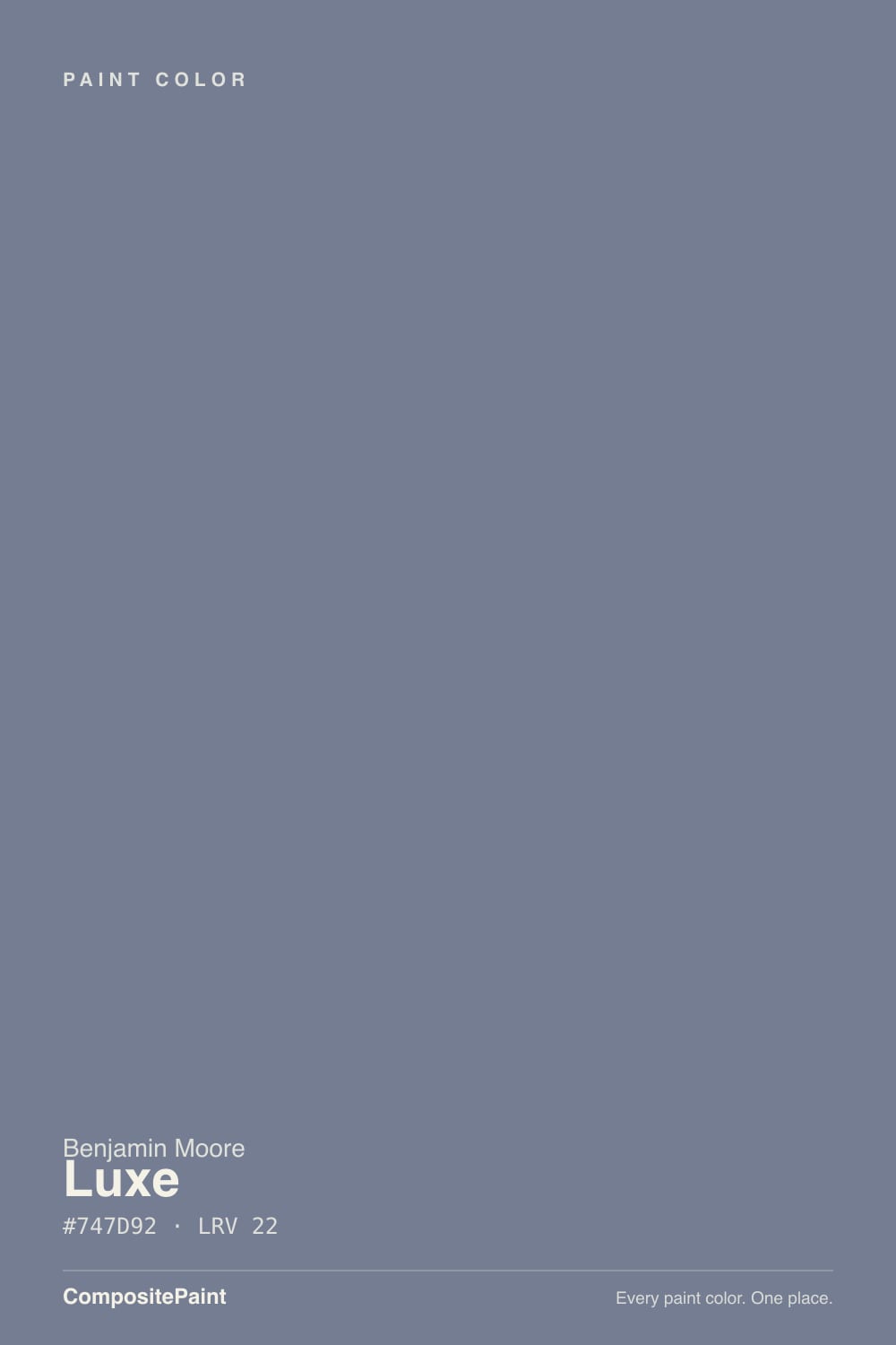
AF-580 · #747D92 · LRV 22 — cool blue tone, dark — high drama, needs strong daylight or warm bulbs.
- 1Hale Navy8
- 2Waterloo13
- 3Luxe22
- 4Resolute Blue40
- 5Lost in the 80s51
What Color Is Luxe, Really?
Luxe AF-580 is a deep gray-blue. The hex is #747D92 and the hue sits at 222 degrees, a true blue direction with a small pull toward violet, while saturation is only 12 percent. That combination gives a heavily grayed blue rather than a bright one. The LRV is 22, which puts it in the dark band. It absorbs most of the light that reaches it and reads as a moody slate rather than a mid gray.
It belongs to Benjamin Moore's Affinity collection, a deck built so the colors sit comfortably next to one another, and it behaves that way on a wall. Quiet, slightly cool, easy to combine with other muted tones. People choose it when navy feels too strong and a plain mid gray feels like nothing at all. The faint violet gives it a slightly dressier feel than a straightforward blue-gray.
That violet is also the thing to check. In cool north light Luxe stays blue-gray and behaves itself. Under warm bulbs and late afternoon sun the purple side comes forward and a large wall can read mauve, which surprises people who chose it as a blue. At LRV 22 it also takes a lot of light out of a room, so a small space with one window will feel closed in.
The undertone is cool blue with a violet edge. Hue 222 degrees is past the middle of blue and heading toward indigo, which is where the purple comes from, and saturation of 12 percent means the color is mostly gray with just enough chroma to have a direction. On a chip it usually reads as a slate gray. On a full wall the blue is obvious and the violet appears intermittently.
Context decides which one you see. Beside a true neutral gray, Luxe looks clearly blue. Beside a navy it looks gray and soft. Beside a warm beige or a cream the violet surfaces and can read mauve, especially in low light. Cool white trim keeps it blue; warm cream trim pushes it purple.
If you want the blue and not the purple, test it against the warmest thing in the room, whether that is oak flooring or a brass fixture, since that is what will pull the violet out.
Best Rooms and Uses for Luxe
This is a mid-to-dark color that suits rooms you want to feel calm and enclosed. Bedrooms are the strongest case, since the blue-gray reads restful and the LRV of 22 takes the edge off bright morning light. Home offices, dens, and dining rooms also take it well, particularly with white trim to keep the walls from feeling heavy.
On cabinetry it is a good island or vanity color, deep enough to anchor a room without the finality of black or navy. It also works on built-ins, interior doors, and a single accent wall behind a bed.
Outdoors it is a credible body color on a house with white or light trim, and a quiet front-door or shutter color that avoids the obviousness of navy. Where it disappoints is a small room with one window, where LRV 22 removes more light than most people expect, and any warm-lit space where the violet is unwelcome.
How Lighting Changes Luxe
At LRV 22 Luxe reflects less than a quarter of the light in a room, so the light source has a large say in how it looks. North-facing rooms give cool, indirect daylight that suits it, holding the color at a clean blue-gray and keeping the violet in check. That is where this color is most predictable.
South and west rooms add warmth, and warmth is what brings the purple out. In late afternoon sun a large wall can shift toward a soft mauve-gray, which is a genuine change rather than a subtlety. East rooms read cool and blue in the morning and warm slightly through the day.
Bulbs push it the same way. Warm 2700K light emphasizes the violet and makes the color feel softer and dustier. Neutral 3500K to 4000K bulbs hold it at blue-gray. Because the color is dark to begin with, look at your sample at night under the fixtures you actually use, not only by daylight.
Most complaints about Luxe are a light mismatch. Upload a photo of your actual room and see it on your walls — then ask for the same wall in north light or evening lamps before you buy a single sample.
Need It From Another Brand?
Any paint counter can custom-tint Benjamin Moore AF-580 directly. If you would rather stay in one brand's own deck, these are the closest stock matches, measured as ΔE2000. Under 2 is a difference you will not see on the wall.
| Brand | Closest color | ΔE | LRV | |
|---|---|---|---|---|
| Sherwin-Williams | Soulful BlueSW 6543 · Sherwin-Williams | 1.0 | 20 | Color page → |
| Behr | Tranquil PondPPU15-07 · Behr | 1.8 | 22 | Color page → |
| Valspar | Window Screen4004-4A · Valspar | 3.5 | 20.7 | Color page → |
| PPG / Glidden | Silver BlueberryPPG1163-5 · PPG / Glidden | 4.7 | 21 | Color page → |
| Glidden | Deep Empire Blue50BB 22/143 · Glidden | 2.6 | 22 | Color page → |
| Dutch Boy | Authentic342-5DB · Dutch Boy | 1.0 | 20 | Color page → |
Similar Benjamin Moore Colors
The nearest shades to Luxe within Benjamin Moore's own range, ranked by perceptual color distance — useful when you want the same look a touch lighter, darker, or warmer.
WCAG 2.1: AA is 4.5 : 1 for normal text, 3 : 1 for large text, AAA is 7 : 1.
Luxe vs Similar Colors
Inside the Benjamin Moore deck the closest relatives differ mostly in how much blue survives the gray. In the Twilight 1434 and CC-934 are listed at the same hex #747D92 and the same LRV 22, so they are the same color with a different label. Bachelor Blue 1629 at #758391 and LRV 22 is a touch greener. Normandy 2129-40 at #6D7E89 and LRV 22 moves toward slate-teal and drops the violet. Sea Life 2118-40 at #7B7C88 and LRV 20 is grayer, and Black Pepper 2130-40 at #717C86 and LRV 21 is the most neutral here.
Across brands, Sherwin-Williams Soulful Blue SW 6543, Dutch Boy Authentic 342-5DB, and HGTV Home Purple Thrush HGSW 2403 all share hex #757C91 and LRV 20 with a deltaE of 0.97, close enough to call true matches. Dunn-Edwards Your Shadow DE5921 at 1.54 is visually identical in normal room light. Glidden Deep Empire Blue 50BB 22/143 at 2.63 and Behr Classy Plum N570-4 at 2.86 are very close but should be sampled. PPG Silver Blueberry PPG1163-5 at 4.72 is close but visibly different side by side.
Colors That Go With Luxe
Trim is where you steer the undertone. A clean, cool white keeps Luxe reading blue-gray and gives crisp contrast against an LRV 22 wall. A warm cream trim softens the whole scheme but invites the violet forward, so pick it on purpose rather than by default.
For a companion surface, the brand's own neighbors give small, controlled steps. Bachelor Blue 1629 at LRV 22 is the same lightness with a fractionally softer blue, useful for an adjacent room. Normandy 2129-40 at LRV 22 leans slightly more toward the teal side of blue. Sea Life 2118-40 at LRV 20 and Black Pepper 2130-40 at LRV 21 are a shade deeper and grayer, good for a ceiling, an island, or trim in a monochrome scheme. In the Twilight 1434 and CC-934 share the same hex and LRV 22, so treat them as the same color under another name.
Walnut and mid-tone oak, brass, aged bronze, and off-white linen all sit well with it. Cool chrome works too and keeps the blue clean.
Coordinated palette
Generated by hue-rotating #747D92 in HSL space. Pair Luxe with one accent and one neutral — the swatches below are starting points, not final picks.
Luxe FAQ
Is Luxe warm or cool?
Luxe is a cool color. Its hue sits at 222 degrees, in the blue range with a small lean toward violet, and saturation of 12 percent keeps it grayed rather than bright. In warm light and under 2700K bulbs the violet side can come forward and make it feel softer, but its base character stays cool.
What is the LRV of Luxe?
Luxe AF-580 has an LRV of 22. On a scale from 0 for black to 100 for pure white, that places it in the dark band, reflecting less than a quarter of the light that hits it. It gives a room real depth but will also make a small space feel more enclosed.
Does Luxe look purple on the wall?
Sometimes. The hue at 222 degrees sits close enough to indigo that warm light pulls the violet out, so in a south or west room in late afternoon, or under warm bulbs at night, a large wall can read mauve-gray. In cool north light it stays a clean blue-gray. Sample it in the room's warmest light before deciding.
Does Luxe work in a dark room?
It will darken the room further, since LRV 22 absorbs most of the light. That can be exactly right for a bedroom or a den where you want an enclosed feel, but in a small space with one window it removes more light than people expect. Pair it with clean white trim and good lamps if you go ahead.
What white trim goes with Luxe?
A clean, cool white gives the crispest contrast against an LRV 22 wall and keeps the color reading blue-gray rather than mauve. A warm cream trim is the alternative and softens the whole scheme, but it invites the violet undertone forward, so choose it deliberately rather than by habit.
What is the closest match to Luxe in other brands?
Sherwin-Williams Soulful Blue SW 6543, Dutch Boy Authentic 342-5DB, and HGTV Home by Sherwin-Williams Purple Thrush HGSW 2403 all share hex #757C91 at LRV 20 with a deltaE of 0.97, close enough to call true matches. Dunn-Edwards Your Shadow DE5921 at 1.54 is visually identical in normal room light.
Have you painted with Luxe?
Rate it — one tap helps the next reader decide.
Ask a Question