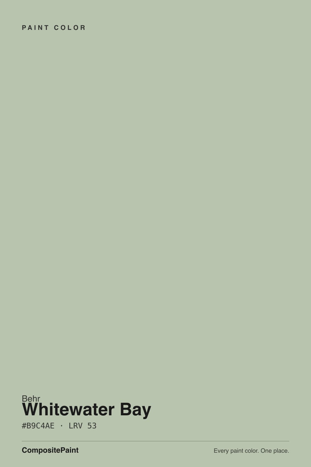
Whitewater Bay
PPU11-10 · #B9C4AE · LRV 53 — cool green tone, light — bounces daylight without going clinical.
- 1Evergreen Fog30
- 2Clary Sage41
- 3Whitewater Bay53
- 4Morning Zen60
- 5Alabaster82
What Color Is Whitewater Bay, Really?
Whitewater Bay PPU11-10 is a light green with a soft gray core. The hex value #B9C4AE sits at hue 90, right where green meets yellow, but saturation is only about 16 percent, so it behaves like a pale neutral with a clear green lean rather than a bright green. An LRV of 53 puts it in the light band, bright enough to bounce daylight around a room without going white or clinical.
It gets picked when a sage feels too dark and a near-white feels too empty. At this lightness the color keeps a room open while still giving walls a recognizable tint, which is why it works well in kitchens, bedrooms, and rooms with a lot of trim. It sits naturally with wood, wicker, linen, and pale stone, and it does not commit the rest of the palette to a strong direction. Behr colors are mixed at The Home Depot, so a matching gallon is easy to get.
The practical catch is that light greens at this saturation can slide. In cool north light Whitewater Bay grays down and can look almost like a plain gray, losing the green you chose it for. In warm afternoon sun the yellow side at hue 90 comes forward and it can drift toward celery. Paint a large board and view it on more than one wall before you commit to the whole room.
The undertone is a cool green built on a yellow base. Hue 90 sits at the green-yellow boundary, so there is warmth underneath, but at roughly 16 percent saturation the color is heavily grayed and the green shows as a lean rather than a statement. On a chip it can pass for a light gray. Across a full wall the green is clear.
What surrounds it decides which reading you get. Against a clean white trim the green comes forward and it looks like a pale sage. Against a saturated green tile or plant-heavy fabric it retreats and reads gray. Against a warm beige it looks cooler and more herbal, and against a true gray it looks warm and slightly yellow.
Hold the sample against your floor, your counter, and your trim white before deciding. Those three surfaces move a low-saturation green further than any chip comparison will.
Best Rooms and Uses for Whitewater Bay
An LRV of 53 makes this an easy whole-room wall color. Bedrooms, living rooms, sunrooms, and bathrooms all take it well, since it keeps the space bright while giving the walls something to say. It is particularly useful in rooms with lots of woodwork, where a pale tint separates the walls from white trim without adding weight.
On cabinetry it gives kitchens, laundries, and vanities a light, airy look that still reads as color, which suits smaller kitchens where a deeper green would close things in. It also works on paneling, built-ins, and ceilings in a room where you want a soft envelope rather than white overhead.
Outdoors it works as a light body color on a cottage or a house set among planting, with darker shutters or a stronger front door for contrast. Keep trim in a separate white so the green edge stays crisp.
How Lighting Changes Whitewater Bay
At LRV 53 Whitewater Bay reflects a good amount of light. It keeps rooms feeling open, but it has enough depth that its character changes with the light source.
North-facing rooms get cool, even daylight that pushes the color grayer and can leave it reading as a soft gray-green with little warmth. South-facing rooms flood it with warm light that lifts the yellow base at hue 90, so it looks fresher and more clearly green, sometimes leaning celery in late sun. East rooms look crisp in the morning and quiet by afternoon. West rooms stay flat early and warm noticeably at the end of the day.
Bulbs move it just as much. Warm 2700K lamps bring out the yellow and can make it look softer and slightly creamy at night. Cooler 3500K to 4000K bulbs strip the warmth and leave the gray-green side dominant. Check a sample under your own fixtures after dark.
Most complaints about Whitewater Bay are a light mismatch. Upload a photo of your actual room and see it on your walls — then ask for the same wall in north light or evening lamps before you buy a single sample.
Need It From Another Brand?
Any paint counter can custom-tint Behr PPU11-10 directly. If you would rather stay in one brand's own deck, these are the closest stock matches, measured as ΔE2000. Under 2 is a difference you will not see on the wall.
| Brand | Closest color | ΔE | LRV | |
|---|---|---|---|---|
| Sherwin-Williams | ContentedSW 6191 · Sherwin-Williams | 5.0 | 52 | Color page → |
| Benjamin Moore | Aganthus Green472 · Benjamin Moore | 2.1 | 50 | Color page → |
| Valspar | Wedding Mint5006-3B · Valspar | 1.1 | 53.6 | Color page → |
| PPG / Glidden | Side KickPPG1126-4 · PPG / Glidden | 3.3 | 53 | Color page → |
| Glidden | Side KickPPG1126-4 · Glidden | 2.9 | 53 | Color page → |
| HGTV Home by Sherwin-Williams | ContentedHGSW 3256 · HGTV Home by Sherwin-Williams | 5.0 | 52 | Color page → |
Similar Behr Colors
The nearest shades to Whitewater Bay within Behr's own range, ranked by perceptual color distance — useful when you want the same look a touch lighter, darker, or warmer.
WCAG 2.1: AA is 4.5 : 1 for normal text, 3 : 1 for large text, AAA is 7 : 1.
Whitewater Bay vs Similar Colors
Within Behr, Composed MQ6-45 at LRV 54 is a fraction lighter and slightly cooler. Historical Ruins BXC-19 at LRV 54 leans a touch warmer. Koala Bear 780D-4 at LRV 53 carries more yellow and reads closer to a light khaki. Castle Path 730C-3 at LRV 54 is grayer, Summer Green PPU11-11 at LRV 54 is the most neutral of the group, and Minted Lemon PPU10-08 at LRV 54 is the yellowest.
Across brands, Valspar Wedding Mint 5006-3B at LRV 53.6 and deltaE 1.15, Hirshfield's Arbor Vitae 0427 at LRV 52 and deltaE 1.16, and Diamond Vogel Arbor Vitae 0427 at LRV 54 and deltaE 1.23 are all visually identical in normal room light. Benjamin Moore Aganthus Green 472 at LRV 50 and deltaE 2.09 and Dunn-Edwards Belize Green DEC782 at LRV 49 and deltaE 2.28 are very close but sit slightly darker, so sample first. Farrow and Ball Mizzle No. 266 at LRV 52 and deltaE 4.68 and Sherwin-Williams Contented SW 6191 at LRV 52 and deltaE 5 are close but visibly different side by side, both reading grayer and less green.
Colors That Go With Whitewater Bay
Trim comes first. A clean white gives crisp separation from an LRV 53 wall and makes the green read clearly. A warmer, creamier white softens the whole scheme and pushes Whitewater Bay toward sage. Sample both on one board, since the difference is easy to see once the wall color is up.
Within Behr, the near neighbors are alternates rather than partners. Composed MQ6-45 at LRV 54, Historical Ruins BXC-19 at LRV 54, Castle Path 730C-3 at LRV 54, and Summer Green PPU11-11 at LRV 54 all sit within a point of it, so they belong on the sample board rather than the adjoining wall. For contrast, a deeper green, a charcoal, or a warm mid-tone neutral gives the step the scheme needs.
Materials do plenty of work here. Oak, rattan, and pale limestone flatter the yellow base, while brass, aged bronze, and matte black hardware all read well against the green.
Coordinated palette
Generated by hue-rotating #B9C4AE in HSL space. Pair Whitewater Bay with one accent and one neutral — the swatches below are starting points, not final picks.
Whitewater Bay FAQ
Is Whitewater Bay warm or cool?
Whitewater Bay is a cool green tone sitting on a yellow base at hue 90. Because saturation is only around 16 percent, the color is heavily grayed, so it reads cool next to beiges and tans but warm next to true grays. Warm afternoon light brings the yellow side forward.
What LRV is Whitewater Bay?
Whitewater Bay PPU11-10 has an LRV of 53. On the 0 to 100 scale that is a light color, so it reflects more light than it absorbs and keeps a room feeling open. It still has enough depth to read as a clear tint rather than an off-white.
Does Whitewater Bay work in a dark room?
It does reasonably well. At LRV 53 it returns a good amount of light, so it will not make a low-light room feel closed in. The thing to watch is the green, which cool north-facing daylight grays down considerably. In a dim north room expect a soft gray-green rather than an obvious sage.
What white trim goes with Whitewater Bay?
A clean white gives the crispest separation from an LRV 53 wall and lets the green read clearly. A softer, warmer white blurs the edge slightly and pushes the whole scheme toward sage, which suits older or cottage-style rooms. Paint both options on one board and choose after the wall color is up.
Is Whitewater Bay good for kitchen cabinets?
Yes, especially in smaller kitchens. At LRV 53 it keeps cabinets light and airy while still reading as color, so a full run will not close the room in the way a deep green would. It pairs naturally with wood counters, white stone, and brass or matte black hardware. Use a cabinet-grade finish for durability.
How is Whitewater Bay different from Sherwin-Williams Contented?
Contented SW 6191 sits at LRV 52 with hex #BDC0B3 against Whitewater Bay at LRV 53 and #B9C4AE. The measured difference is deltaE 5, which means they are close but visibly different side by side. Contented reads grayer and less green, while Whitewater Bay keeps a clearer sage lean.
Have you painted with Whitewater Bay?
Rate it — one tap helps the next reader decide.
Ask a Question