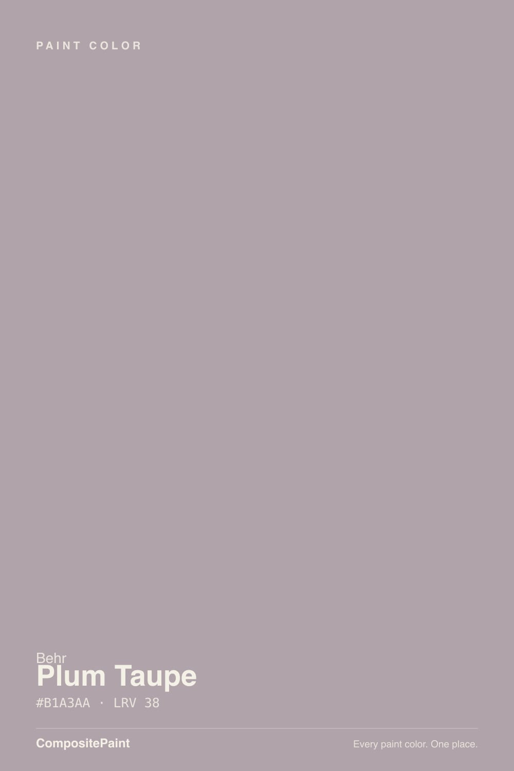
Plum Taupe
N130-4 · #B6A19B · LRV 38 — warm red tone, mid-tone — versatile but shifts visibly with light.
- 1Anonymous20
- 2Felted Wool28
- 3Plum Taupe38
- 4Agreeable Gray60
- 5Balboa Mist66
What Color Is Plum Taupe, Really?
Plum Taupe (N130-4) is a soft gray with a mauve lean. Its hex value #B1A3AA sits at a hue of 330 degrees, which is the red-violet part of the color wheel, but the saturation is only about 8 percent, so it behaves like a gray carrying a whisper of plum rather than a purple. An LRV of 38 puts it in the mid-tone band: dark enough to register as a real color on the wall, light enough that it never closes a room in.
People reach for it when plain gray feels flat and beige feels tired. The magenta lean gives it a dusty, slightly antique softness that suits bedrooms, powder rooms, and older houses with plaster and detailed trim. It also sits comfortably next to both cool and warm finishes, because it is not fully committed to either side. Behr sells at The Home Depot, so a sample pot is easy to pick up.
The catch is that the mauve grows with scale. On a chip it looks like gray; on four walls, especially in warm afternoon light or under 2700K bulbs, the pink comes forward and some people read it as dusty rose. Paint a large sample, at least two feet square, and look at it at night as well as at midday before you commit.
The undertone is a warm magenta, a red-violet that lands nearer to mauve than to true purple. At roughly 8 percent saturation it is faint, so the first impression the color gives is gray. What decides whether you see the plum is what sits beside it. Against clean white trim the mauve becomes obvious. Against a beige or a warm greige the color looks cooler and more violet. Against a blue-gray it flips and reads warm and pinkish. Materials do the same work. Warm oak, terracotta, or a pink-veined marble will pull the mauve forward, while concrete, slate, and black hardware hold it back toward gray. Before you decide, tape a sample between a neutral gray card and a warm beige and look at all three at once. Seeing Plum Taupe in that company tells you quickly how much plum you are actually buying.
Best Rooms and Uses for Plum Taupe
An LRV of 38 makes this a comfortable full-room wall color rather than an accent. It suits bedrooms, where the dusty softness reads restful, and it does well in powder rooms and dressing areas where a little color is welcome without going bold. Living rooms and hallways take it too, though a windowless hall will lose light fast at this level. On doors and trim it works as a quiet contrast against white walls, and on a bathroom vanity or a built-in bookcase it adds depth without the weight of charcoal. It is less at home in kitchens full of orange-toned wood or warm stone, where the mauve can argue with the material. Outside, it can serve as a soft body color on a house with gray stone or cool brick, but it is a subtle exterior and needs a crisper white trim to keep the edges defined.
How Lighting Changes Plum Taupe
At LRV 38 the color reflects a moderate amount of light, so it leans on the room to hold its shape. North-facing rooms get cool, indirect daylight that pushes the magenta down and can make Plum Taupe look like a plain warm gray, sometimes a little flat. South-facing rooms do the opposite: strong, warm light lifts the red-violet and the wall reads clearly mauve. East rooms show the pink in the morning and settle gray by afternoon. West rooms stay quiet most of the day, then flush warm near sunset. Bulbs push just as hard as windows. Warm 2700K lamps bring the plum forward and cozy the room up, while 3500K to 4000K bulbs strip the warmth and leave something close to neutral gray. A mid-tone like this also drops noticeably in dim corners, so judge your sample on the darkest wall in the room, not the brightest.
Most complaints about Plum Taupe are a light mismatch. Upload a photo of your actual room and see it on your walls — then ask for the same wall in north light or evening lamps before you buy a single sample.
Need It From Another Brand?
Any paint counter can custom-tint Behr N130-4 directly. If you would rather stay in one brand's own deck, these are the closest stock matches, measured as ΔE2000. Under 2 is a difference you will not see on the wall.
| Brand | Closest color | ΔE | LRV | |
|---|---|---|---|---|
| Sherwin-Williams | GlamourSW 6031 · Sherwin-Williams | 0.5 | 38 | Color page → |
| Benjamin Moore | Seaside Sand2110-40 · Benjamin Moore | 1.9 | 37 | Color page → |
| Valspar | Poetry in MotionT573 · Valspar | 1.6 | 38.7 | Color page → |
| PPG / Glidden | AwakeningPPG18-05 · PPG / Glidden | 3.3 | 38 | Color page → |
| Glidden | AwakeningPPG18-05 · Glidden | 3.6 | 37 | Color page → |
| Dutch Boy | Just Barely402-3DB · Dutch Boy | 1.6 | 38 | Color page → |
Similar Behr Colors
The nearest shades to Plum Taupe within Behr's own range, ranked by perceptual color distance — useful when you want the same look a touch lighter, darker, or warmer.
WCAG 2.1: AA is 4.5 : 1 for normal text, 3 : 1 for large text, AAA is 7 : 1.
Plum Taupe vs Similar Colors
Inside the Behr deck, Desert Echo (720B-4, #B1A5AB, LRV 39) is the closest sibling and the safer pick if you want less pink, since it holds gray slightly better. Quiet Refuge (710B-4, #B39FA7, LRV 37) goes the other way, a touch deeper and more clearly mauve. Object Of Desire (MQ1-36, #B5A5A6, LRV 39) trades some violet for a browner cast. Across brands, Valspar Heather Bay (T572, LRV 38.8) differs from Plum Taupe by about 1.99, which means the two are visually identical in normal room light. Benjamin Moore Mauve Desert (2113-50, LRV 38) at 2.38 and Sherwin-Williams Intuitive (SW 6017, LRV 38) at 2.4 are very close, close enough to swap in most rooms but worth sampling first. Dunn-Edwards Magical Mauve (DE6011, LRV 37) at 3.42 is close but visibly different side by side, reading pinker.
Colors That Go With Plum Taupe
Trim is the easy part. A clean white keeps the mauve honest and the corners crisp, while a creamier white warms the color and pushes it further toward rose, so pick that direction on purpose. For an adjoining room, the close Behr neighbors give you a shift without a clash. Desert Echo (720B-4) at LRV 39 is a hair grayer, Lavender Suede (HDC-NT-19) at LRV 39 leans browner, and Violet Vista (HDC-CT-18) at LRV 37 carries slightly less pink. Wild Lilac (PMD-34) at LRV 36 takes the violet up a step, which works in a bedroom or powder room. Because all of these sit within a few points of Plum Taupe, treat them as companions in separate rooms rather than as contrast inside one. Real contrast has to come from distance: a deep charcoal or near-black on a door, plus natural wood, brass, or pewter hardware, all of which flatter the plum without repeating it.
Coordinated palette
Generated by hue-rotating #B6A19B in HSL space. Pair Plum Taupe with one accent and one neutral — the swatches below are starting points, not final picks.
Plum Taupe FAQ
Is Plum Taupe warm or cool?
Plum Taupe is warm. Its undertone is a warm magenta at a hue of 330 degrees, which is the red-violet side of the wheel, not the blue side. The warmth is quiet, though, because saturation is only about 8 percent, so in cool north light the color can read as a fairly neutral gray.
What LRV is Plum Taupe?
Plum Taupe (N130-4) has an LRV of 38. Light reflectance value runs from 0 for black to 100 for pure white, so 38 is a mid-tone. It has real presence on a wall without being dark, and it will look noticeably deeper in a room with little daylight.
Is Plum Taupe purple or gray?
It is a gray with a mauve lean rather than a purple. At about 8 percent saturation the plum is a tint, not the main event, so a small chip usually reads gray. On a full wall, and especially in warm light, the mauve becomes much easier to see.
What white trim goes with Plum Taupe?
A clean, fairly neutral white gives the crispest edge and keeps the mauve from spreading into the trim. A warm or creamy white will work too, but it pushes Plum Taupe further toward rose. At LRV 38 the wall is mid-tone, so almost any white in the 80s will give you clear contrast.
Does Plum Taupe work in a dark room?
It can, but expect it to go quieter and grayer. With an LRV of 38 the color reflects only a moderate amount of light, so in a north-facing or windowless room the mauve retreats and the wall can look flat. If you want the plum to stay visible in a dim space, warm 2700K bulbs help bring it back.
What Sherwin-Williams or Benjamin Moore color is closest to Plum Taupe?
Sherwin-Williams Intuitive (SW 6017, LRV 38) and Benjamin Moore Mauve Desert (2113-50, LRV 38) are both very close, with color differences of 2.4 and 2.38. Valspar Heather Bay (T572, LRV 38.8) is nearer still at 1.99 and is visually identical in normal room light. Sample any of them before assuming an exact swap.
Have you painted with Plum Taupe?
Rate it — one tap helps the next reader decide.
Ask a Question