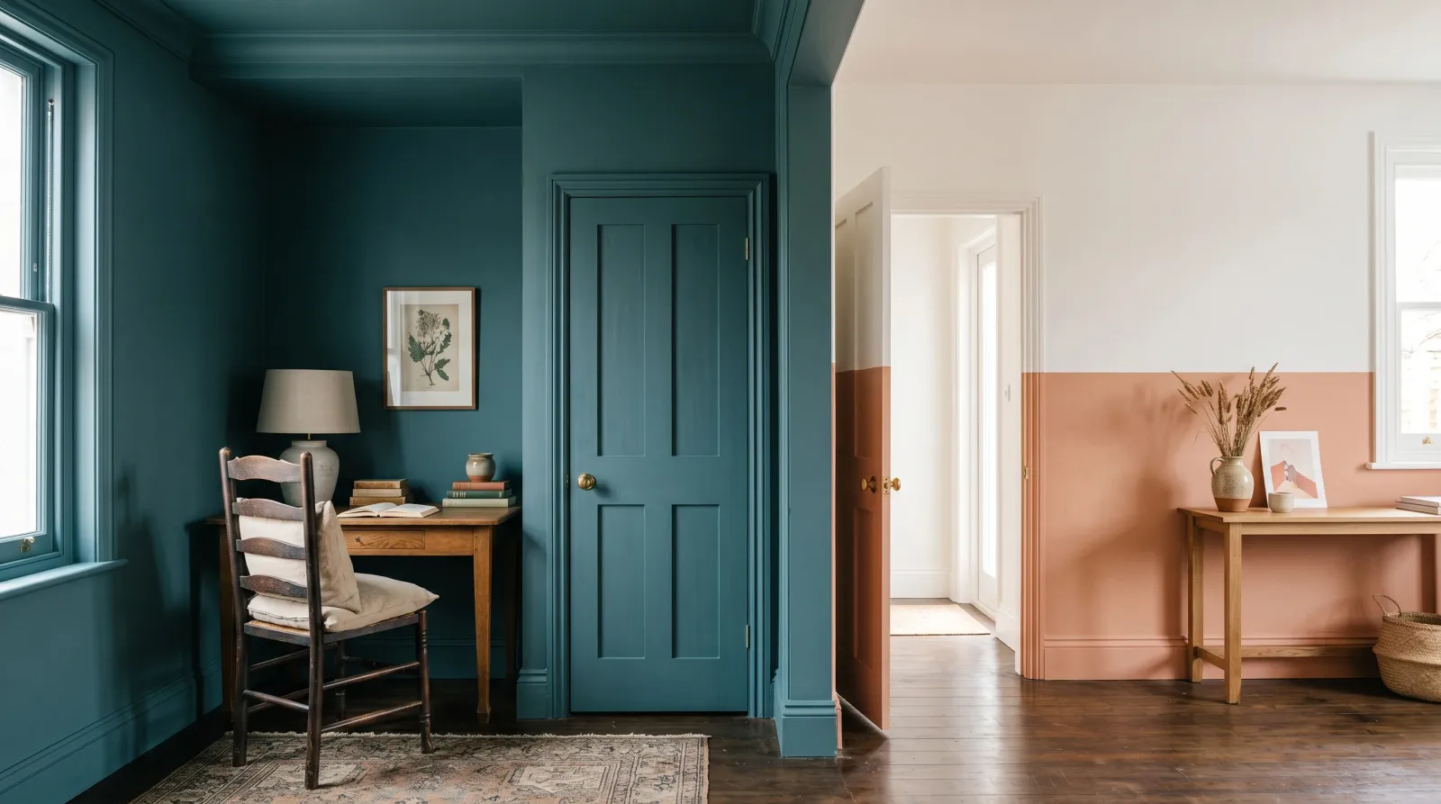
Color Drenching vs Color Blocking
Color drenching vs color blocking, decided by how each one handles light and a room's edges. A verdict by room, plus the sheen and prep that make either one work.

The 30-Second Answer
Color drenching wins when you want a room to feel like one held breath — small spaces, north-facing rooms, bedrooms and studies where the trim and ceiling matching the walls makes the edges disappear and the whole space settles. Color blocking wins when you want energy and structure on a wall: open-plan zones, kids’ rooms, a hallway that needs a pulse. Drench to quiet a room. Block to give it a beat.
At a Glance
| Color drenching | Color blocking | |
|---|---|---|
| The mood it creates | Calm, enveloping, seamless | Graphic, energetic, structured |
| How it handles light | Softens it, edges dissolve | Sharpens it, the line catches light |
| Difficulty | ✓✓ (one color, no cut-line) | ✓ (the line is everything) |
| How it ages | Quietly, slow to tire of | Faster — the line dates first |
| Room size it flatters | Small, awkward, north-facing | Large, open, tall walls |
How to Tell Which One a Room Wants
Stand in the doorway at the hour you actually use the room and look at the edges. If your eye keeps snagging on white trim, a contrasting ceiling, a busy baseboard against the floor, the room is fighting itself. That room wants drenching.
If the room is generous and a little flat, a wide blank wall with nothing to hold the eye, it wants a line. That room wants blocking. Color drenching dissolves edges. Color blocking draws them on purpose. One quiets, one organizes.
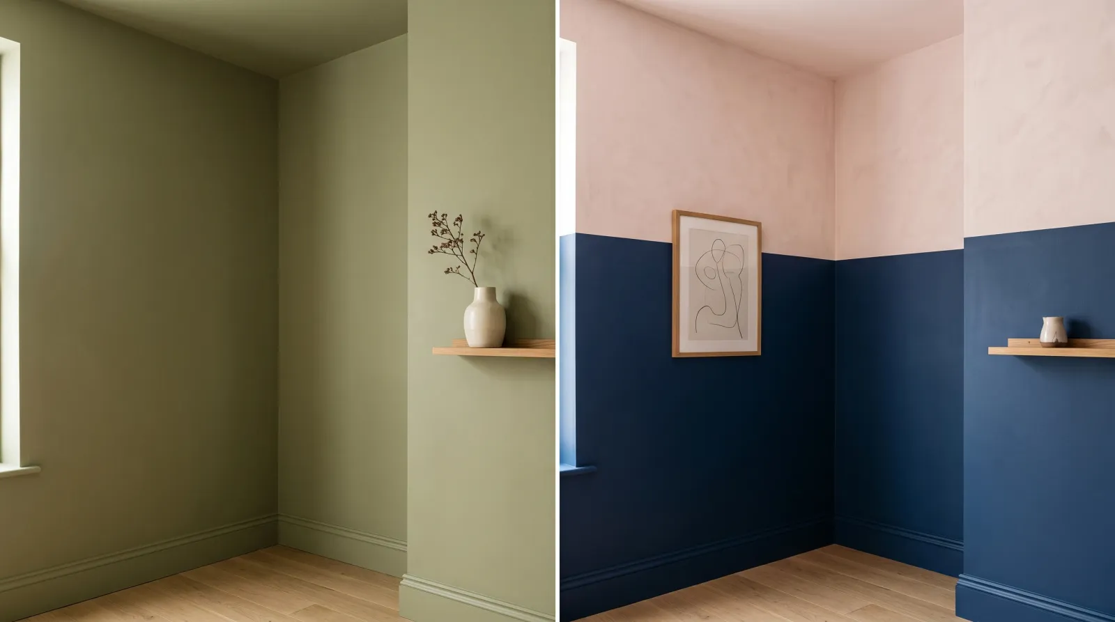 The same corner, two ideas. On the left the olive wraps wall, trim, and ceiling so the corner reads as one plane. On the right the navy meets pale pink along a level line that gives the wall its structure.
The Mood It Creates
Drenching makes a room feel held. When the trim, the ceiling, the door, sometimes the built-ins all carry one color, the boundaries soften and the space reads as a single envelope. There is nothing for the eye to bounce against, so the room goes quiet. A deep drench feels like a cocoon. A pale one feels like soft weather.
Blocking does the opposite. It introduces a line, and a line is tension. Two colors meeting along a crisp edge gives a wall rhythm and a sense of zones. It wakes a room up. In a flat open-plan space that has lost its corners, that beat is exactly what’s missing.
Winner: Color drenching for calm. Color blocking for energy. They serve opposite moods, so pick by the feeling you want when you walk in.
How It Handles Light
This is where the two part ways most clearly. A drenched room treats light gently. Because the color sits on every plane, the wall, the ceiling, the woodwork, light has nowhere to throw a hard contrast. North-facing light, which reads cool and a little flat, looks intentional in a drenched room instead of dreary. The color bounces from surface to surface and warms itself.
A blocked wall asks light to do the opposite. The line between the two colors catches raking light from a window or a downlight, and that’s the point — the edge is meant to be seen. The trade-off is that the same raking light exposes any wobble in the line and any unevenness in the darker block. A deep block under a window will show roller texture that a drenched matte wall would have swallowed.
If you want to understand how a color’s lightness reads on the wall before you commit, the way light reflectance value shapes a room is worth a few minutes. A low-LRV drench feels intimate. A low-LRV block can feel heavy if it climbs too high.
Winner: Color drenching. It forgives light. Blocking puts your line under a spotlight.
How Hard Is It to Get Right?
Drenching is the more forgiving of the two to execute, which surprises people. There is no contrast line to keep crisp, so you don’t need tape discipline, just one color carried cleanly across every surface. The decisions are upstream: choosing a color with an undertone you can live with on every plane, and shifting sheen instead of color so the trim still reads as trim.
The catch is sheen. Roll a flat color over walls and trim alike and the room goes muddy and the woodwork vanishes in a bad way. The move is to keep the same color but lift the trim and doors to satin or semi-gloss against an eggshell or matte wall. The color stays continuous, the woodwork still catches a little light, and the room reads designed rather than dipped.
Blocking is harder, because the line is the whole job. A wobbly edge or a color that bled under the tape ruins it, and no amount of good color choice rescues a bad line. You need a level or a laser, quality painter’s tape pressed down hard, and the trick of sealing the tape edge with the base color first so the second color can’t creep under. The technique sits close to a two-tone wall, where the meeting line does all the work.
Winner: Color drenching. One color, no line to police. Blocking rewards patience and punishes a shaky hand.
How It Ages with You
Drenching ages slowly. A muted, well-chosen color wrapped around a room rarely announces a year. It becomes the room’s backdrop, and you stop seeing it as a decision and start seeing it as the space itself. Deep greens, soft clays, smoky blues read as quietly current for a long stretch.
Blocking dates faster, and it’s the line that gives it away first. Hard, high-contrast blocks in saturated color read of their moment. The version that holds up is the muted one: a tonal pairing, a soft line, two colors that sit close on the same family rather than shouting across the room. If you block, block quietly and it will keep.
Winner: Color drenching. It’s the safer long-term commitment. Blocking stays fresh only if you keep the contrast gentle.
What Room Size Does Each One Flatter?
Drenching flatters the rooms people usually try to avoid touching: small, awkward, low-ceilinged, north-facing. By erasing the trim-and-ceiling contrast, it removes the lines that tell your eye how small the box is, and the room feels larger and more composed. A powder room, a study, a snug bedroom — these are drenching’s natural home. It also rescues rooms with too many jogs and angles, where contrasting trim would only highlight the mess.
Blocking flatters scale. It wants a tall wall, an open-plan run, a stairwell that climbs two stories, a generous bedroom wall behind the headboard. It gives big blank planes something to do. In a cramped room, a high horizontal block lowers the ceiling and crowds the space, so if you must block somewhere small, keep the line low and the upper color light.
Winner: Color drenching for small and awkward. Color blocking for large and tall. This one splits cleanly by square footage.
Verdict by Use Case
- Pick color drenching if: the room is small, north-facing, low-ceilinged, or visually busy with trim and angles; you want calm; you want the easier paint job. Bedrooms, studies, powder rooms, and snugs are where it sings.
- Pick color blocking if: the wall is large, tall, or part of an open plan that’s gone flat; you want energy and zoning; you have the patience for a clean line. Kids’ rooms, hallways, stairwells, and big bedroom walls take it well.
- It’s basically a tie when: you’re treating a single feature wall in a mid-size room. A drenched accent wall and a softly blocked one can both work. Choose by whether you want the wall to recede and calm the room, or step forward and structure it.
Common Mistakes
Drenching in flat everywhere. One color across walls and trim in dead-flat sheen goes muddy and the woodwork disappears. Keep the color, lift the trim and doors to satin or semi-gloss so they still catch light.
Blocking the line by eye. A line that looks level on the wall almost never is. Use a level or a laser, and seal the tape edge with the base color before the second color goes on, so nothing bleeds under.
Drenching with a fussy undertone. A color with a strong, shifting undertone reads differently on the ceiling than on a sunlit wall. Test the actual color on more than one plane before you wrap the whole room.
Blocking too high in a small room. A dark block that climbs past the middle of the wall pulls the ceiling down. Keep the heavier color in the lower third when the room is tight.
Top Picks by Side
Going with color drenching? A premium matte or eggshell that holds its color across a whole room is worth the upgrade — see the best ceiling paint for the surface that’s easiest to get wrong, since drenching means the ceiling takes the wall color too. For the woodwork in the same hue, a durable interior trim paint in satin keeps the trim reading as trim.
Going with color blocking? The line lives or dies on your tape and your sheen. A clean eggshell or satin in both colors keeps the meeting edge crisp; the interior trim paint round-up covers the harder-wearing finishes if your block runs along a high-touch zone.
FAQ
Does color drenching make a room look smaller? No. Painting the trim and ceiling to match removes the visual stops that mark where the room ends, so the boundaries blur and the space usually feels larger and calmer. A dark drench feels enveloping rather than small.
Should the trim match the walls when color drenching? Yes. Drenching means the trim, baseboards, and usually the ceiling all take the wall color. Shift the sheen instead of the color, satin or semi-gloss on the trim against a matte wall, so the woodwork still catches light without breaking the color.
Is color blocking still in style? Yes, in its softened form. The hard primary blocks gave way to muted, tonal pairings with a calmer line. A deep color two-thirds up under a soft neutral, or a painted arch behind a bed, reads current.
Can I color block in a small room? You can, but keep the line low and the upper color light. A high horizontal block lowers the ceiling and crowds a tight space. In most small rooms, drenching flatters more than blocking.