Color spec
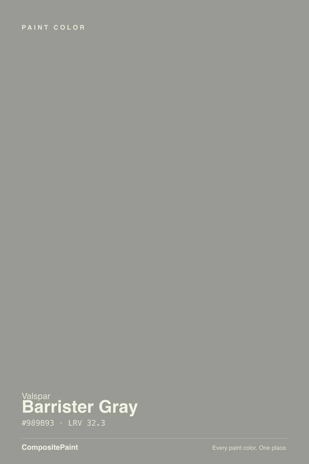
| Brand | Valspar |
| Name | Barrister Gray |
| SKU | T688 |
| Hex | #989B93 |
| RGB | 152, 155, 147 |
| HSL | 82°, 4%, 59% |
| LRV | 32.3 |
| Undertone | neutral with no strong undertone |
| Family | Gray |
About Valspar Barrister Gray
Barrister Gray sits in the mid-range at LRV 32.3, so it shifts visibly through the day — lighter and more open in morning light, deeper and moodier after dark. Because it carries almost no measurable hue, it stays a true neutral and pairs cleanly with nearly any trim or floor. South-facing rooms will pull it lighter and warmer, while north light cools it down.
Barrister Gray is versatile enough for full rooms but has enough depth to anchor a space, so it suits living rooms, bedrooms and cabinetry alike. Grays like this read as a modern neutral and sit comfortably alongside both warm woods and cool metals.
Closest matches by brand
18 brands within ΔE 5The closest matches per brand by ΔE2000, computed against each brand's full deck. Only colors within ΔE 5 (close enough to substitute on a wall) are shown — brands with no real match are left off. Tap any swatch for its full single-color spec; tap the brand title to browse all gray from that brand.
Sherwin-Williams
Behr
Benjamin Moore
PPG / Glidden
Glidden
Dutch Boy
HGTV Home by Sherwin-Williams
Dunn-Edwards
Magnolia Home
Farrow & Ball
Diamond Vogel
Hirshfield's
Rodda
C2 Paint
Clare
Backdrop
Rust-Oleum
Kompozit
Similar Valspar colors
closest in the Valspar deckThe nearest shades to Barrister Gray within Valspar's own range, ranked by perceptual color distance — useful when you want the same look a touch lighter, darker, or warmer.
Coordinated palette
Generated by hue-rotating #989B93 in HSL space. Pair Barrister Gray with one accent and one neutral — the swatches below are starting points, not final picks.
Accessibility (WCAG contrast)
WCAG 2.1: AA = 4.5:1 normal text · AA Large = 3:1 large text · AAA = 7:1 normal text.
Valspar Barrister Gray Equivalents at Other Brands
Matching Barrister Gray from a different paint counter? Below is the single closest color in each major US deck and how close it really is. Remember that any paint store can also custom-tint Valspar T688 directly — these equivalents are for when you'd rather stay inside one brand's own deck.
Sherwin-Williams Equivalent of Barrister Gray
Sherwin-Williams's nearest match is Acacia Haze (SW 9132), visually identical in normal room light (ΔE 1.82). It sits at the same lightness (LRV 32 vs 32.3) and carries a true neutral undertone, so it substitutes for Barrister Gray without repainting risk. See the full Acacia Haze swatch →
Behr Equivalent of Barrister Gray
Behr has no exact twin of Barrister Gray. The nearest is Dolphin Gray (HDC-NT-10A) at ΔE 4.32 — close, but the difference shows next to trim and in side light. It sits at the same lightness (LRV 32 vs 32.3). Compare large swatches before substituting. See the full Dolphin Gray swatch →
Benjamin Moore Equivalent of Barrister Gray
At Benjamin Moore, the closest color to Barrister Gray is Arctic Shadows (1559) — very close at ΔE 2.17, though not an exact twin. It sits at the same lightness (LRV 32 vs 32.3) and carries a warm yellow undertone; sample both side by side if the room gets strong natural light. See the full Arctic Shadows swatch →
PPG / Glidden Equivalent of Barrister Gray
PPG / Glidden has no exact twin of Barrister Gray. The nearest is Playing Possum (PPG0997-5) at ΔE 4.14 — close, but the difference shows next to trim and in side light. It sits at the same lightness (LRV 31 vs 32.3). Compare large swatches before substituting. See the full Playing Possum swatch →
Glidden Equivalent of Barrister Gray
Glidden's nearest match is Greycliffe (50GY 32/046), visually identical in normal room light (ΔE 1.03). It sits at the same lightness (LRV 32 vs 32.3) and carries a true neutral undertone, so it substitutes for Barrister Gray without repainting risk. See the full Greycliffe swatch →
Dutch Boy Equivalent of Barrister Gray
Dutch Boy has no exact twin of Barrister Gray. The nearest is Padlock Gray (438-4DB) at ΔE 3.88 — close, but the difference shows next to trim and in side light. It sits at the same lightness (LRV 31 vs 32.3). Compare large swatches before substituting. See the full Padlock Gray swatch →
HGTV Home by Sherwin-Williams Equivalent of Barrister Gray
HGTV Home by Sherwin-Williams's nearest match is Thorntree (HGSW 3284), visually identical in normal room light (ΔE 1.82). It sits at the same lightness (LRV 32 vs 32.3) and carries a true neutral undertone, so it substitutes for Barrister Gray without repainting risk. See the full Thorntree swatch →
Dunn-Edwards Equivalent of Barrister Gray
At Dunn-Edwards, the closest color to Barrister Gray is Kick the Can (DEGR72) — very close at ΔE 2.23, though not an exact twin. It sits at the same lightness (LRV 32 vs 32.3) and carries a true neutral undertone; sample both side by side if the room gets strong natural light. See the full Kick the Can swatch →
Magnolia Home Equivalent of Barrister Gray
Magnolia Home has no exact twin of Barrister Gray. The nearest is Watering Can (JG-135) at ΔE 4.74 — close, but the difference shows next to trim and in side light. It runs slightly lighter (LRV 34 vs 32.3). Compare large swatches before substituting. See the full Watering Can swatch →
Farrow & Ball Equivalent of Barrister Gray
At Farrow & Ball, the closest color to Barrister Gray is Pigeon (NO. 25) — very close at ΔE 2.08, though not an exact twin. It runs slightly lighter (LRV 34 vs 32.3) and carries a cool green undertone; sample both side by side if the room gets strong natural light. See the full Pigeon swatch →
Diamond Vogel Equivalent of Barrister Gray
At Diamond Vogel, the closest color to Barrister Gray is Everlasting Sage (0422) — very close at ΔE 2.36, though not an exact twin. It sits at the same lightness (LRV 32 vs 32.3) and carries a warm yellow undertone; sample both side by side if the room gets strong natural light. See the full Everlasting Sage swatch →
Hirshfield's Equivalent of Barrister Gray
At Hirshfield's, the closest color to Barrister Gray is Cannon Ball (0449) — very close at ΔE 2.28, though not an exact twin. It runs slightly lighter (LRV 35 vs 32.3) and carries a true neutral undertone; sample both side by side if the room gets strong natural light. See the full Cannon Ball swatch →
Rodda Equivalent of Barrister Gray
Rodda has no exact twin of Barrister Gray. The nearest is Spruce (CA191) at ΔE 4.25 — close, but the difference shows next to trim and in side light. It runs slightly darker (LRV 30 vs 32.3). Compare large swatches before substituting. See the full Spruce swatch →
C2 Paint Equivalent of Barrister Gray
C2 Paint has no exact twin of Barrister Gray. The nearest is Tin Man (C2-970) at ΔE 3.7 — close, but the difference shows next to trim and in side light. It sits at the same lightness (LRV 32 vs 32.3). Compare large swatches before substituting. See the full Tin Man swatch →
Clare Equivalent of Barrister Gray
At Clare, the closest color to Barrister Gray is Shade (PNT100-MD-14) — very close at ΔE 3.15, though not an exact twin. It runs slightly darker (LRV 28 vs 32.3) and carries a true neutral undertone; sample both side by side if the room gets strong natural light. See the full Shade swatch →
Rust-Oleum Equivalent of Barrister Gray
At Rust-Oleum, the closest color to Barrister Gray is Country Gray (285141) — very close at ΔE 3.14, though not an exact twin. It runs slightly darker (LRV 29 vs 32.3) and carries a true neutral undertone; sample both side by side if the room gets strong natural light. See the full Country Gray swatch →
Kompozit Equivalent of Barrister Gray
At Kompozit, the closest color to Barrister Gray is Cannon Ball (0449) — very close at ΔE 2.28, though not an exact twin. It runs slightly lighter (LRV 34 vs 32.3) and carries a true neutral undertone; sample both side by side if the room gets strong natural light. See the full Cannon Ball swatch →