Perfect Periwinkle
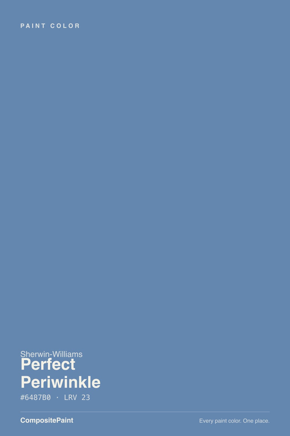
SW 9065 · #6487B0 · LRV 23 — cool blue tone, dark — high drama, needs strong daylight or warm bulbs.
- 1Hale Navy8
- 2Waterloo13
- 3Perfect Periwinkle23
- 4Resolute Blue40
- 5Lost in the 80s51
What Color Is Perfect Periwinkle, Really?
Perfect Periwinkle (SW 9065) is a medium-dark blue with a soft violet lean. Its hex value #6487B0 sits at hue 212, which is squarely blue, and saturation of about 32 percent gives it enough color to be unmistakable without turning bright. The LRV is 23, which is a fair way down the scale. On a wall it holds real weight, closer to a denim or a dusty French blue than to a pale sky blue.
People choose it when they want blue with softness in it. The violet edge takes away the sharpness that a pure blue can have, so the color feels calm and slightly faded rather than crisp and nautical. That makes it easier to live with on full walls than a saturated blue of the same depth, and it is why it shows up on bedrooms, cabinetry, and painted furniture.
The catch is the name. Despite being called periwinkle, the data puts it in blue territory, not lavender. If you are picturing a clear blue-violet you may find it too plainly blue, and next to a true violet it will look blue rather than purple. Sample it before you commit to the idea in your head.
The undertone is cool blue with a small push toward violet. Hue 212 is a fraction past pure blue on the way to indigo, and 32 percent saturation is moderate, so the color is clearly blue but not electric. What most people register as periwinkle is that faint violet edge showing up in the soft, dusty quality of the color rather than as obvious purple.
Context decides how much of that violet you see. Next to a gray-blue such as Sporty Blue SW 6522 (#6A8AA4, LRV 24), Perfect Periwinkle looks warmer and more violet. Next to a genuine blue-violet like Venture Violet SW 6970 (#7381B3, LRV 23) it swings the other way and reads plainly blue.
If the violet is the reason you like the color, test it against both a gray-blue and a violet-blue at the same time. Seeing it in the middle is the fastest way to know whether it is periwinkle enough for you.
Best Rooms and Uses for Perfect Periwinkle
This is a bedroom and study color first. At LRV 23 it wraps a room rather than brightening it, and the soft violet edge keeps it restful instead of stimulating. Guest rooms, primary bedrooms, home offices, and powder rooms all suit it. In a small windowless room it will read very dark, so plan for good lamp light if you go there.
Cabinetry is its other strong use. On a bathroom vanity, a laundry run, a kitchen island, or a built-in bookcase, the depth reads as considered rather than trendy, and the blue pairs well with white counters and warm wood.
Outside it works better as an accent than as a body color. A front door, shutters, or a porch ceiling in this blue against a light body gives contrast without the hardness of navy. Keep trim in a separate white so the blue stays a color rather than blending into shadow.
How Lighting Changes Perfect Periwinkle
At LRV 23 this color reflects a limited amount of light, so it deepens quickly as light drops. North-facing rooms hand it cool, flat daylight that reinforces hue 212 and pushes it colder and grayer, sometimes closer to slate than to periwinkle. South-facing rooms give it warm, plentiful light that softens the blue and lets the violet edge come through.
East rooms read crisp and cool in the morning and mellow through the afternoon. West rooms stay quiet and deep early, then pick up warmth late in the day, which is when the color looks its softest.
Bulbs move it just as much. Warm 2700K lamps take the chill off and bring the dusty violet forward, which suits bedrooms. Cooler 3500K to 4000K bulbs sharpen the blue and can make the walls feel cold at night. Since 23 LRV goes dim easily, always check a sample under your own fixtures after dark.
Most complaints about Perfect Periwinkle are a light mismatch. Upload a photo of your actual room and see it on your walls — then ask for the same wall in north light or evening lamps before you buy a single sample.
Need It From Another Brand?
Any paint counter can custom-tint Sherwin-Williams SW 9065 directly. If you would rather stay in one brand's own deck, these are the closest stock matches, measured as ΔE2000. Under 2 is a difference you will not see on the wall.
| Brand | Closest color | ΔE | LRV | |
|---|---|---|---|---|
| Behr | Cowgirl BlueM530-5 · Behr | 1.6 | 23 | Color page → |
| Benjamin Moore | Yin Yang824 · Benjamin Moore | 3.3 | 23 | Color page → |
| Valspar | Picasso8001-44E · Valspar | 3.5 | 22 | Color page → |
| PPG / Glidden | Shrinking VioletPPG1162-5 · PPG / Glidden | 1.4 | 22 | Color page → |
| Glidden | Shrinking VioletPPG1162-5 · Glidden | 1.5 | 22 | Color page → |
| Dutch Boy | Beautified Blue141-5DB · Dutch Boy | 4.5 | 24 | Color page → |
Similar Sherwin-Williams Colors
The nearest shades to Perfect Periwinkle within Sherwin-Williams's own range, ranked by perceptual color distance — useful when you want the same look a touch lighter, darker, or warmer.
WCAG 2.1: AA is 4.5 : 1 for normal text, 3 : 1 for large text, AAA is 7 : 1.
Perfect Periwinkle vs Similar Colors
Within the brand, Scanda SW 6529 (#6B8CA9, LRV 25) is the closest neighbor but reads grayer and slightly lighter, so it feels more like a soft slate blue. Dazzle SW 6962 (#5287B9, LRV 22) is more saturated and cleaner, a brighter blue with none of the dusty softness. Venture Violet SW 6970 (#7381B3, LRV 23) is the real violet in the group and makes Perfect Periwinkle look blue by comparison.
Across brands, PPG Shrinking Violet PPG1162-5 (#5E84B0, LRV 22) at deltaE 1.36 and the Glidden version of the same color at deltaE 1.51 are visually identical in normal room light. C2 Paint Moody Blue C2-763 (#6481AD, LRV 21) at deltaE 2.67 and Behr Majestic Mount 620F-5 (#6C84AA, LRV 23) at deltaE 3.02 are very close, so sample first.
Benjamin Moore Yin Yang 824 (#6A82A8, LRV 23) at deltaE 3.26 and Valspar Picasso 8001-44E (#5287B9, LRV 22) at deltaE 3.45 are also very close but worth testing, since Picasso is the cleaner and brighter of the two.
Colors That Go With Perfect Periwinkle
A clean white trim gives this blue the crispest frame, and a warm white softens it if you want the room to feel gentler. Either way the gap between LRV 23 and a white in the low 80s is wide enough for a clear trim line.
For tonal layering inside the Sherwin-Williams deck, Scanda SW 6529 (#6B8CA9, LRV 25) and Sporty Blue SW 6522 (#6A8AA4, LRV 24) sit at nearly the same depth with a grayer, less violet character, which makes them useful for an adjoining room that should feel related but not identical. Blue Cruise SW 7606 (#6591A8, LRV 26) is the lightest of the group and works on a ceiling above Perfect Periwinkle walls. For a more violet partner, Venture Violet SW 6970 (#7381B3, LRV 23) matches the depth exactly.
Warm woods do the heavy lifting on materials. Oak, walnut, and rattan all warm the blue, as do brass and aged bronze. Natural linen and unbleached textiles keep the whole thing from feeling cold.
Coordinated palette
Generated by hue-rotating #6487B0 in HSL space. Pair Perfect Periwinkle with one accent and one neutral — the swatches below are starting points, not final picks.
Perfect Periwinkle FAQ
Is Perfect Periwinkle blue or purple?
It is a blue with a violet lean, not a purple. Hue 212 sits just past pure blue, and at 32 percent saturation the violet reads as softness rather than as obvious lavender. Next to a gray-blue it will look more violet, and next to a true blue-violet it will look plainly blue. Most people see it as a dusty, soft blue.
What LRV is Perfect Periwinkle?
Perfect Periwinkle SW 9065 has an LRV of 23. On the 0 to 100 scale that is a medium-dark color, so it holds real depth on a wall and will not brighten a room. Expect it to look considerably deeper in corners and after dark than it does on the chip in your hand.
Does Perfect Periwinkle work in a dark room?
It works if you want the room to feel enclosed. At LRV 23 it gives back a limited amount of light, so a north-facing or dim room will push it toward a cold slate blue and the softer violet character mostly disappears. Warm 2700K bulbs and good lamp coverage bring it back. In a bright south-facing room it stays much more clearly periwinkle.
What white trim goes with Perfect Periwinkle?
Both directions work. A clean white gives the sharpest contrast against LRV 23 walls and keeps the blue crisp, while a soft warm white takes the chill off and suits bedrooms better. Because the wall sits at 23 and typical trim whites sit in the low 80s, the trim will read clearly either way, so choose based on how cool you want the room to feel.
Is Perfect Periwinkle good for cabinets?
Yes. At LRV 23 it gives a vanity, island, or built-in enough depth to read as furniture, and the soft violet edge keeps it friendlier than a navy. It pairs well with white or light stone counters, warm wood floors, and brass or bronze hardware. On full kitchen runs it will darken the room, so it is often used on lowers or an island only.
What is the closest match to Perfect Periwinkle from another brand?
PPG Shrinking Violet PPG1162-5 (#5E84B0, LRV 22) is nearest at deltaE 1.36, which is visually identical in normal room light, and the Glidden version of the same color follows at deltaE 1.51. After that, C2 Paint Moody Blue C2-763 at deltaE 2.67 is very close but worth sampling before you commit.
Have you painted with Perfect Periwinkle?
Rate it — one tap helps the next reader decide.
Ask a Question