Patchwork Plum
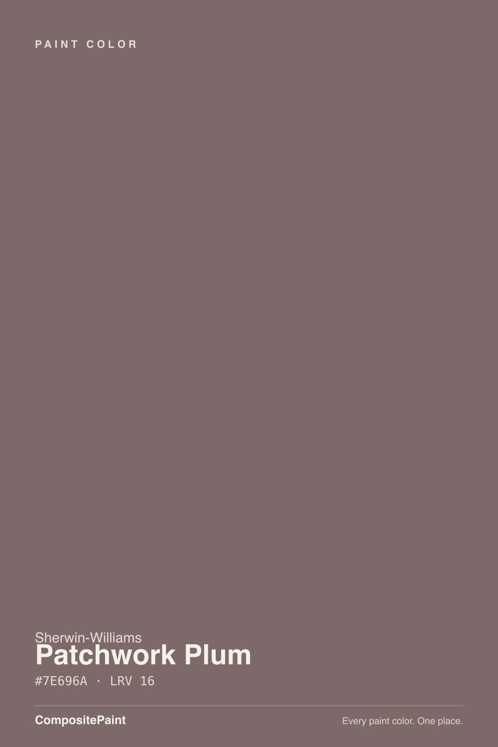
SW 22 · #7E696A · LRV 16 — warm red tone, dark — high drama, needs strong daylight or warm bulbs.
- 1Rookwood Dark Red3
- 2Rumors8
- 3Patchwork Plum16
- 4Inferno22
- 5Rejuvenate30
What Color Is Patchwork Plum, Really?
Patchwork Plum reads as a warm red tone — dark — high drama, needs strong daylight or warm bulbs. The notes below cover how Sherwin-Williams SW 22 behaves in different light and the closest matches at competing US brands.
Best Rooms and Uses for Patchwork Plum
Patchwork Plum works best as a feature — a single wall, built-ins, a study or dining room — rather than wrapping a whole bright space. Reds bring energy and appetite, classic in dining rooms and front doors.
How Lighting Changes Patchwork Plum
With an LRV of 16, Patchwork Plum is a deep, dramatic shade. It soaks up light in north-facing rooms and looks richest where strong daylight hits it. Its red undertone is the part to watch: it gets picked up by whatever sits next to it, so test it against your trim, floor and the room's main light before committing. Warm artificial light softens it; cool LED can make it look flat, so match your bulbs to the mood you want.
Most complaints about Patchwork Plum are a light mismatch. Upload a photo of your actual room and see it on your walls — then ask for the same wall in north light or evening lamps before you buy a single sample.
Need It From Another Brand?
Any paint counter can custom-tint Sherwin-Williams SW 22 directly. If you would rather stay in one brand's own deck, these are the closest stock matches, measured as ΔE2000. Under 2 is a difference you will not see on the wall.
| Brand | Closest color | ΔE | LRV | |
|---|---|---|---|---|
| Behr | Autumn AshesMQ1-41 · Behr | 1.3 | 16 | Color page → |
| Benjamin Moore | Mink Violet1252 · Benjamin Moore | 0.9 | 16 | Color page → |
| Valspar | Cocoa Berry8004-5F · Valspar | 3.5 | 15 | Color page → |
| PPG / Glidden | Bold BrandyPPG1017-6 · PPG / Glidden | 4.1 | 15 | Color page → |
| Glidden | Purple DuskPPG13-19 · Glidden | 4.9 | 16 | Color page → |
| Dutch Boy | My Devoted446-5DB · Dutch Boy | 1.6 | 17 | Color page → |
Similar Sherwin-Williams Colors
The nearest shades to Patchwork Plum within Sherwin-Williams's own range, ranked by perceptual color distance — useful when you want the same look a touch lighter, darker, or warmer.
WCAG 2.1: AA is 4.5 : 1 for normal text, 3 : 1 for large text, AAA is 7 : 1.
Coordinated palette
Generated by hue-rotating #7E696A in HSL space. Pair Patchwork Plum with one accent and one neutral — the swatches below are starting points, not final picks.
Have you painted with Patchwork Plum?
Rate it — one tap helps the next reader decide.
Ask a Question