Color spec
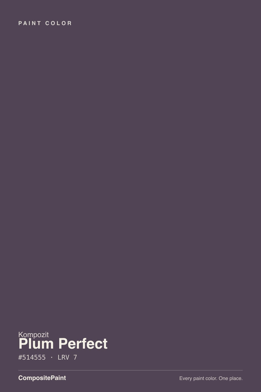
| Brand | Kompozit |
| Name | Plum Perfect |
| SKU | 1292 |
| Hex | #514555 |
| RGB | 81, 69, 85 |
| HSL | 285°, 10%, 30% |
| LRV | 7 |
| Undertone | cool violet tone |
| Family | Purple |
About Kompozit Plum Perfect
At LRV 7, Plum Perfect is about as dark as paint gets — it reads near-black on a wall and reveals its character only in direct daylight or under warm bulbs. Its violet undertone is the part to watch: it gets picked up by whatever sits next to it, so test it against your trim, floor and the room's main light before committing. In rooms with little natural light it can feel heavy, so reserve it for spaces you want to feel enveloping.
Plum Perfect earns its keep as a statement: accent walls, a front door, cabinetry, a moody powder room, or exterior trim where you want sharp contrast. Purples range from restful (bedrooms) to dramatic (powder rooms) depending on depth.
Closest matches by brand
14 brands within ΔE 5The closest matches per brand by ΔE2000, computed against each brand's full deck. Only colors within ΔE 5 (close enough to substitute on a wall) are shown — brands with no real match are left off. Tap any swatch for its full single-color spec; tap the brand title to browse all purple from that brand.
Sherwin-Williams
Behr
Benjamin Moore
Valspar
PPG / Glidden
Glidden
Dutch Boy
HGTV Home by Sherwin-Williams
Dunn-Edwards
Farrow & Ball
Diamond Vogel
Hirshfield's
C2 Paint
Portola Paints
Similar Kompozit colors
closest in the Kompozit deckThe nearest shades to Plum Perfect within Kompozit's own range, ranked by perceptual color distance — useful when you want the same look a touch lighter, darker, or warmer.
Coordinated palette
Generated by hue-rotating #514555 in HSL space. Pair Plum Perfect with one accent and one neutral — the swatches below are starting points, not final picks.
Accessibility (WCAG contrast)
WCAG 2.1: AA = 4.5:1 normal text · AA Large = 3:1 large text · AAA = 7:1 normal text.
Kompozit Plum Perfect Equivalents at Other Brands
Matching Plum Perfect from a different paint counter? Below is the single closest color in each major US deck and how close it really is. Remember that any paint store can also custom-tint Kompozit 1292 directly — these equivalents are for when you'd rather stay inside one brand's own deck.
Sherwin-Williams Equivalent of Plum Perfect
Sherwin-Williams has no exact twin of Plum Perfect. The nearest is Quixotic Plum (SW 6265) at ΔE 4.07 — close, but the difference shows next to trim and in side light. It sits at the same lightness (LRV 6 vs 7). Compare large swatches before substituting. See the full Quixotic Plum swatch →
Behr Equivalent of Plum Perfect
At Behr, the closest color to Plum Perfect is Napa Harvest (ECC-17-3) — very close at ΔE 2.52, though not an exact twin. It sits at the same lightness (LRV 7 vs 7) and carries a warm magenta undertone; sample both side by side if the room gets strong natural light. See the full Napa Harvest swatch →
Benjamin Moore Equivalent of Plum Perfect
Benjamin Moore's nearest match is Grappa (1393), visually identical in normal room light (ΔE 1.33). It runs slightly lighter (LRV 9 vs 7) and carries a cool violet undertone, so it substitutes for Plum Perfect without repainting risk. See the full Grappa swatch →
Valspar Equivalent of Plum Perfect
Valspar's nearest match is Purple Fury (4001-4C), visually identical in normal room light (ΔE 1.06). It sits at the same lightness (LRV 6.9 vs 7) and carries a cool violet undertone, so it substitutes for Plum Perfect without repainting risk. See the full Purple Fury swatch →
PPG / Glidden Equivalent of Plum Perfect
At PPG / Glidden, the closest color to Plum Perfect is Blackberry (PPG1172-7) — very close at ΔE 2.04, though not an exact twin. It sits at the same lightness (LRV 6 vs 7) and carries a cool violet undertone; sample both side by side if the room gets strong natural light. See the full Blackberry swatch →
Glidden Equivalent of Plum Perfect
At Glidden, the closest color to Plum Perfect is Nighttime Purple (90RB 07/075) — very close at ΔE 2.89, though not an exact twin. It sits at the same lightness (LRV 7 vs 7) and carries a warm magenta undertone; sample both side by side if the room gets strong natural light. See the full Nighttime Purple swatch →
Dutch Boy Equivalent of Plum Perfect
Dutch Boy's nearest match is Great Aubergine! (346-7DB), visually identical in normal room light (ΔE 1.94). It sits at the same lightness (LRV 6 vs 7) and carries a cool violet undertone, so it substitutes for Plum Perfect without repainting risk. See the full Great Aubergine! swatch →
HGTV Home by Sherwin-Williams Equivalent of Plum Perfect
HGTV Home by Sherwin-Williams has no exact twin of Plum Perfect. The nearest is Oceanic Trench (HGSW 3391) at ΔE 4.07 — close, but the difference shows next to trim and in side light. It sits at the same lightness (LRV 6 vs 7). Compare large swatches before substituting. See the full Oceanic Trench swatch →
Dunn-Edwards Equivalent of Plum Perfect
The closest Dunn-Edwards equivalent of Plum Perfect is Nightshade (DET407). At ΔE 0.82 the two are indistinguishable on a wall — it carries the same cool violet undertone and sits at the same lightness (LRV 6 vs 7). If Dunn-Edwards is your counter, order Nightshade and you'll get the same color. See the full Nightshade swatch →
Farrow & Ball Equivalent of Plum Perfect
At Farrow & Ball, the closest color to Plum Perfect is Pelt (NO. 254) — very close at ΔE 2.89, though not an exact twin. It sits at the same lightness (LRV 7 vs 7) and carries a warm magenta undertone; sample both side by side if the room gets strong natural light. See the full Pelt swatch →
Diamond Vogel Equivalent of Plum Perfect
At Diamond Vogel, the closest color to Plum Perfect is Purple Shadow (1215) — very close at ΔE 3.04, though not an exact twin. It sits at the same lightness (LRV 7 vs 7) and carries a warm magenta undertone; sample both side by side if the room gets strong natural light. See the full Purple Shadow swatch →
Hirshfield's Equivalent of Plum Perfect
The closest Hirshfield's equivalent of Plum Perfect is Plum Perfect (1292). At ΔE 0 the two are indistinguishable on a wall — it carries the same cool violet undertone and runs slightly lighter (LRV 9 vs 7). If Hirshfield's is your counter, order Plum Perfect and you'll get the same color. See the full Plum Perfect swatch →
C2 Paint Equivalent of Plum Perfect
C2 Paint has no exact twin of Plum Perfect. The nearest is Chocolate Cosmos (BD28) at ΔE 3.86 — close, but the difference shows next to trim and in side light. It sits at the same lightness (LRV 6 vs 7). Compare large swatches before substituting. See the full Chocolate Cosmos swatch →