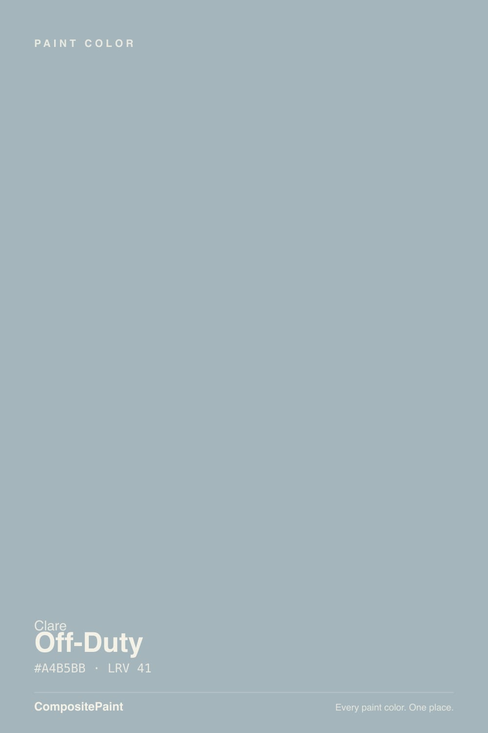
Color spec
| Brand | Clare |
| Name | Off-Duty |
| SKU | Clare 13 |
| Hex | #A4B5BB |
| RGB | 164, 181, 187 |
| HSL | 196°, 14%, 69% |
| LRV | 41 |
| Undertone | cool blue-green tone |
| Family | Gray |
What Color Is Off-Duty, Really?
Off-Duty is a soft blue-gray with a quiet green lean. Its numbers tell the story: a hue sitting in the blue-green range, low saturation around 14 percent, and an LRV of 41 that puts it squarely in the mid-tone band. That means it reads mostly as a calm, cool gray, but there is enough blue-green in it to keep it from ever looking flat or plain. It is not a bright color and not a pale one, so it holds its own on a full wall.
Clare built it as a coastal-blue everyday neutral, the kind of shade you can live with in any room without it shouting. That everyday quality is why it is popular.
It suits homes that want a bit of color without commitment: calm bedrooms, bathrooms, offices, and living rooms in modern coastal, transitional, or relaxed traditional styles.
Off-Duty leans cool, toward blue with a touch of green. Its saturation sits around 14 percent, which is low but not invisible. That is above the near-neutral threshold, so the blue-green shows more clearly than it would in a true gray, especially across a large wall.
When and where does the undertone appear? In bright daylight and next to clean whites, the blue-green reads plainly and the color feels coastal. In dim light or against warm woods and beige, it quiets down and reads closer to a plain soft gray. North light pushes it bluer and cooler, while warm lamplight pulls it toward a muted gray-green.
Test it against a crisp white trim sample and a warm greige at the same time. If it looks too blue for you, place it beside warmer neutrals to settle it. Always judge a painted sample, not the chip.
Best Rooms and Uses for Off-Duty
At LRV 41, Off-Duty is a versatile mid-tone rather than a whole-home light color or a dark statement shade. It has enough depth to feel like a real color choice yet stays calm enough for everyday rooms.
It works well on full walls in bedrooms, bathrooms, home offices, and living rooms, where its coastal-blue calm suits rest and focus. It is a strong choice for cabinets and built-ins, where the mid-tone depth gives them presence without going dark. On an accent wall it adds quiet color behind a bed or in a nook.
Outside, it makes a soft, weathered-blue body color or a shutter and front-door color on lighter houses, reading like a gentle coastal blue. Keep true whites for trim so the undertone stays clean. It is a bit deep for trim itself, so save trim duty for a lighter white.
How Lighting Changes Off-Duty
With an LRV of 41, Off-Duty is a mid-tone. It reflects a moderate amount of light, so it will read noticeably darker in a dim room and lift toward a soft powder blue-gray in a bright one. It never goes truly pale, so plan for a room with real color on the walls.
In north-facing rooms, the cool light emphasizes the blue and can make the color feel a little chilly, so pair it with warm wood and warm bulbs. South-facing rooms flood it with light and bring out its best, keeping it soft and clear. East light reads fresh and blue in the morning, then calms by afternoon. West rooms warm it up in the evening.
Warm bulbs around 2700K mute the blue and add gray. Cooler bulbs near 4000K sharpen the coastal blue-green. Test both before deciding.
Most complaints about Off-Duty are a light mismatch. Upload a photo of your actual room and see it on your walls — then ask for the same wall in north light or evening lamps before you buy a single sample.
TEST IT IN YOUR LIGHT →Off-Duty vs Similar Colors
Off-Duty (LRV 41) sits between Clare's other coastal blues, so the differences are subtle but real on a wall.
Make Waves (PNT100-MD-43) shares the same LRV of 41 but leans noticeably greener and more muted, reading closer to a soft sage-blue. Choose Make Waves when you want the color to feel more like a gray-green and Off-Duty when you want the blue to stay clearer.
Vacay (PNT100-LT-44, LRV 42) is greener still, drifting toward teal, so it feels more playful and coastal than the calmer Off-Duty. Cloud Watching (PNT100-MD-73) is lighter at LRV 50 and leans a touch more blue and less green, giving you an airier, more open feel for a brighter room. If your space is dim or you want more presence, Off-Duty's mid-tone depth holds up better than the lighter Cloud Watching.
Colors That Go With Off-Duty
For trim and ceilings, pair Off-Duty with a bright, clean white. Snow Day (Clare 04), at an LRV of 92, gives you the crispest contrast and keeps the blue-green looking fresh. If you want a slightly softer, warmer white, Beach House (Clare 01, LRV 84) settles the cool edge without muddying it.
For a second wall color or a grounding anchor, Stargazer (Clare 14, LRV 27) is a deeper cousin in the same blue-gray family and layers naturally in the same room. For real depth on a door, island, or accent, Goodnight Moon (Clare 10, LRV 6) delivers a near-navy that makes the lighter blue pop.
To warm the scheme, add Greige (Clare 07, LRV 50) as a neutral partner, or bring in Dirty Chai (Clare 06, LRV 33) on furniture. Natural oak and walnut and both brass and matte-black metals all sit comfortably alongside it.
Need It From Another Brand?
Any paint counter can custom-tint Clare Clare 13 directly — but if you would rather stay in one brand's own deck, these are the closest stock matches:
Similar Clare colors
closest in the Clare deckThe nearest shades to Off-Duty within Clare's own range, ranked by perceptual color distance — useful when you want the same look a touch lighter, darker, or warmer.
Coordinated palette
Generated by hue-rotating #A4B5BB in HSL space. Pair Off-Duty with one accent and one neutral — the swatches below are starting points, not final picks.
Accessibility (WCAG contrast)
WCAG 2.1: AA = 4.5:1 normal text · AA Large = 3:1 large text · AAA = 7:1 normal text.
The Questions Everyone Asks
Is Off-Duty warm or cool?
Off-Duty is a cool color. Its hue sits in the blue-green range with low saturation, so it reads mostly as a calm gray with a clear blue lean. In cool north light it feels cooler and bluer, while warm lamplight and warm wood tones can soften the cool edge and make it read a little more neutral.
Is Off-Duty more blue or more gray?
It is both. With a saturation around 14 percent, Off-Duty is soft and gray enough to work as an everyday neutral, but there is real blue-green in it, so it never reads as a plain gray. On a large wall in good light the blue shows plainly. In dim rooms it quiets down and looks closer to a soft gray.
What trim white goes with Off-Duty?
A bright, clean white works best. Snow Day (Clare 04), with an LRV of 92, gives the crispest contrast and keeps Off-Duty's blue-green looking fresh. If you prefer a softer, slightly warmer trim, Beach House (Clare 01, LRV 84) still holds the cool wall color without muddying it. Keep the trim lighter than the wall so the undertone stays clean.
Does Off-Duty work on cabinets and exteriors?
Yes. Its mid-tone LRV of 41 gives cabinets and built-ins real presence without going dark, which suits kitchens and bathrooms that want soft color. Outside, it makes a gentle weathered-blue body color or a shutter and front-door color on lighter houses. Pair it with a true white trim so the blue-green reads clearly against the surrounding surfaces.
What does an LRV of 41 mean for Off-Duty?
LRV measures how much light a color reflects, from 0 for black to 100 for white. At 41, Off-Duty is a mid-tone: it reflects a moderate amount of light, so it looks like a real color on the wall rather than a pale wash. Expect it to read deeper in dim rooms and lift to a softer blue-gray in bright, sunny spaces.
How is Off-Duty different from Make Waves?
Make Waves (PNT100-MD-43) shares Off-Duty's LRV of 41, so they are equally deep, but Make Waves leans noticeably greener and more muted, reading like a soft sage-blue. Off-Duty keeps its blue clearer and cooler. Choose Make Waves for a gray-green feel and Off-Duty when you want the coastal blue to stay in front. Sample both side by side.
Will It Work in YOUR Room?
No page can promise how Off-Duty behaves in your light. Upload a photo and see it on your own walls in seconds — before you spend a cent on samples.
TRY OFF-DUTY ON YOUR ROOM →Ask a Question

Not sure about Off-Duty in your room?
Ask Jessica below — every question gets a real reply, usually within a day.