Pastel Pink
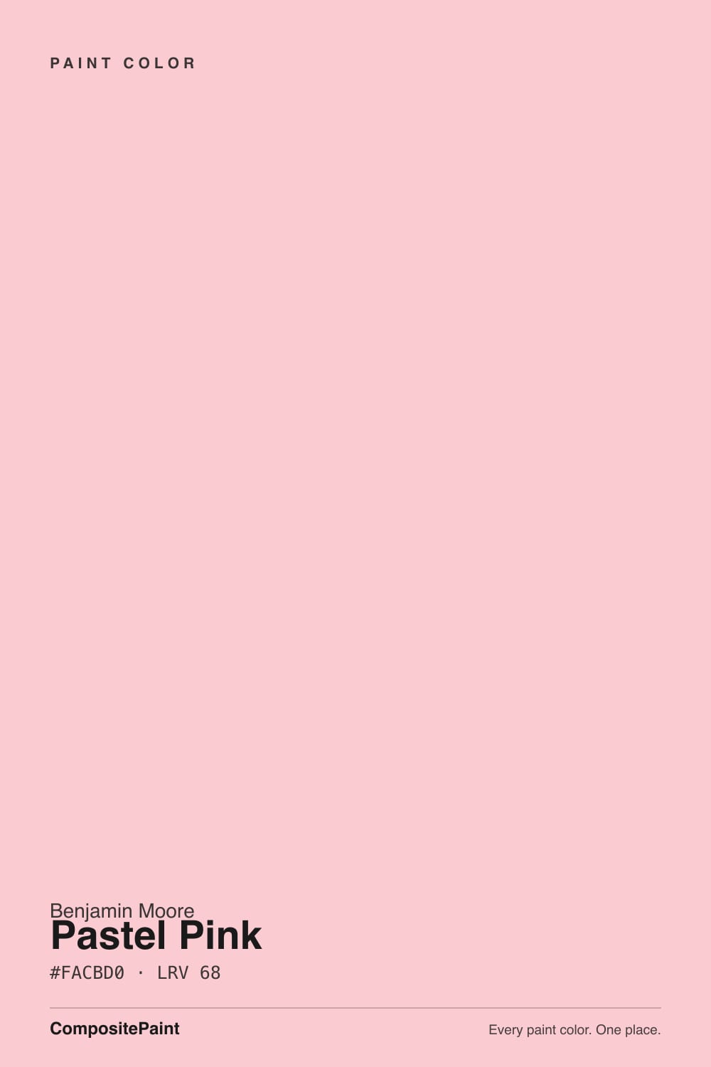
2007-60 · #FACBD0 · LRV 68 — warm red tone, light — bounces daylight without going clinical.
- 1Vintage Tea Rose47
- 2Pale Cherry Blossom61
- 3Pastel Pink68
- 4First Light76
- 5Pink Bliss82
What Color Is Pastel Pink, Really?
Pastel Pink 2007-60 is a pale, clean pink. Its hex value is #FACBD0 and its hue sits at 354 degrees, which is a true red rather than a coral or a mauve. The saturation reads high on paper at 82 percent, but the lightness is 89 percent, so what lands on the wall is a soft blush, not a bright pink. Its LRV is 68, in the light band: it reflects plenty of daylight and keeps a room open without going clinical.
People choose it when they want pink that stays gentle. Because the hue is a straight warm red with no orange in it, Pastel Pink avoids the salmon and peach directions that make some pinks feel dated. It reads fresh and slightly cool for a warm color, which is what makes it usable on full walls rather than only on a child's room accent. At LRV 68 it behaves almost like a tinted neutral in daylight.
The catch is that pale pinks amplify. At this lightness the color is quiet on a chip and much stronger across four walls, especially in a room with warm afternoon sun, where it can push toward candy. In cool north light it goes the other way and can look slightly gray and washed out. Paint a large sample on two walls before you commit.
The undertone in Pastel Pink is a warm red. At 354 degrees of hue it sits just on the red side of neutral, with no orange and no violet pulling it sideways. That is what keeps it from reading as coral or as a dusty mauve. The very high lightness of 89 percent is doing most of the work, softening a saturated red base into a blush.
What is next to it changes how strong it looks. Against a bright, blue-based white the pink is obvious and reads clearly warm. Against a cream or a beige it can look cooler and cleaner, almost like a tinted white. Next to a red or a terracotta it retreats and looks like a neutral.
Before choosing, hold it against your trim white and any wood in the room. Warm oak floors will strengthen the pink; gray floors will cool it and can make it look slightly chalky.
Best Rooms and Uses for Pastel Pink
At LRV 68 Pastel Pink is a light wall color that suits bedrooms, nurseries, dressing rooms, and powder rooms. In a bedroom it gives a soft, restful wash that is warmer than a white but far quieter than a saturated color. In a powder room the small footprint lets the pink read as a deliberate choice, and it looks well against brass or polished nickel fixtures.
On cabinets and millwork it works best in small doses. A pink vanity, a laundry cabinet run, or the inside of a bookcase gives the color somewhere to be interesting without asking a whole kitchen to commit. On ceilings it can be lovely, since the reflected light warms the room below.
Outdoors it is a limited option. Pale pinks work on stucco or shingle in coastal and southern settings but can look faded elsewhere, and strong sun raises the warmth further. It is not a trim or contrast color.
How Lighting Changes Pastel Pink
With an LRV of 68 Pastel Pink reflects a lot of light, so it stays bright almost anywhere. What moves is how pink it looks. North-facing rooms get cool, indirect daylight that tones the warm red down, and the color can read as a soft gray-pink or nearly a warm white on the wall.
South-facing rooms do the opposite. Strong warm light pushes the 354-degree red forward and Pastel Pink becomes much more obviously pink, sometimes more than people expect from the chip. East rooms are pinkest in the morning and calm down by afternoon; west rooms stay quiet early and bloom in late-day sun.
Bulbs shift it noticeably. Warm 2700K lamps intensify the pink and can make an evening room feel rosy. Cooler 3500K to 4000K bulbs mute it toward a pale neutral. Because the difference between those two states is large at this lightness, check the sample at night under your own fixtures.
Most complaints about Pastel Pink are a light mismatch. Upload a photo of your actual room and see it on your walls — then ask for the same wall in north light or evening lamps before you buy a single sample.
Need It From Another Brand?
Any paint counter can custom-tint Benjamin Moore 2007-60 directly. If you would rather stay in one brand's own deck, these are the closest stock matches, measured as ΔE2000. Under 2 is a difference you will not see on the wall.
| Brand | Closest color | ΔE | LRV | |
|---|---|---|---|---|
| Sherwin-Williams | Reverie PinkSW 6856 · Sherwin-Williams | 2.7 | 66 | Color page → |
| Behr | Demure Pink210C-2 · Behr | 0.7 | 69 | Color page → |
| Valspar | Icing on the Cake8001-10B · Valspar | 1.4 | 68 | Color page → |
| PPG / Glidden | Kendall RosePPG1185-2 · PPG / Glidden | 1.9 | 67 | Color page → |
| Glidden | Kendall RosePPG1185-2 · Glidden | 1.9 | 67 | Color page → |
| Dutch Boy | Blushed Pink103-3DB · Dutch Boy | 1.1 | 65 | Color page → |
Similar Benjamin Moore Colors
The nearest shades to Pastel Pink within Benjamin Moore's own range, ranked by perceptual color distance — useful when you want the same look a touch lighter, darker, or warmer.
WCAG 2.1: AA is 4.5 : 1 for normal text, 3 : 1 for large text, AAA is 7 : 1.
Pastel Pink vs Similar Colors
Within the brand the differences are small but real. Exotic Pink 2003-60 and Cat's Meow 1332 at LRV 70 are lighter and read a shade fresher, while Authentic Pink 2006-60 and Sweet 16 1310 at LRV 65 are three points deeper and hold more color under weak light. Unspoken Love 1269 at LRV 66 is the softest and grayest of the group.
Across brands, Behr Demure Pink 210C-2 at LRV 69 has a deltaE of 0.74 and Diamond Vogel Fruitbowl 1113 at LRV 69 sits at 0.94, so both are true matches. Dutch Boy Blushed Pink 103-3DB at LRV 65 and Valspar Icing on the Cake 8001-10B at LRV 68 land near 1.1 to 1.4, visually identical in normal room light. Sherwin-Williams Reverie Pink SW 6856 at LRV 66 is 2.66 away, very close but worth sampling first. HGTV Home by Sherwin-Williams Enchanting Pink HGSW 1047 at LRV 70 is 4.48, close but visibly different side by side.
Colors That Go With Pastel Pink
Inside Benjamin Moore, the near neighbors give you an easy family to build with. Cat's Meow 1332 at LRV 70 and Exotic Pink 2003-60 at LRV 70 are two points lighter, useful for a ceiling or an adjoining room that should feel airier. Pink Parfait 2004-60 at LRV 66 and Unspoken Love 1269 at LRV 66 sit slightly deeper and cooler, which makes them good for a second wall or a trim accent within the same scheme. Authentic Pink 2006-60 and Sweet 16 1310, both at LRV 65, are the deepest of the group and read a little more saturated.
For trim, a clean white keeps the pink crisp; a cream white will warm it further and can make the room feel sweet. For materials, walnut and warm oak both ground the color, and brass, unlacquered nickel, or black hardware all give it a needed edge.
Coordinated palette
Generated by hue-rotating #FACBD0 in HSL space. Pair Pastel Pink with one accent and one neutral — the swatches below are starting points, not final picks.
Pastel Pink FAQ
Is Pastel Pink warm or cool?
Pastel Pink is warm. Its undertone is a warm red sitting at 354 degrees of hue, with no orange and no violet pulling it off center. It is a clean pink rather than a peachy or dusty one. In cool north light the warmth is muted enough that the color can read almost like a soft warm white.
What LRV is Pastel Pink?
Pastel Pink 2007-60 has an LRV of 68. LRV measures reflected light on a scale from 0 for black to 100 for pure white, so 68 is a light color. It bounces plenty of daylight and keeps a room feeling open, while still carrying enough tint to be clearly recognizable as pink on a full wall.
Does Pastel Pink look too pink on a whole room?
It can, depending on your light. At LRV 68 the color looks quiet on a chip and much stronger across four walls. Warm south and west light push the 354-degree red forward and the pink becomes obvious. Cool north light tones it down toward a soft neutral. Sample two walls, not one, before deciding.
Does Pastel Pink work in a dark room?
Yes, better than most tinted colors. At LRV 68 it reflects a lot of light, so it will not close a dim room in. The trade-off is that weak, cool light mutes the warm red undertone, and the wall can read gray-pink or slightly washed. Warm 2700K bulbs bring the color back at night.
What white trim goes with Pastel Pink?
A clean, bright white is the safest choice. It keeps the wall reading as a clear pink and gives crisp edges against an LRV of 68. A cream or yellow-leaning trim white warms the pink further and can tip the room toward a sweeter look than most people want.
Is Pastel Pink good for cabinets or exteriors?
On cabinets it works best in small runs, like a vanity, a laundry cupboard, or the inside of built-ins, where the color stays a detail. Outdoors it is limited. Pale pinks suit stucco and shingle in coastal or southern settings, but strong sun raises the warmth and in cooler regions the color can look faded.
Have you painted with Pastel Pink?
Rate it — one tap helps the next reader decide.
Ask a Question