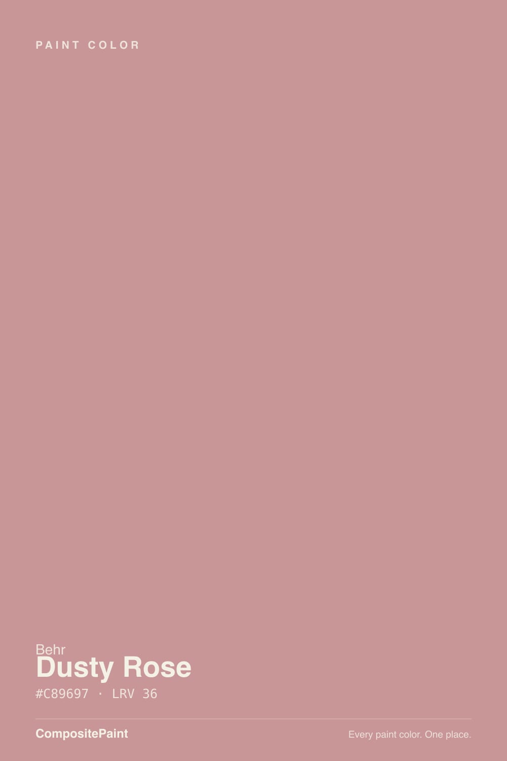
Dusty Rose
S140-4A · #C89697 · LRV 36 — warm red tone, mid-tone — versatile but shifts visibly with light.
- 1Razzle Dazzle20
- 2Coming up Roses30
- 3Dusty Rose36
- 4Pale Cherry Blossom61
- 5Romance66
What Color Is Dusty Rose, Really?
Dusty Rose S140-4A is a muted mid-tone pink. Its hex is #C89697 and its LRV is 36, which places it in the middle of the range: it has real color presence on a wall and it takes light out of a room rather than adding it. The hue sits at 359 degrees, right at the red end of the wheel, with about 31 percent saturation. That partial saturation is what makes it a dusty rose instead of a clean pink.
People pick it when they want pink that behaves like a warm neutral. The gray in the mix keeps it from looking sweet or childish, and the red base gives it enough warmth to sit comfortably with wood, terracotta, and aged brass. On a full wall it reads soft and slightly faded, closer to old plaster than to a modern pink.
The catch is that a mid-tone pink is very sensitive to light. At LRV 36 it goes noticeably darker and grayer in weak light, and in strong warm sun the red base can push it toward salmon. Live with a large sample for a few days before committing a whole room.
Dusty Rose is a warm red at its core. The hue reads at 359 degrees, which is true red rather than the purple-leaning side of pink, so it stays earthy instead of turning mauve. Saturation is around 31 percent, high enough that nobody will mistake it for a neutral, low enough that it never looks bright.
What sits beside it decides how pink it reads. Against a crisp white it looks clearly rosy. Against warm beige or terracotta it grays down and can look almost taupe. Next to a cooler mauve or lilac the red warmth jumps forward and Dusty Rose starts to look peachy by comparison.
Check it against your floor first. Red oak and warm laminate share the same red base and can make the walls look more orange than you want. Gray-toned wood, cool tile, or a green rug will pull the pink forward instead.
Best Rooms and Uses for Dusty Rose
Dusty Rose is a wall color for rooms you want to feel calm and enclosed rather than bright. Bedrooms are the natural fit, along with dining rooms, powder rooms, and reading nooks. At LRV 36 it will make a small room feel cozier and a large room feel warmer, but it will not brighten anything, so keep it out of rooms that already struggle for light unless that softness is the goal.
On cabinets and built-ins it works better than most people expect. A dusty mid-tone pink on a vanity, a pantry, or a laundry cabinet run reads as a considered color rather than a novelty, especially with brass or bronze hardware.
Outdoors it suits a front door or a shutter on a light body color, and it sits naturally with brick and terracotta roof tile. As a full exterior body color it is a strong commitment and best judged with a large sample in real sun.
How Lighting Changes Dusty Rose
An LRV of 36 means Dusty Rose reflects a moderate amount of light and nothing more, so the room does most of the work. North-facing rooms get flat, cool daylight that mutes the red and lets the gray in the mix take over. There the color reads deeper, dustier, and closer to a warm taupe.
South and west rooms are the opposite. Direct sun lands on that 359 degree hue and lifts it, so the walls look warmer, pinker, and in late afternoon sometimes distinctly salmon. East rooms are rosy in the morning and settle to a quieter mid-tone by afternoon.
Bulbs shift it hard. Warm 2700K lighting deepens the pink and makes it feel candlelit, sometimes too much so in a small room. Neutral 3500K to 4000K bulbs strip out some of the warmth and leave it grayer and calmer. Because 36 is not a bright color, check the sample at night, when the room may go darker than you expect.
Most complaints about Dusty Rose are a light mismatch. Upload a photo of your actual room and see it on your walls — then ask for the same wall in north light or evening lamps before you buy a single sample.
Need It From Another Brand?
Any paint counter can custom-tint Behr S140-4A directly. If you would rather stay in one brand's own deck, these are the closest stock matches, measured as ΔE2000. Under 2 is a difference you will not see on the wall.
| Brand | Closest color | ΔE | LRV | |
|---|---|---|---|---|
| Sherwin-Williams | Pressed FlowerSW 6304 · Sherwin-Williams | 1.3 | 35 | Color page → |
| Benjamin Moore | Amaryllis1256 · Benjamin Moore | 1.4 | 37 | Color page → |
| Valspar | Cameo Pink1006-8A · Valspar | 2.9 | 34.8 | Color page → |
| PPG / Glidden | Mexicali RosePPG18-06 · PPG / Glidden | 3.0 | 38 | Color page → |
| Glidden | Mexicali RosePPG18-06 · Glidden | 2.7 | 38 | Color page → |
| Dutch Boy | Driscoll Pink302-4DB · Dutch Boy | 1.3 | 35 | Color page → |
Similar Behr Colors
The nearest shades to Dusty Rose within Behr's own range, ranked by perceptual color distance — useful when you want the same look a touch lighter, darker, or warmer.
WCAG 2.1: AA is 4.5 : 1 for normal text, 3 : 1 for large text, AAA is 7 : 1.
Dusty Rose vs Similar Colors
Sherwin-Williams Pressed Flower SW 6304 is #C39393 at LRV 35, with a deltaE of 1.25 against Dusty Rose. Benjamin Moore Amaryllis 1256 is #C89896 at LRV 37 and sits at 1.37. Both are visually identical to Dusty Rose in normal room light, so the choice comes down to where you buy paint.
Diamond Vogel Garnet Shadow 0091 at LRV 36 is 1.61 away, which is also within the range most eyes read as the same color on a wall.
The gap opens further out. Dunn-Edwards Rose Meadow DE6025 at #C4989E and LRV 34 has a deltaE of 2.57, and Glidden Mexicali Rose PPG18-06 at LRV 38 sits at 2.66. Both are very close but worth sampling first, since Rose Meadow reads slightly cooler and darker and Mexicali Rose reads lighter. Valspar Cameo Pink 1006-8A at #BE9695 and LRV 34.8 is 2.88 away and the most obviously deeper of the group. Inside Behr, Peach Preserve T15-20 at LRV 37 is the clearest departure, trading the red base for an orange one.
Colors That Go With Dusty Rose
Trim should be a clean or slightly warm white so the pink stays soft. Anything in the high 70s or above for LRV will separate cleanly from a wall at LRV 36. Avoid a cream that shares the same red warmth, since the two can blur into each other.
Within the Behr range, the near neighbors give you tonal variations rather than contrast. Artifact 210F-5 at LRV 37 is almost the same value with a fractionally different cast, Lady Guinevere MQ1-13 at LRV 38 is a touch lighter and softer, and Shiny Kettle S180-4 at LRV 39 lifts it slightly. Pressed Blossoms MQ1-18 at LRV 34 is the darker, browner option for a lower cabinet or a moodier wall, and Peach Preserve T15-20 at LRV 37 leans clearly toward peach.
Beyond paint, warm woods, unlacquered brass, aged bronze, and natural linen all flatter it. Deep green and charcoal make good contrast accents against a rose wall.
Coordinated palette
Generated by hue-rotating #C89697 in HSL space. Pair Dusty Rose with one accent and one neutral — the swatches below are starting points, not final picks.
Dusty Rose FAQ
Is Dusty Rose warm or cool?
It is warm. The hue sits at 359 degrees, which is a true red base rather than the blue-leaning side of pink, so it never turns mauve or cold. The gray in the mix softens that warmth, which is why it reads dusty rather than bright. In cool north light it will look grayer, but the underlying character stays warm.
What LRV is Dusty Rose?
Dusty Rose S140-4A has an LRV of 36. On a scale where 0 is black and 100 is pure white, that is a mid-tone. It has clear color presence on a wall and it absorbs more light than it returns, so a room painted in it will feel cozier and slightly darker.
Does Dusty Rose work in a dark room?
It works if you want the room to feel enclosed and soft rather than bright. At LRV 36 it will not add light back, and in weak or north light the gray side takes over and the color deepens. Small bedrooms and powder rooms usually take it well; a dark family room that already feels dim will feel dimmer.
What white trim goes with Dusty Rose?
A clean or barely warm white works best, generally something with an LRV in the high 70s or above so it separates clearly from a wall at LRV 36. Steer away from a cream that carries the same red warmth, because the two tones can smudge together and lose the crisp edge you want on trim.
Is Dusty Rose good for cabinets or a front door?
Yes to both. On a vanity, pantry, or laundry cabinet run its mid-tone depth gives the color enough seriousness to look designed rather than playful, and brass or bronze hardware suits the warm red base. On a front door it reads as a soft, aged pink against a light body color and sits naturally next to brick.
How is Dusty Rose different from Pressed Flower?
Sherwin-Williams Pressed Flower SW 6304 is #C39393 at LRV 35, one point darker than Dusty Rose at 36, with a deltaE of 1.25 between them. That difference is small enough that the two look identical in normal room light. If you already have one of them mixed, there is no practical reason to switch.
Have you painted with Dusty Rose?
Rate it — one tap helps the next reader decide.
Ask a Question