What Is Color Folding?
Color folding is why one paint color reads as several tones across a single wall as light bends over it. Here is how to spot it and choose colors that fold well.

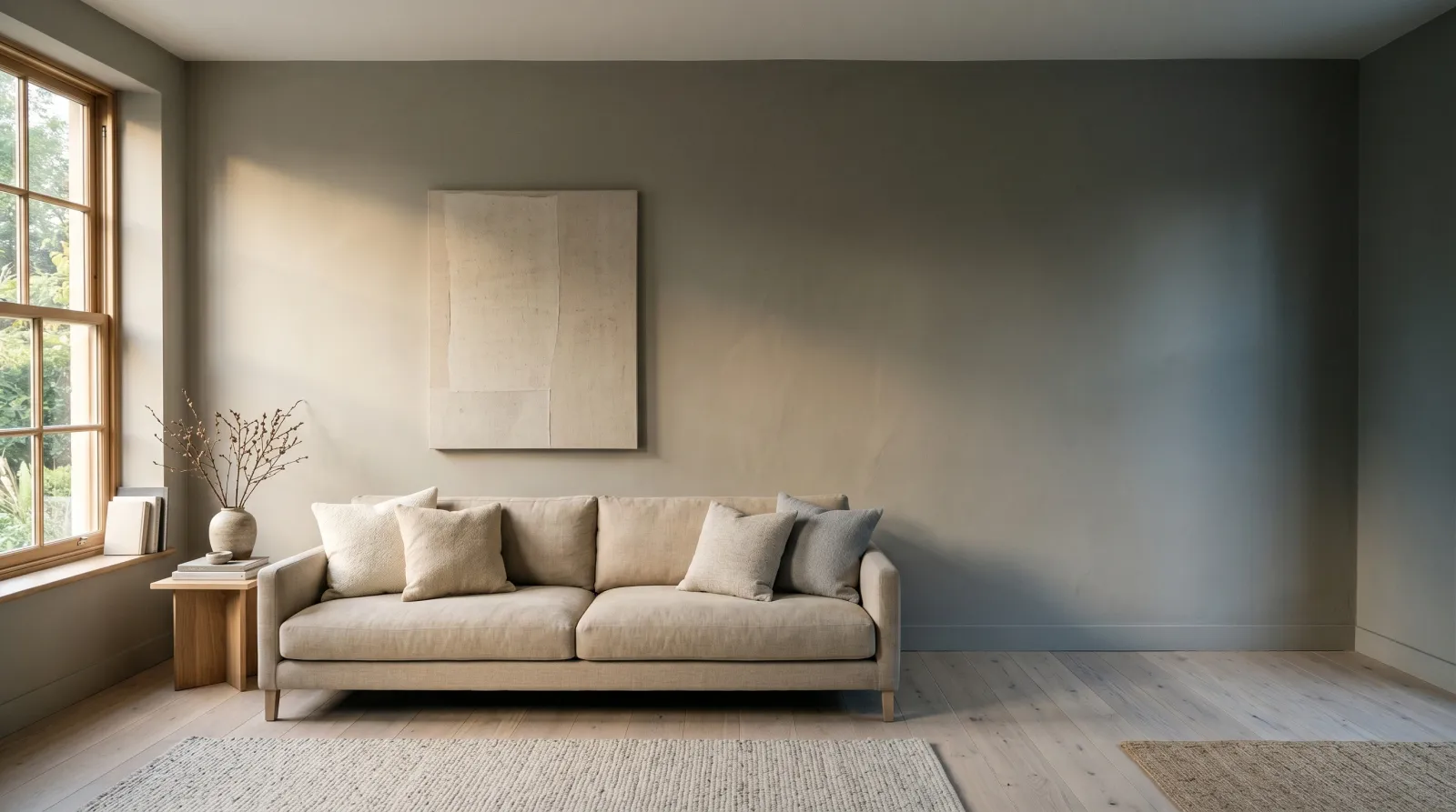
Stand at one end of a long living-room wall on a sunny afternoon and look down its length. The color near the window reads light and warm. The same paint at the far corner reads a few shades deeper and cooler. Nothing is wrong with the wall. You are watching color folding, the way a single paint color grades through several apparent tones as the light bends across it.
Color folding is the visible shift a color makes between its fully lit state and its shadowed state on one continuous surface. The swing can be small on a soft neutral and large on a saturated color. On a 12-foot wall in raking side light, a mid-tone greige can read 5 to 10 LRV points lighter at the lit end than at the dark end. The paint is identical. Your eye is reading two ends of a light gradient as two colors.
TL;DR
- Color folding is one color appearing as several tones across a wall as light falls off.
- It’s light doing the work, not a paint flaw. A perfect job still folds.
- Saturated and deep colors fold hardest. Soft, grayed mid-tones fold most gently.
- Sheen matters. Flat softens the fold; satin and gloss sharpen it.
- Test with a big board, not a chip, in the room’s real light at the hours you live there.
Why Color Folding Happens
A wall doesn’t get one even wash of light. Light arrives from a window or a fixture, hits the surface hardest where it lands, and falls off as it travels away. That falloff is gradual, so the color folds smoothly from its bright reading into its dim one.
The fold has two parts. The first is brightness: the lit zone returns more light, so it reads higher on the LRV scale. The second is the color’s undertone, which surfaces more in shadow. A warm greige can sit quietly warm in the light and tip noticeably green or gray where the light thins out. The shadow doesn’t add a color. It stops drowning the one that was always there.
Texture folds too. A wall with heavy orange-peel or knockdown texture catches micro-shadows in every dimple, so it folds harder than a glass-smooth wall of the same paint.
When Color Folding Helps You
Folding isn’t a problem to solve. On the right wall it’s the thing that makes a flat color feel alive.
Lean into it for:
- Long feature walls and stairwells, where the gentle grade adds depth a single flat tone would miss.
- Deep, moody rooms (libraries, dining rooms) where the fold makes a rich color feel layered instead of like a paint sample blown up to room size.
- North-facing rooms with one strong window, where the warm-to-cool drape across the wall reads as quiet sophistication.
- Lime-based and mineral finishes, which are designed to fold and mottle. See the limewash explainer for how that look is built on purpose.
When Folding Works Against You
Watch it on:
- Two adjacent walls that meet at a corner with very different light, where the fold can make one paint look like two cans.
- Saturated accent colors on a wall lit from one hard angle. The lit end and the shadow end can read as different colors entirely.
- Glossy surfaces in raking light, where the fold sharpens into something that looks like a streaky finish.
- Open-plan spaces where the same color runs from a bright zone into a dim one and people expect it to look identical end to end.
How Color Folding Compares to Things It Gets Confused With
People often mistake folding for an application problem. They aren’t the same.
| Color folding | Flashing | Lap marks | |
|---|---|---|---|
| Cause | Light falling off across the wall | Uneven sheen over patched or porous spots | Wet paint dragged into dry paint |
| Shape | Smooth gradient following the light | Dull patches in random spots | Hard stripes following the roller |
| Fix | Add light, lower sheen, soften the color | Prime the repairs, reroll evenly | Keep a wet edge, work faster |
If the change follows the window, it’s folding and the paint is fine. If it follows your tools, see the fixes for lap marks or roller marks.
How to Choose a Color That Folds Well
Start with saturation. The more chroma a color carries, the more it has to lose in shadow, so it folds harder. A slightly grayed sage holds together across a long wall far better than a pure, vivid green of the same lightness. When you love a saturated color, look at its quieter sibling one or two steps toward gray.
Then check the LRV swing you can live with. On a long wall in strong side light, expect the dim end to read several points lower. If that worries you, push the color a touch lighter so the shadow end still reads the way you want, and let the lit end be the bonus.
Sheen is your other lever. A flat or matte finish scatters light and folds gently, which is why designers reach for it on big feature walls. Step up to satin or semi-gloss and the fold sharpens. The full breakdown lives in the sheen guide.
Last, give the dim end help. A lamp or a sconce on the shadowed side of the wall narrows the gap between the two readings, so the fold softens without you touching the color at all.
Common Mistakes
- Judging the fold from a 2-inch chip. A chip can’t span the light gradient, so it never folds. You see the real behavior only on a board big enough to read at both ends of the wall.
- Picking the color at the bright end. People stand by the window, fall for the lit reading, and forget the far corner exists. Choose for the dim end and let the light end delight you.
- Going high-sheen on a long raking wall. Satin and gloss turn a soft fold into what looks like a streaky job. Drop a step in sheen for any wall lit hard from one side.
- Blaming the painter. A smooth gradient that follows the window is light, not labor. Before you ask for a redo, check whether the change tracks the window or the roller.
- Matching two rooms by the can, not the light. The same color in a bright room and a dim hallway will fold to different places. Sample in each space.
What It Looks Like
A wall folds along the path the light takes. Picture one long greige wall with a window at the left: warm and bright by the glass, settling cooler and a little deeper as your eye travels right toward the corner. That drape is the fold. On a flat finish it’s a soft fade. On a semi-gloss it reads as a sharper band of light near the window. Same color, same wall, two very different moods, set entirely by sheen and light direction.
Where to Start
You don’t buy color folding. You buy a color and a sheen that fold the way you want. For walls that fold gracefully in tricky light, soft, slightly grayed mid-tones in a matte or eggshell finish are the safe bet. For a moody room where you want the fold to add drama, a deep color in flat does the work.
Sort your shortlist by LRV first to control the brightness swing, then choose the undertone that drapes the way you like in shadow. If the wall is a true feature, the accent-wall project guide walks through placement and light.
Then do the one test that settles it. Paint a board at least two feet square, lean it against the actual wall, and look at it at both ends of the room, morning and late afternoon, and once under the lamps you use at night. The chip got you a candidate. The board shows you the fold.