How to Tone Down a Too-Bright Wall Color
Your paint is too bright fix: the color amplified over a full wall. Tone it down with a softer same-family shade, a grayer base, or a flatter sheen, the right way.

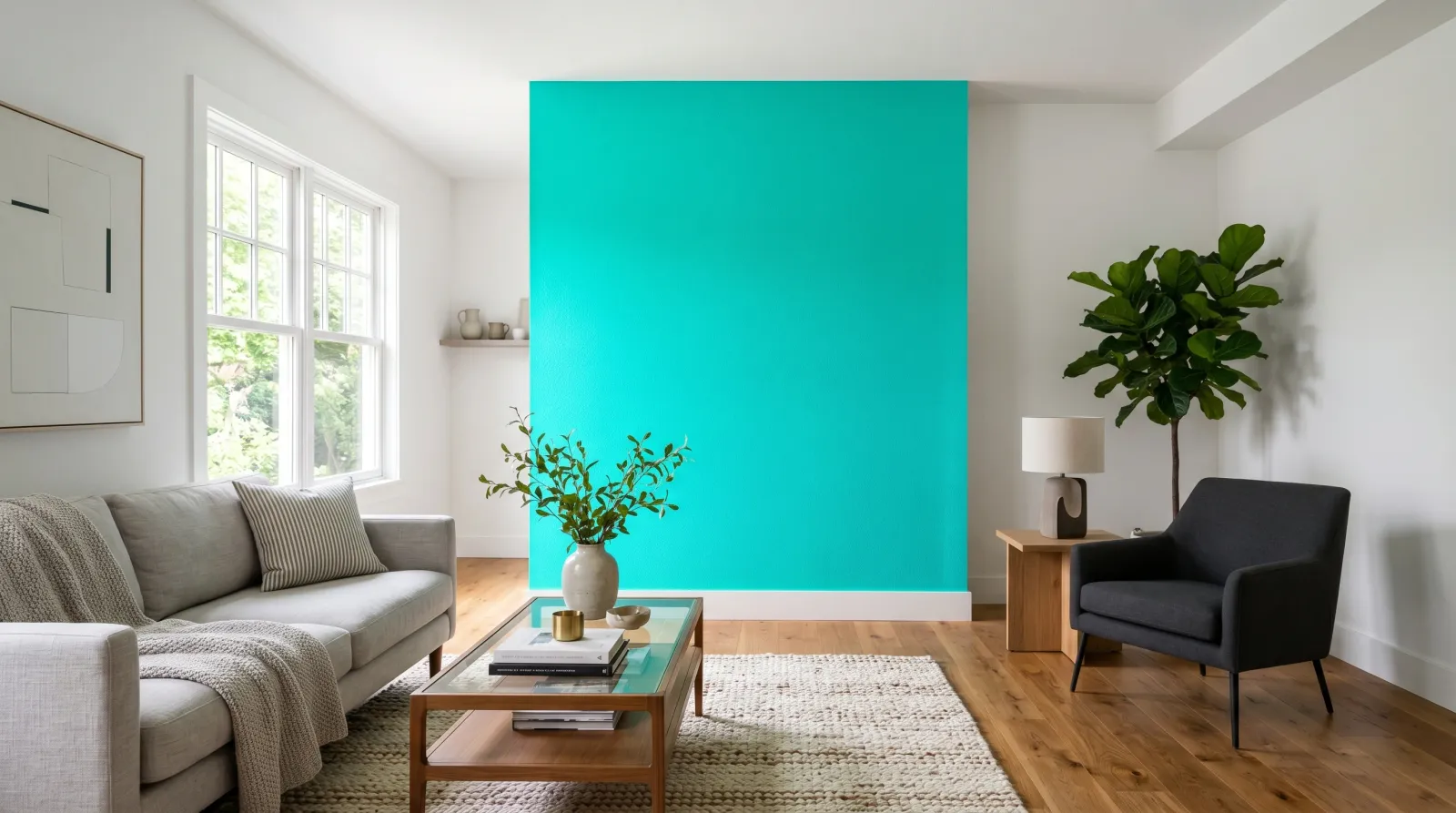
You loved the color on the chip, rolled it onto the wall, and now the room is shouting at you. Too bright, too loud, almost glowing. The hue is the one you chose. What changed is the size: a color you picked from a two-inch chip now covers a hundred square feet, and color amplifies over a large area. The fix is rarely a different color. It’s the same color with the saturation turned down.
TL;DR
- A too-bright wall is almost always a saturated color amplified over a large area. The chip was honest about the hue, not about how strong it would feel.
- A second coat makes it brighter, not calmer. Adding more of the same paint can’t soften it.
- The real fix is a grayer version of the same color, a lower-chroma shade in the same family.
- A flatter sheen and a thin glaze each take a small amount of brightness off. Use them for a minor drop, not a major one.
- Before you repaint, sample the grayer shade big and on the wall. A two-foot square next to the trim tells the truth.
Does This Match What You’re Seeing?
The way the wall feels wrong tells you which fix you need.
- The color is right but the room feels loud, energized, hard to relax in: classic over-saturation. The hue is fine; the chroma is too high for a full wall. You want a grayer version of the same color.
- The wall almost glows or vibrates, especially a clear red, orange, teal, or lime: a high-chroma color doing exactly what high-chroma colors do at scale. The chip couldn’t show you this.
- It looks brighter and shinier than the sample, with a slight glare: sheen. You sampled a flat card and bought satin or semi-gloss, and the shine is lifting the color.
- Bright by the window, calmer across the room: light. Direct sun supercharges a saturated color near the glass. This part is normal.
- The color reads almost neon at night under warm bulbs: warm LED can push a warm-leaning bright color further. A bulb change sometimes settles it.
- Patchy and uneven, brighter in streaks: that’s coverage, not chroma. Finish the second coat before you judge the brightness at all.
If the whole wall is evenly, calmly the wrong intensity, you have a chroma problem, and that’s the fixable one.
How Serious Is This?
Cosmetic, top to bottom. The paint is bonded and protecting the wall. Nothing fails, nothing spreads, nothing’s unsafe. The only damage is that you have to live in a room that feels louder than you wanted, and a color you fight every day is worth fixing.
Give it three days before you commit to a repaint. A bright wall sometimes settles once your furniture, rug, and art go back up, because a saturated color floating on a bare wall in an empty room always reads at its most extreme. Dress the room, then look again. If it still pushes too hard with everything in place, repaint, and this time sample the quieter version on the wall first so the second color is the last one.
The exception is an accent wall meant to be bold. If you chose a feature color on purpose and it came out stronger than expected, you may only need to dress it down with the room rather than repaint. A loud accent against calm neutrals reads very differently than a loud accent in a half-finished room.
Why This Is Happening (root Cause)
A color has two parts that matter here: the hue (which color it is) and the chroma (how saturated, how pure, how far from gray it is). You chose the hue from the chip and got it right. The chroma is what ambushed you, and three things turn it up.
Large area amplifies saturation. This is the big one. The eye reads a small swatch and a full wall completely differently. On a two-inch chip, a bright color is a pleasant accent your eye takes in at a glance. Spread that same pigment across a hundred square feet and your eye receives the color as a flood, not a sample, and it reads far more intense. Cheerful becomes loud. Lively becomes neon. Designers tell you to size up your samples for exactly this reason: saturated colors shrink on a chip and shout on a wall. The brighter and purer the color, the bigger the jump.
Sheen lifts brightness. A glossier finish bounces light back at your eye, and bounced light reads as a brighter, more energized surface. The same bright blue in satin glows more than it does in matte. If you sampled on a flat printed card and then bought satin for a kitchen or hallway, the wall is brighter than the card partly because the finish is throwing light. The sheen guide walks through how much each finish lifts a color.
Light supercharges the chroma. Direct sun and bright daylight pour energy into a saturated color, pushing it toward its most vivid version near the window. A south- or west-facing wall in afternoon light will look louder than the same paint on a shaded wall across the room. Warm bulbs at night can do the same to a warm-leaning bright. The color isn’t changing; the light is amplifying what’s already there. That interaction is the LRV and light conversation in practice.
One thing this isn’t: a mis-mix. The store almost never makes a color too bright by accident. The chip showed you a true small sample of a saturated color, and the wall showed you what that saturation does at full size.
The Fix
You have three moves, from cheapest to most certain. Try them in order of how far off the brightness is.
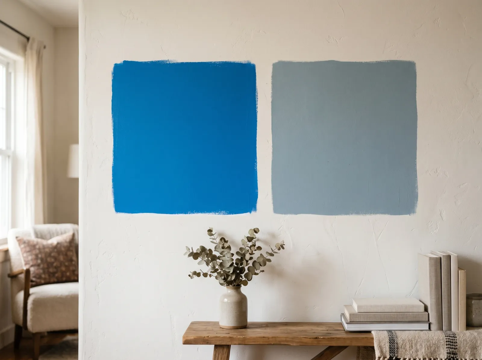 The same blue, grayed down. The quieter square is the color you actually wanted.
Step 1. Drop the Sheen Before You Repaint
If the wall is only a little too bright and a little too shiny, switch to a flatter finish. Matte and flat absorb light instead of bouncing it, so the color reads slightly deeper and less glaring. This won’t change the hue, so a true neon stays neon, but it takes the glow and glare off a borderline-bright wall. It’s the smallest, cheapest change, so it’s worth trying first if the brightness is mild. Repaint over the existing color in a matte version of the same paint, two coats.
Step 2. Knock It Back With a Thin Glaze
For a moderate over-brightness, a thin glaze coat softens the color without a full color change. Mix a small amount of white or light-gray paint into a clear water-based glaze (most brands sell one, like Valspar or Behr glaze, for around $15 to $25 a quart), roll a thin even layer over the dry wall, and soften it with a damp cloth or brush while it’s wet. The white veil mutes the chroma underneath, taking the color down maybe ten to twenty percent. Practice on a sample board first. Glaze is fussy to keep even across a big wall and it changes the sheen, so it’s a real fix for a small drop, not a rescue for the wrong color.
Step 3. Repaint With a Grayer Version of the Same Color
This is the certain fix, and the one I’d reach for if the wall is genuinely too bright. Stay in the same color family and choose a lower-chroma shade, the same hue with more gray mixed in. If your wall is a bright clear blue, look for a smoky blue-gray or a slate blue. If it’s a vivid green, find a sage or a grayed-down eucalyptus. You’re keeping the color you fell for and turning its volume down. A grayer version reads as the color you wanted without dominating the room. Most fan decks put the saturated color and its grayed cousins in the same column; the softer one is usually a step or two down.
Step 4. Sample the Quieter Shade Big, on the Wall
Don’t choose the calmer color from a chip and repeat the same mistake at a lower volume. Buy sample pots of two or three grayer candidates, paint a square at least two feet across directly on the too-bright wall, two coats, in the sheen you’ll buy. Put it next to the trim and the floor. Look at it morning and evening, in your real light, with the room’s furniture in view. The grayed color that still reads as the right hue but no longer pushes is your answer.
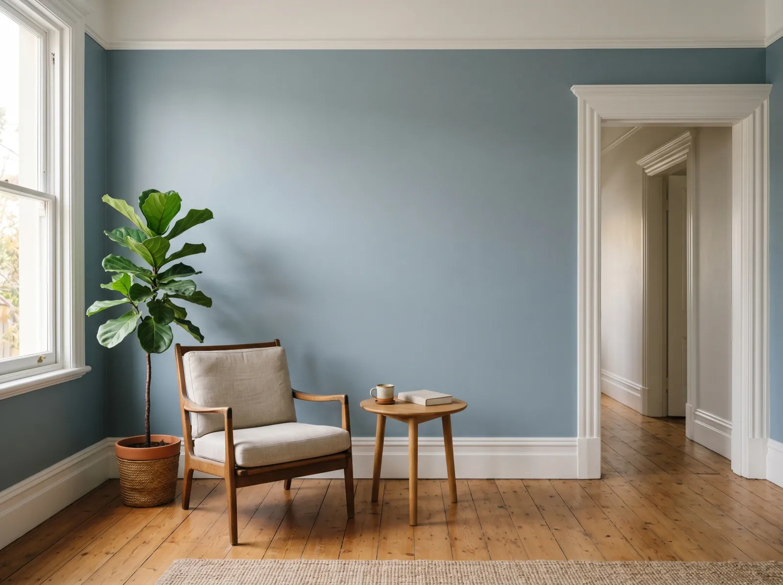 The repaint. Same hue, lower chroma, and the wall finally sits quietly in the room.
Step 5. Prime Only If You’re Going Much Lighter
If your grayer pick is dramatically lighter than the bright wall, a coat of gray-tinted primer keeps the saturated color from ghosting through and saves you a coat of finish. Going from a deep bright color to a soft muted one usually needs the primer plus two finish coats for clean, even coverage. If the new color is close in depth to the old, you can often skip the primer and go straight to two coats.
Recommended Approach
There’s no single product that tones a wall down; the fix is the right color choice, not a bottle. For the certain result, repaint in a grayer version of the same hue. For a small adjustment, a tintable glaze in white or light gray, or simply a flatter sheen, will take the edge off. Spend the money on real sample pots before gallons. The samples are the cheap insurance against painting the room a second wrong color.
Prevention
The fix for next time isn’t a product. It’s how you sample, and how you read chroma at scale.
- Sample big, on the wall, in two coats. A two-foot painted square in the real sheen, not a chip. This single habit catches the large-area jump in brightness before you own gallons.
- Respect saturation. The brighter and purer a chip looks, the louder it will be on a full wall. For saturated colors, expect the wall to read a full step more intense than the chip and choose accordingly.
- For bold colors, go grayer than feels right on the chip. The grayed version that looks almost too soft on the card usually lands as the lively-but-livable color you actually wanted on the wall.
- Use bright colors in small doses. A high-chroma color often works better on one accent wall, a door, or a built-in than across a whole room. The same color that overwhelms four walls can be lovely on one.
- Match your bulbs. Warm 2700K LED pushes warm brights further. If a color reads loud only at night, the bulb temperature may be part of it.
Understanding what a color’s undertone and chroma are doing before you commit is most of the battle. The undertone explainer covers how to read a color’s lean, and the saturation that surprises people at scale comes from the same place.
When to Call a Pro
- You’ve repainted the room twice and still can’t get the brightness right. A color consultant, often free through a paint store or about $50 to $150 independently, will pin the chroma level the room can carry and the light it’s fighting.
- The bright color runs through an open-plan space with several light conditions, and you need it to feel calm in all of them at once.
- It’s an exterior color across many gallons. A too-bright exterior is expensive to redo, and direct sun amplifies saturation hard. Get a trained eye on it before you commit forty gallons.
- You want the color to stay bold but stop overwhelming the room. A stylist can balance it with the right trim, ceiling, and neighboring colors instead of repainting the wall at all.
FAQ
Can I just put a glaze or wash over a too-bright wall? You can, for a small drop in intensity. A thin white or gray glaze mutes the color underneath by maybe ten to twenty percent without a full repaint. It’s fussy to keep even over a large wall and it changes the sheen, so use it when the color is only a little too lively. A true neon still needs a grayer repaint.
Does a second coat make a bright color less bright? No, the opposite. A second coat builds the color to full opacity, so a too-bright wall gets more saturated, not calmer. If the first coat already looks loud, the second turns it up. Adding more of the same paint can’t soften the color you already have.
Will a flatter sheen tone down a bright color? A little, and it’s the cheapest thing to try. Matte and flat absorb light instead of bouncing it, so the same color reads slightly deeper and less glaring than it does in satin or semi-gloss. It won’t change the hue, so pair it with a grayer color for the real fix.
What color tones down a wall that’s too bright? Stay in the same family and pick a version with more gray in it. A bright clear blue becomes a smoky slate blue; a vivid green becomes a sage. Same hue, lower chroma, the volume turned down. Don’t jump to a different hue, since you liked the color, just not the loudness.