Why Paint Looks Different in the Can vs on the Wall
Paint looks different in the can than on the wall because wet film, sheen, surface area, and your room's light all change how the color reads. Here is what to expect and how to test.

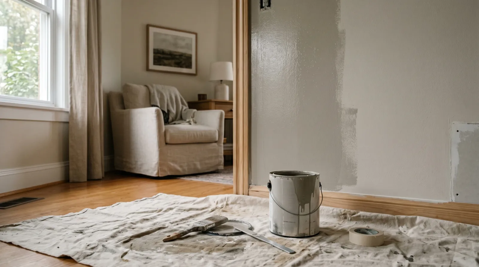
The color in the can almost never matches the color on the wall, and that is the paint behaving exactly as it should. Wet paint reads dark and rich. A chip reads tidy and small. A finished wall reads like whatever the room does to it. Before you decide the store mixed it wrong, let me walk you through what is actually happening.
TL;DR
- Wet looks darker. Paint in the can carries water or solvent that deepens the color and adds gloss. It dries lighter and flatter.
- One coat lies. A single coat lets the wall underneath bleed through. The real color shows up after two coats.
- Big reads stronger than small. A chip is a postage stamp. A wall is a field. The same color amplifies over a large area.
- Light owns the color. North-facing daylight cools it. Afternoon sun warms it. Your room’s light has the final say, not the showroom’s.
- Sheen shifts it. Glossier finishes read lighter and cooler; matte holds the color deep.
- The fix is one habit. Paint a two-foot square, let it fully dry, and look at it morning and night before you buy gallons.
Does This Match What You’re Seeing?
Most “the color is wrong” panics fall into one of these. Find yours before you blame the mix.
- The wet roller looks darker than the chip. Normal. Wet film always deepens a color. Wait for it to dry.
- One coat looks patchy, weak, or the wrong undertone. You are seeing the wall through thin paint. The second coat fixes it.
- The wall reads cooler and greyer than you expected. A north-facing room, or a cloudy day. Cool light pulls warm colors toward neutral.
- The wall reads too yellow or too pink. Warm afternoon light, or warm-LED bulbs, pushing the undertone forward.
- The color looks fine in one corner and off across the room. Two walls, two light conditions. This is the most common “mistake” that isn’t a mistake.
- It looks lighter and shinier than the sample card. Your sample was matte and you bought satin or semi-gloss. The sheen is doing it.
If the dried, two-coat wall still reads visibly off in flat midday light, then it is worth checking the formula against the label. Everything above is the paint and the room, not an error.
How Serious Is This?
This is the gentlest problem on the site. Nothing is failing, nothing is unsafe, and the paint is doing its job. The disappointment is the only damage, and it is real. A color you live with every day and quietly dislike is worth fixing.
The cost of getting it wrong is a wall you have to repaint, which is a weekend and a gallon, not a catastrophe. The cost of testing first is twenty dollars in samples and three days of patience. Spend the small one.
 The chip and the wet can both read denser than the color will on a whole wall.
Why This Is Happening (root Cause)
Four things stand between the can and the wall, and they stack.
Wet film versus dry film. The paint in the can is suspended in water (or solvent, for oil-based). That carrier sits on top of the pigment as a thin wet layer, deepening the color and lending a temporary gloss. It reads dark and saturated. As the water evaporates, the binder and pigment flatten into a dry film, the surface loses that wet sheen, and the color lifts. Most wall paint dries a shade lighter than it looked going on. Deep, saturated colors and strong blues and greens move the most.
One coat versus two. A single coat rarely hides what is underneath. Old color, primer, patched drywall, all of it shows through thin paint and muddies the result. The color you picked is the color at full opacity, and full opacity takes two coats. Judging after one is like judging a photo while it is still developing.
Small sample versus large surface. A color always reads stronger and more intense over a big area than it does on a chip. A soft grey on a card can go cold and heavy across a whole wall. A cheerful yellow can turn loud. This is why designers tell you to size up: a bold color shrinks on a chip and shouts on a wall. The reverse happens with pale colors, which can wash out to near-white once they cover a room.
The light in your actual room. This is the big one. A printed chip and a store showroom have nothing to do with your space. North-facing light is cool and even, and it drains warmth out of a color, nudging it grey. South and west light is warm, especially late in the day, and it pushes warm undertones forward. Your floor bounces its own color up onto the wall. Your bulbs, warm LED or daylight LED, tint everything. The same paint will read warm in one home and cool in another, and that is the LRV and light conversation in a nutshell.
 A two-foot patch, dried and seen morning and night, is the only honest preview.
The Fix
You cannot stop a color from shifting between can and wall. You can preview the shift before you buy a drop of it. The whole fix is a test patch done properly.
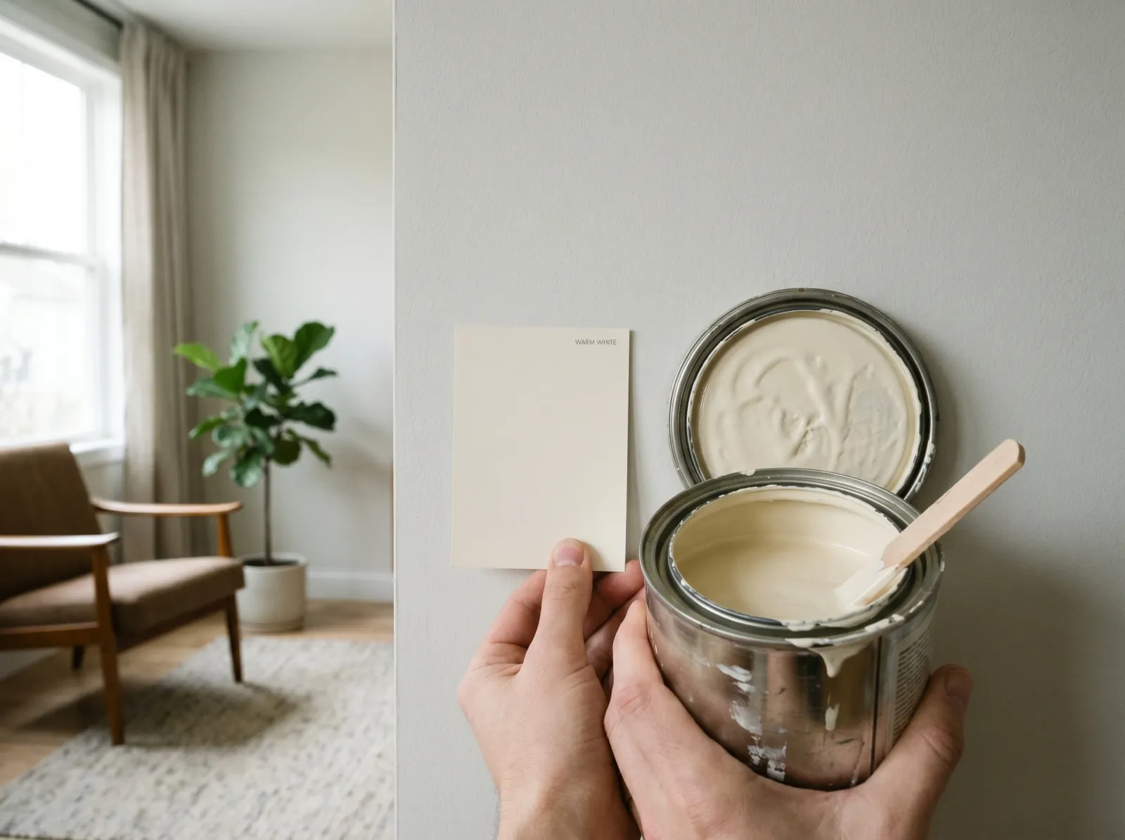
Step 1. Buy a Real Sample, Not Just a Chip
Get a sample pot of the actual paint, in the actual sheen you plan to use. Most brands sell pint or eight-ounce samples for $6 to $12 (Benjamin Moore, Sherwin-Williams, Behr, Clare all do). Peel-and-stick painted samples from companies like Samplize work too and skip the mess. A printed chip is ink, not pigment, and it cannot show you the wet-to-dry shift or the sheen. Spend the few dollars on the real thing.
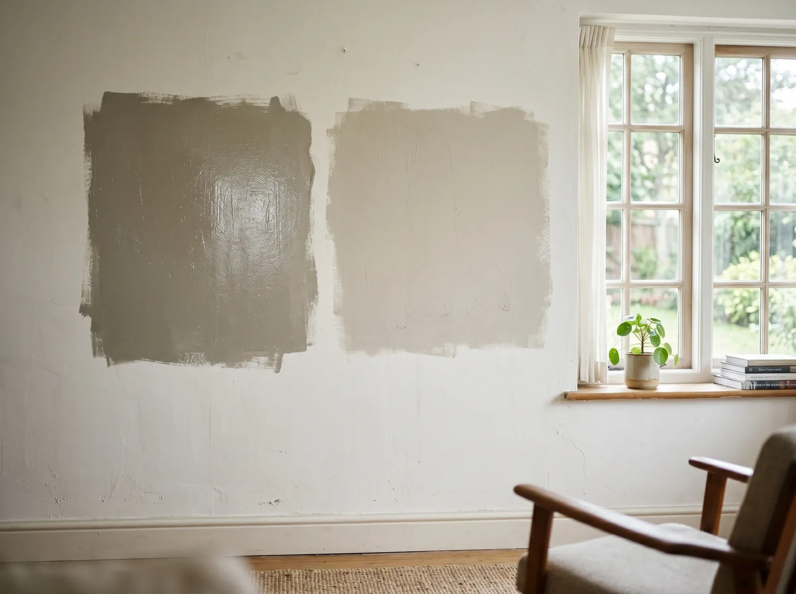
Step 2. Paint a Two-Foot Square, Two Coats
Brush or roll a patch at least two feet by two feet, big enough to escape the small-sample trap. Two coats, the way you will actually paint the wall, with the second coat going on after the first is dry. One thin coat will lie to you about the undertone. Let the patch dry the full recommended time before you judge anything, usually two to four hours to touch and longer to read true.
Step 3. Look at It in Every Light You Live In
Stand in front of the patch at the hours you use the room. Morning coffee. Midday. Lamp-lit evening. A north-facing bedroom and a sunset-facing living room will do completely different things to the same swatch. Watch how the color drapes across the day. If it reads warm and inviting at 7pm but cold and clinical at breakfast, you now know that before you own five gallons of it.
Step 4. Test on More Than One Wall
If the room has walls facing different directions, patch the two that get the most different light. The wall that faces the window and the wall beside it will not match, and you want to like both. Move a sample card around if you must, but a painted patch on each wall is the honest test.
Step 5. Judge Against the Room, Not the Card
Hold nothing against the store card anymore. Look at the dried patch beside your floor, your trim, your sofa, the wood you cannot change. A greige that sits beautifully against grey-washed oak can go muddy against honey pine. Color choices are never about the color alone. They are about how it sits against everything already in the room.
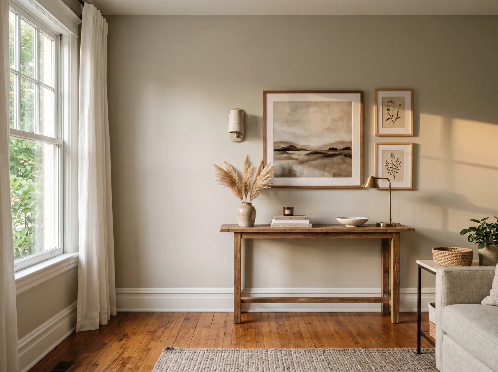 On a whole wall, dried, the color settles into the room it actually lives in.
Does Sheen Change How the Color Looks?
It does, more than most people expect. Sheen is how much light the dried film bounces back, and bounced light dilutes color. A flat or matte finish absorbs light and holds the color deep and true. Step up to eggshell, satin, then semi-gloss and gloss, and each one throws more light at your eye, so the same color reads progressively lighter and a touch cooler.
If you fell in love with a color on a matte sample card and then bought it in satin for a kitchen or bathroom, expect it to read a shade paler and a little washed. Test in the sheen you are buying, not a different one. For the full breakdown of what each finish does, see the sheen guide.
Common Mistakes
- Judging the color while it is wet. Wet always reads darker. Walk away and look after it dries.
- Deciding after one coat. You are seeing the wall, not the paint. Two coats, then decide.
- Choosing from a chip alone. The chip is printed ink and a tiny area. It cannot show the wet-dry shift, the large-area intensity, or your light.
- Testing on a primed white wall and judging it there. Bright white primer reflects light up into the patch and skews it lighter. Test where the real wall conditions are, or two-coat over the primer.
- One patch in one corner. Different walls get different light. Patch at least two.
- Sampling a matte and buying a satin. The sheen changes the read. Match the sheen.
- Picking under the store’s fluorescents. Showroom light is nothing like home light. The store is for narrowing down, never for the final call.
When to Call a Pro
This is a problem you can solve yourself in almost every case. A color consultant earns their fee in a few situations:
- Open-plan spaces where one color runs through several light conditions and has to work in all of them at once. A stylist sizes the undertone to the worst light in the run.
- Whole-house palettes where each room’s color has to flow into the next without a jarring switch. Holding a palette together across a house is genuinely hard.
- A color you have already repainted twice and still cannot make read right. At that point you are fighting an undertone or a light condition you cannot see, and a fresh trained eye is cheaper than a third gallon.
- Historic or specialty finishes like limewash and mineral paint, which shift as they cure in ways standard wall paint does not.