Sherwin-Williams AlabastervsPPG / Glidden Delicate White
Why this comparison: PPG’s bright default white against SW’s soft icon — not as close as people assume. Alabaster and Delicate White are very close (ΔE 3.32). The difference shows up most in side-by-side comparison and under specific light.

Built from our full reviews of both colors — same measured data, same real-room photos. About the testing process →
The Numbers
Delicate White is slightly lighter (LRV 88 vs 82, 6-point delta).
What Each Color Really Is
A warm off-white built on a yellow-beige base, with a small amount of grey mixed back in to keep the yellow from going buttery. That grey is the reason Alabaster became a default instead of a cream: it takes the edge off the warmth so the wall reads "soft white" rather than "antique." The trade-off is that the grey is not a pure grey — there is a faint green thread running through it, and it stays invisible only while the yellow is doing its job. Cancel the yellow and the green half of the mix is what you are left looking at.
At LRV 82 it bounces back most of the light in the room, so it behaves like a white in daily use — but it is not a bright white, and the gap shows the moment a truly bright one is in frame. Extra White SW 7006 sits at 86 and High Reflective White SW 7757 at 93; next to either, Alabaster suddenly has visible body and looks like a color rather than a blank. On its own wall, with nothing brighter nearby, your eye adapts within a minute and simply calls it white. That is the whole reason it photographs so well and why it has been Sherwin-Williams' most-specified white for a decade.
A clean, high-reflectance neutral white — and "neutral" here is close to literal. PPG's own description calls the undertone non-existent, and the color data mostly backs it up: the green channel is the highest and the blue channel the lowest by a couple of points, which puts it a hair on the green-yellow side of dead center with almost no saturation at all. In practice that trace does one useful job — it keeps the wall from reading like the blue-white of a hospital corridor — and otherwise stays invisible. PPG files it with its cool whites, and that is the right shelf: next to a cream it reads clean and slightly cold, never buttery.
At LRV 88 it is a true bright white, not an off-white. That is high enough to matter: it is brighter than White Dove (LRV 85) and Extra White (LRV 86), a step behind Behr Ultra Pure White (LRV 92), and effectively a twin of Benjamin Moore Super White (LRV 87). Reflectance that high is a tool, not a virtue. In a windowless closet or a basement laundry it multiplies what little light you have. On four sunlit walls it can go glare-white and flatten every shadow line in the room.
Specs Side by Side
| Spec | Alabaster | Delicate White |
|---|---|---|
| Brand | Sherwin-Williams | PPG / Glidden |
| SKU | SW 7008 | PPG1001-1 |
| Hex | #EDEAE0 | #F0F1ED |
| RGB | 237, 234, 224 | 240, 241, 237 |
| LRV | 82 | 88 |
| Undertone | yellow / warm | near-white |
| Family | White | White |
How Light Changes Them
The cream comes forward and the room feels sunlit even on grey days. Late sun pushes it slightly buttery.
Cool daylight cancels the yellow and the green-grey base shows. This is where people repaint.
2700K lamps make it cozy cream. 4000K keeps it crisp. Change the bulbs before you change the paint.
At LRV 82 a powder room or hallway still reads bright, and the warmth feels cozy instead of cave-like.
Cool, even daylight is where an undertone-free white is unbeatable — there is nothing warm to be drained out, so it just stays clean and bright.
A sunlit south wall at LRV 88 goes glare-white and washes out every shadow and trim profile. Sample the sunniest wall before you commit.
Barely moves — that is the selling point. Golden hour lays a brief warm cast over it, then it goes right back to neutral.
2700K lamps give it the only warmth it will ever have, and it is flattering. Cool 4000K LEDs push it toward a blue-white glare — swap bulbs before you swap paint.
Both Colors in Real Rooms
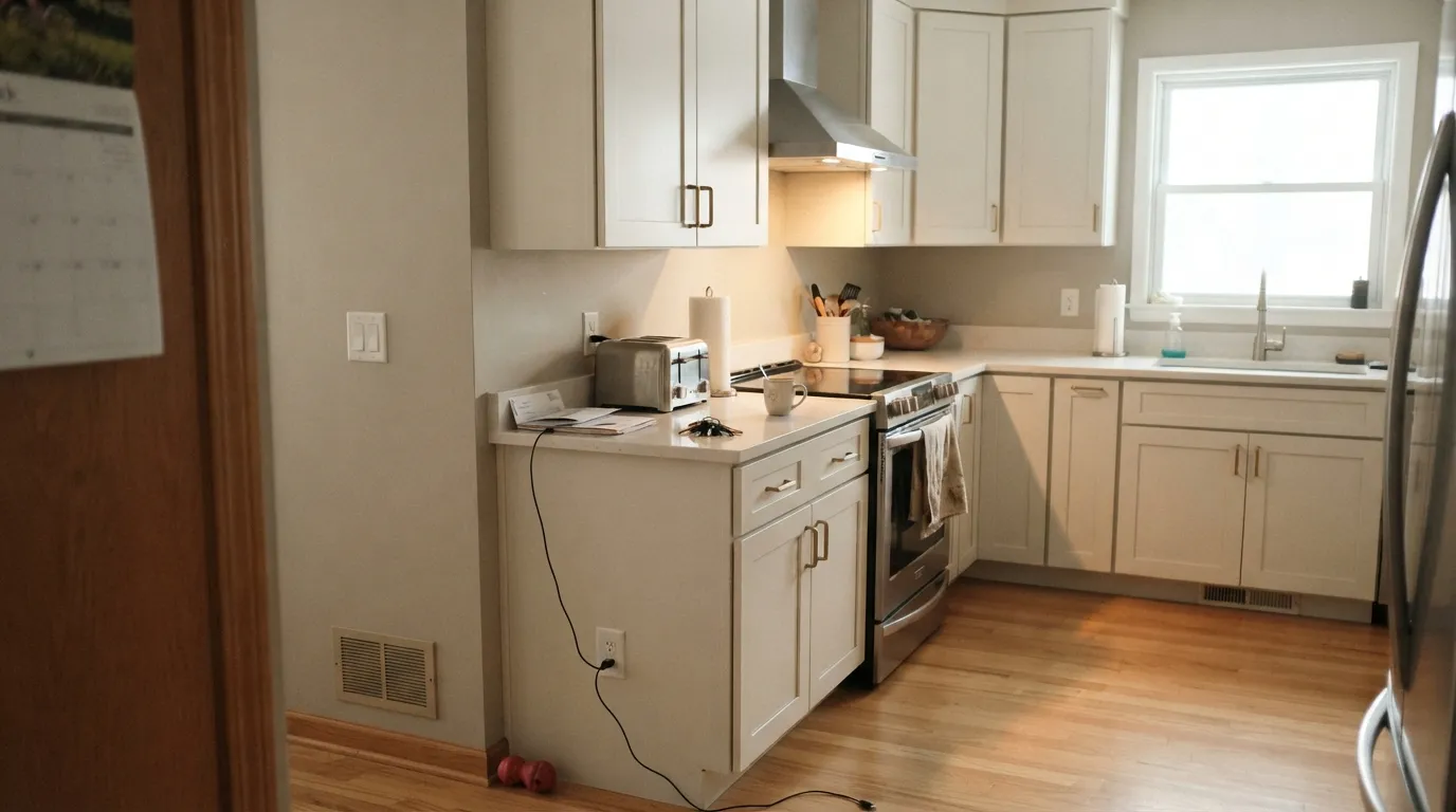
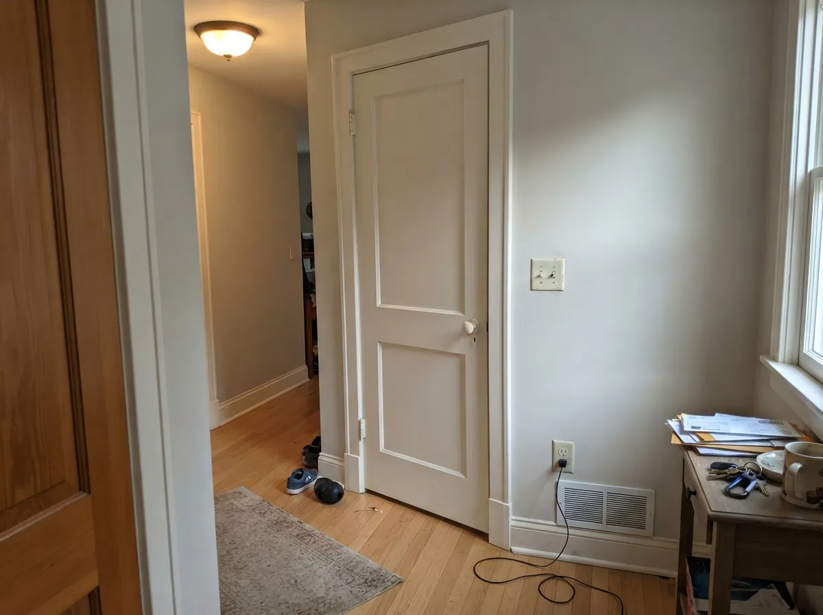
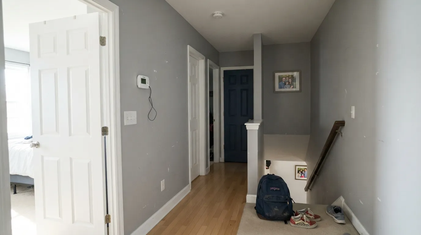
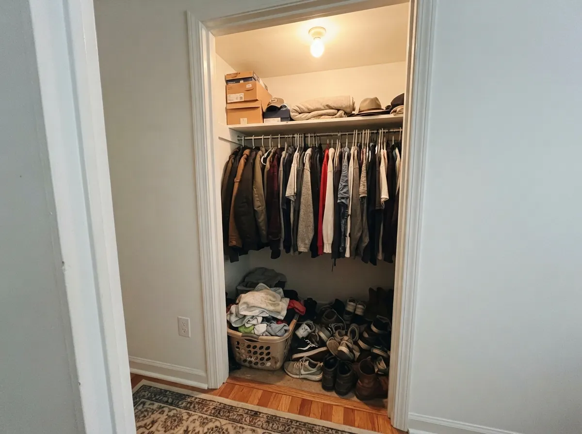
Photos from our full reviews — the same rooms and captions, so you can judge each color where it actually lives, not on a chip.
When to Pick Which
Kitchen and bath cabinets · trim and interior doors · south and east rooms · houses with oak, brass, or cream-toned stone
Your room faces north and is dim · your tile, quartz, or appliances are stark white · your floors are cool grey · you want a crisp modern gallery white
Trim, doors and ceilings · windowless closets, laundry rooms and basements · garage doors and painted fences · anyone who wants a white with no undertone to argue with
You want a soft, cozy, creamy white · your existing trim or cabinets are a cream like Swiss Coffee · the room is wall-to-wall honey oak and beige · a big south-facing wall in blazing full sun
No comparison page can see your light. Upload one photo of your room and try both colors on the same walls, seconds apart.
Alabaster vs Delicate White FAQ
Which is lighter, Alabaster or Delicate White?
Delicate White is lighter: LRV 88 vs 82. Delicate White is slightly lighter (LRV 88 vs 82, 6-point delta).
Which is warmer, Alabaster or Delicate White?
Alabaster is the warmer of the two (yellow / warm); Delicate White reads near-white.
How similar are Alabaster and Delicate White?
Alabaster and Delicate White are very close (ΔE 3.32). The difference shows up most in side-by-side comparison and under specific light. The only reliable test is seeing both in your own room and light — a side-by-side on a screen or chip flattens the difference.
Can I use Alabaster and Delicate White together in one house?
Not in the same room, and be careful in the same house. At ΔE 3.32 they are so close that two walls in each will read as a tinting mistake, not a design choice. Pick one, or keep them on different floors where they are never seen together.
Ask a Question