Black Lacquer
Pratt & Lambert's flagship true black, reviewed honestly: the doors and sash where it reads graphic, the rooms it swallows, and when a softer near-black is the smarter buy.

Jessica has spec'd whites and neutrals for more than 300 rooms and keeps a sample wall of painted drawdowns in her studio. Every color review is checked against real reader rooms in the comments and re-tested when a formula changes. About the testing process →

- 1Black Lacquer3
- 2Graphite8
The Fast Verdict
Black Lacquer is the Pratt & Lambert black you reach for when the job is contrast, not atmosphere. At LRV 3 it is a true void with a faint cool blue-gray — graphic on a front door, a window sash, or a set of cabinets, and a cave on four walls. It is not a trendy charcoal and it is not a brown-black. If you want millwork that reads as black from the curb, this is the chip. If you wanted the room to still feel like a color, keep walking.
Front doors · window sash, shutters, and exterior trim · interior doors · kitchen cabinets in bright rooms · anyone who wants a graphic true black, not a soft charcoal
You want four walls of mood · your floors are honey oak or gold-cream · you actually wanted charcoal you can still see · you will not prime dark and shoot a real sheen
- True graphic black at LRV 3 — it actually reads as black, not charcoal
- Best-in-house on front doors, sash, shutters, and interior doors
- Cool enough to stay modern; no brown or bronze drift
- Pairs cleanly with spec whites (Designer White, White Dove)
- One extra gallon on doors can finish a whole builder interior
- Four walls become a cave — this is a millwork black, not a wall color
- Cool blue-gray flashes next to honey oak and gold cream
- Shows every ding, dusting, fingerprint, and roller ridge
- P&L is harder to buy than Sherwin or Benjamin Moore in most towns
What Color Is Black Lacquer, Really?
A true near-black with a cool, slightly blue-gray cast — the Pratt & Lambert answer to the high-contrast millwork black every white house eventually asks for. It sits on the 32 card next to Cinder, Granite, and Chalkboard, but unlike those, Black Lacquer is not trying to be a color you live inside. It is the period at the end of a scheme: a door, a sash, a shutter, a cabinet run. Painters who already work in Accolade reach for 32-2 the way Sherwin painters reach for Tricorn Black — it is the shop's default void.
At LRV 3 it absorbs almost every photon that hits it. That is the whole point on a door: the white siding gets brighter by comparison, the hardware reads as jewelry, and the elevation suddenly has a focal point. It is also the whole problem on a wall. Four coats of this on a living room will not look 'moody'; they will look like the lights went out, and every roller ridge, patch, and nail pop will telegraph because there is no bounce-light left to hide them. Plan the sheen and the surface before you plan the room.
Undertone in one line: cool, faint blue-gray — never brown, never green. In hard south sun the blue can flash for an hour; in warm lamplight it settles closer to a neutral void. If your sample reads green, you are looking at Chalkboard (32-5), not this. If it reads brown or bronze, you sampled the wrong black.
Where It Shines
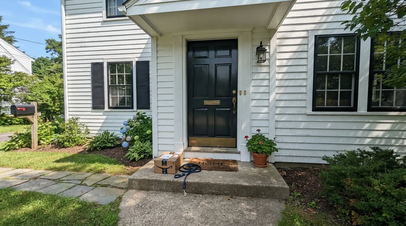
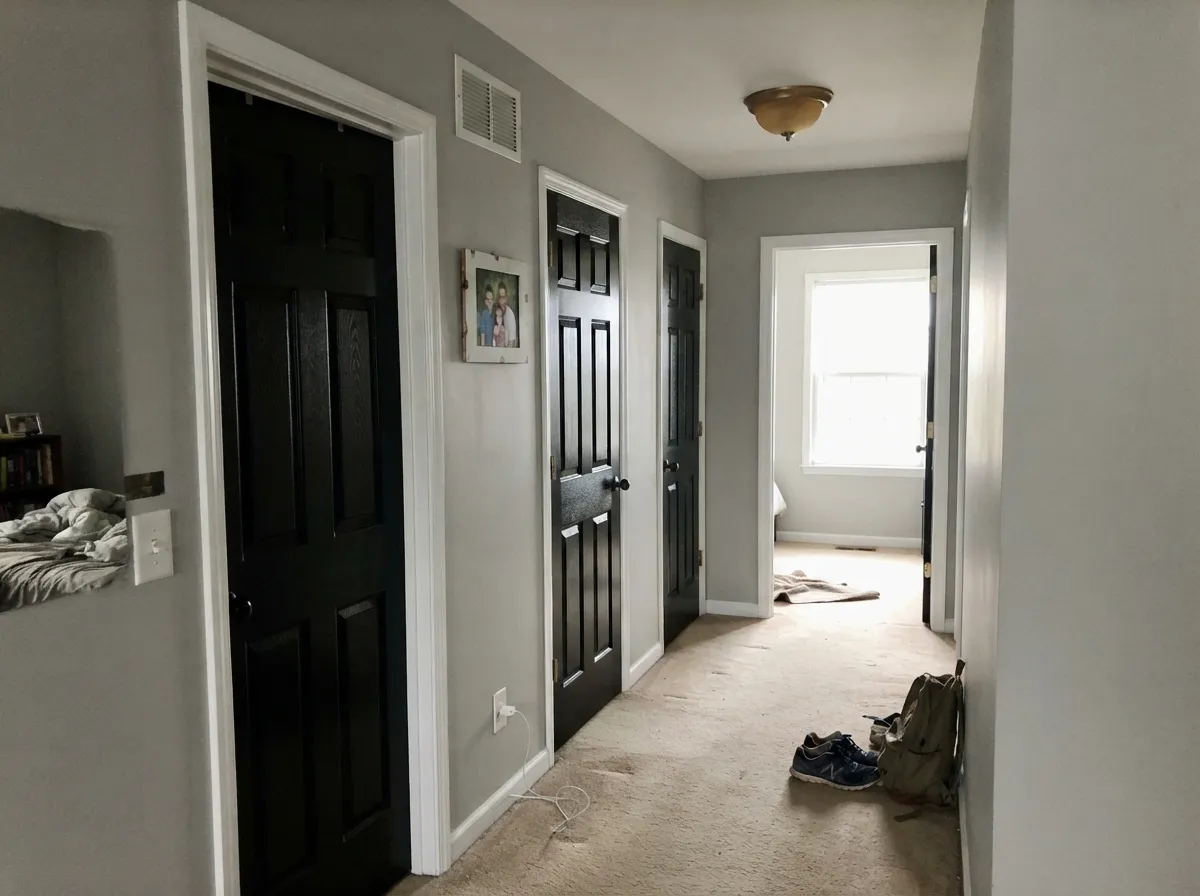
Give it a door, a sash, or a cabinet in real daylight and it does exactly one thing extremely well: it reads as black. Against Designer White siding or a spec cream, the contrast is crisp and architectural rather than gloomy. Semi-gloss on a well-prepped door is the money shot — the kind of millwork black that makes brass, nickel, and even cheap builder hardware look considered. Interior doors in the same color, with a quiet greige on the walls, is the designer move that costs one extra gallon.
Where It Fails
Almost every regret story about a true black this deep follows one of three scripts, and you can call them before the primer dries. None of them are a tinting error — they are a job-description error. If your project matches one, this is the wrong chip.
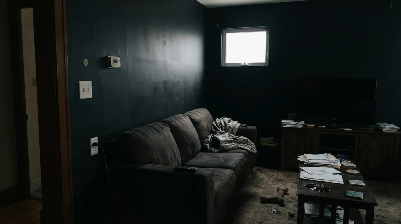
LRV 3 on four walls is not a mood; it is a blackout. The room loses every bit of bounce-light, corners go dead, and roller texture that would disappear under a greige becomes a topographic map. Readers chasing 'moody' from Instagram are the ones who repaint. If you still want dark walls, step up to Cinder (LRV 11) or Wrought Iron (LRV 8) and leave Black Lacquer on the door.
This black is cool. Golden oak floors, orange-stained trim, and gold-cream walls (Antique White territory) push the blue-gray forward until the door looks navy-black and the wood looks more orange. Walnut, espresso, pale white oak, and a true spec white are safe. If the honey oak is staying, pick Black Beauty — the warmest true black in the BM deck — or skip black entirely.
On the chip it can pass for a very dark gray. On a door in daylight it is black, full stop. If you wanted a soft near-black that still reads as a color from the street — something with a little gray left in it — Wrought Iron or Kendall Charcoal will do that job. Black Lacquer will not meet you halfway.
Room by Room
This is the reason the color exists. Semi-gloss on a properly primed door, against white or pale siding, reads graphic from the curb and hides in no one's memory as 'that dark gray we settled for.' Brass, black, and nickel hardware all work. A metal door in full south sun will get hot — that is physics, not the tint.
Window sash and shutters in Black Lacquer on a Designer White or other spec-white house is the classic high-contrast elevation. Keep body color light enough that the black still cuts; on a mid-gray house the sash disappears. Exterior formula, and accept that full sun can flash a hint of blue for an hour at midday.
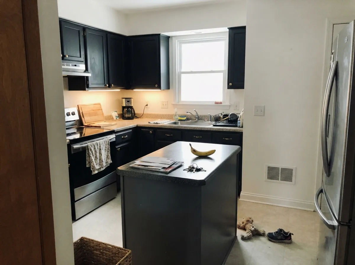
Painting every interior door Black Lacquer, with White Dove or Designer White trim and a greige on the walls, is one gallon of commitment that makes a builder hallway look finished. Satin or semi-gloss; eggshell on a door will look dusty in a week. Do not do the doors and leave the jambs builder-beige.
Satin Black Lacquer cabinets against a true white (Designer White, White Dove) are the current black-kitchen look without a brown cast. They need south or west light, or the room goes cave. Fingerprints will show — satin hides them better than gloss, worse than a mid-tone. Not the move over honey-oak floors.
A powder room can take a drench because you are never in it long enough for the void to get depressing, and a single sconce plus a mirror puts the light back. Matte walls, satin vanity, bright white trim. A primary bath or a windowless guest bath is a different, worse idea.
Do not. Even in a south-facing room with huge glass, LRV 3 on four walls eats the furniture, the art, and the daylight. An accent wall behind a bookcase is the most you should attempt, and Cinder or Wrought Iron will still look more expensive because you can see them. Save 32-2 for the door out of the room.
Your Light Is the Risk
Hard, clear sun on millwork is the honest read: a true graphic black with just enough coolness to look crisp, not brown. This is the light the color was mixed for.
Cool gray daylight plus LRV 3 is a blackout. The blue-gray undertone comes forward, corners die, and the room feels unfinished rather than dramatic. Do not test it as a wall color in this light and then act surprised.
On an exterior door, noon sun can flash a faint blue for an hour; in shade or late afternoon it drops back to a neutral void. Sample the door in place at 9am and 2pm before you commit the whole elevation.
2700K bulbs warm it a half-step toward charcoal and make cabinets feel less severe. Cool white LEDs push the blue-gray and make a black kitchen look institutional. Swap the bulbs before you swap the paint.
Most complaints about Black Lacquer are a light mismatch. Upload a photo of your actual room and see it on your walls — then ask for the same wall in north light or evening lamps before you buy a single sample.
Need It From Another Brand?
Any paint counter can custom-tint Pratt & Lambert 32-2 directly. If you would rather stay in one brand's own deck, these are the closest stock matches, measured as ΔE2000. Under 2 is a difference you will not see on the wall.
| Brand | Closest color | ΔE | LRV | |
|---|---|---|---|---|
| Valspar | Tuxedo8006-8G · Valspar | 2.6 | 2 | Color page → |
| Hirshfield's | Silent Sea0515 · Hirshfield's | 4.5 | 5 | Color page → |
| Portola Paints | Factory BlackFACTORY BLACK · Portola Paints | 4.6 | 2 | Color page → |
| Backdrop | Hocus PocusBD-HP · Backdrop | 0.0 | 3 | Color page → |
| Kompozit | Silent Sea0515 · Kompozit | 4.5 | 2 | Color page → |
Contrast and Legibility
WCAG 2.1: AA is 4.5 : 1 for normal text, 3 : 1 for large text, AAA is 7 : 1.
Black Lacquer vs the Colors You're Also Considering
Every Black Lacquer sample board has the same rivals on it. The numbers show the real lightness gap — then it comes down to which risk you would rather live with.
Pick this if you are already in Pratt & Lambert and want the cooler, slightly more graphic void on the same LRV.
Sherwin-Williams SW 6258 · LRV 3Tricorn BlackPick this if your painter already lives in Sherwin-Williams — it is the reference true black, a touch more neutral, and every lumberyard has it.
Pick this when you want the cooler, crisper millwork black and you do not want any bronze in it.
Sherwin-Williams SW 6991 · LRV 3Black MagicPick this when you want the same depth with a whisper more brown — still unforgiving, slightly less blue in hard sun.
Pratt & Lambert has other dark colors people cross-shop, and the differences are practical. Chalkboard (32-5) sits at LRV 6 and reads as a soft near-black with a green cast, so it feels a little warmer and less absolute than Black Lacquer. Choose Chalkboard when you want a black that relaxes into charcoal; choose Black Lacquer when you want black to look truly black.
Cinder (32-20) is a different animal at LRV 11: it is clearly a deep charcoal gray, not a black, and it will show as gray next to Black Lacquer in daylight. Use Cinder when you want the drama of dark without full black.
Forest (27-9) at LRV 7 is a deep, near-black green. Next to Black Lacquer its green is obvious, so pick Forest when you want a color that hints at nature and Black Lacquer when you want a clean, neutral black.
Black Lacquer Coordinating Colors
The rule is simple: give it a light, clean partner and a mid-value so the black has somewhere to sit. Spec whites and stone grays are the natural company; gold creams and honey woods are the fight. These are the chips that keep showing up next to 32-2 when the scheme works:
Front Doors, Sash, And The Exterior Job
Black Lacquer is a millwork color that happens to live in a wall-paint deck. Pratt & Lambert has never run a Color of the Year campaign around it, and it does not need one: 32-2 is the shop black for painters who already trust Accolade, used the way a cabinet shop uses a can of black enamel. The famous-use story is not a celebrity kitchen. It is a white clapboard house with black sash, repeated on side streets for a hundred years.
Outside, sheen and formula matter more than undertone. Semi-gloss on the door, satin on shutters if you want less glare, always an exterior line, always a dark primer. Full south sun will heat a metal door and can flash the blue-gray for an hour at noon; a shaded north door will read as a quieter void and pick up fewer dust highlights. Garage doors in this color work when the body is light; on a gray house they disappear. Walk the sample around the elevation before you spray 400 square feet of raised-panel door.
Black Lacquer With Wood Tones And Floors
Cool black is picky about wood. Walnut, espresso, stained mahogany, and pale unfinished white oak all sit comfortably next to it — the temperature match is close enough that neither side looks dyed. Pale white oak plus Black Lacquer cabinets is the current kitchen that still looks like a kitchen in five years.
The honest no is golden: honey oak floors, orange builder stain, yellow-beige carpet, and gold-cream walls. The cool blue-gray in 32-2 pushes that gold toward orange, and the orange pushes the black toward navy. No extra coat fixes complementary colors. A large dark rug can referee a hallway; it cannot referee a whole kitchen. If the honey oak is staying, Black Beauty is the warmer true black, or skip black and stay in Cinder.
Metals are easy: unlacquered brass, antique bronze, matte black, and polished nickel all work. Champagne and rose gold look costumey against a void this deep. Chrome is fine on a contemporary door, cold on a colonial one.
Three Ready Palettes Built on Black Lacquer
A color is never alone on the wall. These are complete combinations in the 60-30-10 pattern, with the reason each one holds together. Every one opens in the visualizer.
Designer White is the spec-deck white architects actually use; Black Lacquer on the door and sash is the graphic cut that white is waiting for. Cinder shutters sit a step up from true black so the elevation has two darks instead of one flat silhouette — and Cinder still needs real daylight, which a facade has.
Try this palette in your roomA black kitchen only works if the walls bounce light. Designer White does that without going icy; Granite on the island is P&L's stone-true mid-gray, so the room has a middle value instead of a black hole under the range hood. Brass or polished nickel, not champagne, on the pulls.
Try this palette in your roomAgreeable Gray is the safest greige until the light goes cool, which is exactly the kind of quiet wall a black door needs. White Dove trim keeps the edges warm and finished; Black Lacquer doors are the single dark note. Do not put a brighter trim white next to the greige or the walls will look dirty and the doors will look pasted on.
Try this palette in your roomBlack Lacquer FAQ
Is Black Lacquer a true black or a blue-black?
True black first, with a faint cool blue-gray that you will only notice in hard sun or next to a gold cream. It is not a navy and it is not Tricorn's more neutral gray-black. If blue is a dealbreaker, sample it on the actual door at noon, or look at Black Beauty instead.
Is it good for a front door?
It is the best use in the deck. Semi-gloss, dark-tinted primer, two finish coats, and a light body color behind it. Metal doors in full south sun will get hot, and cheap exterior formulas will chalk — use P&L's exterior line, not leftover interior satin.
Can I paint kitchen cabinets Black Lacquer?
Yes, in a bright kitchen, in satin, against a true white wall. It will show fingerprints around the pulls and it will fight honey-oak floors. A urethane-fortified enamel is non-negotiable. If the kitchen is north-facing or window-poor, the cabinets will read as a void and the room will need more under-cabinet light than you think.
What white goes with Black Lacquer?
A spec white, not a gold cream. Designer White (33-1) is the in-family pick; White Dove if you want the trim a half-step warmer. Antique White is gold and traditional — it can work on a colonial elevation, but it will push this black cooler. A stark gallery white is fine if the house is already that house.
How many coats does a black door take?
Prime with a gray- or black-tinted primer, then two finish coats. Three if you are covering a stained or red door. Skipping the dark primer is how you get gray haze in the corners and a door that never quite looks black. Sand between coats; at this LRV, every ridge shows.
Should I use it on walls?
Almost never. A powder room drench or a small accent behind a bookcase is the ceiling of a good idea. Four walls of a living room, bedroom, or hallway at LRV 3 will swallow the light and advertise every surface flaw. If you want dark walls, Cinder or Wrought Iron still read as a color.
Have you painted with Black Lacquer?
Rate it — one tap helps the next reader decide.
Ask a Question